8 Paint Colors That Make Your House Look More Expensive, According to Designers
"Hearst Magazines and Yahoo may earn commission or revenue on some items through these links."
There are many reasons why someone might want their home to look more expensive. Perhaps they’re planning to sell their house soon, or they simply want their surroundings to feel more luxurious. One of the most effective ways to make your interiors look more expensive without breaking the bank is through paint, and there are some color choices that look more “expensive” than others.
“Paint is one of the most practical and budget-friendly things you can do to keep your home updated,” says interior designer Shelby Van Daley of Daley Home. “Let’s face it—an updated home will naturally look more expensive.”
Van Daley points out that this includes keeping your walls, trim, and doorways looking fresh and touched-up. Also, for interiors, Van Daley says that using multiple paint colors, especially with your cabinetry and millwork, is a great way to differentiate spaces and give your home a more expensive look.
Van Daley goes on to say that are countless paint options, and you can start selecting paint by pulling hues from artwork, a rug, or other textiles in a space.
Interior designer Kristina Phillips of Kristina Phillips Interior Design believes that painting a room darker, particularly in small spaces, gives off a sophisticated, luxe vibe. She also advises to not overlook the trim, saying, “Painting the trim a deeper tone, or even a contrast color, can add a bespoke, luxurious-feeling detail.”
Now that you have some ideas to start with, consider narrowing down your color choices to these “expensive” paint picks from our designers.
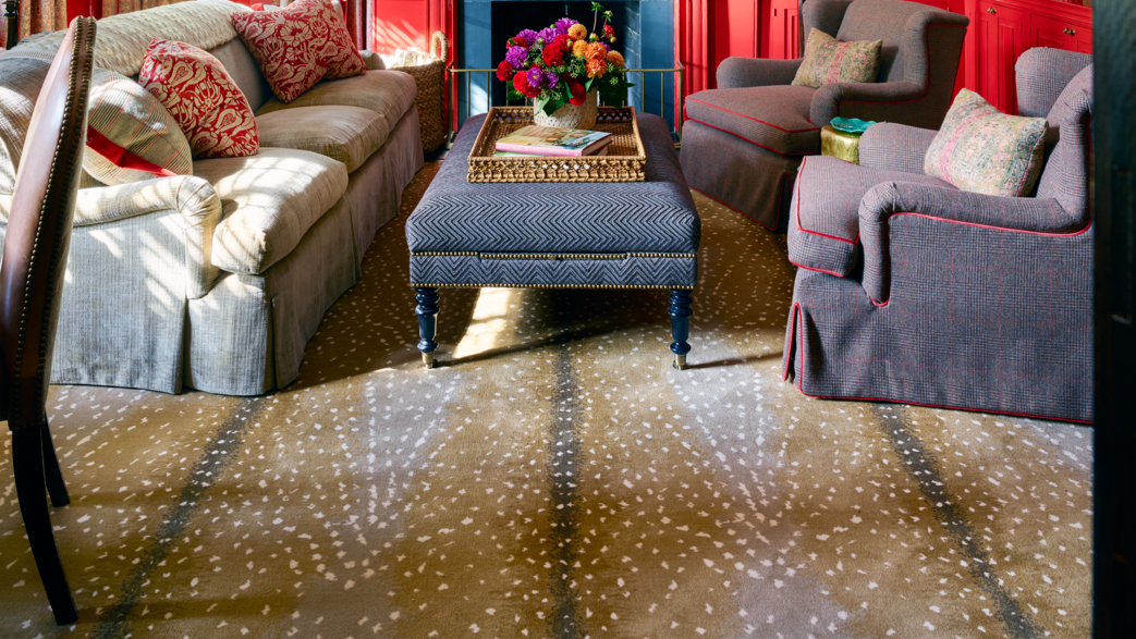
Slate Gray
Dark and moody slate gray continues to trend, and for good reason. There are many different shades that can help you accomplish the “expensive” look you’re going for in a space. For instance, Dark Lead by British company Little Greene is a hue that Phillips has used on both walls and trim in different finishes, “as I find it coordinates brilliantly with a variety of wallcoverings, given its warm grayish blue hue, and brings an understated warmth to any room.” She’s also used Down Pipe by Farrow and Ball in small bathroom spaces “to have them immediately look updated and chic.”
When it comes to dark gray, Van Daley is partial to Urbane Bronze by Sherwin-Williams. “If you want dark interior millwork or cabinetry, this is the perfect dark, yet warm, tone,” she says. “We love the way that Urbane Bronze looks in a whole room with a satin finish.”
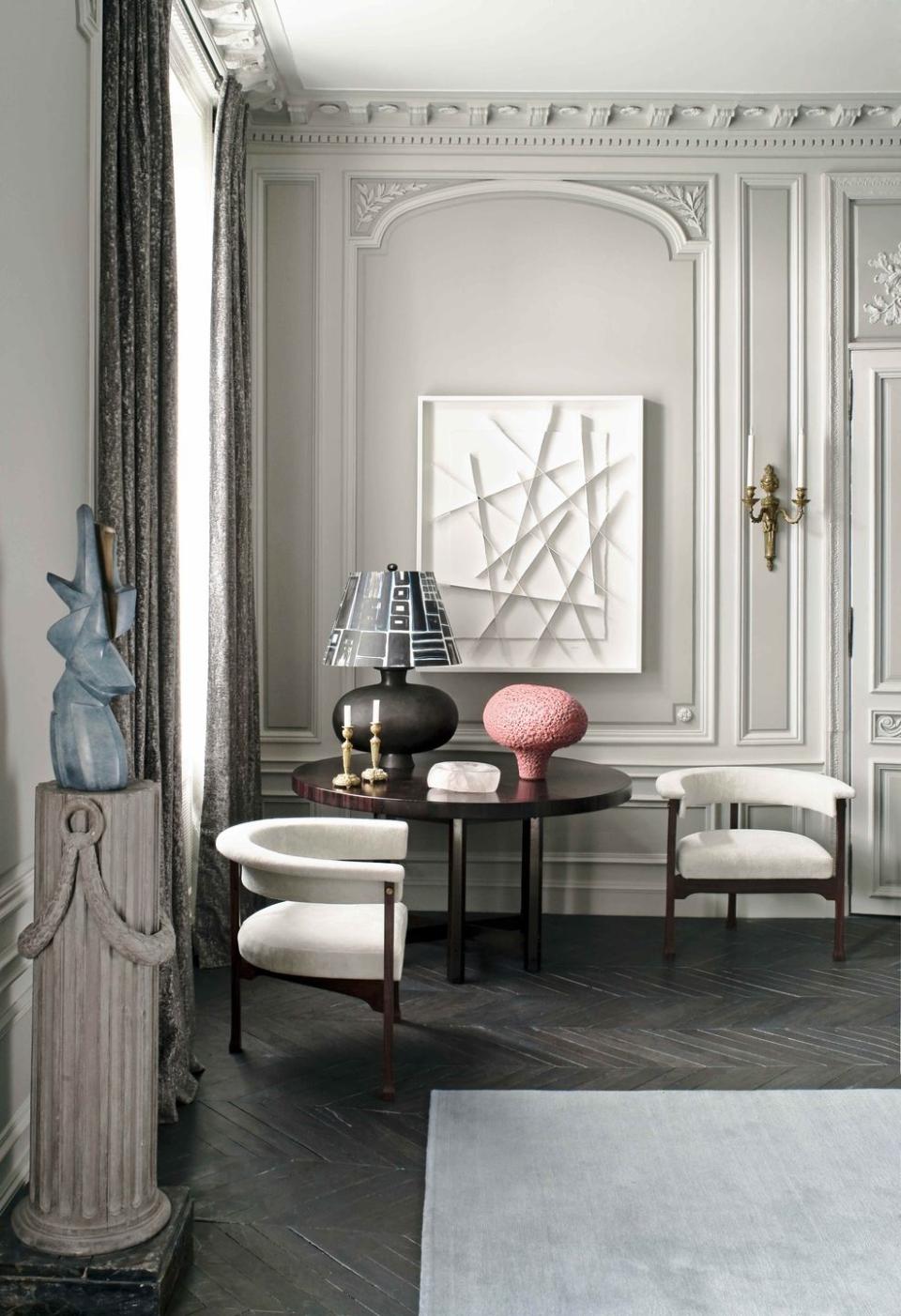
Light Gray
On the flip side, light gray is also a color that can make a room look more expensive. Actually, most shades of gray are a wise choice if you want to level up your interiors. Leaning toward creamy grays that hint at taupe or greige, Phillips particularly likes Stormy Monday by Benjamin Moore, an “almost lavender,” as she describes it, that has a calming effect “that makes a room look and feel effortless yet sophisticated.”
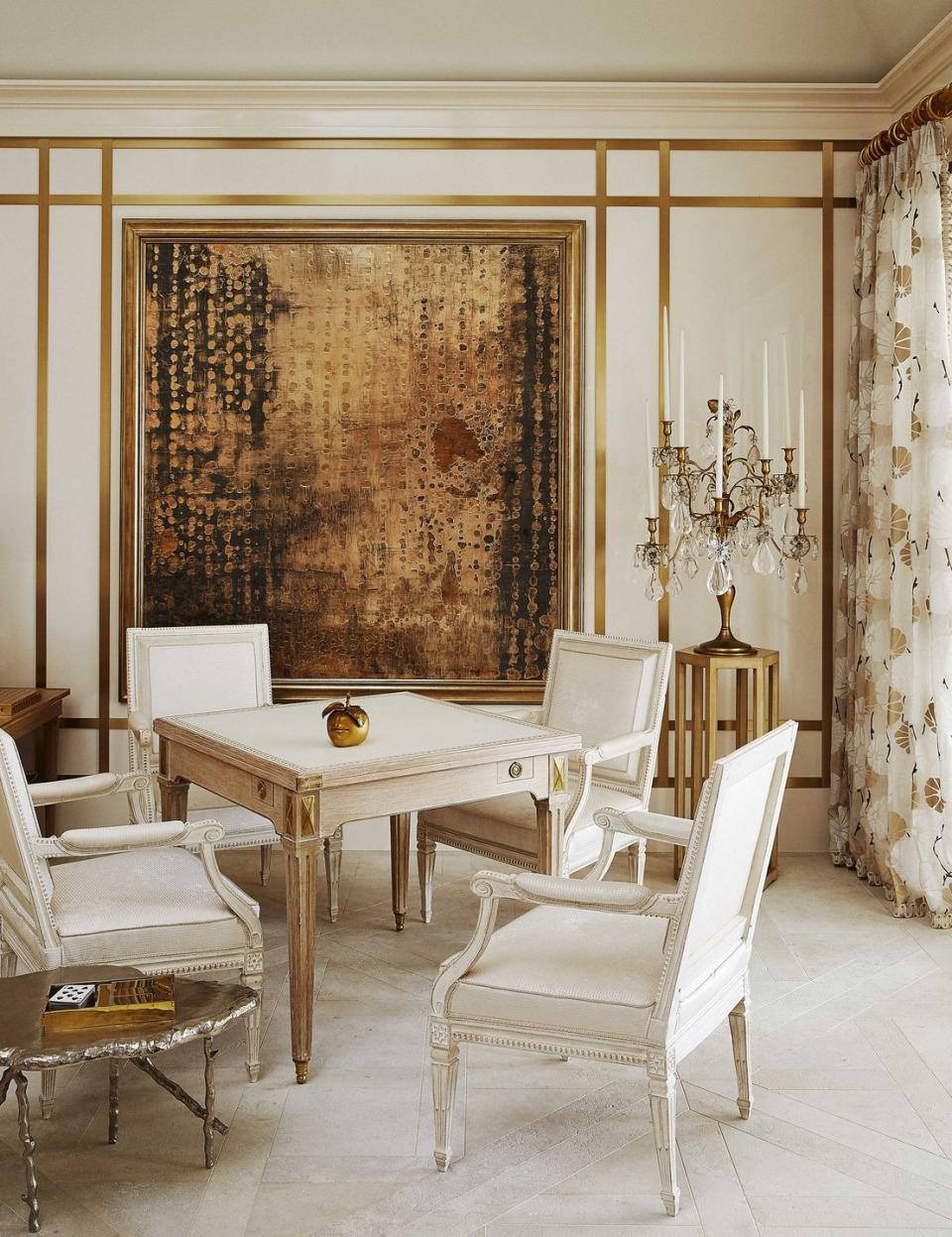
White
White Dove by Benjamin Moore is a darling among designers, praised for its “perfect, classic white” quality, as Van Daley puts it, a color that, in general, you can’t go wrong with on trim, doors, and cabinetry.
“It works well with a lot of different wall colors,” Van Daley notes. “We often use white trim in the main areas of the home and source additional paint colors for specific rooms to elevate the home.”
Off-White
Also in the white color family, off-white is a fine choice if you want to elevate a space, keeping it looking timeless and luxurious. Although Phillips says that “finding the right off-white paint color can be daunting,” since underlying tones can run the gamut, she specifically recommends Simply White by Benjamin Moore as a tried and true classic. She says that the color “blends just a touch of creamy without any yellowness, so it looks lush and clean.”
Beige
With a sandy temperament that’s not quite tan and not quite white, beige is one way to warm up a room and make it look expensive as well. The beige-hued Shoji White by Sherwin-Williams is Daley Home’s most popular interior wall color. Van Daley describes it as “a light, soft white that can appear warm or cool depending on the lighting.” She tends to use the hue in a matte finish on walls and ceilings.
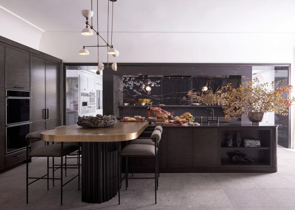
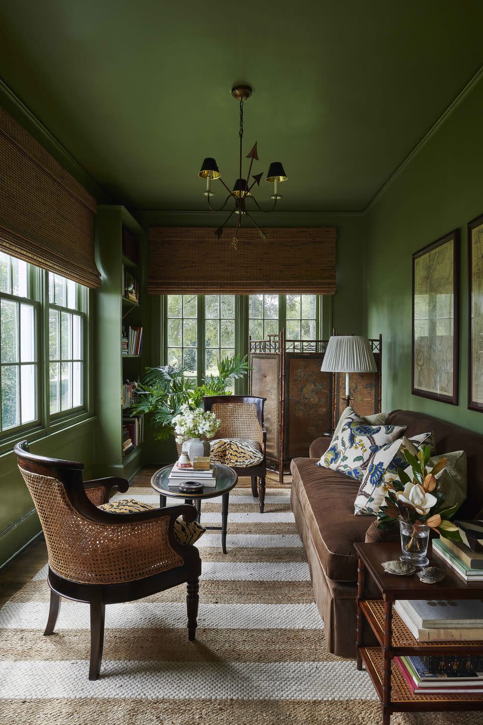
Dark Green
Dark green has become popular recently, spanning from shades of teal to forest green that’s reminiscent of pine trees. It also has an uncanny way of bringing up a space to make it look more expensive. One shade of dark green that Van Daley gravitates towards is Regent Green by Benjamin Moore.
“This is perfect for a moody office,” she says. “You can paint all the walls or a bookcase for a dark, moody feel. You can even consider painting the ceiling in a high gloss finish for an elevated, high-end look.”
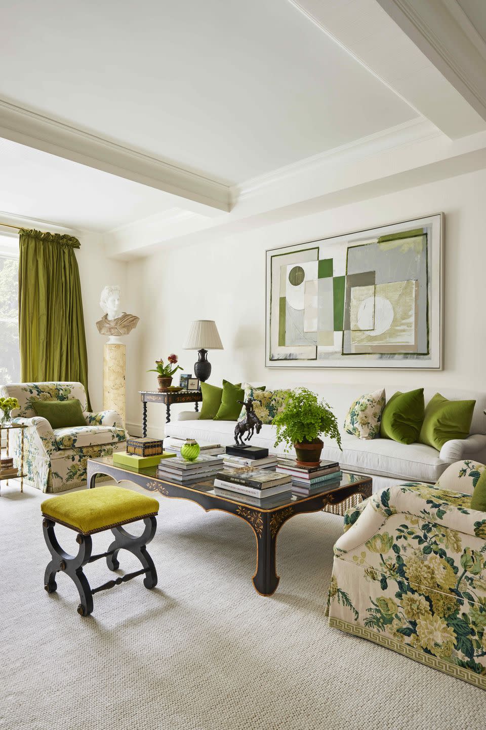
Light Green
Sage, or light green, is another color that homeowners have been using more and more, adding a hint of color without being overpowering and leveling up interiors in the process. A shade of light green that Van Daley prefers? Sea Salt by Sherwin-Williams. She calls it the “perfect timeless light green with a cool undertone,” adding that she enjoys using it for bathroom vanities, built-ins, and children’s play areas.
Crimson Red
While it may seem bold, a dark, crimson red actually has the ability to make a room look more expensive. In fact, Phillips says that a color like Baked Cherry by Little Greene is just the right shade of red, which can bring richness and regality to a room.
There are many reasons why someone might want their home to look more expensive. Perhaps they’re planning to sell their house soon, or they simply want their surroundings to feel more luxurious. One of the most effective ways to make your interiors look more expensive without breaking the bank is through paint, and there are some color choices that look more “expensive” than others.
“Paint is one of the most practical and budget-friendly things you can do to keep your home updated,” says interior designer Shelby Van Daley of Daley Home. “Let’s face it—an updated home will naturally look more expensive.”
Van Daley points out that this includes keeping your walls, trim, and doorways looking fresh and touched up. Also, for interiors, Van Daley says that using multiple paint colors, especially with your cabinetry and millwork, is a great way to differentiate spaces and give your home a more expensive look. She adds that there are countless paint options, and you can start selecting paint by pulling hues from artwork, a rug, or other textiles in a space.
Interior designer Kristina Phillips of Kristina Phillips Interior Design believes that painting a room darker, particularly in small spaces, gives off a sophisticated, luxe vibe. She also advises to not overlook the trim, saying, “Painting the trim a deeper tone, or even a contrast color, can add a bespoke, luxurious-feeling detail.”
Now that you have some ideas to start with, consider narrowing down your color choices to these “expensive” paint picks from our designers.
Dark Gray
Dark and moody slate gray continues to trend, and for good reason. There are many different shades that can help you accomplish the “expensive” look you’re going for in a space. For instance, Dark Lead by British company Little Greene is a hue that Phillips has used on both walls and trim in different finishes, “as I find it coordinates brilliantly with a variety of wallcoverings, given its warm grayish-blue hue, and brings an understated warmth to any room.”
She’s also used Down Pipe by Farrow and Ball in small bathroom spaces “to have them immediately look updated and chic.”When it comes to dark gray, Van Daley is partial to Urbane Bronze by Sherwin-Williams. “If you want dark interior millwork or cabinetry, this is the perfect dark, yet warm, tone,” she says. “We love the way that Urbane Bronze looks in a whole room with a satin finish.”
Light Gray
On the flip side, light gray is also a color that can make a room look more expensive. Though grays can be a predictable paint choice, they're a solid bet when looking to boost resale value. To find the prettiest shade, Phillips recommends leaning toward creamy grays that hint at taupe or greige. She particularly likes Stormy Monday by Benjamin Moore, an “almost lavender,” as she describes it, that has a calming effect “that makes a room look and feel effortless yet sophisticated.”
White
White Dove by Benjamin Moore is a darling among designers, praised for its “perfect, classic white” quality, as Van Daley puts it, a color that, in general, you can’t go wrong with on trim, doors, and cabinetry.
“It works well with a lot of different wall colors,” Van Daley notes. “We often use white trim in the main areas of the home and source additional paint colors for specific rooms to elevate the home.”
Off-White
Also in the white color family, off-white is a fine choice if you want to elevate a space, keeping it looking timeless and luxurious. Although Phillips says that “finding the right off-white paint color can be daunting,” since underlying tones can run the gamut, she specifically recommends Simply White by Benjamin Moore as a tried and true classic. She says that the color “blends just a touch of creamy without any yellowness, so it looks lush and clean.”
Creamy Beige
With a sandy temperament that’s not quite tan and not quite white, beige is one way to warm up a room and make it look expensive as well. The beige-hued Shoji White by Sherwin-Williams is Daley Home’s most popular interior wall color.
Van Daley describes it as “a light, soft white that can appear warm or cool depending on the lighting.” She tends to use the hue in a matte finish on walls and ceilings.
Dark Green
Dark green has become popular recently, spanning from shades of teal to forest green that’s reminiscent of pine trees. It also has an uncanny way of bringing up a space to make it look more expensive. One shade of dark green that Van Daley gravitates towards is Regent Green by Benjamin Moore.
“This is perfect for a moody office,” she says. “You can paint all the walls or a bookcase for a dark, moody feel. You can even consider painting the ceiling in a high-gloss finish for an elevated, high-end look.”
Light Green
Sage, or light green, is another color that homeowners have been using more and more, adding a hint of color without being overpowering and leveling up interiors in the process. A shade of light green that Van Daley prefers? Sea Salt by Sherwin-Williams.
She calls it the “perfect timeless light green with a cool undertone,” adding that she enjoys using it for bathroom vanities, built-ins, and children’s play areas.
Crimson Red
While it may seem bold, a dark, crimson red actually has the ability to make a room look more expensive. In fact, Phillips says that a color like Baked Cherry by Little Greene is just the right shade of red, which can bring richness and regality to a room.

You Might Also Like

