8 Gorgeous Barbiecore Colors that Aren’t Pink
- Oops!Something went wrong.Please try again later.
Pink paint shortage or not, there are plenty of ways to get that playful, chic Barbiecore look without leaning entirely on blushing tones.
Barbiecore is the newest aesthetic sweeping the fashion and interior design worlds, thanks, in part, to the highly anticipated Barbie movie starring Margot Robbie and Ryan Gosling. This eye-catching design trend inspired by the popular Mattel doll is all about bright colors, playful ultra-feminine details, and lots (and lots!) of pink.
However, while pink is definitely a staple of this aesthetic, when it comes to achieving the Barbiecore look in your home, there are plenty of other color options that you can play around with. After all, not even Barbara Millicent Roberts herself (aka the original Barbie) wears pink all the time! Whether you’re feeling the impacts of so-called pink paint shortage or you’re looking for some different hues to try in your Barbiecore decor, here are eight colors—that aren’t pink!—to get the Barbiecore look.
Related: This Is What Barbie’s Dreamhouse Smells Like
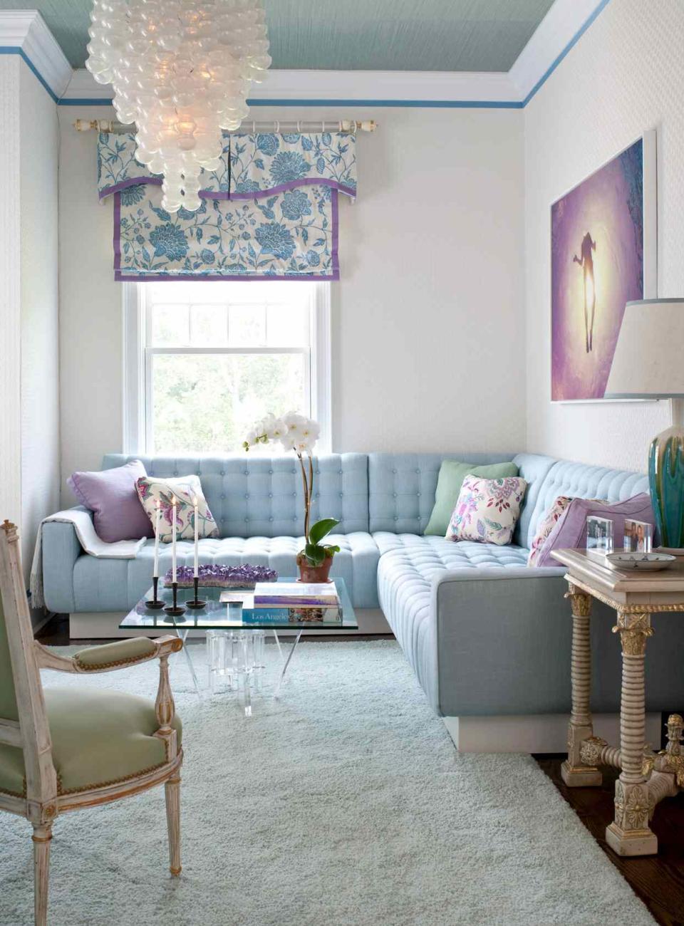
Aqua Blue
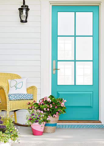
Blue is probably one of the last colors that comes to mind when you think of Barbiecore, but it is actually a staple in Barbie’s world, particularly light and bright blue shades like aqua blue. In 1971, the ultimate surfer girl was added to the Barbie lineup—Malibu Barbie. She rocked bright blue eyeshadow, her trademark long straight blonde hair, and a sporty aqua blue bathing suit.
Since then, this playful shade has made reappearances time and time again in Barbie’s outfits and accessories. To make this cool tone work in an interior design Barbiecore aesthetic, consider using it sparingly alongside other blushing tones. For example, consider painting an accent wall this light blue paint color, or feature aqua blue accessories throughout your space.
Tiffany Blue
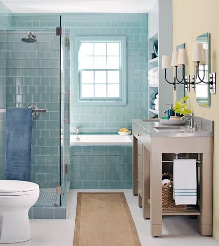
In a similar vein, Tiffany Blue is a great cool tone to play around with in the Barbiecore aesthetic.
“Known for its association with luxury and elegance, Tiffany Blue can infuse your space with a sense of glamour,” says Mina Lisanin, founder and principal designer of ML Interiors, based in New York City. Pair Tiffany Blue with some metallic finishes for an ultra chic and timeless look, Lisanin suggests. The fact that this specialty shade of blue looks great with pink gives this iconic shade major bonus points in Barbiecore world.
Coral
Kim Cornelison
If you like pink but want something a little more subtle and toned-back, then coral is a great choice.
“This vibrant shade adds warmth and vivacity to your space, creating a playful and glamorous atmosphere,” Lisanin says. Coral pairs well with Barbie pink for a bold, color-drenched look, or you can opt for a more muted look by using it alongside white and glamorous metallic accents.
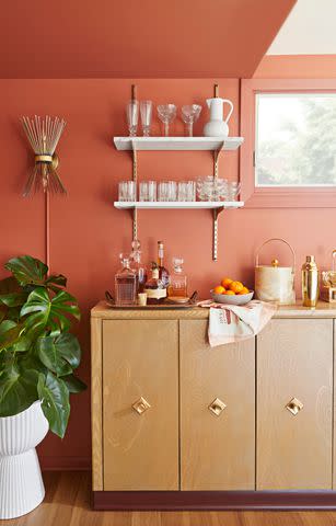
Orange
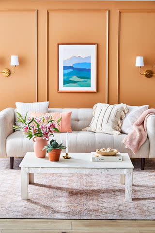
Carson Downing
In lieu of pink, orange is another bright, energizing shade that makes a great addition to any Barbiecore aesthetic, says Pamela O’Brien, principal designer and founder of Pamela Hope Designs. Avoid dark or muted shades of orange, instead opting for sunny hues like bright orange, neon orange, creamsicle, and more.
Lavender
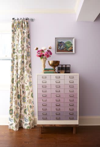
Michael Partenio
When in doubt, you can’t go wrong with lavender.
“This color has a similar whimsical and delicate feel to pink, while offering a refreshing twist,” Lisanin says. Plus, lavender is plentiful in Barbie’s world, so it’s not a stretch to incorporate this shade in your Barbiecore aesthetic. Lisanin recommends opting for soft shades of lavender to bring a touch of femininity and elegance to your space.
Related: 8 Ways to Decorate with Lavender, This Year’s Hottest New Color Trend
Lime Green
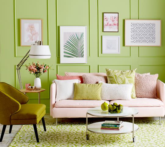
Channel ’90s-era Barbie by using hints of lime green in your space! While green differs drastically from Barbie’s trademark pink, lime green is a similarly energizing and happy shade, O’Brien says. In fact, Barbie herself has been known to rock the shade: Just take a look at the 1997 Movin’ Groovin’ Barbie! For a bold, color-blocked look, try pairing lime green with other neon colors, like purple, blue, yellow, and pink, in your design.
Bright Yellow
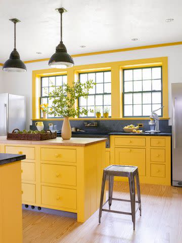
Yellow is another cheerful shade that lends itself well to the Barbiecore trend. Barbie herself can be seen sporting this sunny color frequently. In keeping with the Barbiecore aesthetic, it’s best to choose bright yellows like neon yellow, lemon yellow, sunny yellow, and other similarly energizing shades.
When using yellow in Barbiecore, it’s best used as an accent color for items like accessories or statement decor and furniture. Try pairing yellow with some blushing tones to ensure you still get the trademark Barbiecore look.
Go Patterned
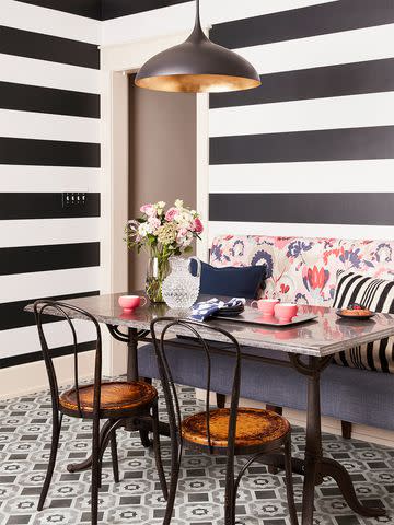
While patterns aren’t technically a color, they are plentiful in Barbiecore and a great way to add some contrast and visual interest to your space. Barbie was first introduced in 1959, around the time that pop art was beginning to take off, which is evident in much of Barbie’s style and choice of patterns. Think simplistic, flat, and bold patterns like chevron (a la Barbie’s original swimsuit!), thick stripes, or polka dots, O’Brien says. Black and white patterns are a great choice, but you can also opt for a more colorful pairing (like aqua blue and lavender) to really make a statement.
For more Better Homes & Gardens news, make sure to sign up for our newsletter!
Read the original article on Better Homes & Gardens.

