These '70s Paint Color Trends Are Back in Style
Create a modern groovy moment with the decade's classic hues.
Courtesy of Behr
The decade that brought us shag carpet, disco, and gelatin salad is currently trending in the design world again. While you might not necessarily want avocado green appliances in your kitchen, the green shade translates beautifully into a warm and inviting paint color. The same is true for other '70s classics, whether it's a deep blue shade inspired by a pair of worn-in bell bottoms or a saturated yellow tone whose golden warmth is reminiscent of the ultimate vintage dessert: pineapple upside-down cake.
To inspire your own groovy decorating, we're sharing how to embrace the signature color palette of the '70s with a modern twist on these classic hues. Grab a paintbrush (and your bell-bottoms!) and add some funky flair with these '70s paint color trends that are back in style.
Related: '70s Design Is Back: Here Are 5 Ways to Make the Retro Style Feel Fresh
Rusty Orange
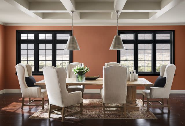
Courtesy of Sherwin-Williams
Add cozy warmth with Cavern Clay by Sherwin-Williams, which is a rusty orange shade that instantly creates a welcoming atmosphere. The deep paint color has a rustic quality and looks best when paired with warm neutrals, dark woods, and leather accents. For a nod to a signature '70s color duo, pair the rich tone with a fun and playful light pink shade.
Paint Color: Cavern Clay by Sherwin-Williams
Related: Burnt Orange Is Back: How to Decorate with the '70s Shade
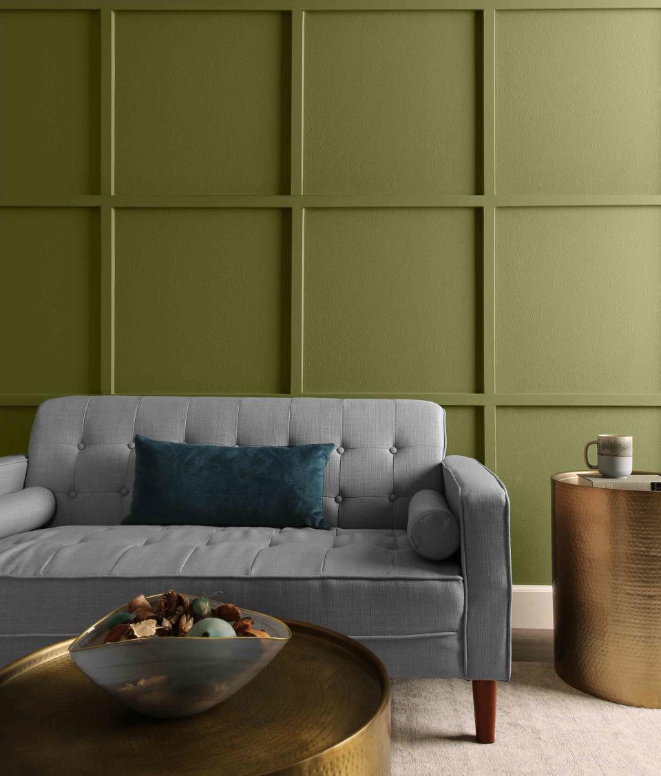
Avocado Green
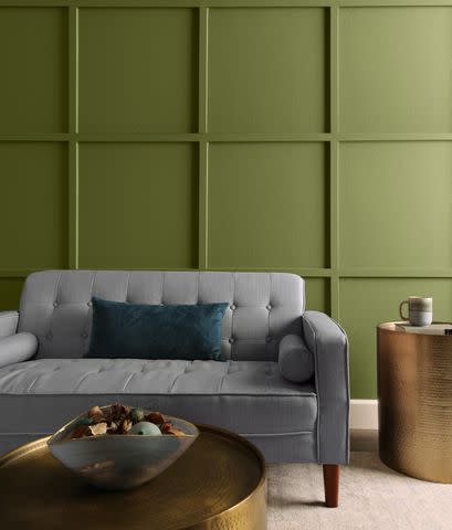
Courtesy of Behr
Take inspiration from the decade's famously colorful appliances and infuse your home with the comforting warmth of Garnish by Behr. It has a reassuring quality that translates well into a bedroom wall color, whether it's a modern space with textured linens and minimalist furniture or a cozy attic room featuring plenty of patterned quilts and reclaimed wood accents.
Paint Color: Garnish by Behr
Related: 4 Home Trends from ‘Daisy Jones & The Six’ that Perfectly Capture the ’70s
Chocolate Brown
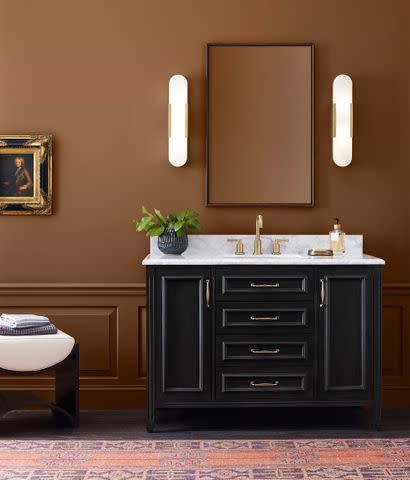
Courtesy of Sherwin-Williams
Earth tones became hugely popular in the 1970s and Antiquarian Brown by Sherwin-Williams is the perfect representation of the darker end of this warm color palette. Update the rich brown shade with black and white accents, sophisticated materials such as marble and brass, and wall mirrors that help bounce light around to brighten the space.
Paint Color: Antiquarian Brown by Sherwin-Williams
Related: A BHG Editor Revived Her Midcentury Modern Home with '70s Style
Golden Yellow
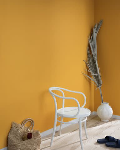
Courtesy of Benjamin Moore
Bring a '70s design staple—a warm and saturated golden yellow—into your home with a splash of Spicy Mustard by Benjamin Moore. Its amber glow is bold yet comforting and to complete the vintage look, layer it with soft creams, comforting tans, and deep browns.
Paint Color: Spicy Mustard by Benjamin Moore
Related: How to Pull off Mustard Yellow Paint in Your Home
Bubblegum Pink
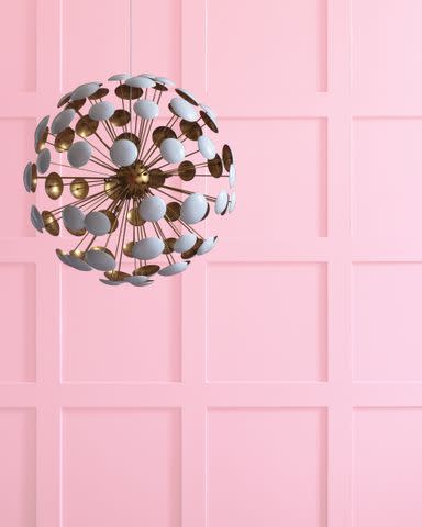
Courtesy of Benjamin Moore
Embrace the flower power design aesthetic with Benjamin Moore's Sweet Taffy. This candy-inspired shade captures the light-hearted spirit of childhood with it's sugary vibrance and uncomplicated whimsy. Elevate the color by juxtaposing it with crisp white trim for a clean look and matte black metals to give it an unexpected edge.
Paint Color: Sweet Taffy by Benjamin Moore
Related: The Colorful Plumbing Trend Is Bringing ’70s Style Back to Bathrooms
Cozy Tan
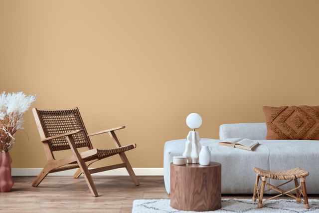
Courtesy of Glidden
Cracker Blitz by Glidden is another earth tone to add to the '70s nature-inspired color scheme. Featuring a golden warmth, this sunny tan is one of the brand's most popular neutrals and a great choice for a timeless living room, calm and serene bedroom, or elegant home office.
Paint Color: Cracker Blitz by Glidden
Related: Earth-Tone Paint Colors Recommended by the Pros
Deep Blue
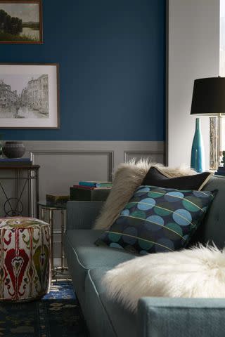
Courtesy of Behr
Like a well-worn pair of bell bottoms, Nocturne Blue by Behr exudes style, comfort, and livability. Use this deep shade as an all-over wall color that makes a stylish statement, on kitchen cabinets paired with brass hardware for a modern look, or to color drench a room for a moody coziness.
Paint Color: Nocturne Blue by Behr
Related: 9 Blue-Gray Paint Colors the Experts Swear By
Bold Red
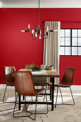
Courtesy of Valspar
While one end of the '70s design pendulum is defined by warm earth tones, the other is characterized by bright and energetic shades such as Valspar's Classic Red. For a true vintage-inspired look, pair this bold red with pinks and oranges layered with lots of graphic patterns, or tone it down with dark woods, leather upholstery, and creamy white accents.
Paint Color: Classic Red by Valspar
Related: The Best Red Paint Colors, According to Experts
For more Better Homes & Gardens news, make sure to sign up for our newsletter!
Read the original article on Better Homes & Gardens.

