7 subtle logo changes that made a big difference
Subtle logo changes often attract a fair deal of amusement, fun poking and even outright criticism. We've all seem comments on social media along the lines of 'you paid someone how much to change the hex number of the brand colour by one value?'
We have to admit that here in Creative Bloq we often have a lot of fun with such logo redesigns too, sometimes challenging people to spot the difference between old and new designs. But the reality is that sometimes a subtle logo change is just what a brand needs to make a real improvement to its visual identity. Below we round up some examples of subtle logo redesigns that made a difference (also see our pick of the best new logos).
01. The NBC logo
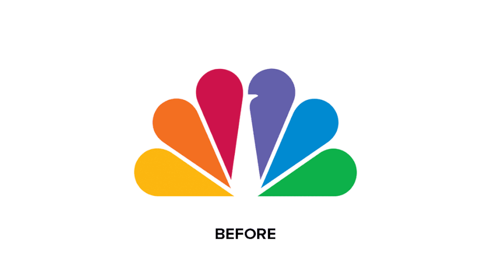
The NBC logo already featured a clever use of negative space: at first glance it's simply a coloured fan, but if you look at the white space in the centre, it becomes clear that it's a peacock. At least that was the idea. The problem with some hidden logo secrets is that they're a bit too hidden, and there's not really much point in them if people don't notice they're there. Thus, last year the NBC logo was updated to make the peacock clearer. It was made slightly larger (the colours were also tweaked) and that was enough to make the clever use of negative space more easily noticeable.
02. The Aston Martin logo
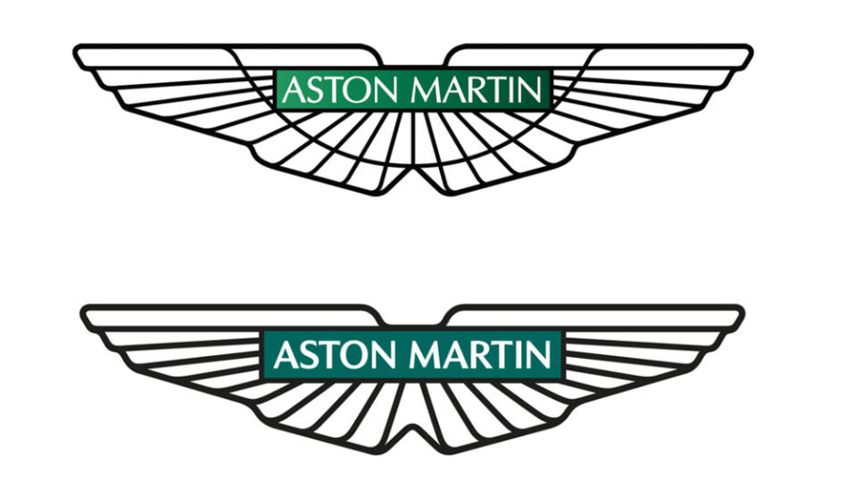
The famed graphic designer Peter Saville CBE described his redesign of the Aston Martin logo as "subtle but necessary" and we agreed. He removed the fussy Egyptian-inspired semi-circular line, thickened others and solidified the racing green colour in a move that respected the heritage of the brand while making it look more modern and streamlined. It also makes it easier to apply in new applications.
03. The Pandora logo
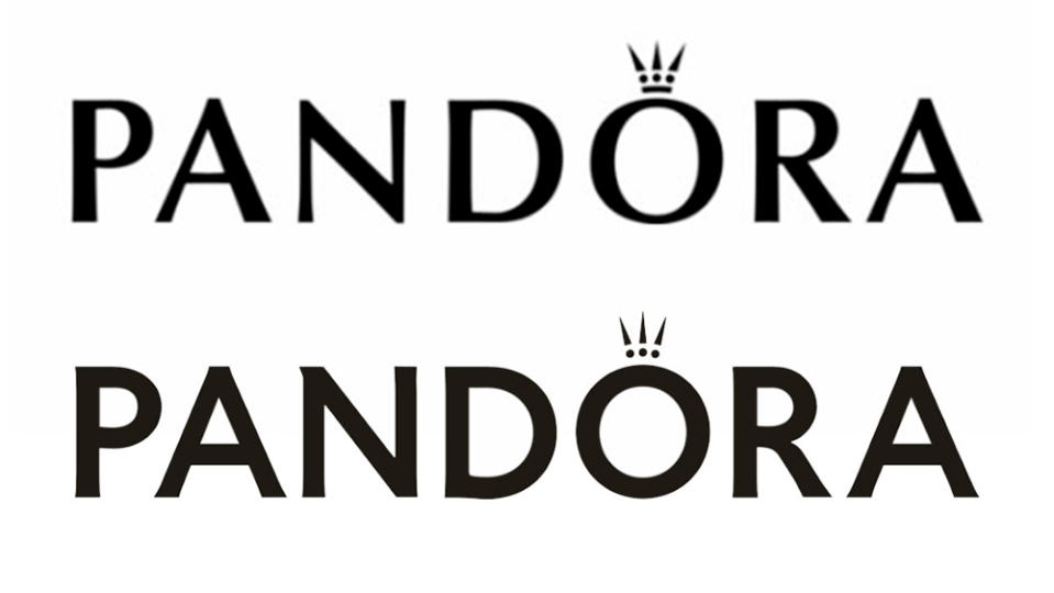
The jewellery company Pandora was pushing the definition of 'sans serif' with this logo change that saw it switch from Optima to a font that has some of the subtlest serifs we've ever seen. The tiny flicks could almost pass unnoticed, but they make a significant contribution to the overall presence of the design, giving it more weight and helping it stand out from all those sans serif fashion logos out there just a little bit.
Pandora also made a subtle change to the crown above the 'o', removing the bottom line to make it cleaner. It also makes the 'o' look more like a ring, which is quite apt for a jewellery brand.
04. The Google Play logo

Sometimes a subtle logo redesign is mainly about colours. The new Google Play logo retained the basic form of the previous design, evoking a 'Play' button, but the colours (red, green, blue and yellow) were made bolder and more saturated, bringing them into line with the colours of the other Google logos, such as Chrome, Drive logos and the eponymous search engine. That makes for much better brand consistency (although we've seen plenty of complaints about the practical implications of this move from Google when it comes to searching for an app).
The colours weren't the only change, however. The shape of the play icon has been changed too, with the corners made more rounded. And the proportions of the colour segments were also changed. All in all, the redesign created a greater sense of balance – in fact, the old logo now feels somehow wrong in comparison.
05. The LG logo

When the new LG logo was revealed this year, many people's first response was, 'what new logo'? The design looked very similar to the logo we already knew, albeit in a different shade of red. But lines were also made thinner. That might seem like another minor logo change, but it's what this tweak made possible that's interesting, since the finer lines made the logo more suitable for animation, and this has given the brand the personality that it lacked. LG now feels brighter, younger and more noticeable.
06. The Sunmaid logo
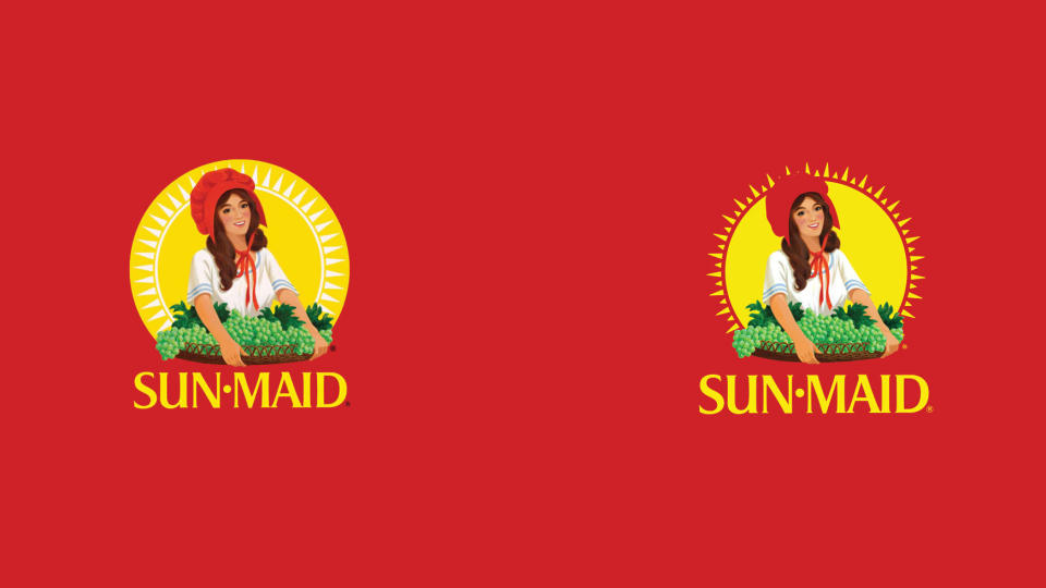
Subtle logo changes often come accompanied by, and form part of, a packaging refresh to present an overall improved look for a product. Back in 2020, the agency quench updated the Sun-maid logo by giving the eponymous maid (Lorraine, apparently) more 'space and depth'. They also gave more prominence to the sun rays surrounding the illustration to make the image 'pop' more. This was accompanied by other changes on product packaging, including a hint of a drop shadow, new tag lines and a 'since 1912' a statement of heritage.
07. The Visa logo
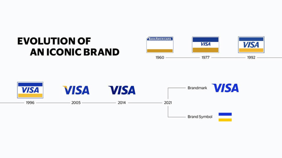
Sometimes the most significant part of a logo redesign is what's left out. A revamp for Visa in 2021 separated its wordmark from its logomark, allowing each to be used individually. Mastercard had already made a similar move, starting to use its mark without the brand name. Such a move makes more use of what has already become a recognisable part of the brand identity while offering more flexibility for the brand.
For more tips on logo design, see our guide to how to design a logo. And for inspiration, see our pick of the best logos of all time.

