6 colors to avoid in an entryway – and the ones designers know make a better first impression
Color is key in any part of your home. The right colors can make a space look brighter, larger or if the occasion calls for it, darker and more sultry. Of course, the same is true of entryways and as New York-based Principal Designer at Nufacet Interiors, Isfira Jensen, rightfully says: “An entryway is a home’s first impression, it sets the tone for the entire home and helps make visitors feel welcomed”.
This means making the right decision regarding your entryway color scheme has never been more crucial. Slip and paint your entryway in dark shades and suddenly a bright space is looking narrow and dingy. On the flipside, going bright and bold may add personality and verve to the space, but may feel like it isn’t reflecting you and the calm esthetics of the rest of your home.
Colors to avoid in an entryway
Here are a selection of colors the industry’s most trusted are reaching for when working on entryway spaces, and those being kicked to the curb.
1. Avoid Light YELLOW - use greige instead
Brooke Spreckman, Founder and Principal Designer of Design Hutch has clear advice for picking your entryway color - avoid yellow, especially in naturally light spaces. She explains that “too many light tones will either get washed out or show excessive wear easily. It’s nice to have darker surfaces that can contrast against surrounding light walls/windows.”
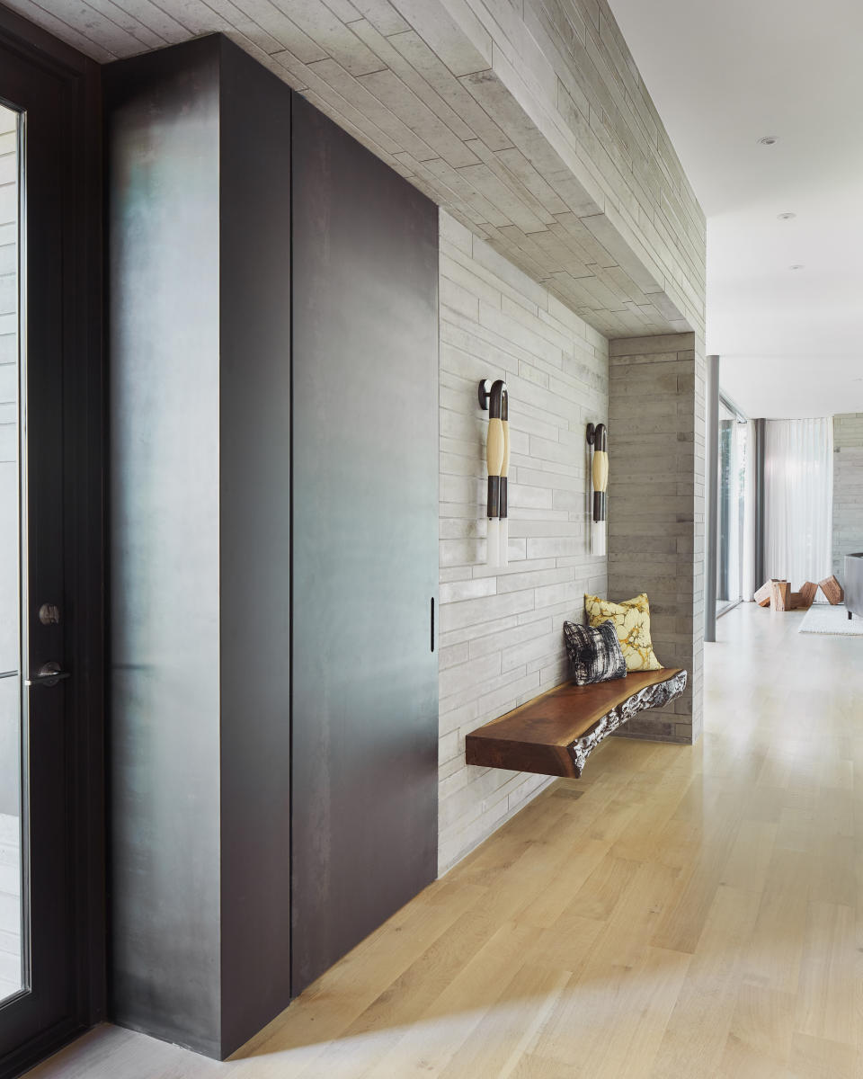
As an alternative, she advises mixing “earthy tones that will age well over time, considering use and the timeless factor.” Her top tip is to “use warm tones that won’t lean too dark or light” and says entryway palettes should include some neutral wood, whether oak or walnut, and olive green, a warm-toned gray, and a textured and patterned runner.” Greige is a good bet for the walls - see our guide to the best greige paint for more inspo.

Get the look
Accent table lamps
Price: $105 for two
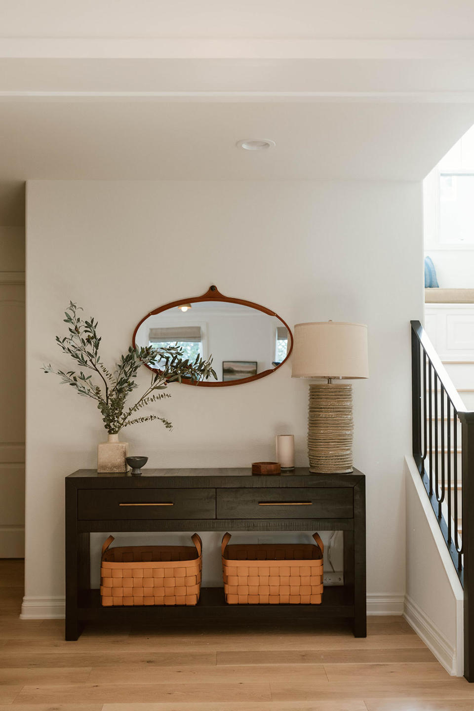
2. Avoid using neutrals on wood - use accent shades instead
Though neutrals are often a go-to for creating light, open spaces - especially in small entryways - Color Curator for Farrow and Ball, Joa Studholme, says to use them wisely. “A very neutral wall color alongside white woodwork will possibly feel too ordinary,” she says, warning this could prevent a natural flow through the house.
Instead using an accent color can add dimension and life back into a room that uses a neutral palette. Studholme explains: “The use of a light color in an entryway evokes calm and serenity. However you must be wary of creating a bland characterless or uninviting space. The best way to avoid this is to contrast light walls with a darker tone on the trim.”
She goes on to explain that “because the walls are by far the biggest surface you will retain a feeling of space while the darker trim will add an extra decorative element to your room. A subtle contrast like Farrow and Ball School House White on the walls and Drop Cloth on woodwork feels still, calm and gentle while a stronger contrast like Railings on the woodwork will create a more dynamic vital space.”
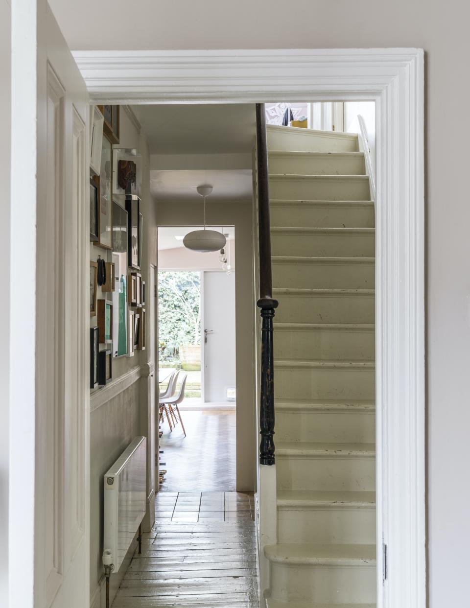
3. Avoid WHITE ON WHITE
Similarly, you will likely find that a white on white theme could be doing your entryway a disservice as Studholme recommends embracing bold colors, if you’re brave enough to ditch neutrals altogether, that is. The color curator explains that a strong color in your entryway, even if it is dimly-lit, will create a distinct point of view drawing your eye to a natural focal point like a light filled kitchen.
She elaborates: “If your hall is deprived of light it may be advisable to use an enveloping warm color, establishing it firmly as the heart of the home. You are not going to win the battle with nature to create a light airy space, so best to embrace what you have and use it to your advantage. Using a strong color like Farrow and Ball Dead Salmon or Selvedge in a hallway instantly makes adjacent rooms look bigger and brighter because walking from a darker into a paler space makes rooms feel instantly lighter.
4. Avoid BRIGHT RED - use moodier hues
If you are taking Studholme’s advice on board and looking to branch into bold colors, Texas-based designer Jean Liu recommends choosing your color thoughtfully. She says: “Since the entryway can be about making a good first impression, staying away from bright or primary colors might be suggested. These colors, while fun, can be quite specific and might give off the wrong idea about you and the house.”
She uses red as an example, saying: “A red entry might give Moulin Rouge vibes when you don’t mean to convey that notion.” She says the same may be true of using pink too liberally if a Barbie dreamhouse isn’t your vibe. Instead, Liu recommends using a warm, moodier hue to create an entryway that is cozy without being cavernous.
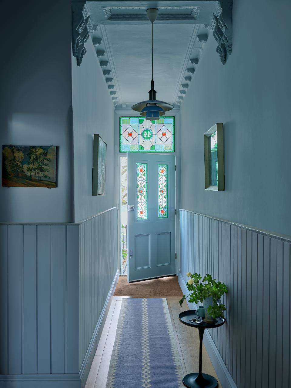
5. Avoid WEAK COLOURS IN URBAN SPACES - use bold ones instead
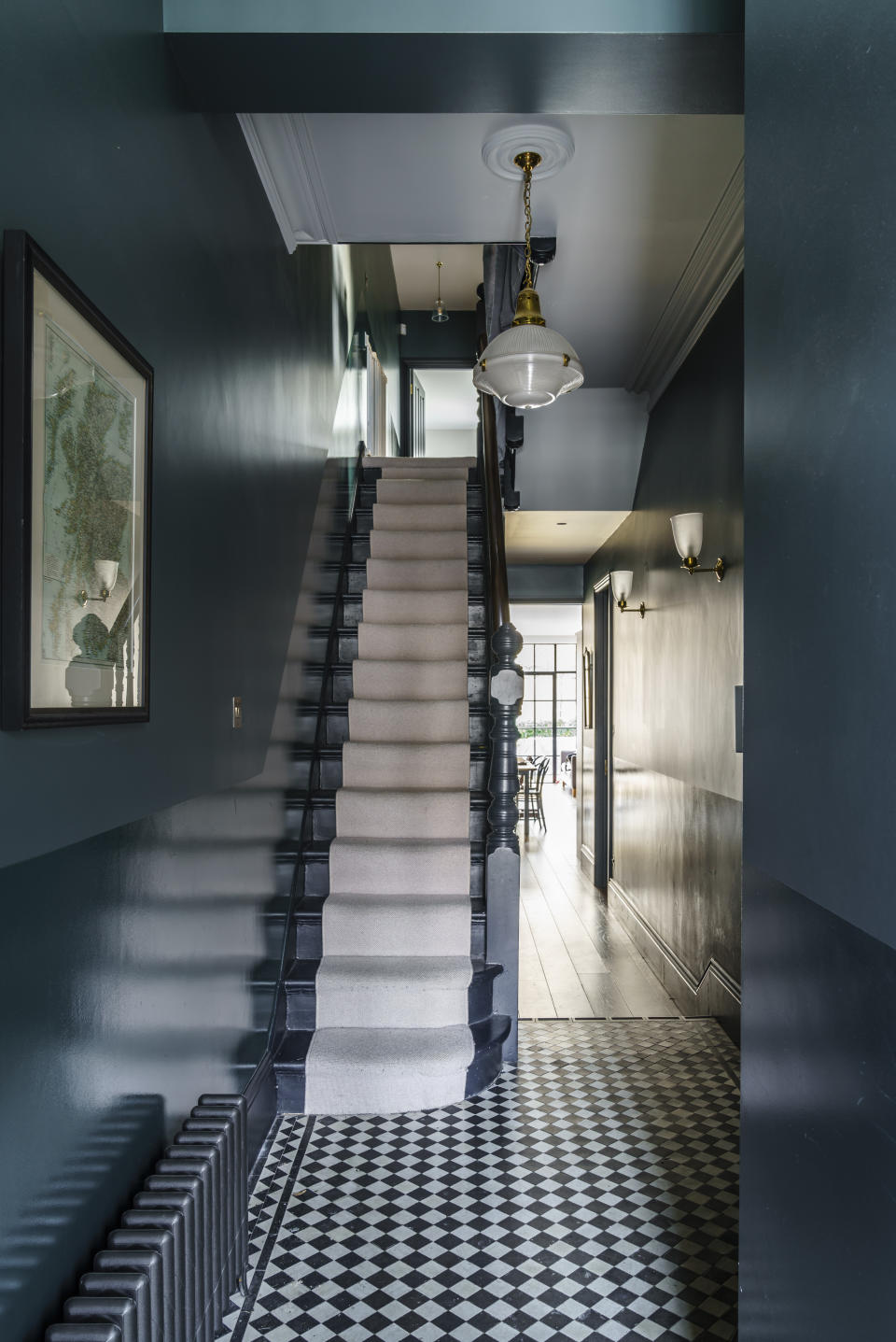
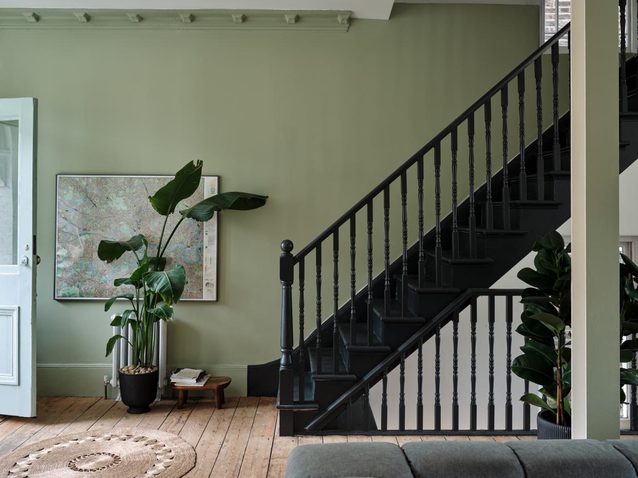
The genetic makeup of your home should also play an important role in choosing your color scheme. Studholme says that taking note of your home’s architecture can be a helpful color guide. For example, urban entryways often lack natural light and would suit a shade like Farrow and Ball Ichyra Blue.
“Perhaps you want to keep the walls light but might add some interest with the use of a stronger colours like Farrow and Ball Tanners Brown or Railings on the spindles of the staircase creating a strong grounding spine through the house,” Studholme suggests. “If you have molding or panelling it is wise to consider using a stronger colour on the bottom and a lighter colour on the walls to open up the space. The finish of paint used in an entryway is also very important - it should be durable to cope with high traffic.”
6. Avoid CHARCOAL GREY - use ashier greys instead
Though a light grey can be a welcomed asset to an earthy palette, Spreckman says to stay away from charcoal grey in a small space as it will “darken the space more.” This color, unlike the dark browns Studholme recommends or the moody hues Liu leans towards, charcoal grey offers all the depth of these favored tones but none of the warmth.
Instead, opt for a lighter wall and mix the ashier grey shades into your soft furnishings with warm wood furniture to take the edge off the coolness of this color for a more inviting space. There are many entryway colors which when too light, too dark or too cool can change the space for the worse. However, letting your entryway’s natural architecture dictate your color scheme can be a helpful place to start. Jean Liu also offers some useful advice, regardless of the shades you pick: “I recommend looking at all paint colors that are being considered throughout the day. The color may look exactly how one envisions it during the morning light but far too different into the later afternoon or evening.”

