These Are The 5 Top Paint Brand's Most Popular Paint Colors
These paint colors are best sellers for a reason.

When it comes to paint colors, the options are truly limitless. Suppose you don't know what to choose or where to begin. In that case, it helps to reference favorites of interior designers, family members with a penchant for decorating, or even neighbors with enviable interiors. Once you start researching, you'll find that there's a lot of overlap. And if you want to avoid a paint color research deep dive? Don't worry. We've researched for you. Find some of the most popular paint colors from five major paint brands.
Benjamin Moore
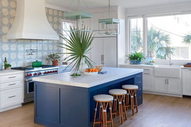
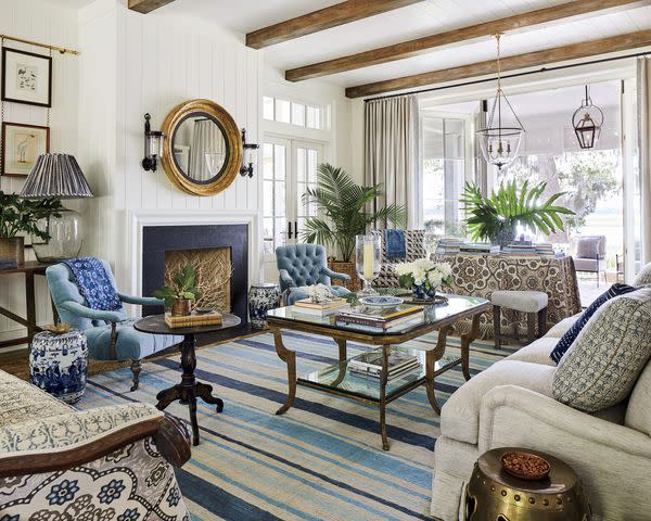
Benjamin Moore Hale Navy (HC-154)
Rich, saturated, and nautical (but not too much so), Hale Navy is a classic that is both a dose of drama and a versatile neutral. This blue expertly balances everything a space can be in one striking color.
Pictured above: Island in Hale Navy (HC-154)
Benjamin Moore Revere Pewter (HC-172)
Perfect for open floor plans because of how well it plays with other colors despite not being white, Revere Pewter is a mix of gray and beige with a defined warmth that creates a polished earthiness. This paint color bridges warm and cool tones effortlessly.
Pictured above: Revere Pewter (HC-172) cabinetry and wall paint.
Benjamin Moore White Dove (OC-17)
Our first (and favorite!) white paint of the bunch, this soft shade perfectly balances warmth with brightness, creating a dynamic classic option. Use White Dove to elevate molding, trim, large spaces, and everywhere else.
Pictured above: Siding in White Dove (OC-17).
Behr
Behr Swiss Coffee (12)
An off-white with hints of ivory, Swiss Coffee warms up whatever space you put it. This paint still allows the rest of the room to pop as this creamy shade complements other warm earth tones.
Pictured above: Trim in Swiss Coffee (12) and exterior in Benjamin Moore Cliffside Gray (HC-180).
Behr Burnished Clay (PPU18-9)
Warm up with this beige and gray combination, featuring slightly cool undertones. Burnished Clay appears differently depending on the time of day or light source, making it extra versatile.
Pictured above: Walls in Burnished Clay (PPU18-9).
Behr Ultra Pure White (1850)
Never has there been a more accurate name for a paint color than Ultra Pure White. It's the whitest white of them all: crisp, clean, and highly reflective.
Pictured above: Walls in Ultra Pure White (1850).
Sherwin-Williams
Sherwin-Williams Aleutian (SW 6241)
Muted but not muddy, Aleutian is a pale blue-gray that instantly calms down a room. Reminiscent of a stormy sky yet creamier, this color feels neutral and natural while still bringing dynamic pigmentation.
Pictured above: Doors in Aleutian (SW 6241).
Sherwin-Williams Pure White (SW 7005)
A rental favorite for a reason, Pure White is what it claims to be: white that's not too warm or too cool—it's just right. This versatile hue is relatively low-risk, making it a good option if you need to pick a paint before getting a chance to test it.
Pictured above: Pure White (SW 7005) ceiling and Light Buff (SW 0050) walls.
Sherwin-Williams Agreeable Gray (SW 7029)
This color is often considered the perfect "greige"—a combination of gray and beige. Free from any significant undertones, Agreeable Gray is another rental favorite for its easy versatility. This paint, complementing most other colors, adds warmth without being distracting.
Pictured above: Agreeable Gray (SW 7029) walls.
Clare Paint
Clare Paint Current Mood
This rich and dynamic paint never stays the same color for long (as the name suggests), which is precisely what makes it so popular. Current Mood brings the drama, shifting from a dark teal-gray during the brightest part of the day to an intense, moody green when the sun goes down.
Pictured above: Cabinets in Current Mood.
Clare Paint Whipped
Clean, cozy, and creamy are just a few words to describe this warm white. Recommended to solve the lack of natural light in north-facing rooms, Whipped brightens without overwhelming.
Pictured above: Whipped on walls and cabinets.
Clare Paint Headspace
A match for serene, natural sea glass, Headspace is soft and airy. Able to pass as a neutral, this hue brings just enough color to add visual interest without oversaturating a space with a blue or green.
Pictured above: Walls in Headspace.
Farrow & Ball
Farrow & Ball Wimborne White (No. 239)
This color is only a whisper away from pure white, achieved by adding a touch of warm yellow to the mix. Magnify Wimborne White's timelessness and sophistication when combined with Farrow & Ball's signature velvety finish.
Pictured above: Walls in Wimborne White (No. 239).
Farrow & Ball Hague Blue (No. 30)
The slight green undertone of this rich shade sets it apart from others, elevating its drama into full-on glamour. Paint Hague Blue in rooms without much natural light, smaller spaces, and outdoors.
Pictured above: Door in Hague Blue (No. 30).
Frequently Asked Questions
What interior paint color sells a house the fastest?
Neutral paint colors help to sell a house quickly because it allows potential buyers to imagine their personality within the surroundings. White, beige, taupe, grays, and blends of these colors are highly marketable paint colors.
What is the most popular wall color for 2023?
One of the most popular wall color options is Behr's 2023 Color of the Year, Blank Canvas (DC-003). This paint color creates a welcoming atmosphere in any room, embraces a calming serenity and coziness that people want in their homes, and projects versatility when paired with complementing colors.
For more Southern Living news, make sure to sign up for our newsletter!
Read the original article on Southern Living.

