4 Secrets to Decorating with Moody Paint Colors, According to Joanna Gaines
- Oops!Something went wrong.Please try again later.
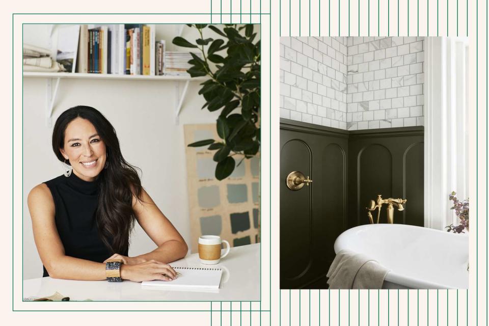
In celebration of the new paint color collection used in <em>Fixer Upper: The Castle</em>, we spoke with Joanna Gaines about using darker colors in any space.
Left: Magnolia; Right: Magnolia Home by Joanna Gaines / KILZ; Design: Better Homes & Gardens
Fans of Fixer Upper, Chip and Joanna Gaines, and all things Magnolia are probably already fans of Fixer Upper: The Castle, too: This new series from Magnolia Network follows the restoration of an iconic castle in Waco, Texas, with all the design inspiration and construction drama we’ve come to know and love from house-flipping shows. But while Chip and Joanna Gaines have made-over many an unusual structure (never forget the barndominium), the Castle is a unique building with its own legacy and challenges.
Pair that with the focus on preservation the Gaineses bring to the project, and you’ve got a truly one-of-a-kind set of problems to solve—some of which are very well solved by the launch of a new paint color line, inspired by and used in the restoration of the Castle. Appropriately called the Castle Collection and curated by Joanna Gaines for the Magnolia Home line with KILZ, this line of 10 paint colors was carefully selected to both enhance the character and history of the Castle and enable anyone to tell a story within their own home.
“Once we figured out, ‘OK, this is what each space is going to become,’ my next move was, ‘What story am I going to tell in each room?’” Joanna says of the process of developing the Castle Collection. “With that, paint is always the first thing that I have to decide, because that is what really sets the palette. It sets the mood for each space, and I wanted to be really intentional with the color.”
While few homes today are like the Castle in design or in age, that doesn’t mean you can’t learn a few lessons from Joanna’s approach to color in the space—or even try the same colors at home.
“You can take these colors into any style of home, however old the home is, and really tell your own unique story with these fun colors,” Joanna says.
Magnolia Home by Joanna Gaines / KILZ
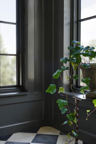
The colors in the Castle Collection range from a classic cream (Castle Cream) to a French gray (Drawing Room) to a rich charcoal (Conservatory, above). Many are moodier tones than what you might expect from Joanna Gaines, whose Fixer Upper design projects were famous for their bright white spaces, but this shift toward darker colors is reflective of a larger design shift away from white and toward bolder hues. (Just look to this year’s predictions for Color of the Year 2023 for more proof that rich color is here to stay.) It’s also a design choice that perfectly fits the Castle.
As a stone structure with smaller, walled-off rooms (no open-concept floorplans here), the Castle is a darker building all on its own. “Even if the walls are all painted white, something about the structure feels heavy,” Joanna says. “In some rooms where I really wanted to play up that story and that history and that richness and that intention, I went darker, and I didn’t look back.”
Still, you don’t need to live in a castle (or anything like it) to try similar color choices at home.
“A lot of the time, I’m like, ‘Did I go too dark?’” Joanna says. “But I just feel like I’m at a stage in life where I’m willing to take these risks, and it’s more fun that way. You’ll see that even beyond the Castle, in some of the spaces that we’re designing just on the side, [in] the projects that we’re doing, I am going darker and moodier because I just feel like those more storied and saturated colors—that’s just what’s speaking to me right now. I’m having fun with it.”
If you want to do the same, read on for tips from Joanna on incorporating rich colors like those in the Castle Collection into your space.
:
Joanna Gaines’s Tips for Using Darker, Moodier Colors
Start Small
“If you want to experiment but you’re too scared to do it in a larger space just because of the investment—and also if you hate the color, it’s just harder to switch when it’s a whole room—start in smaller spaces,” Joanna says.
In the Farm (the Gaines family home), she started exploring using dark colors in a guest room, she says, and moved on to larger and more high-profile spaces, eventually even painting her kitchen cabinets a darker color.
Magnolia Home by Joanna Gaines / KILZ
Let the Colors Work Together on Their Own
As you incorporate bolder colors into your home, don’t worry too much about tying everything together, Joanna says.
“For me right now, what I’m loving about home and even when we’re designing these spaces, is letting each room tell its own unique story,” she says. “When you do that, and you do it with that intention, somehow it still ties in.”
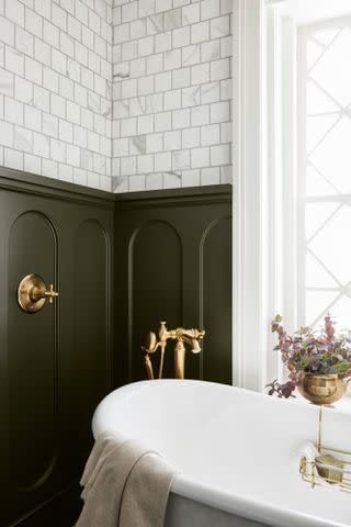
Case in point: In her own application of colors from the Castle Collection in the Castle itself, Joanna let light and dark spaces balance each other out.
“I used to care so much about making sure that this ties here, and I think that’s important,” she says. But that doesn’t necessarily mean you need to make that your focus, she says: “In the castle, in the guest bathroom, I painted it Step Stool Green [pictured above], but then right across the hall in what I was calling the boys room, I painted it the color Estate, which is like a kind of a different shade of green, and somehow they all tie together.”
The key to keeping everything cohesive, she says, is focusing on the story you want to tell with your home.
“I do feel like that as long as you’re the storyteller and you’re doing it in your own unique way, somehow that magically works,” she says.
:
Maintain Some Visual Transitions
You still can’t completely abandon all design transitions, though. If you’re looking to update a space that was previously all white, you’ll be working with a white ceiling, and if you jump straight from that white ceiling to a rich, bold color on the walls, that can be a jarring shift, no matter how much you love the darker paint color.
Fortunately, Joanna has a simple solution: “For me, that perfect transition is with trim,” she says.
Installing crown molding at the top of your walls can be a smooth design transition that makes a statement all on its own, too. (Trim of any sort will also add visual interest to your space.)
“Sometimes I feel like if people go dark, but then it goes from dark to a white ceiling, you need that transition, and that’s where I say molding will go a long way,” Joanna says.
Use Decorative Details to Create Balance
Finally, just because you’re using rich, traditional colors (colors inspired by a castle, no less) doesn’t mean your space has to look overly formal.
“What I love is taking these traditional colors and toning the feeling down a little bit with what I accent it with, whether it be my rug, my pillows, my throw, even the art on the wall,” Joanna says.
That’s what design is: It’s all about balance.
While she uses paint colors to set the tone, she says, she’ll use accents to balance everything out. In a space with moody charcoal walls, for example, she’ll bring in playful furnishings to keep the space from feeling formal and stuffy. “I don’t ever want a room to feel like it’s not livable,” she says.
With that in mind, pick colors that you can temper with your favorite decor and other details.
“All of these colors really can play in that space, so these are rooms that you are wanting to live in,” Joanna says. “This is your office, this is your living area, this could be your kitchen or your formal dining room, but then again allowing that lightness to come in with your light fixtures, with your florals, with your accents, it’s all about balance. That’s what design is: It’s all about balance. To me color is always that first step into what story you’re wanting to tell, and from there you build off of it.”
The paint colors in the Castle Collection will be featured in the episode of Fixer Upper: The Castle airing October 28.
:
false

