4 Color Palettes You Need in 2024, According to Sherwin-Williams
Sherwin-Williams
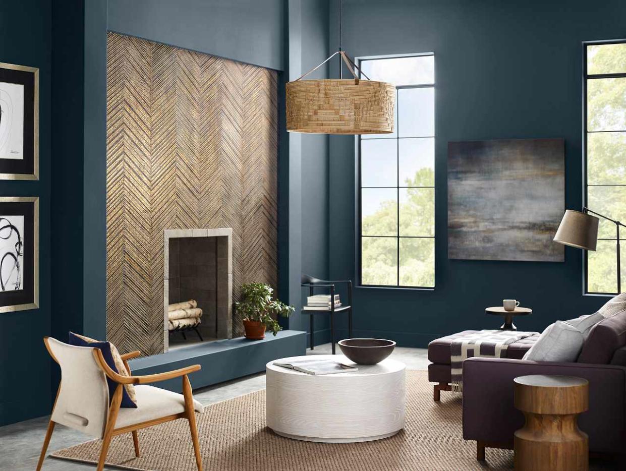
Today, Sherwin-Williams is introducing Colormix Forecast 2024, Anthology: Volume One which is a new biennial approach to their annual color trend report. With a focus on what will reign supreme next year, this collection explores 48 hand-selected hues within four key color families: Palette No. 1 (blues and greens), Palette No. 2 (reds and purples), Palette No. 3 (deeps and darks), and Palette No. 4 (delicate tints).
"With Anthology, we’ve created a forecast that focuses on the evolution and directional shifts of our key color families, which we will revisit every other year moving forward," explains Sherwin-Williams Director of Color Marketing Sue Wadden. "My hope for Anthology is to inspire color confidence among our homeowners, designers, and professionals alike."
Below, Wadden shares what to keep top of mind when choosing paint colors for the home.
Meet the Expert
Sue Wadden is the Director of Color Marketing at Sherwin-Williams.
The Color Palettes
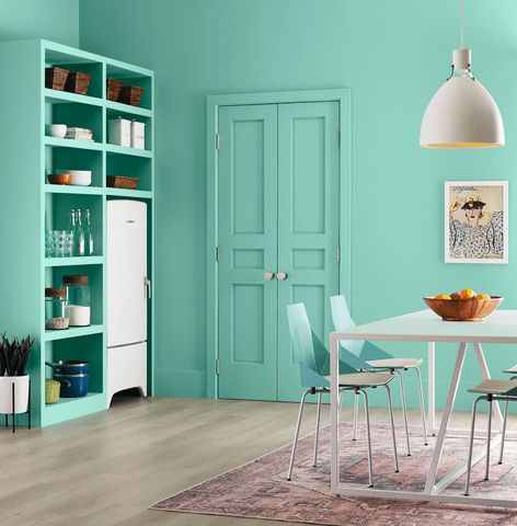
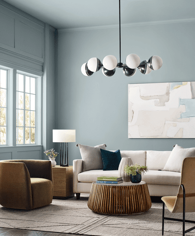
Wadden shares insights regarding each of the four color palettes noted above. Palette No. 1, composed of greens and blues, reflects two trending hues of the moment.
"Green was an emblematic color in the past decade, and now we’re seeing blue emerging as the new top color," Wadden tells The Spruce. These colors are particularly ideal for what Wadden refers to as "respite spaces," within the home, which include bedrooms, laundry rooms, and bathrooms.
Sherwin-Williams
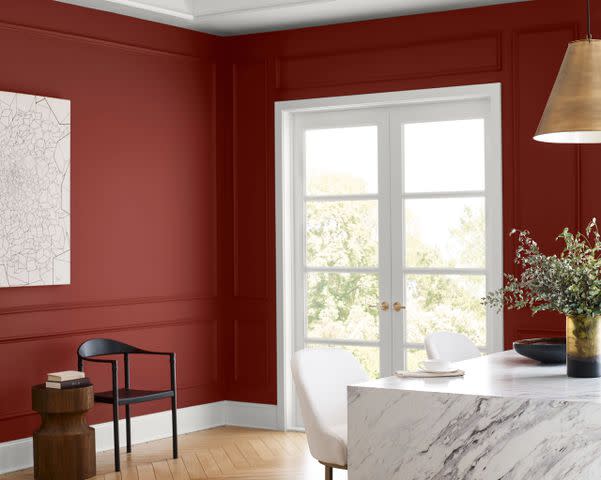
Palette No. 2, composed of reds and purples, is a bit more forward-looking.
As Wadden notes, "red has not been a popular color in the US since the '90s, but we’re seeing people warming up to the idea of using it in the home." Sherwin-Williams named Redend Point (SW 9081), a blush beige hue, as its color of the year for 2023, and since then, colors within this family have surged in popularity—for example, as Wadden points out, pinks have been having a major moment as of late due to the Barbie craze.
"We’re loving and excited to see how these really warm tones that take on this beige cast of cosmetic hues will continue to evolve," she says. Not sure where to incorporate Palette No. 2 in your own space? Wadden suggests using reds in gathering spaces including dining rooms and living rooms since they can set an energetic tone.
Sherwin-Williams
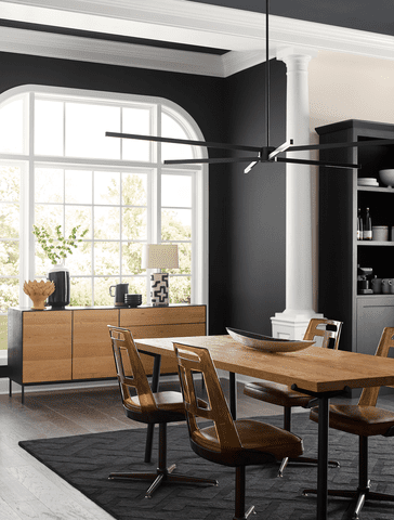
Palette No. 3, which is composed of deeps and darks, reflects the current environmental state we're living in.
"We’ve seen in the past when times are uncertain, colors tend to go dark," Wadden adds. Wadden advises consumers to embrace darker paint colors in their homes instead of being intimidated by them.
"One misconception I often see is that dark colors are overwhelming and make a room feel small and closed in, which is not always true," she notes. "For those who are hesitant to try a dark color in their homes, these hues, when done right, can contrarily make a space feel very cozy and intimate."
There are also stylish ways to ease into utilizing darker hues without committing to covering all four walls of a room. Wadden recommends painting an accent wall or cabinets with darker shades to ease into using them and complementing them with other lighter shades to balance everything out.
"This will create a nice counterbalance between delicate tints and bolder colors," Wadden says.
Personally, Wadden likes the idea of using the deep colors from Palette No. 3 in TV rooms because they can create an immersive setting close to an actual theater.
Sherwin-Williams
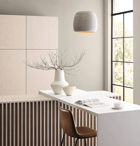
Last but not least, Palette No. 4 is composed of delicate tints. This palette represents the direction in which Sherwin-Williams sees neutrals going. Similar to Palette No. 3, it also reflects today's uncertain times in its own way, which is why it was important for Sherwin-Williams to create a palette that brought calmness into the home.
Wadden recommends this palette for the kitchen since the delicate hues can create clean and crisp environments homeowners look for in a kitchen space.
Sherwin-Williams
While Wadden is excited about each of the four palettes, she particularly appreciates Palette No. 3 and Palette No. 4. "They really highlight the duality of darks and lights," she says. "We’ve been focused on natural and earthy tones like greens for a while, so it’s exciting to see the high contrast with darks and lights. It’s very fresh and new!"
Wadden encourages homeowners who are struggling to land on the perfect paint color for a given space to "find inspiration by looking around and seeing what you love," whether that entails exploring a website, a magazine, or a color forecast. "There’s usually some point of reference you’re looking to match, and that’s a great place to start," she says. "Inspiration helps narrow down the focus."
Wadden adds that oftentimes, people are hesitant to make use of color in their spaces, and that's why neutrals can be so popular. But the process doesn't have to be as daunting as people make it out to be. Wadden says that starting a mall and painting a ceiling or accent wall is a perfect way to add pops of color around your home without having to commit to painting an entire room—especially if overpowering a common space is your concern.
Sherwin-Williams
At Sherwin-Williams stores, customers can easily visit the ColorSnap® Studio and select paint chips to examine in closer detail. Wadden advises that taking your favorite chips home and placing them on the wall in the room of your choice is a great way to spend some time getting used to the color before committing. You can even take it a step further by picking up a Color to Go® sample and painting a test area on the wall.
Consulting the Colormix® Forecast 2024, Anthology: Volume One, will help streamline decision-making all on its own. "Typically, homeowners start out with a color in mind that they’d like to explore," Wadden says. "In using Anthology, they can head straight to that color family and be met with a narrowed palette of options and the differences between each hue. There will always be limitless combinations that can be created with the palettes, but we hope this guide will inspire their decisions with more clarity and ease."
You can learn more about Sherwin-Williams 2024 Colormix® Forecast 2024 at swcolorforecast.com.
Read Next: These 10 Cool Paint Colors From Sherwin-Williams Freshen Up a Room

