These 3 New Stores Are Offering Us So Much Design Inspo
Do you ever walk into a store and think, I could live here? We most definitely have, so when a few of our favorite interior designers shared new retail spaces they’d worked on, we jumped at the chance to find out how their style translated to home. Read on to find out how Nicholas Obeid, Adi Goodrich, and Tamsin Johnson created three distinct but equally beautiful spaces—and how you can get each look for yourself.
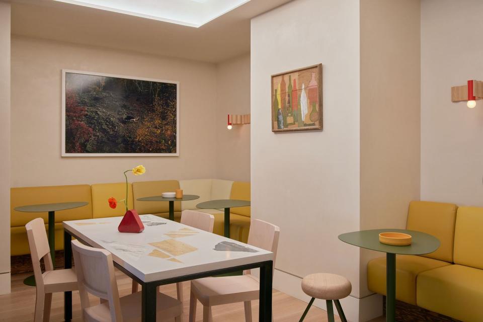
The Client: Isle of Us
The Designer: Nicholas Obeid
The Look: A Brentwood Kitchen by Way of the Bauhaus
When designer Nicholas Obeid was tasked with creating a “comfortable yet elevated” space for restaurateur Lisle Richards, he summoned the spirit of Bauhaus. Mixing bold primary hues with warm, tactile surfaces and custom furnishings—Obeid counts the dining tables, made with repurposed scraps of marble in a nod to the work of Jacques Avoinet, as a personal favorite—Isle of Us, on Manhattan’s Upper East Side, feels more like an artist’s home than a marketplace and café. “The intention was to step into the brand upon entry—[to create] a space that dynamically balances softness with punch,” says Obeid. Here’s how he did it.
Use color to keep things consistent when mixing materials. “The biggest challenge in designing this café was being very considerate about where each material was applied—and to what extent—in an effort to maintain a sense of calm. The space features four finishes of Ettore Sottsass–inspired stained Douglas fir plywood, in brown and varying shades of green, but after several rounds of sampling, the final hues perfectly complement the green-tiled counter.”
Play with scale to keep things contemporary. “One of the myriad material surfaces is handmade Moroccan tile, but we applied it in a large-scale color-block pattern, taking something traditional and finding an application for it that felt modern.”
Don’t be afraid of change. “My suggestion for bronze countertops didn’t go over well initially, but the orbital brush and irregular finish will allow it to wear beautifully over time.”
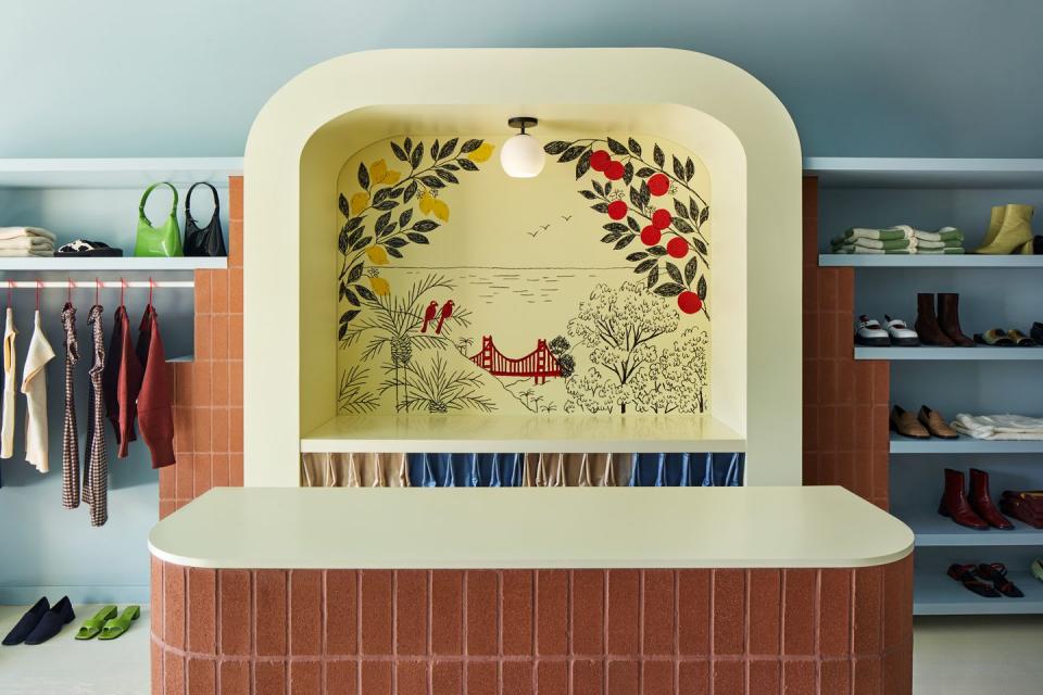
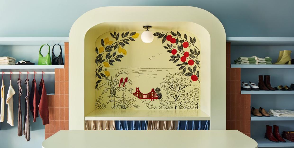
The Client: Lisa Says Gah
The Designer: Adi Goodrich for Sing-Sing Studio
The Look: The Virgin Suicides Meets Cher Horowitz’s Closet
The first brick-and-mortar space for Lisa Says Gah (LSG) recently opened in an Italianate-inspired storefront in Los Angeles. Overseen by artist and designer Adi Goodrich, the interior is “the intersection of joy and comfort,” a sentiment that will surely ring true for fans of the brand. “I wanted to create a physical space that echoed the energy I’ve felt from LSG’s online presence: bright, energetic, and inspired,” says Goodrich, who took the work of Gio Ponti—his use of color, illustration, and pattern—as her starting point. Here’s how she got the look.
Never paint a room a true white if you’re going for, well, white. “We used the softest lemon yellow as our ‘white’ in the space. It lightened the store without washing things out and provides a soft, warm glow.”
Take baby steps towards bold strokes. “If you’re afraid of pattern, try color blocking. We created panels of blue and cream drapery in the back of the store to add a bit of visual interest without using a true printed pattern. When you walk into the store, a wall of bold and welcoming stripes beckons you to the back of the space.”
Don’t forget about the ceiling. “We painted the ceilings to match the walls—a dusty, bluish grey to offset the lemon yellow of the floor. My biggest pet peeve is leaving a ceiling as is, because there’s so much opportunity running just above the heads of everyone who enters the room.”
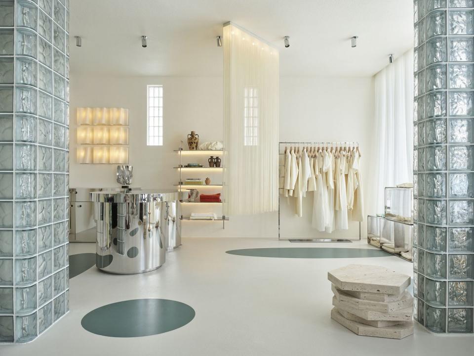
The Client: SIR. the Label
The Designer: Tamsin Johnson
The Look: Laura Dern’s House on Big Little Lies, with an Echo Park Twist
For SIR. the Label’s Sydney flagship, designer Tamsin Johnson wanted to capture an “L.A. feeling”—coastal cool with a bit of grit. The resulting space is dynamic and “architectural,” with a breezy maritime twist. Much of the furniture is vintage and is used thoughtfully to contrast or complement different finishes throughout the space, such as the polished concrete floor with Corian inlays. “Only when I can’t find the right thing will I design it, have it made, or go looking,” says Johnson. Here, she shares her secrets for hitting the right balance between soft and sculptural.
Comfort is key. “Commercial spaces can have more edge and make a stronger statement if needed, but both commercial and residential spaces should feel welcoming, somewhere you can hang around. The goal here was something a bit more striking, dynamic, and architectural.”
Warm and cool are more than just color tones. “I think it is color and shape, not just palette working here. I faced cold aggregate concrete floors against muted white carpet walls, thus warming them up. Vintage timber details add a sort of heartbeat and seem to have a peculiar harmony with the smoky green-gray Venetian glass bricks. Silvery stainless steel elements add necessary severity and ‘cut.’ Terra-cotta carpets further warm up the space and add to a strange soft-meets-hard sensation that’s seen again in shapes like the truncated architectural curves opposing more nostalgic and soft complete arches.”
Take things out of context. “If individual pieces are strong and are brought out of the original context for which they were designed, they can be ‘activated’ somewhat and actually have a novel posture—they shrug off their past.”
You Might Also Like

