It’s Official: These Are the Best Blue Paint Colors
"Hearst Magazines and Yahoo may earn commission or revenue on some items through these links."
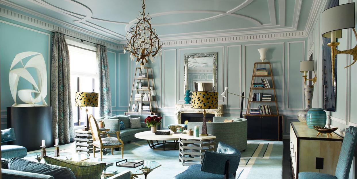
Trends may come and go, but blue is here to stay. From Picasso's Blue Period to azure-coated cities like Chefchaouen, Morocco and Greece's Santorini, the cool-tinged shade has been an integral tone for centuries. So, why not add the hue to your home? Despite euphemisms like "feeling blue," interior designers treat a fresh coat of blue paint as a champion rather than a mood-dampener—and for good reason. The soothing power of blue, linked psychologically to tranquility and peace, aligns perfectly with the sense of refuge we seek in our homes.
Thanks to its variety of nuanced shades, blue is capable of being both a statement and a whisper; a hero and a sidekick, if you will. While a light cornflower can bring a traditional touch to your kitchen cabinets, an inky blue can add a jolt of drama to your powder room.
From Picasso’s Blue Period to euphemisms like “feeling blue,” the cool-tinged tone has a reputation for being a mood-buster. But when painting your home, it’s a go-to color for interior designers—and for good reason. For starters, the color blue has been psychologically linked to calmness and serenity, which is exactly what most people want to feel in their homes. And, thanks to its variety of nuanced shades, blue boasts a chameleon-like quality. For example, lighter tones might turn your bathroom into an oasis, while a bold teal or inky navy can add a touch of drama to your bedroom. It’s that enduring versatility that makes blue a consistent crowd-pleaser.
Ready to dive into an ocean of blues? Look no further. We talked to a handful of designers about their favorite shades. Though their picks run the gamut from muted tones to deeper hues, one thing’s for sure: This roundup proves there’s nothing sad about the color blue.
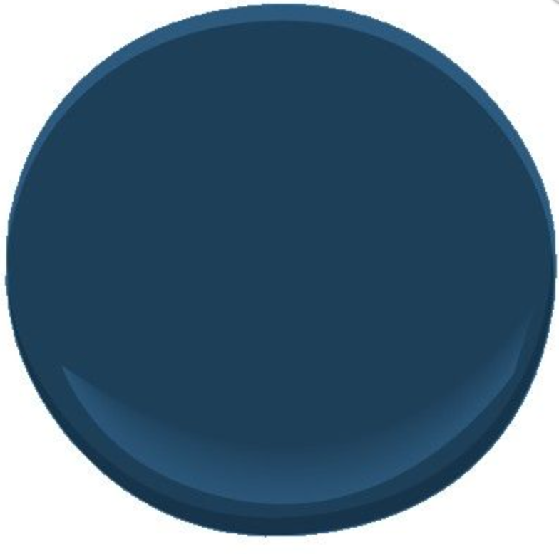
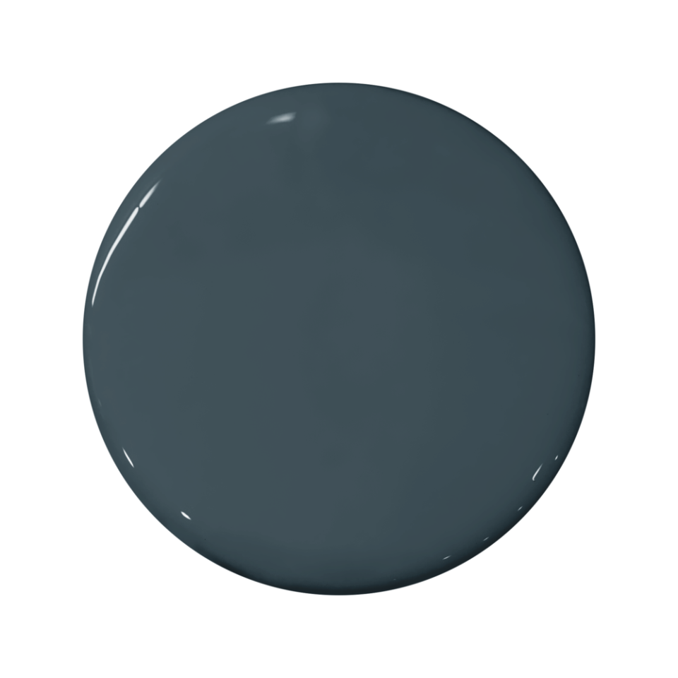
Benjamin Moore Marine Blue 2059-10
"Its remarkable saturation strikes the perfect balance between vibrancy and subtlety, making it an ideal choice for those seeking a touch of drama without overwhelming the space." —Rayman Boozer, Apartment48
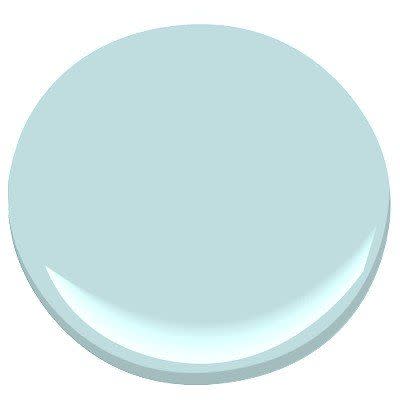
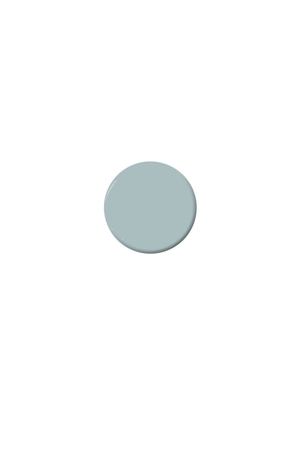
Benjamin Moore Bird's Egg 2051-60
"[Benjamin Moore's Birds Egg effortlessly captures the iconic elegance of a Tiffany box. This hue lends a subtle sophistication, elevating any room with its refined charm." —Rayman Boozer
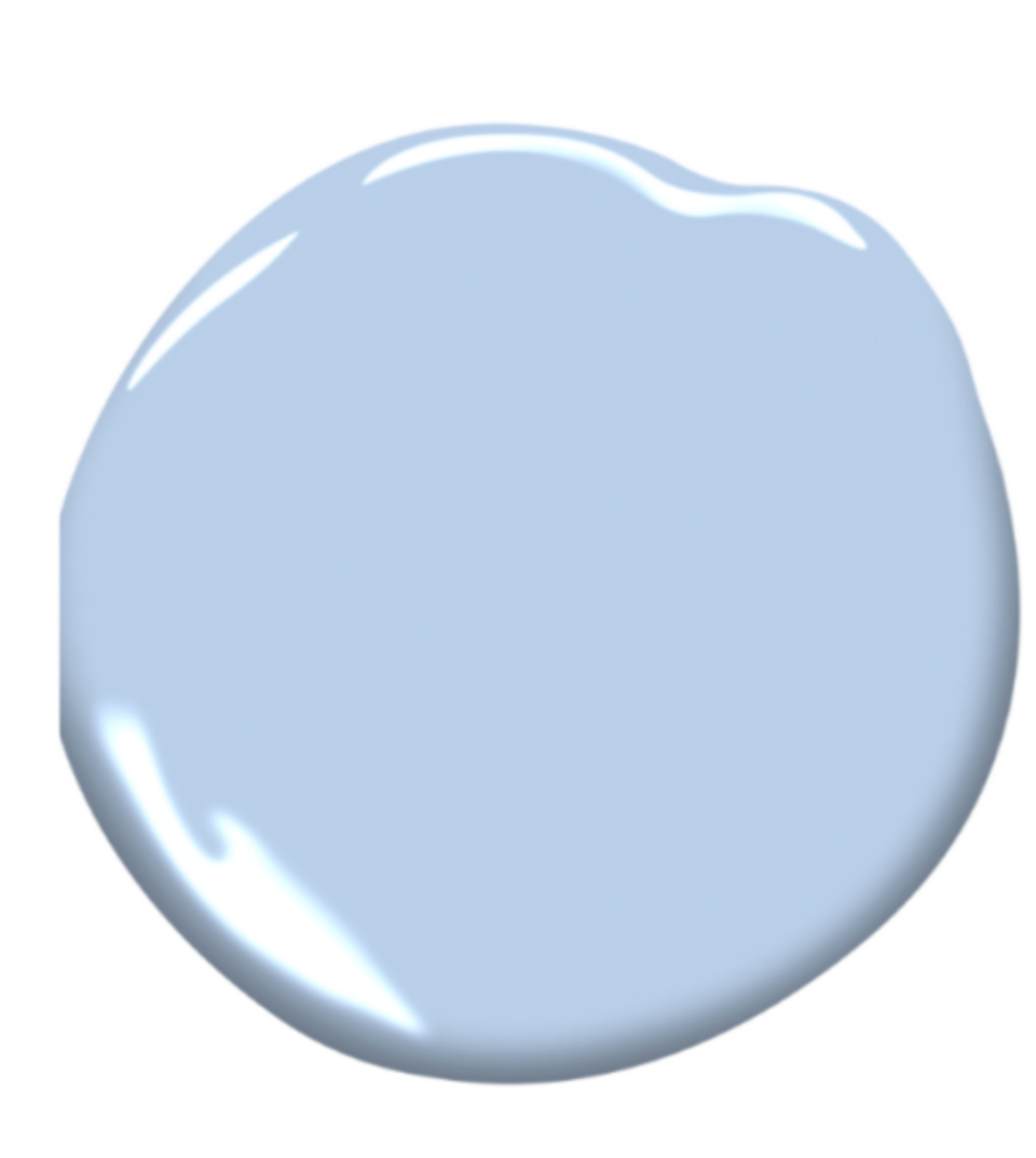
Benjamin Moore Windmill Wings 2067-60
"If I had to choose a top favorite, it would have to be Windmill Wings [by Benjamin Moore]. With delicate hints of lavender woven into its ethereal blue embrace, this shade has an almost magical quality that exudes a soothing aura." —Rayman Boozer

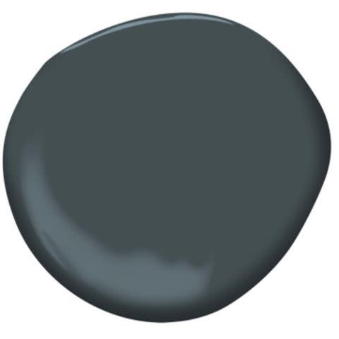
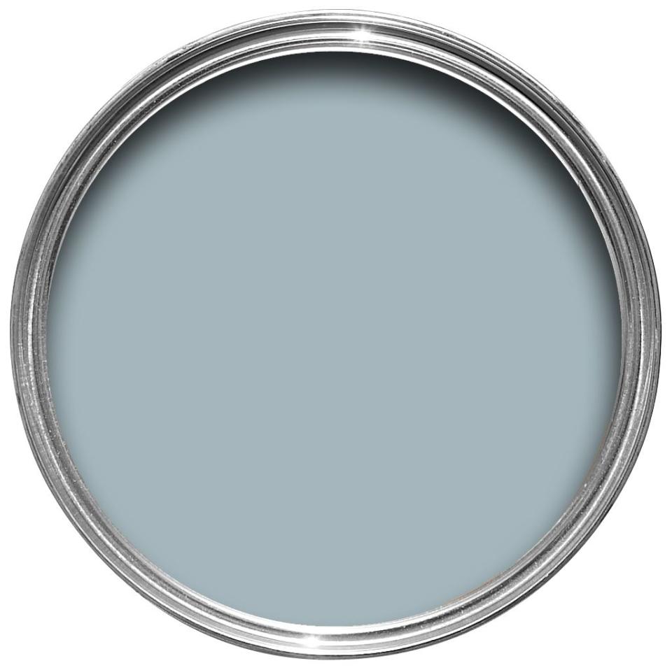
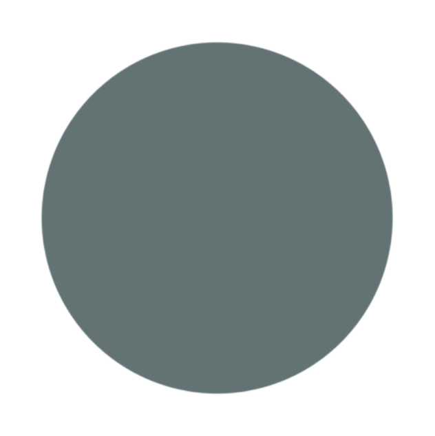
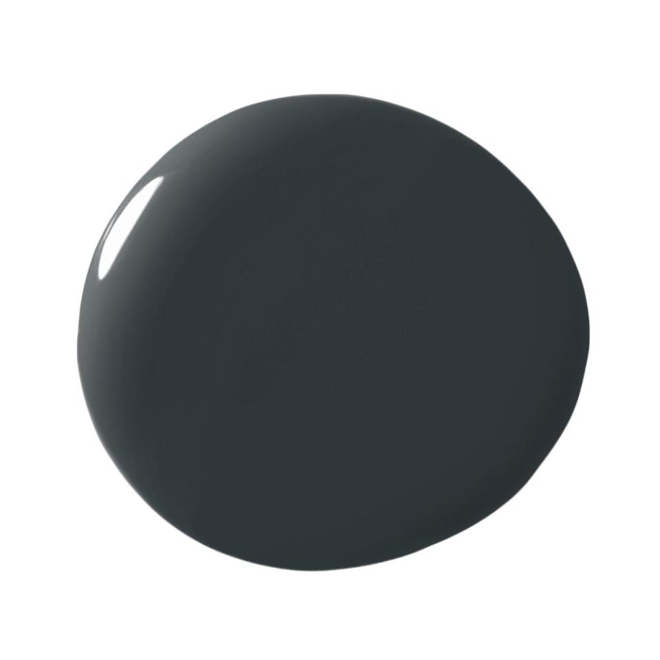
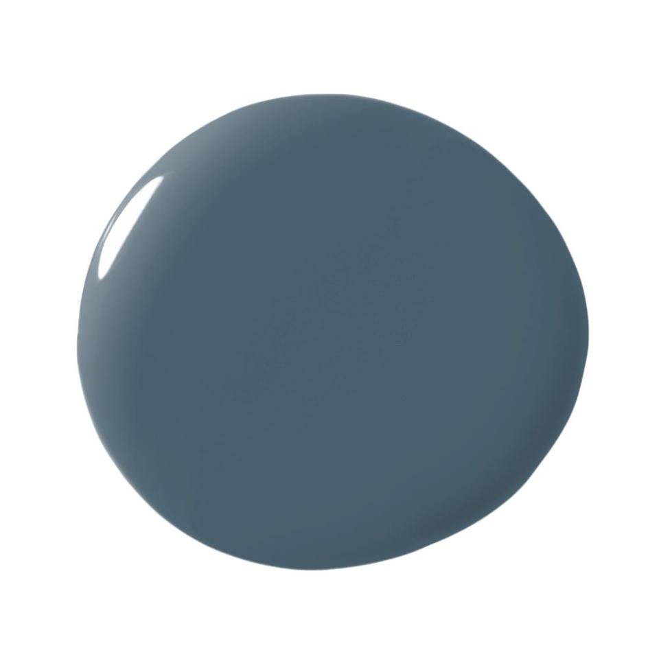
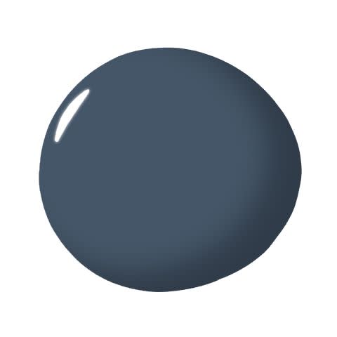
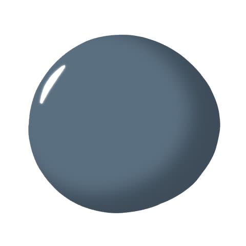
Benjamin Moore Lead Gray 2131-30
"On one of our projects located in a 1910 historical building, we used Lead Gray. While the name may be deceiving, it's a wonderful smoky blue that transformed the beautiful lower cabinets!" —Barry Goralnick, Barry Goralnick Architecture & Design
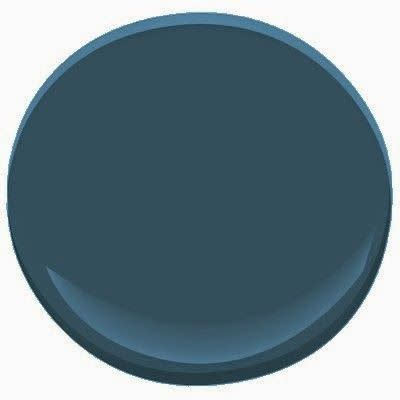
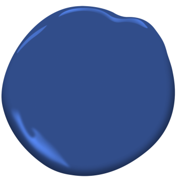
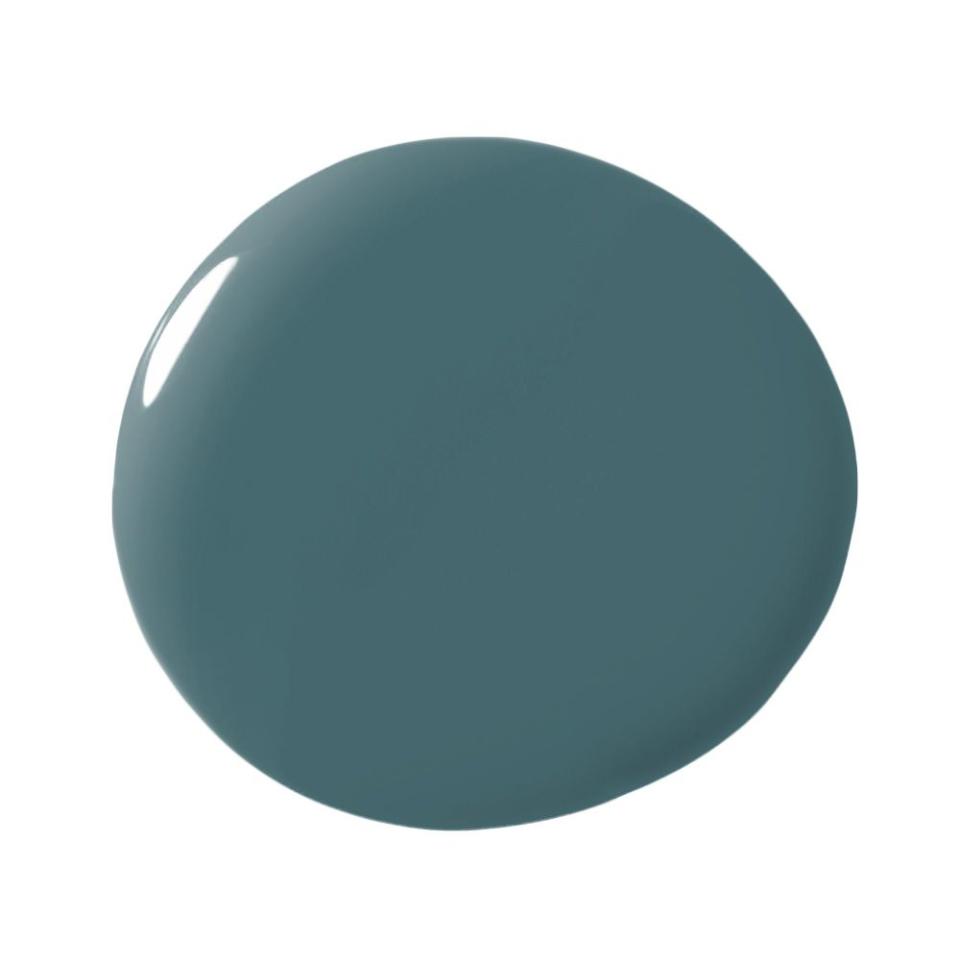
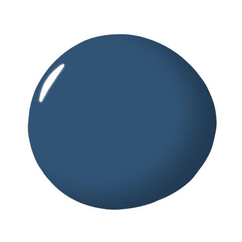
Benjamin Moore Blue Danube 2062-30
"Color is an incredibly powerful tool to stimulate emotion. I use paint colors that are refreshing, calming, and flattering, which is why I love to use Blue Danube by Benjamin Moore. The color has a touch of teal, making it very versatile. The classically vibrant color radiates in the light and hits a moodier tone in darker spaces." — Courtney McLeod, Right Meets Left Interior Design
Portola Paints Lost Highway
"I am a big fan of Portola Paint’s Lost Highway. It is so deep and fabulous with a skosh of teal. It looks killer with yellow, camel, red, you name it!" —Amy Sklar

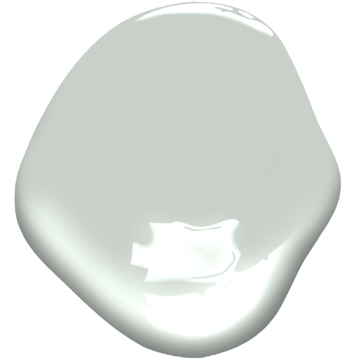
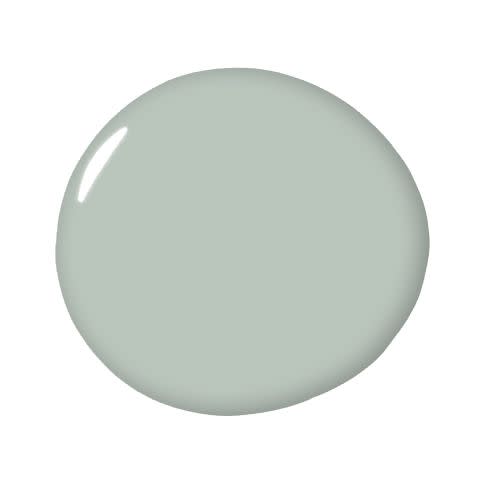
Farrow & Ball Parma Grey No. 27
“I’m obsessed with Farrow & Ball’s Parma Grey. It is a grown-up and sophisticated take on light blue that doesn’t scream ‘baby shower.’ I love this color from floor to ceiling, including trim for a classic and refined look.” — Alessandra Wood, Modsy
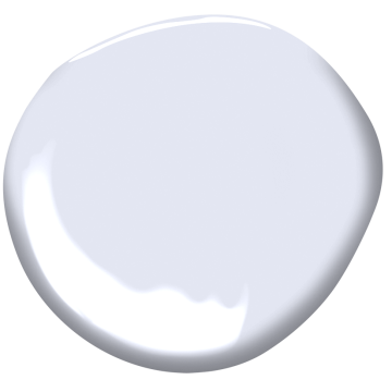
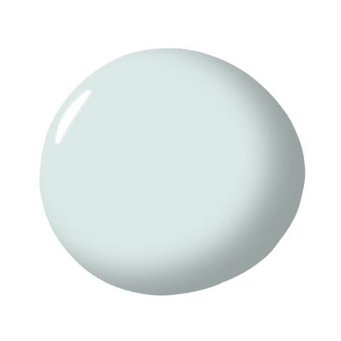
Benjamin Moore White Heaven 2068-70
“The color blue, besides being America’s favorite color for decades, is the global winner by far as well. A primary color, blue is relaxing and connotes harmony, calm, and infinity. A Drake/Anderson favorite shade of blue is an ethereal wisteria, with a purple-ish cast. Our go-to for this delicious color is Benjamin Moore’s White Heaven 2068-70, the perfect celestial hue!”— Jamie Drake, Drake/Anderson
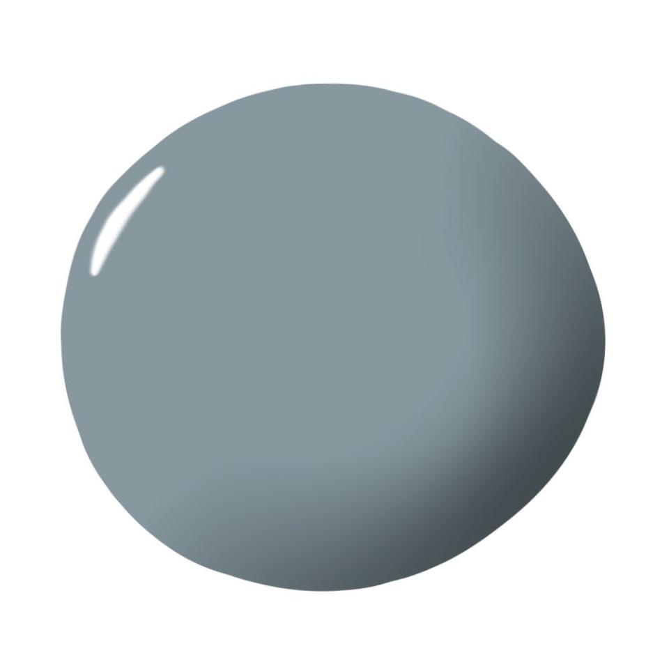
Sherwin-Williams Still Water SW 6223
“Funny enough, long before I was a designer I wasn’t a fan of blue. But now, it's a color that constantly makes me smile. Every time I use a tint or hue of it in a project, it motivates me to continue to play with the color. I once used Still Water by Sherwin-Williams in a client’s bedroom; it was so perfect for the vibe I was trying to create that I vowed to never use it. It was too special to be shared anywhere else.” — Beth Diana Smith
Benjamin Moore Woodlawn Blue HC-147
“We love using a sky blue on the ceiling to bring the outdoors in and give the space a sense of endlessness. We painted the shiplap ceiling in a children’s library Benjamin Moore’s Woodlawn Blue, and it was a great finishing touch.” — Marguerite Rodgers
Clare Good Jeans
“When you want to add some color to a bedroom, blue is always my go-to! Good Jeans from Clare has enough depth in the color and richness, while not being too dark or overwhelming. Just like a good pair of jeans!” — Rozit Arditi
Sherwin-Williams Sea Salt SW 6204
“I love this blue; sometimes it's blue-blue, and other times it’s blue-green. Of all the paints I have ever used (and there have been a lot), this is the one that changes the most based on time of day, weather outside, and natural light. One of my favorite things about paint colors like Sea Salt is simply enjoying how much they evolve.” — Isabel Ladd
Farrow & Ball’s Inchyra Blue No. 289
“Blue always seems to be crowd-pleaser, and Farrow & Ball’s Inchyra Blue might be my latest crush. A gorgeous earthy blue that you dream about.” — Kristen Peña
"As for the best blue paint, our current favorite is Inchyra Blue by Farrow & Ball. There’s no doubt this is blue, but the depth and grey undertones give the color a more modern twist rather than a straight up navy.” —Jean Liu
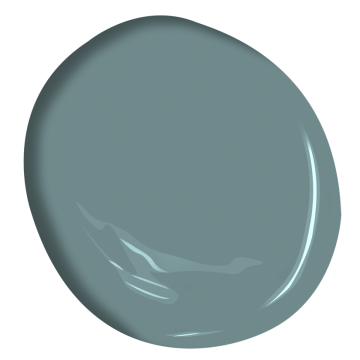
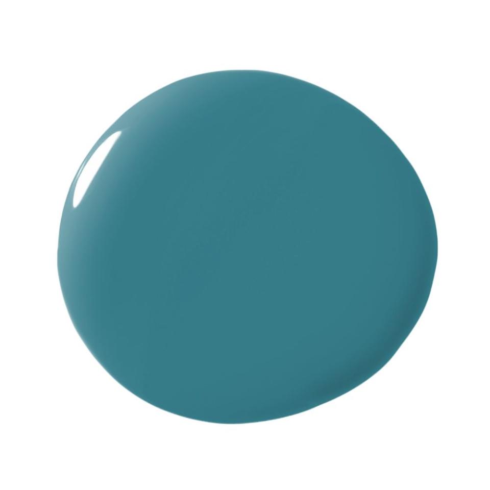
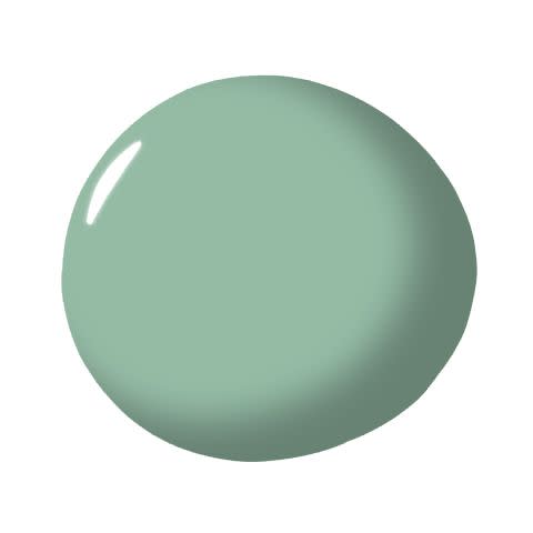
Benjamin Moore Aegean Teal 2136-40
“I really enjoy using blue hues with hints of green in them. As a California beach girl and lover of oceanic hues, I appreciate the visually calming impact they can have in a space. My go-to paint for a soothing and spalike effect that delights the senses is Benjamin Moore’s Aegean Teal.” — Breegan Jane
Sherwin-Williams Amalfi SW 6783
“Amalfi is a bright blue that is perfectly named for the Mediterranean coast. It’s a burst of ‘water color’ that is both uplifting and calming. We like to pair more dramatic colors like this with neutrals to make it more balanced. It’s a great way to add bold color without going overboard.” — Beth Dotolo and Carolina Gentry, Pulp Design Studios
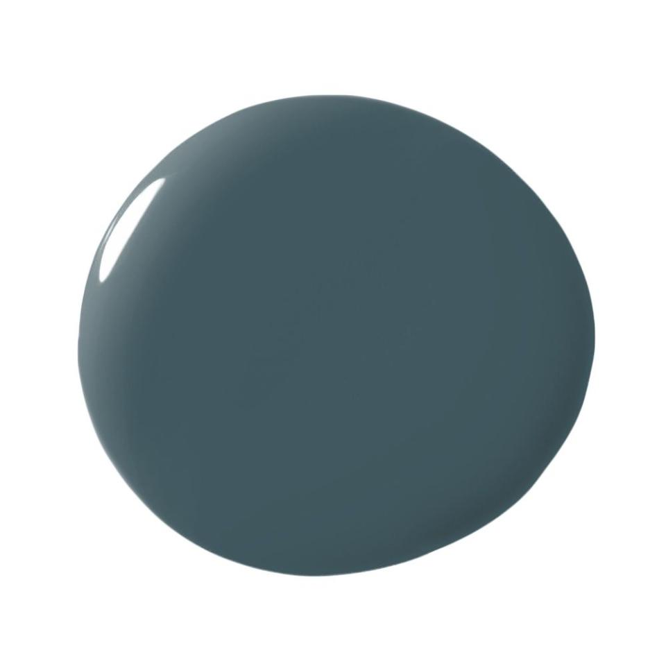
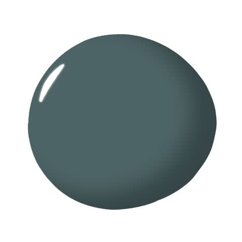
Benjamin Moore Narragansett Green HC-157
“Don’t be fooled by its name; Narragansett Green is a hue of blue that we’ve been using as a statement color. It’s both moody and sophisticated with a deep, nautical flair.” — Chanae Richards

Behr Atlantic Blue
"I love Atlantic so much that I've used it in my own home. It's literally everywhere! In the living room, on an accent wall in the dining room and on the deck...yes, the deck is stained in the same color. And our staircase is too!" —Chanae Richards

Benjamin Moore Symphony Blue 2060-10
“My bedroom doesn’t receive a lot of natural light, so I needed to find a richly saturated blue that wouldn’t look dull. Benjamin Moore's Symphony Blue hits all the right notes, no pun intended. It’s a gorgeous marine blue that has a real sense of depth to it. In a way, the room felt more expansive after I painted it; like being at the bottom of the sea.” — Tara McCauley
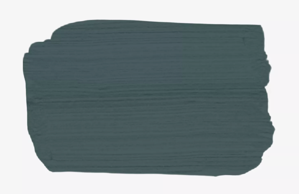
Farrow & Ball Railings No. 31
“My favorite blue paint is Farrow & Ball's Railings because it’s somewhat masculine with a soft off-black hue and blue undertones. This rich color subtly adds a dramatic twist to any space.” — Sara Ianniciello, director of design at Whitehall Interiors
Benjamin Moore Deep Royal 2061-10
“Recently, I fell in love with deep blues, which look both blue and black. My favorite is Deep Royal by Benjamin Moore.” — Silvia Kuhle, Standard Architecture

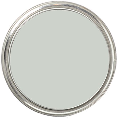
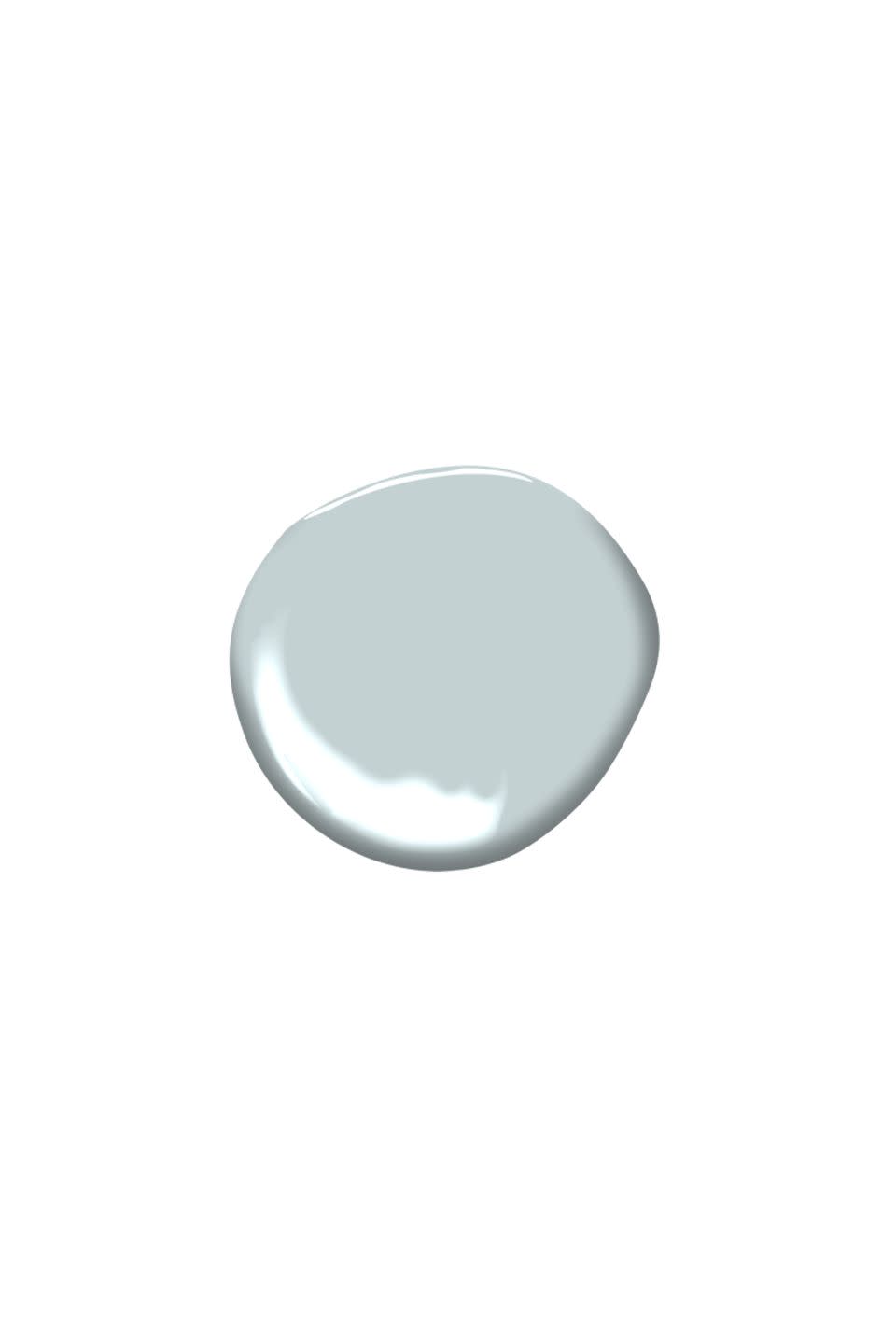
Farrow & Ball Skylight No. 205
“Farrow and Ball’s Skylight is a soft pale blue gray that I love for its chameleon-like quality, taking on many different feels throughout the day and night. It can read cheerful and light with the morning sun and then transform into a more sophisticated moody envelope in the evening.” — Marea Clark
Farrow & Ball De Nimes No. 229
“Farrow & Ball’s De Nimes organically blends tones and contrasting materials like stone, wood, and metals. When so many blues present cool and striking, De Nimes is that down to earth, natural blue that reads grounding and fundamental to an entire palette.” — Cortney Bishop
Benjamin Moore Quiet Moments 1563
“Benjamin Moore’s Quiet Moments is a soft blue gray that is the perfect restful backdrop. It’s a great option for a soft spalike color and works well in bedrooms and bathrooms.” — Zandy Gammons and Liles Dunnigan, The Warehouse Interiors
Benjamin Moore Delphinium CC-872
“Delphinium Blue is part of Benjamin Moore’s Designer Classics Collection and provides sophistication and punch. It can be mood altering, which works very well in a work-from-home environment.” — Marion Philpotts-Miller
Benjamin Moore Water's Edge 1635
“We’ve used this perfectly toned mid-blue for cabinetry and walls. I love how it creates a little drama and depth without too much darkness.” — Erin Gates
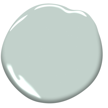
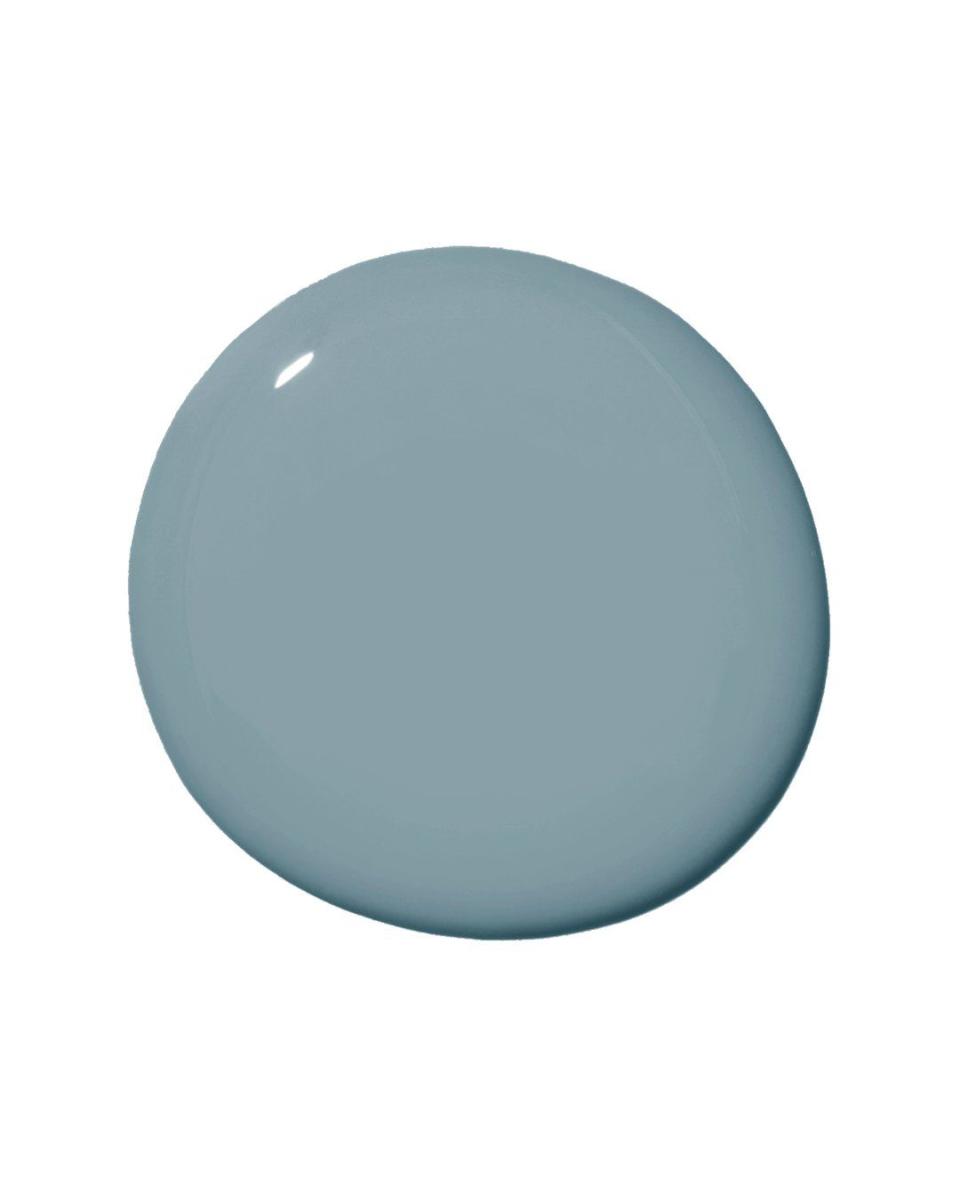
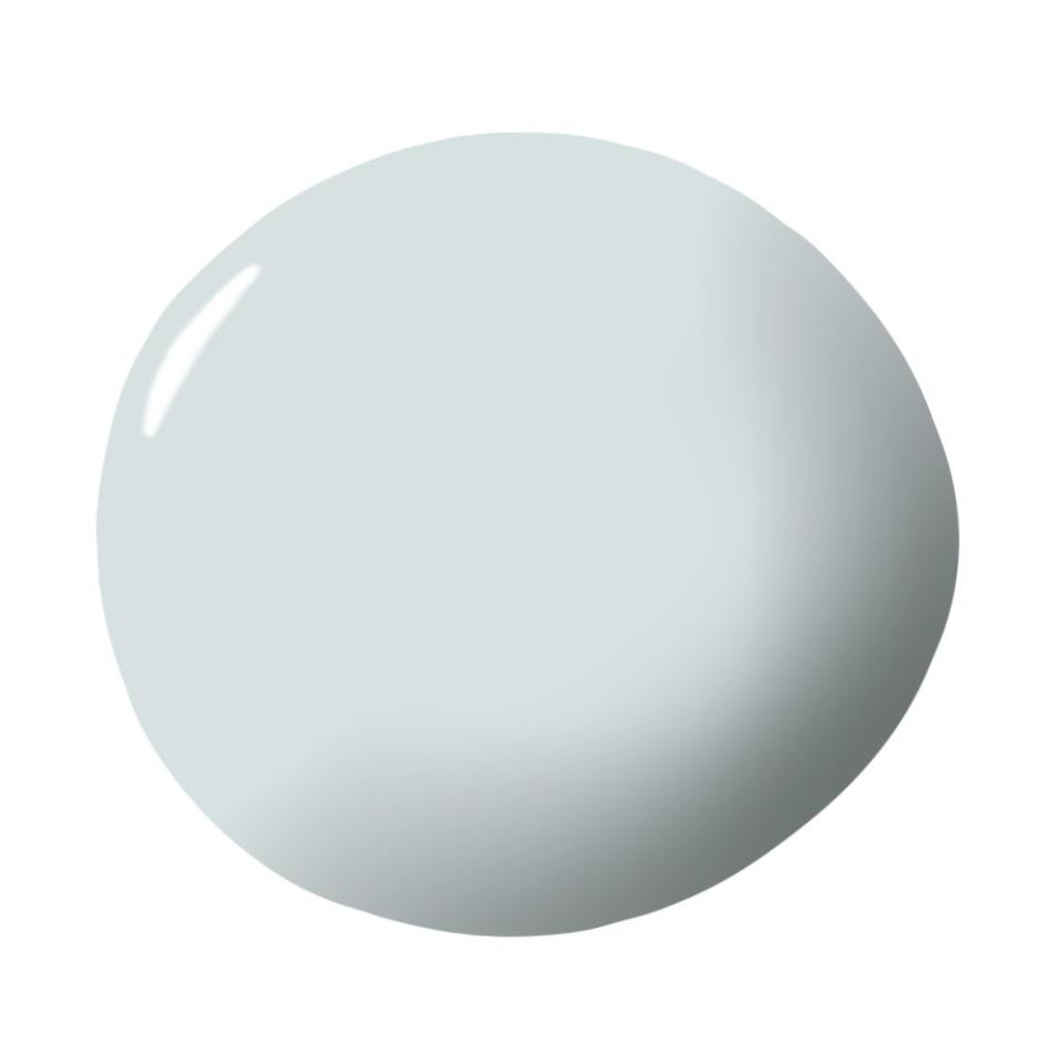
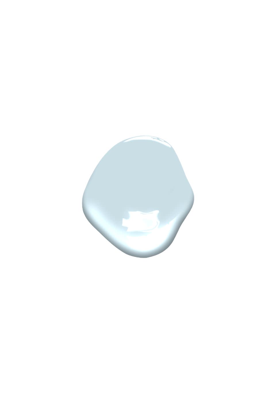
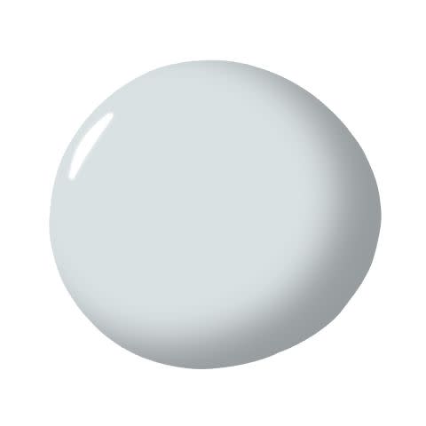
Benjamin Moore Iceberg 2122-50
“Benjamin Moore’s Iceberg is our go-to for master bedrooms and bathrooms. This soft shade of blue is serene, cool and easy on the eyes first thing in the morning!” — Marika Meyer
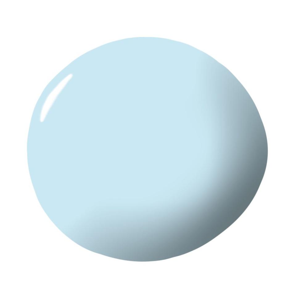
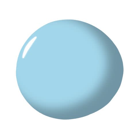
Benjamin Moore Light Blue 2066-70
“This color makes me think of a beautiful day where the sky is perfectly blue. It's refreshing so it’s great for any kid’s room or bathroom, but also for a home that has a more traditional or beachy feel.” — Linda Hayslett
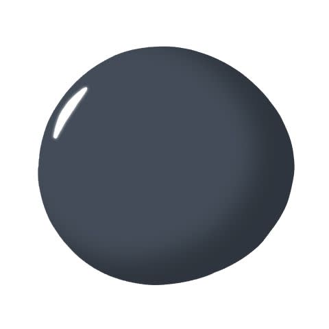
Benjamin Moore Hale Navy HC-154
“Hale Navy is easily used in a boy’s bedroom as it is in a dining room. It's sophisticated and playful all at once. It also works great with all accompanying colors.” — Nancy Mayerfield
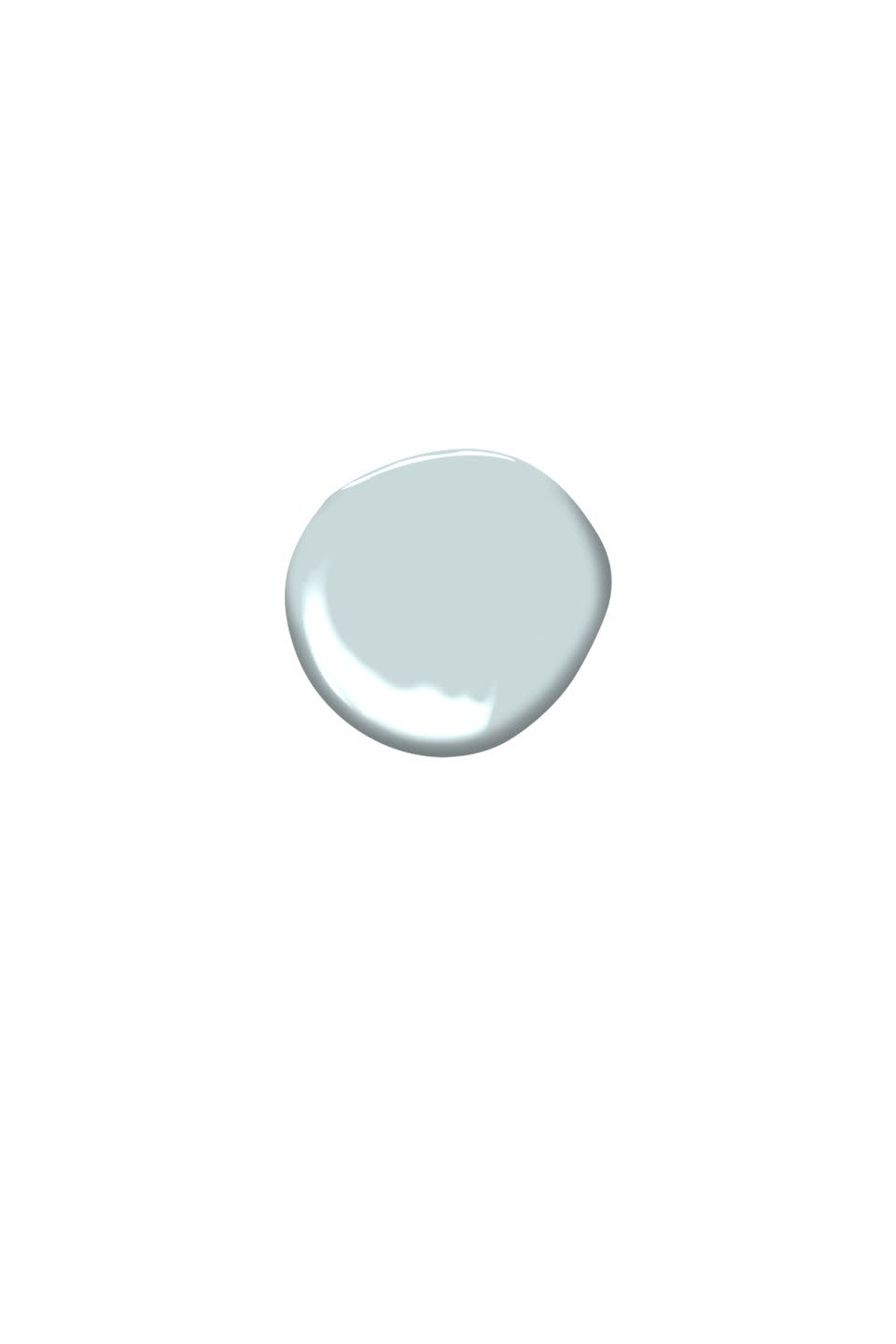
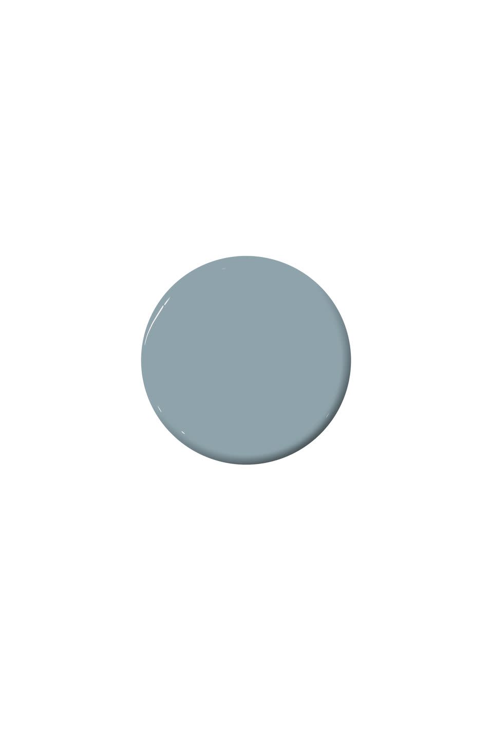
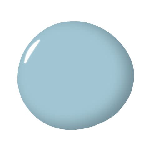
Benjamin Moore Windy Sky 1639
“A blue as pale as Benjamin Moore’s Windy Sky can almost serve as a neutral. It’s a cool-toned shade with enough color to make a subtle statement, but not so much that it overpowers the space. A pale blue like this one offers a sense of serenity and calm and pairs well with so many other colors.” —Anne Hepfer
Farrow & Ball Luluworth Blue No. 89
“I love using Farrow & Ball’s Luluworth Blue. I chose it recently for a beach house overlooking the ocean. It has a hint of sea green in it and it's the perfect bedroom color for a coastal property. It’s not too cool, and it’s beautifully serene and peaceful.” — Katharine Pooley
Benjamin Moore Stained Glass CSP-685
"My favorite blue paint of the moment is Benjamin Moore’s 'Stained Glass.' It’s a gorgeous deep sophisticated blue with accents of green. As a plus, it pairs beautifully with unlacquered brass hardware!" — Katie LeClercq
Benjamin Moore Brittany Blue 1633
"It's such a calming, soothing color. It's perfect for a dressing room, as a backdrop for clothing, jewelry, and accessories." — MA Allen
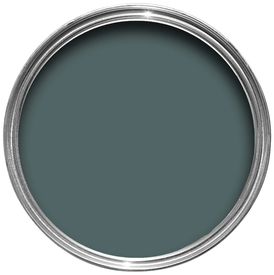
Farrow & Ball Hague Blue No. 30
“We love Hague Blue by Farrow & Ball. It’s a deep moody blue that picks up moments of grey, so it can change with the light. It’s very elegant and timeless. We’ve used it on beams in a loft and on a front door to make it a focal point. We recently used it in a hallway and art looks fantastic on it. We’re currently using it on kitchen cabinets with brass hardware and it looks phenomenal. It brings character to the kitchen without making it feel too blue or too grey. It’s the perfect shade.” — Dolores Suarez and Caroline Grant, Dekar Design
"I love this color blue for its richness and depth of color. It looks beautiful in the matte finish but can also add instant glamor to a room in high-gloss." — Nicole Hollis
Benjamin Moore Breath of Fresh Air 806
"We love Breath of Fresh Air by Benjamin Moore. We often paint and lacquer ceilings in this hue to give detail and added layers in a room.” — Shelley Johnstone
Donald Kaufman Color Azurite
“Blue is my absolute favorite color and so many shades of blue show up in our work. One of my favorite blues is Azurite, which adds so many dimensions to a room. This classic color works with so well with almost any other color and creates many different feelings depending on the time of the day.” — Kazuko Hoshino
Benjamin Moore Blue Note 2129-30
"A rich, deep shade of navy blue that casts a unique tone in whatever space you paint with it. I love this color so much, I used it in my own bedroom!" — Becky Shea

Benjamin Moore New Providence Navy 1651
"The stunning blue works great as an accent color and looks beautiful with brass finishes. This hue has a great electric personality that brings any room to life." — Birgit Klein
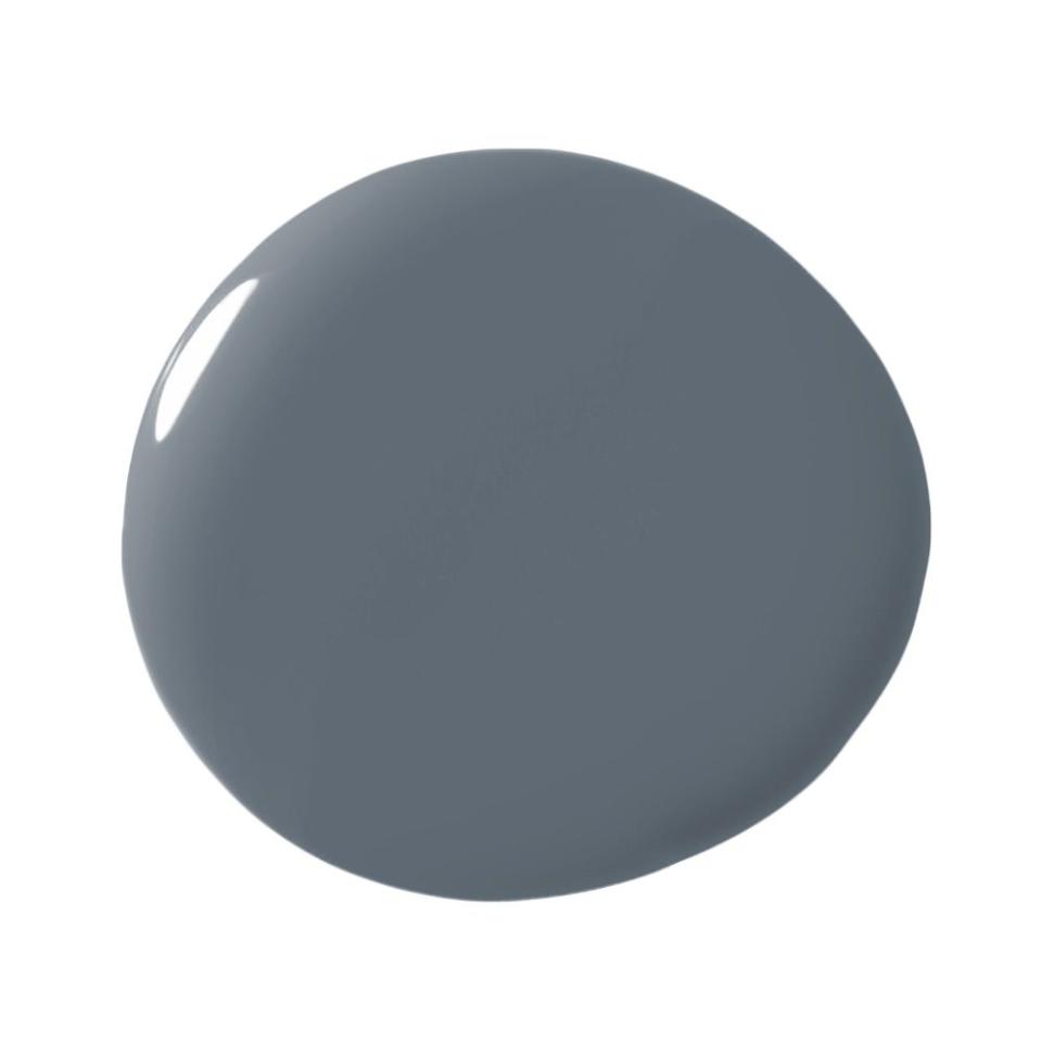
Sherwin-Williams Granite Peak SW 6250
"I love my blues to have a lot of gray in them which makes them more palatable and pleasant to the eye. This moody blue is a favorite of mine for built-in cabinetry in an office or laundry room. It pairs well with brass accents so bring on the decadence in your cabinet hardware, library lights, or mesh panel inserts on your doors. It’s a chameleon of a color as it works well with deep, saturated hues or soft, subtle neutrals." — Donna Mondi
Farrow & Ball St Giles Blue No. 280
“Right now my favorite blue is ‘St Giles’ by Farrow & Ball. It’s ethereal and moody, vibrant but still soft — a wonderful shade. I used it in a living room recently, and it gives a fresh feel to the space. Sometimes blues are too sweet, too classic, too cutesy, or preppy, this one somehow is just right and feels a bit irreverent and whimsical.” — Summer Thornton

Benjamin Moore Polo Blue 2062-10
"I use this shade of blue whenever I want to add drama to a space. It is the perfect balance of modern masculinity and classic design. Matte or high gloss finish, you can't go wrong!" —Amanda Sacy

Benjamin Moore Caribbean Blue Water 2055-30
"I love Benjamin Moore's 'Caribbean Blue Water' for its depth and intensity. I've used it both as a lacquer finish as well as dead flat, on walls and on a ceiling, and it never disappoints. Veering a bit towards teal, it looks good in bright sunlight as well as more dimly lit spaces, and pairs well with other colors almost as though it were a neutral." — Kelly Behun

Farrow & Ball Stiffkey Blue No. 281
"My favorite blue paint is Farrow & Ball's 'Stiffkey Blue,' which is a really gorgeous, moody, inky navy; perfect for sexy and tailored bedrooms and high gloss offices and libraries." — Ariel Okin
"We love the sumptuous color in Stiff Key Blue by Farrow & Ball. We used this shade in a den where the walls were flat, and it paired well against built-in bookshelves, doors, and trim that were finished in a satin. The play on sheens was subtle and gorgeous, especially watching the light change throughout the day and night." — Eva Bradley, Studio Heimat
Benjamin Moore Avalon Teal CSP-645
"Blue is one of my favorite colors to work with. Teal, in particular, really speaks to me. It embodies the power and tranquility of the San Francisco Bay. I really love Benjamin Moore's Avalon Teal — it is such a strong color and changes with the light, reminiscent of the sun setting over the water. You can't look at this color without feeling calm and serene." —Kendall Wilkinson
Benjamin Moore Old Glory 811
"This classic cobalt has a softness that makes it the perfect accent in almost any space. I've used it in high gloss for a contrast front door and on a dining room ceiling in tandem with graphic black and white wallpaper. Both applications are unexpected, warm and add a hint of Americana to the space." —Emilie Munroe

Benjamin Moore Gentleman's Gray 2062-20
"This is a rich dark blue with a lot of gray in it. This color has great depth and is gorgeous in a room from floor to ceiling." —Lindsey Coral Harper

C2 Brigand C2-757
"This is hands down my favorite blue paint. It's almost black in some lights, picking up shades of blue when light is introduced. Like a beetle's skin or the background in a Rembrandt painting: it's bold, mysterious and utterly sexy." —Jon Call

Benjamin Moore Fairview Blue 779
"This is my all-time favorite. It's a bolder blue, but isn't too offensive because of its lighter tone. I love that a color can make a statement in a room without being too overwhelming. I even had my bedroom painted this shade, and it was wonderfully calming." —Maddy Pasqualini
Farrow & Ball Inchyra Blue No.289
"This color is so heavy, with rich blue green pigments, it feels like a cashmere blanket, at first cool to the touch but enveloping and slowly warming. We are using it next in a matte finish in a formal Bermuda dining room, knowing that most meals will be outdoors except in winter months. The mood will be deeper but we'll want a reference to that ocean surrounding the island." — Celerie Kemble
Benjamin Moore Newburyport Blue HC-155
"Blues can dominate and overpower a room, but not Newburyport Blue. It is subtle yet strong enough to anchor a room or even the exterior of a house. I love the results I have achieved in intimate cozy room walls where contrasting art and drapes stand out elegantly." — Moises Esquenazi
Benjamin Moore Tranquility AF-490
"It has enough gray in it to muddy it up and give it depth, so even though it's a light blue, it feels moody and sophisticated. I love it in a master bedroom; it's a great background to layer in bold colors." — Karen Vidal
Benjamin Moore New York State Of Mind 805
"It's a deep enough blue to be elegant, but not too dark that it makes the room feel enclosed. Blue can be tricky. If you pick the wrong color it can feel like it belongs in a kids' room. But New York State of Mind is a blue for grownup spaces. It's chic, understated and happy." — Lauren Behfarin
Paint & Paper Library Bluebird
"I love how bright this color is and how it can be made sophisticated with black and white, or it can be used as a building block color for children. It is also my new 'splash of' color. Where previously I have gone for yellow, increasingly I find myself wanting to add this blue as an accessory." —Rita Konig
Benjamin Moore Stunning 826
"The name says it all. It's stunning. It's deep, bold and oh-so cozy. I have used it on everything from walls in a traditional dining room to cabinetry in a modern kids' bathroom. It mixes well with crisp white, soft gray, silver, gold and even black. Using a deep blue as a base can give a space major visual impact." —Jess McClendon

Sherwin-Williams Distance SW 6243
"It's a beautiful marine blue with touches of gray and indigo. You could use it on a front door or in a cozy room like a library. The color works great on walls with white trim or in a room with a lot of white furniture." —Trip Haenisch
Benjamin Moore Whispering Spring 2136-70
"This is my preferred choice for low ceilings and walls of rooms that need a hint of depth and dimension. It is atmospheric and expansive." —Don Stewart
Farrow & Ball Pavilion Blue No. 252
"It has a luminescent quality and shifts between a watery blue to a gray green-blue depending on what it is paired with and the natural light in the room. We have been using it on ceilings and as trim color to complement graphic wallpapers." —Christine Markatos
Sherwin-Williams Cruising SW 6782
"The dark bluish, greenish hue reminds me of one of the various colors of the ocean that I experienced during my recent summer trip to the Cayman Islands. This calming hue would look fabulous as a wall color in a powder bathroom, dining room or study. This color is a bold, radiant and impactful hue of blue, which are all the qualities that I look for in a statement color." —Nina Magon

Benjamin Moore Blue Veil 875
"It's a blue with undertones of gray that has a very ethereal quality to it, lending itself easily as an overall 'neutral' that has depth and sophistication. I used it in a California beach house as the wall color of all the hallways and common areas over a bright white wainscot. It is such a subtle blue that changes throughout the day with the natural light, remaining calm and soothing but not at all boring." — Jeff Andrews
You Might Also Like

