23 Incredible Charts That Repeatedly Made Me Go, "Now That Is Fascinating!"
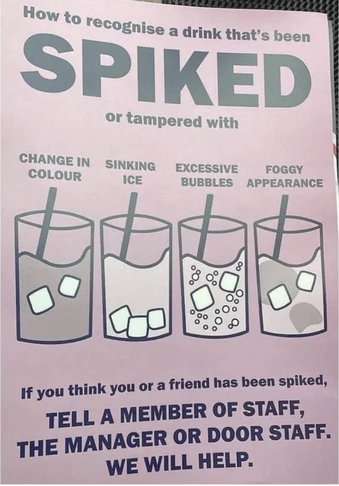
1.First, this important chart tells you how you can know when someone has spiked (or otherwise tampered with) your drink:
2.Here's another one that could save your life — it demonstrates the visibility of swimsuit colors underwater:
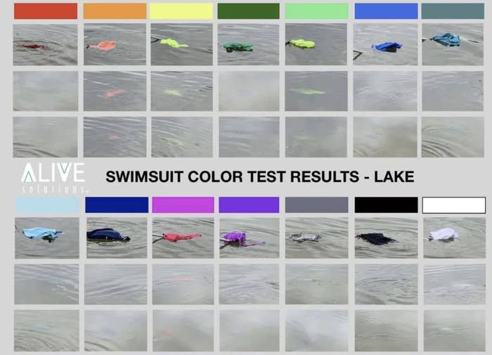
Via Alive Solutions.
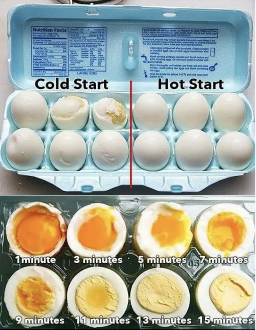
3.This chart is less life and death, but still really valuable! Why? It teaches you how make a hard-boiled egg EXACTLY as you like it:
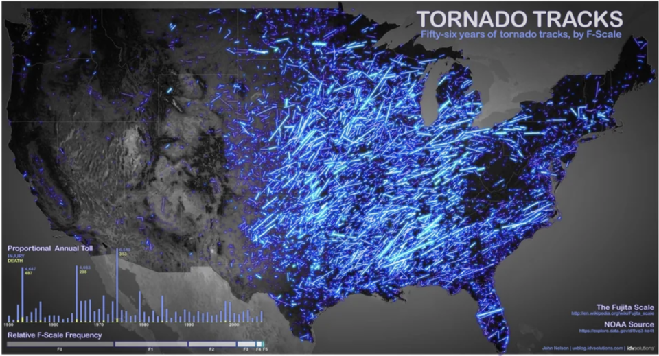
4.If you live in the western United States and worry about tornados, this chart will put you at ease (as for the rest of you, well, uh...):
5.This chart explains once and for all just what the heck the difference is between ice cream and gelato:
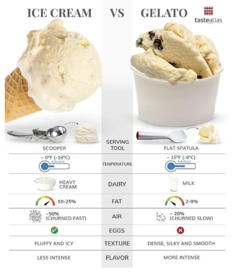
Via Taste Atlas.
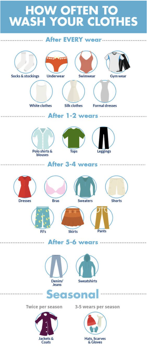
6.And this chart explains how often you should wash your clothes (apparently I wash my sweatshirts way too often):
7.Ever wonder where exactly the eight billion people on earth live? Well, this chart breaks it down by country:
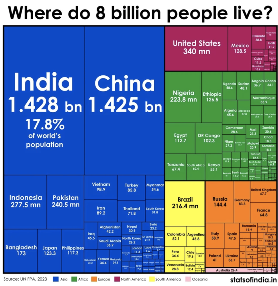
Via Stats of India.
8.And this chart shows the largest cities in the world by population! Wow! Look at the size of Tokyo:
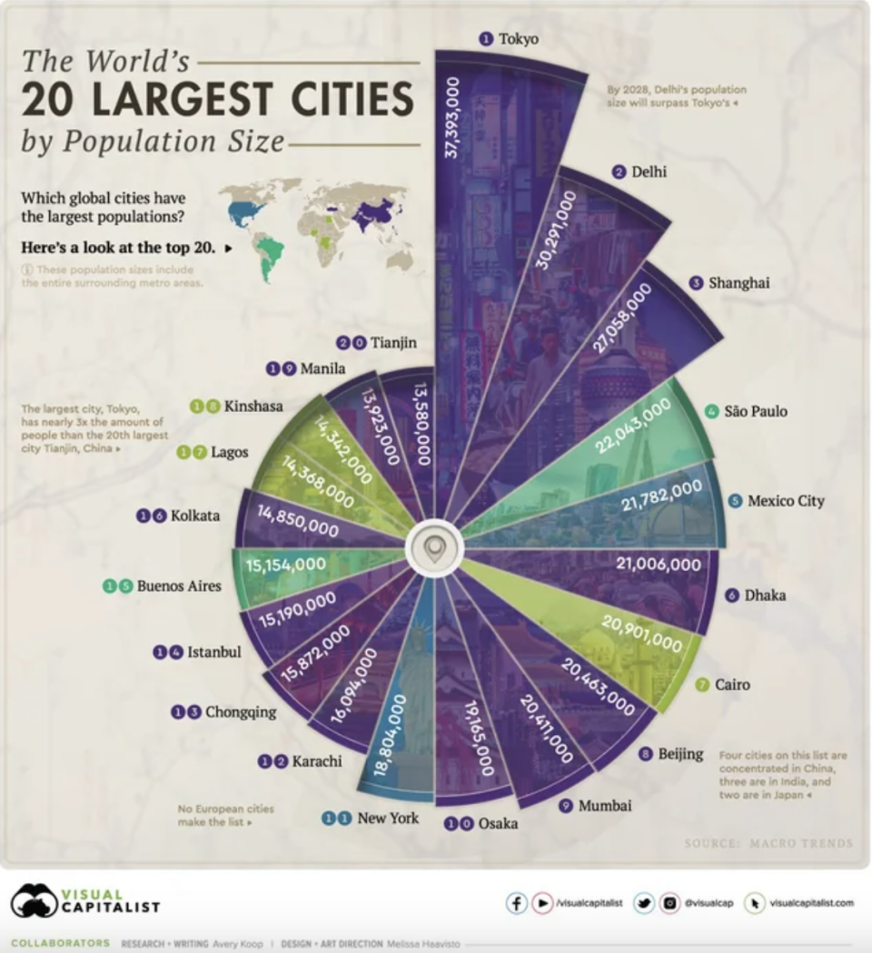
Via Visual Capitalist.
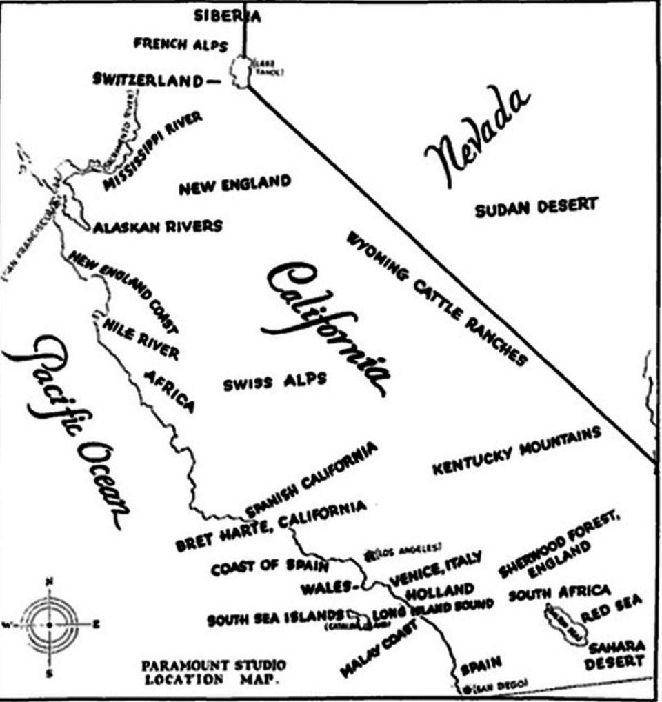
9.This chart/map was made by Paramount Pictures in 1928 and details all the locations around California that could double as places in the world (Have a scene set in Switzerland? Go to Lake Tahoe!):
10.And here's another historical chart — it documents the percentage of the population of each nation killed during World War II:
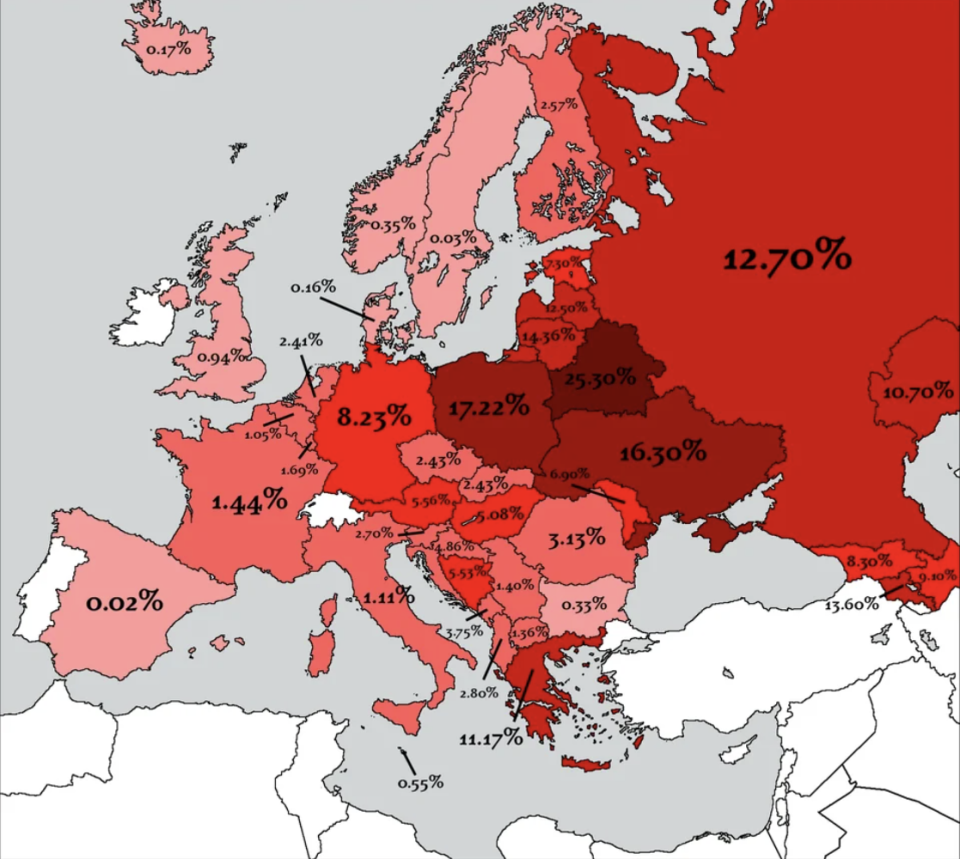
Sixty million or more people died during the war, and, of course, not just in Europe. China alone lost 20 million people during The Pacific War (in Asia).
11.Fast forwarding to the distant future (i.e. now) when AI is taking over, here's a chart that details just how smart ChatGPT actually is:
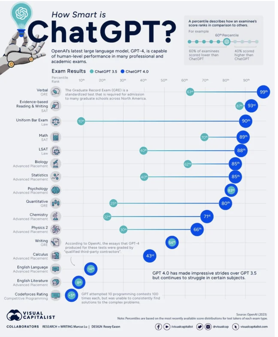
Via Visual Capitalist.
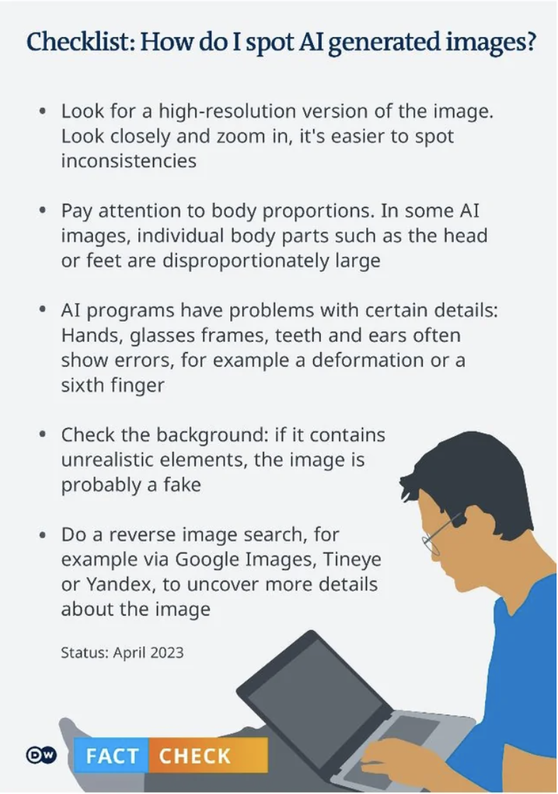
12.And here's a useful chart that'll help you know how to spot AI-generated images:
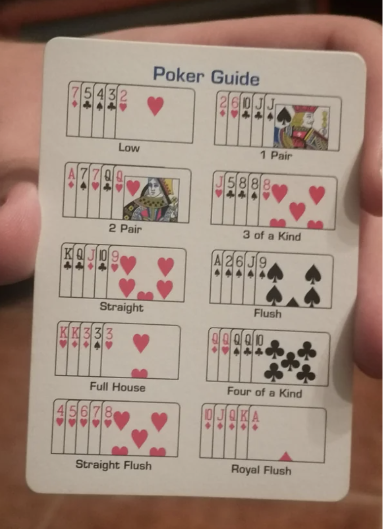
13.This card (found in a deck of cards) explains all the hands you can have in poker:
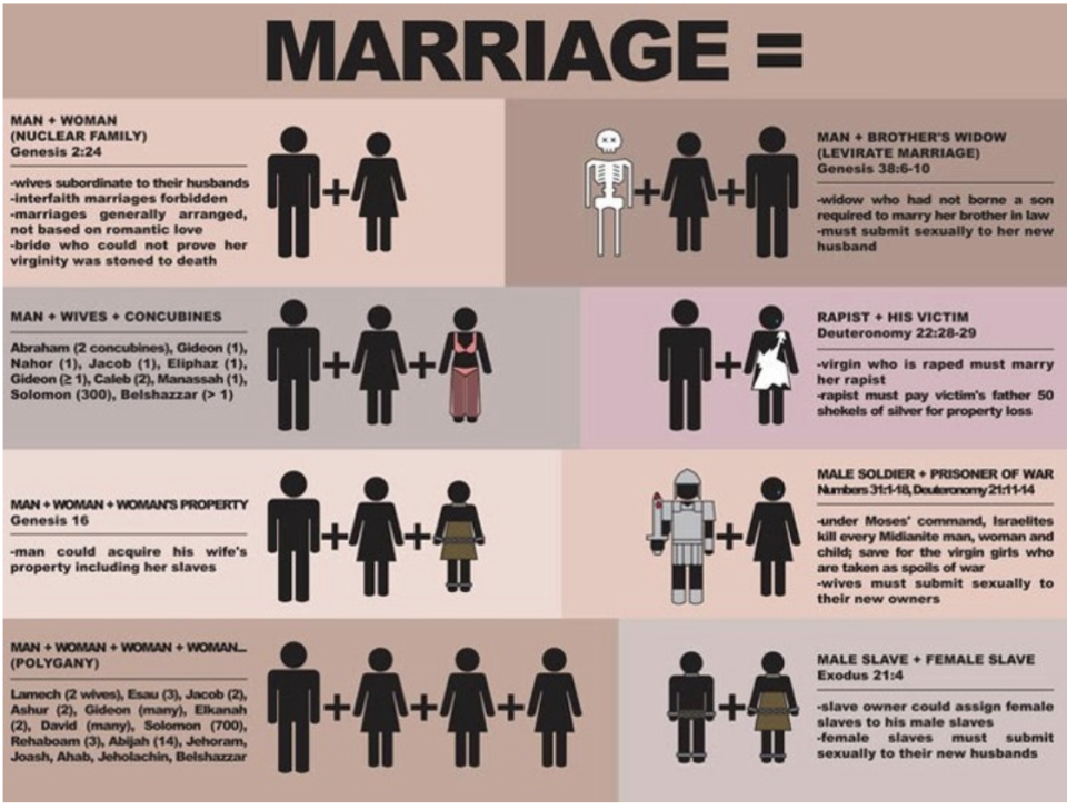
14.You hear a lot of people screaming about traditional marriage and how marriage should be how it was in the bible. Well, this chart explains all the acceptable marriages in the bible (including a rapist and his victim):
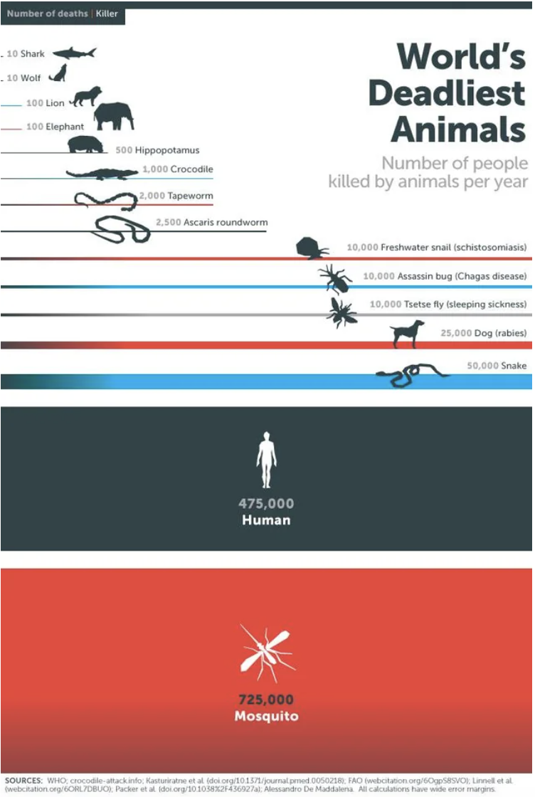
15.This chart shows which animals kill the most humans each year, and — spoiler alert — it's not sharks you should be worried about:
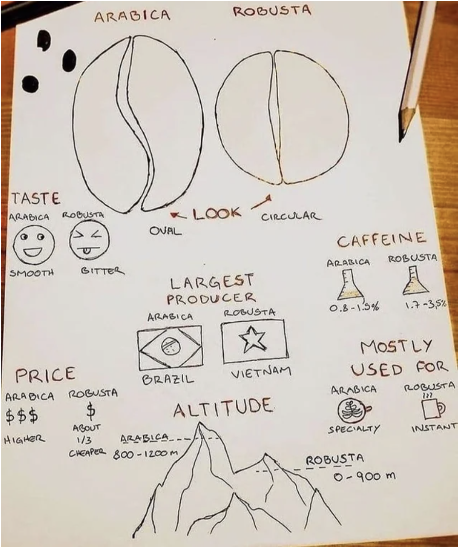
16.This delightfully hand-drawn chart explains the difference in coffee beans:
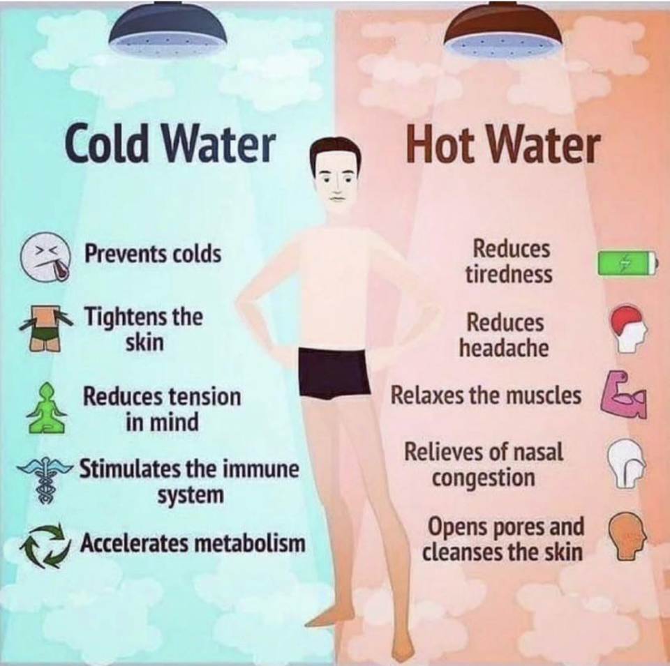
17.And this chart shows the very different benefits of taking a cold vs. hot shower:
18.This chart shows all the foods you can regrow from scraps:
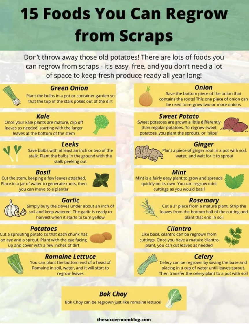
Via The Soccer Mom Blog.
19.And this chart tells you what vegetables are highest in protein (vegetarians/vegans will love this one):
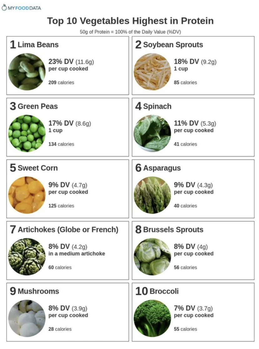
Via My Food Data.
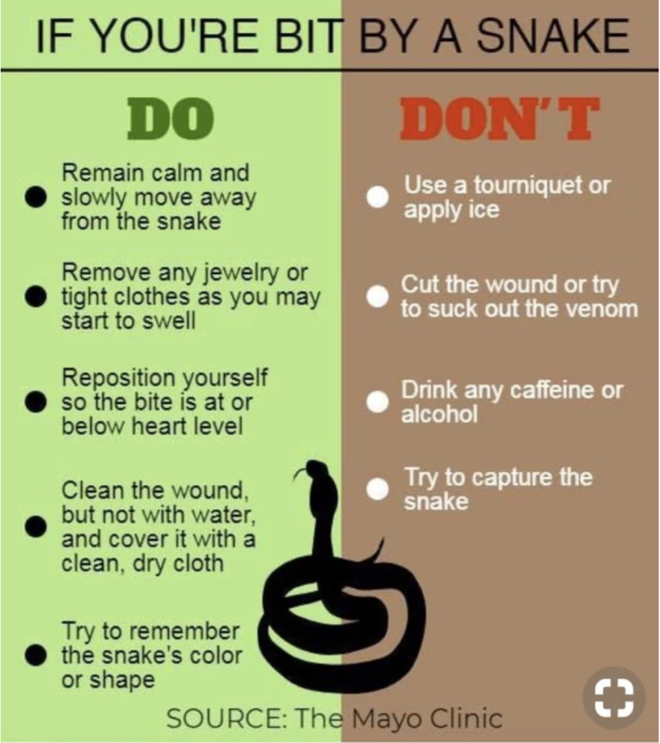
20.This chart tells what to do — and NOT to do – if you should ever find yourself in the unfortunate position of getting bit by a snake:
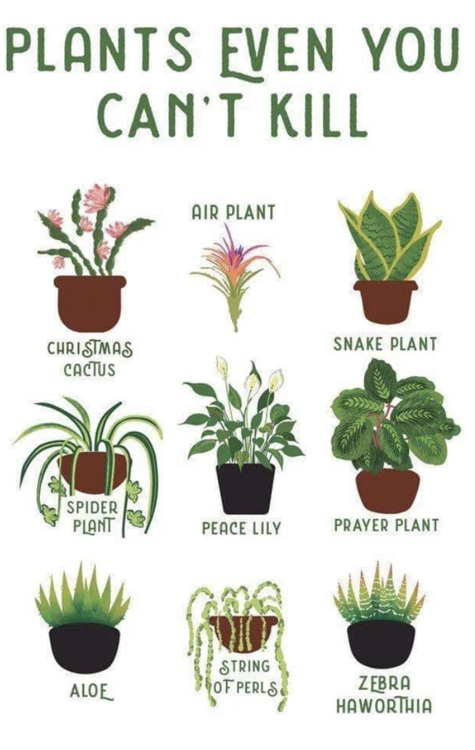
21.If you kill a lot of plants, this chart is for you:
22.Mmmmm...this chart lists all the best cheese dishes in the world:
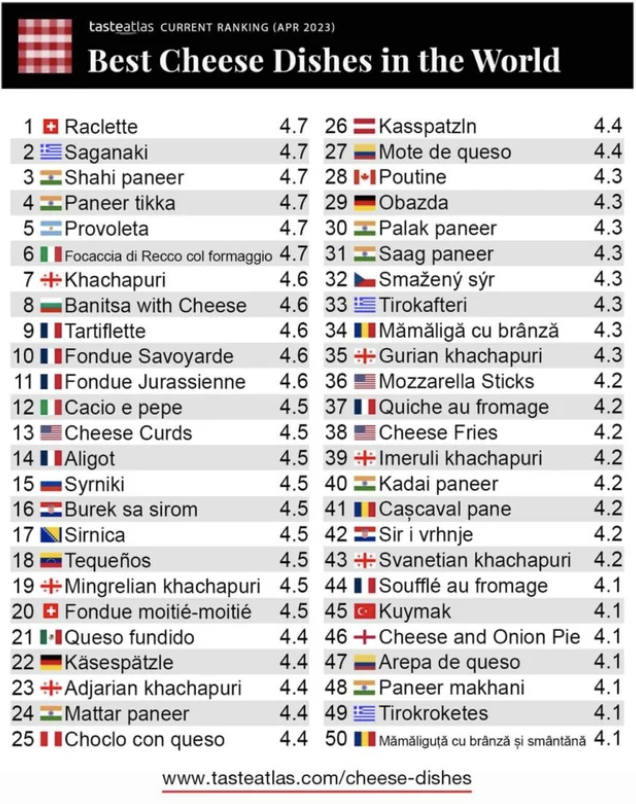
Via Taste Atlas.
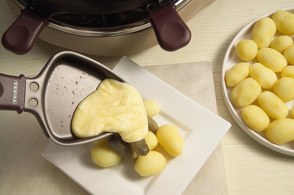
In case you're wondering what Raclette is (and you know you are), it's a Swiss dish where delicious, creamy melted cheese is scraped onto (usually) boiled potatoes:
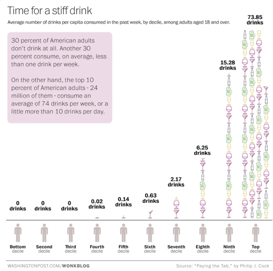
23.And lastly, this chart show how many drinks Americans tend to drink each week. While 30% drink nothing at all, 10% drink more than ten drinks per day (yikes):