21 Fascinating Charts That Will Genuinely Teach You Something You Didn't Know
1.This ingenious image does a great job of explaining how genetics work...and making you crave gummy bears.
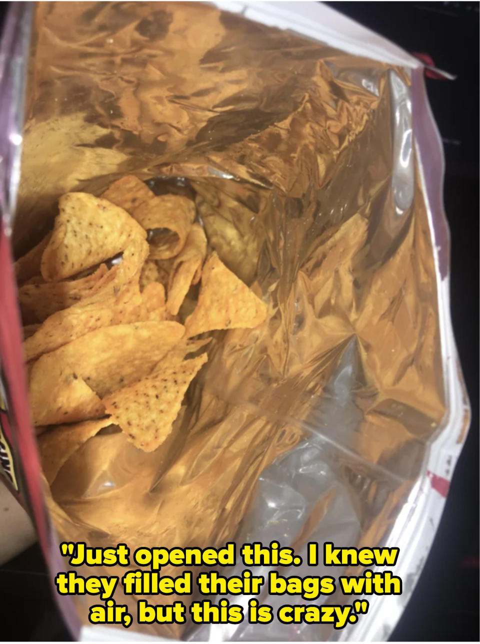
2.This chart might leave you with a chip on your shoulder after you see just how much air is in a bag of your favorite treat.
It's time we AIR our grievances with chip companies!
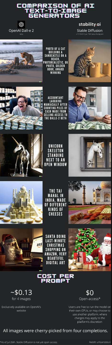
3.Now, this one is really interesting. It shows what happens when you give two AI text-to-image generators (Open AI and Stable Diffusion AI) the exact same prompt.
4.This incredible image shows just how much a cervix can dilate during childbirth.
5.This graphic shows — if you ever have to go IRL action hero — how you can kick open a locked door.
6.And this cool chart shows you 16 — yes, 16! — different sizes of mattresses.
And if you're wondering what the heck an Alaskan King looks like in person...well, here's one.

7.If you're a little foggy on the difference between a second cousin and a first cousin once removed, this napkin explains it all!
8.This super-cool chart spells out just how vastly different the planets are in our solar system...using fruit:
And if you want another humbling image demonstrating the sizes of things in our solar system, feast your eyes on this one (and damn, the sun is HUGE):
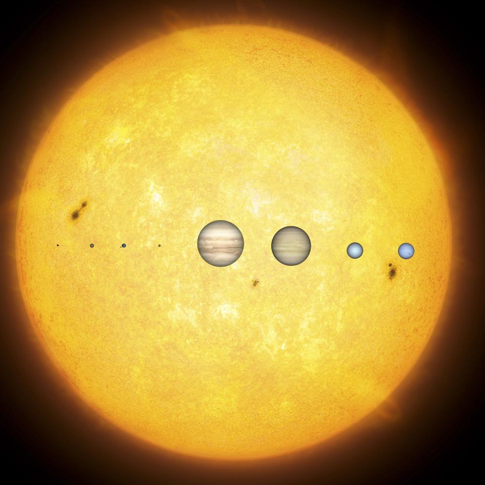
The planets from left (closest to the sun) to right (furthest from the sun) are Mercury, Venus, Earth, Mars, Jupiter, Saturn, Uranus, and Neptune.
The sun, by the way, is roughly 10 times the diameter of the largest planet, Jupiter...and Jupiter is almost 11 times larger than Earth!
9.Being color-blind doesn't mean you see the world in black and white — it's that you have a narrower perception of color.
10.OK, I absolutely LOVE this chart! It shows how people around the world express laughter in texting, and — spoiler alert — they don't write LOL.
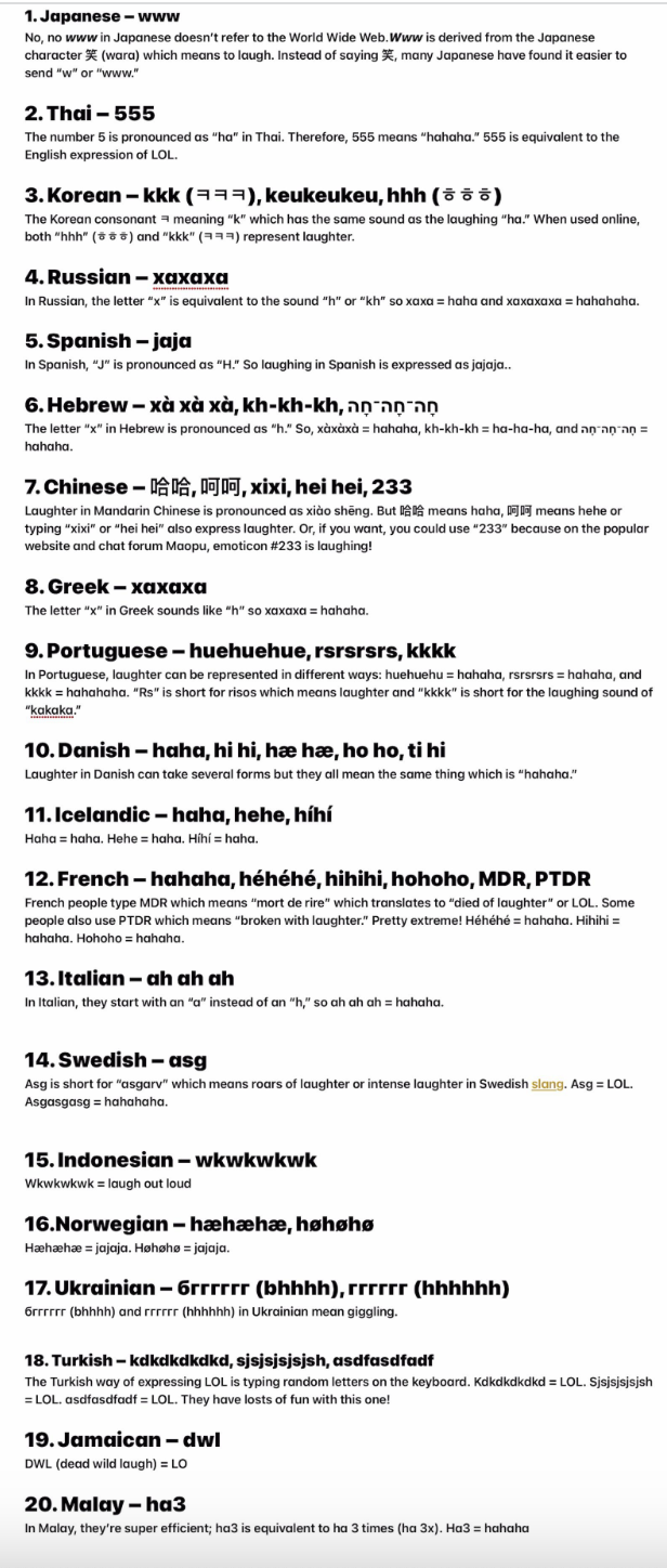
In Thailand: "555!" In Portugal: "huehuehue" In Sweden: "asg!" In Jamaica: "dwl!" 😂😁 😂
Dreamworks
11.It turns out people draw tally marks their own ways in different parts of the world too!
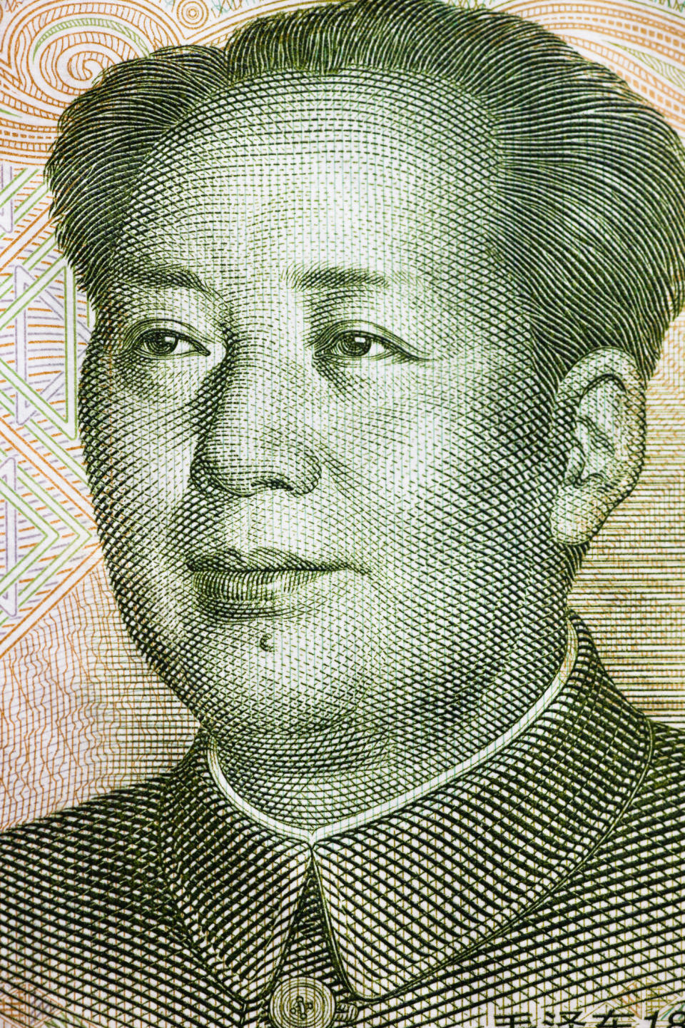
12.This disturbing and sobering chart shows you the dictators who killed the most people in history.
So, how did Mao Zedong — The chairman of the Chinese Communist Party from 1943–1976 — kill so many people? A big part of it was due to his Great Leap Forward program, which aimed to turn China from an agrarian nation into an industrialized one...fast. Way too fast. As a result, as many as 45 million starved, fueled by Mao's refusal to acknowledge what was happening or to accept international aid.
13.Did I think when I woke up this morning I'd see a ranking of countries based on how accepting they are of infidelity? No, I did not. But here we are!
Wow, France! You do you, LOL!
Robert E. Blackmon / Via giphy.com
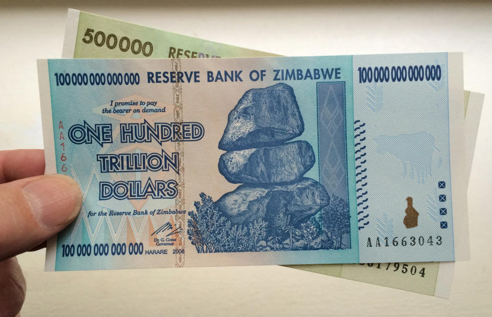
14.This incredible chart shows you just how unfathomably large a trillion dollars is.
And speaking of a trillion...this fact is wild. Hyperinflation hit Zimbabwe so heavily in 2009 (inflation literally reached 230,000,000% that year!!!) that the country introduced a 100 TRILLION dollar bill...which was worth about 40 US cents.
15.This chart shows that "fishes" CAN be the plural form of "fish." Little kids everywhere are vindicated!
16.This chart lists the most trusted and least trusted professions in the USA, and yep — members of Congress came in last!
"What?! Members of Congress are the least trusted? How, just HOW could that possible be?!"

17.I found this chart super fascinating because it details the many ways we self-sabotage.
18.This chart basically screams, "Hey America, maybe we should lean into public transit a bit more, what do you think?"
America:
Honda / Via giphy.com

