20 Perfect Mid-Century Modern Color Palettes, From Vibrant to Calming
Mid-century modern design's curves, wood tones, sleek lines, geometric shapes, and pops of color can be seen throughout homes and commercial spaces alike. The principles of this retro design style are relatively simple, but when it comes to color palettes, you may not know where to start.
As it turns out, your options are essentially limitless, as long as you stick to the basic rules of mid-century modern design. Here are 20 mid-century modern color palettes to inspire your space.
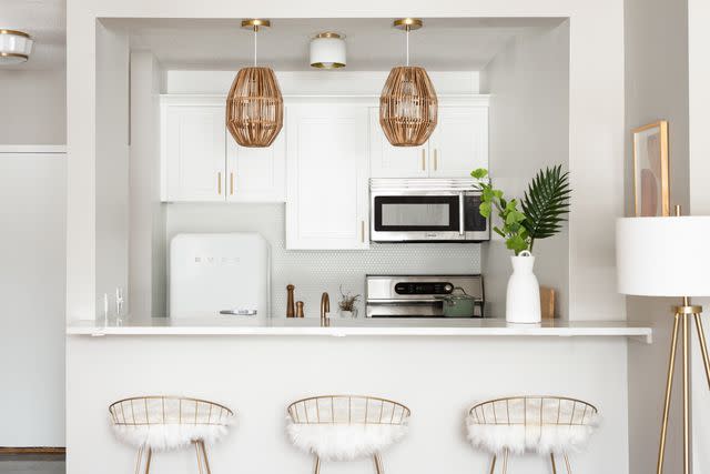
White and Wood Tones
White and warm wood tones are a classic neutral pairing in mid-century modern design that you just can't go wrong with. To stay true to the style, we recommend incorporating a few pops of color where possible to liven up the space. Here, a fresh bouquet of flowers and some carefully chosen wall art help this neutral space to feel fresh and totally mid-century modern.
Gray and Warm Browns
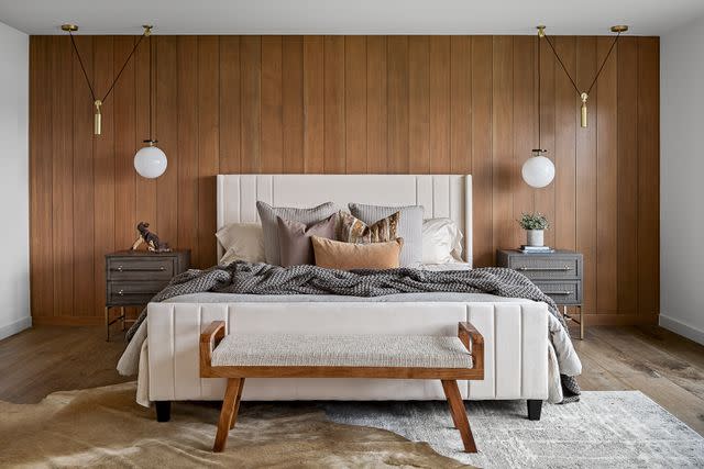
Design by Kim Duensing Projects / Photo by Sarah Szwajkos
Gray and warm brown is another great neutral pairing. Use several shades of each color to create dimension and contrast in the space, or opt to add a few accent colors using artwork and decor. When in doubt, incorporating brown by using wood furniture and accents is a fail-proof way to nail the look.
Black and White
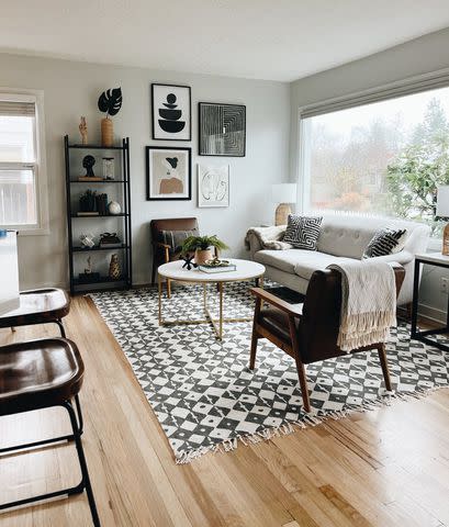
Create an edgy, high-contrast space by using black and white. Keep the space from looking too monotone by incorporating lots of geometric shapes and patterns using decor, as seen in this stylish living room by Arbor & Co.
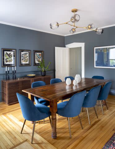
Blue and Orange
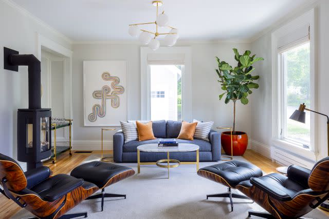
Jessie Tobias Design / Photo by Sarah Szwajkos
Complementary colors are always a great choice for mid-century modern design, but orange and blue in particular just look right with this retro style. You can go as bright or muted as you want—just be sure to keep the two colors in the same general shade range for a more cohesive look.
Teak and Neutrals
Teak furniture is an iconic part of mid-century modern design, so don’t be afraid to go all out if you’re a fan of this medium-toned wood. This kitchen by Laura Brophy Interiors showcases how teak wood can take center stage in a space by using a neutral color palette for a super sophisticated look. Incorporating a few pops of color using fresh greenery or decor is always a good idea.
Blue and Green
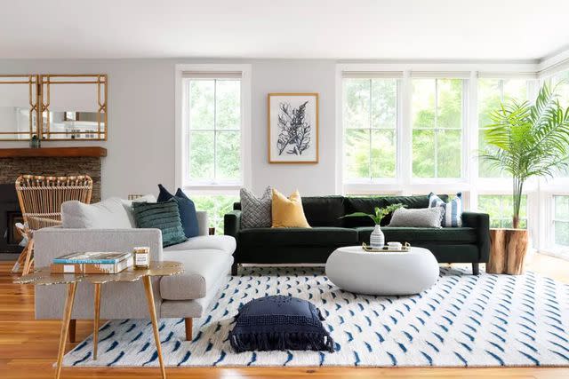
Green and blue offer a relaxed and playful color palette for mid-century modern spaces. Go bold and bright for an eye-catching look or opt for more muted shades if you want a more relaxed and natural look. If you are looking for accent colors, you can’t go wrong with yellow for this color palette.
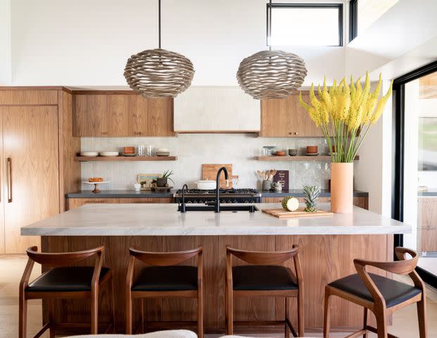
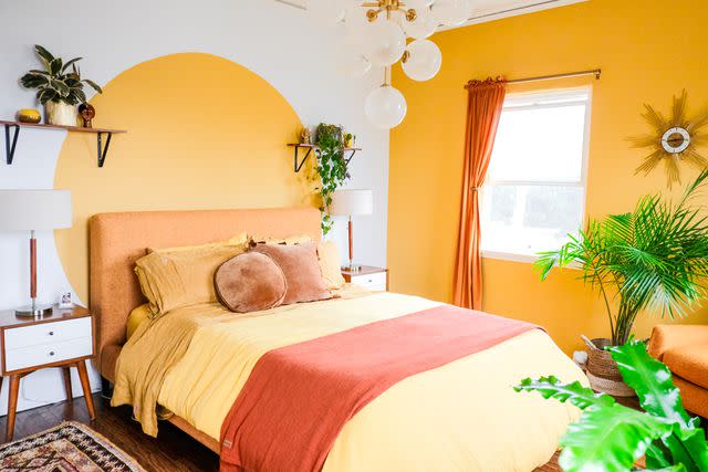
Bright Primary Colors
Design by Tamarack Builders / Photo by Sarah Szwajkos
Add some fun to your space by using a color palette of bright primary colors. Blue, yellow, and red in bright hues offer a nostalgic, retro feel that fits in perfectly with this design style. This kitchen by Tamarack Builders offsets these bright colors with plenty of white and wood tones for a mid-century modern look that we absolutely love.
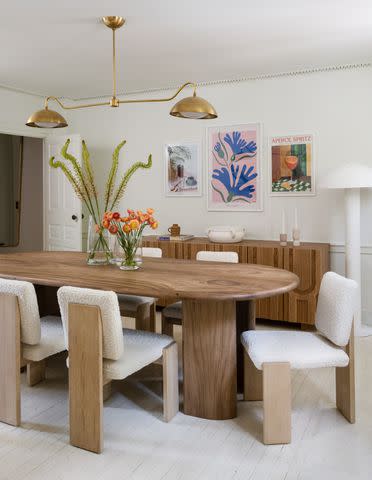
Peach and Gold
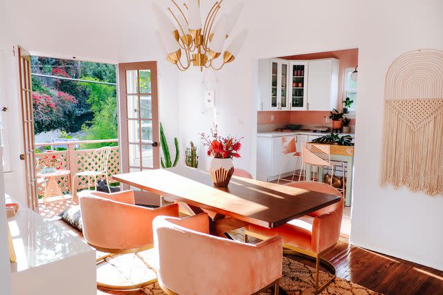
Pair peach and gold with the hallmarks of mid-century modern design and you’ll get a calm and inviting space with a bohemian flair as seen in this dining room design by Dazey Den. To get the look, pair peach and gold with plenty of white, wood tones (like teak), and natural accents.
Teal and Wood Tones
Jessie Tobias Design / Photo by Sarah Szwajkos
Teal is a vibrant yet calming color that can also be elegant, depending on the space. This dining room features teal velvet dining chairs and muted teal wall paint that gives the room a calm sophistication that we love. The look is finished off with a classic mid-century modern chandelier light in the center of the room.
Red, Orange, and Yellow
If you’re a fan of color then this color-drenched space by Dazey Den will be right up your alley. Warm, muted shades of yellow, orange, and red make up the primary color palette of the space, while white and wood tones provide some balance. A striking chandelier and classic retro wall clock finish off the look.
White and Blue
Blue is undoubtedly a popular color choice for mid-century modern spaces, and for good reason. This calming hue pairs well with nearly any color and has a charming retro feel. Don’t be afraid to stick to the basics and pair blue with white. This classic combination is truly timeless and can be accentuated using black, gold or bronze, wood furniture, and much more.
Pink and Teal
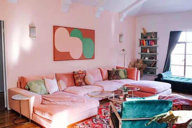
Pink and teal is another fun complementary color scheme to consider for your mid-century modern space. Both of these playful hues have a charming retro feel that suits mid-century modern design well. Try going all out with a color-drenched, maximalist look, or test out the color palette using a few items of decor first.
Green and Neutrals
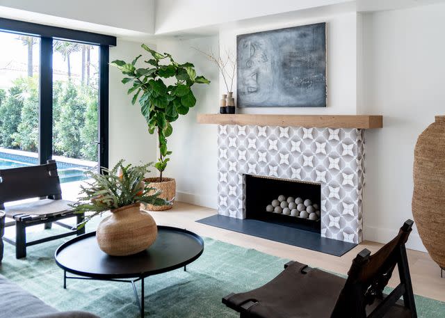
Pair green with neutral colors like white, black, and beige for a calming, nature-inspired look that is sure to impress. This living room by Laura Brophy Interiors starts with a neutral base—white walls, light floors, and black and white fireplace— and incorporates green with decor and live greenery.
Beige and Cream
Sad beige? We’ve never heard of her! This calming, spa-like space is achieved by using various tones of beige and cream. To keep the space from looking flat, contrast is brought in using black accents and live greenery. A single burgundy throw pillow and bright green wall art offer that pop of color that is characteristic of the mid-century modern style.
Blue and Black
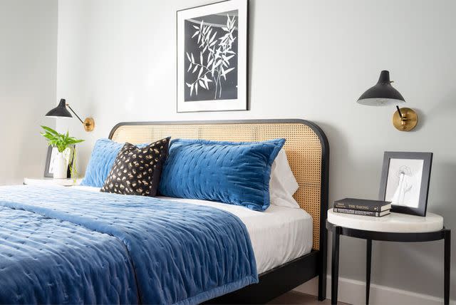
For some high-contrast drama, consider pairing blue and black. This pairing looks great in bedrooms, dining rooms, and even kitchens and suits the mid-century modern style well. While you can definitely go all out with these two shades, incorporating lighter tones like white, grey, and beige can help to provide a bit of balance.
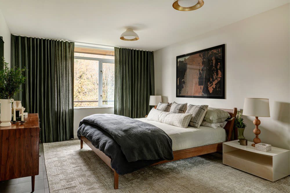
Olive Green and Teak

Olive green is a great option for mid-century modern spaces, particularly when paired with teak wood. This color palette exudes comfortable sophistication, particularly when paired with other calming tones like cream, warm grays, and more.
White and Gold
Bright and elegant, white and gold are a classic choice for this retro style. This color combination can be played out in various ways, from stark white and gold minimalism to warm white and gold with an eclectic flair. This bright white space by Desiree Burns Interiors showcases the former for a chic and elegant space that we just can’t get over.
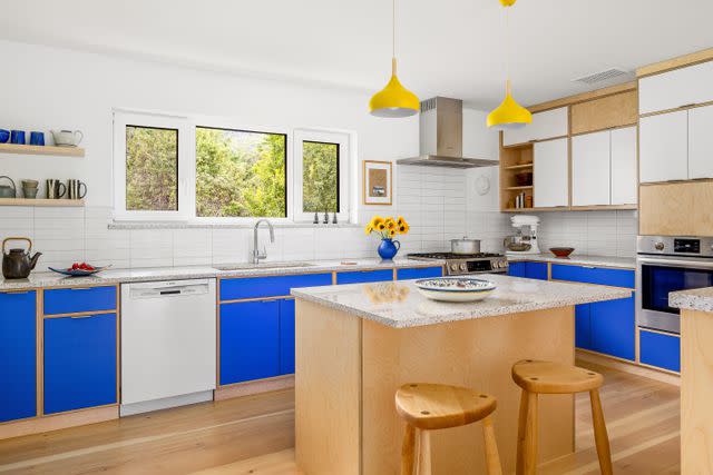
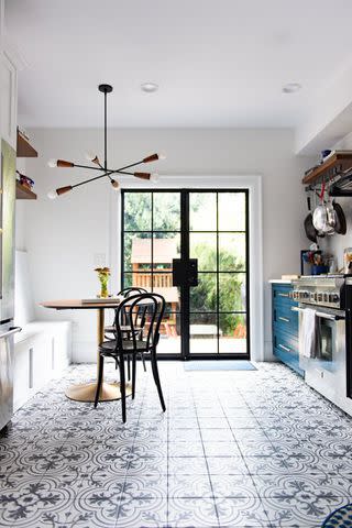
Blue and Natural Wood
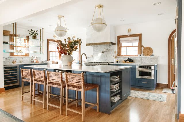
An earthy, slightly coastal take on a blue mid-century modern color palette uses blue and natural wood, as seen in this kitchen by Jessica Nelson Design. Pair the natural wood tones with plenty of white, cream, and gold to accent the blue in your space.
Red and Teak
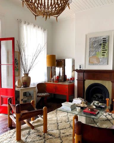
@midcenturyjo / Instagram
Red can be an intimidating color to use in your space, but mid-century modern design is the perfect place to test it out. If you’re not ready to bust out the red wall paint, consider incorporating it using decor, furniture, or by painting a smaller area like a door or window trim. Pair it with classic teak furniture to finish off your space.
Brown and White
You can’t go wrong by pairing white and brown. Brown is another inherently retro tone, particularly if you opt for brown vintage furniture or vintage lookalike pieces. Just be sure to incorporate several shades of brown and white to keep your space from feeling flat and two-dimensional.
Frequently Asked Questions
What is the best color for a mid-century modern house?
Earthy tones and neutrals like white, beige, taupe, cream, and black are among the most popular colors for mid-century modern spaces. They are usually accentuated by bright pops of color using decor like artwork, throw pillows, vases, greenery, and more.
Is teal a mid-century modern color?
Teal is a great option for mid-century modern homes. Vibrant hues of teal will give your space a more eclectic look, while more muted tones give off an earthy, calming feel.
Is pink a mid-century modern color?
Shades of red and pink are popular choices for mid-century modern decor. Use pink to add a pop of color to your space, or go all out with a fun and playful color-washed look. The options are endless.
Read Next: 6 Designer-Approved Tips for Picking the Perfect Color Palette for Your Room
Read the original article on The Spruce.

