20 Best Off-White Paint Colors for a Neutral Space

Design: Catherine Wilson Interiors / Photo: Tanya LaCourse
Wondering which off-white paint colors designers are most excited about? There are a variety of off-white paint colors in different shades that can subtly change the look and feel of your home. Off-whites can be neutral; have cool undertones for a bright and crisp finish; warm undertones for a softer feel; or mix both cool and warm undertones.
We polled more than a dozen pros and asked them to weigh in with their favorite off-white hues. You'll definitely want to grab one of these expert picks for your next paint project.
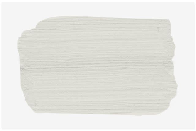
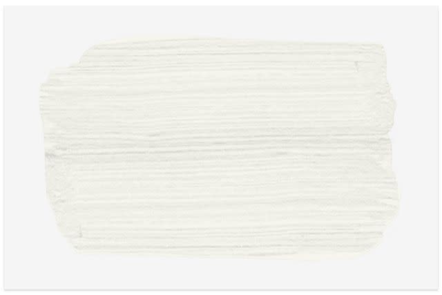
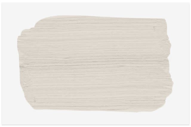
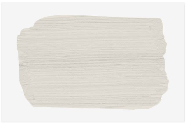
Benjamin Moore Silver Satin
The Spruce
"This popular off-white paint color certainly provides a light and airy look. It’s a subtle warm pale grey hue that complements many interior styles and light conditions. We appreciate that this color does not have present blue or green undertones." — Kate Davidson of Kate + Co
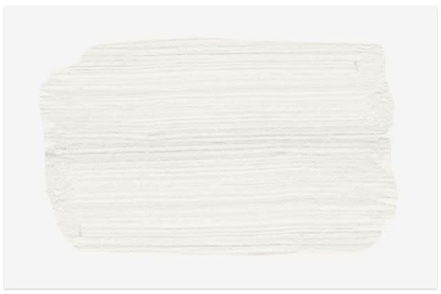
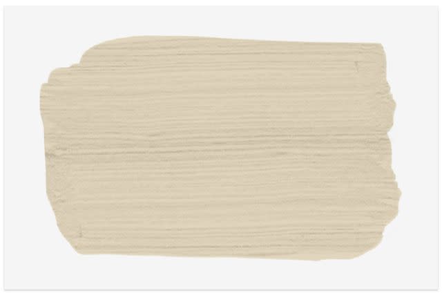
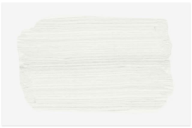
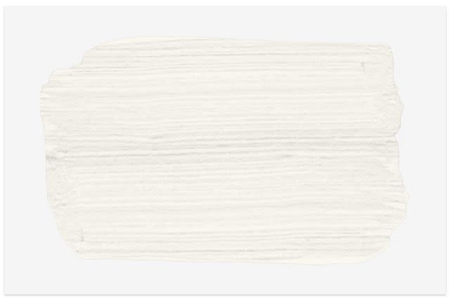
Dunn Edwards Warm White
The Spruce
"I love this white—it is warm enough to feel comfortable but crisp enough to read architectural which is always a challenge with white paint. It is the perfect white for an art filled interior with wood floors." — Matthew Boland of MMB Studio
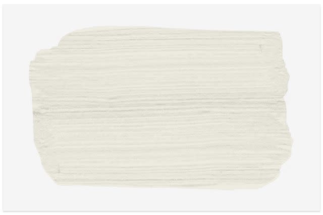
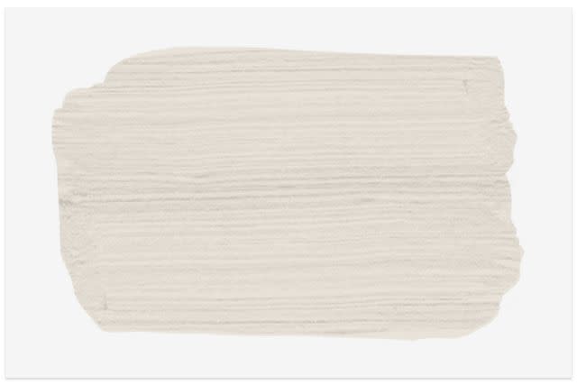
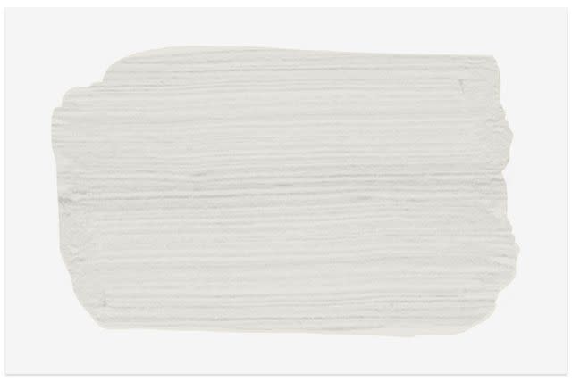
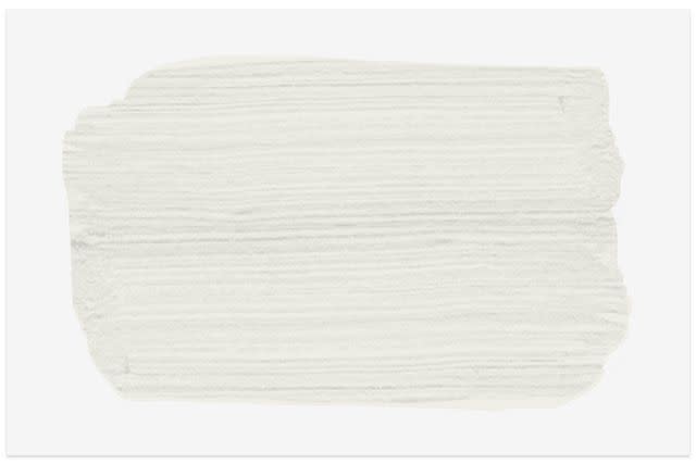
Benjamin Moore Swiss Coffee
The Spruce
"This is a beautiful off-white shade that works with multiple paint colors and interiors. It is a creamy white yet doesn’t have too much of a yellow tone underneath. We like the warmth of it and the comfort it gives to a room." — Amy Youngblood of Amy Youngblood Interiors
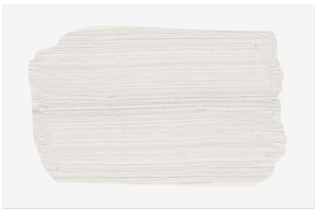
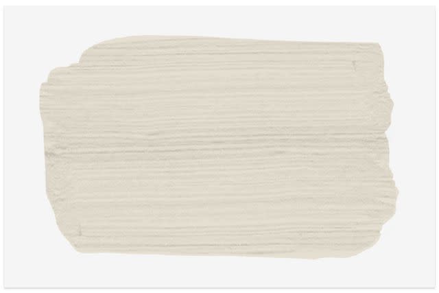
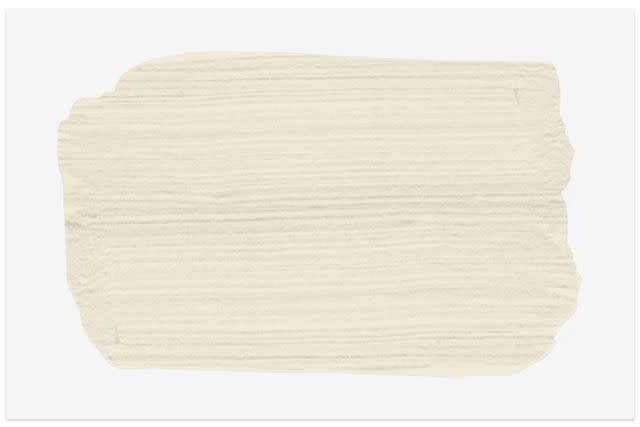
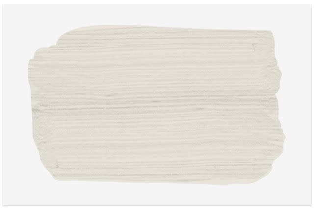
Sherwin-Williams Snowbound
The Spruce
"It's one of my favorite whites because it is warm without being too yellow. It has a very clean undertone—no green, blue, or pink hues." — Amy Leferink of Interior Impressions
Benjamin Moore Simply White
The Spruce
"This is great as it has no undertones and goes well with warm or cool aesthetics and is a perfect choice to use for walls as well as cabinetry." — Sherry Gibson of Isabey Interiors
Sherwin Williams Snowbound
The Spruce
"It doesn't lean too far cool or too far warm, making it a wonderful neutral to accompany any color palette. This color can be used throughout the entire house or in an office space as the neutral backdrop to layer upon." — Vy Truong of Very Handsome Studio
Farrow & Ball Off White
The Spruce
"If you want something creamy but still light with a bit of warmth, this is a great way to get a white in a room without being too stark white. I love this color for a cozy living room vibe, for a fireplace surround, or even on interior doors for a home. It's a really warm way of making your home feel like it's lived in and comforting." — Linda Hayslett of LH.Designs
Consider Natural Lighting
When choosing an off-white shade, consider the light exposure of your room to help you create the mood you want. For example, counterbalance the lack of direct sunlight in a northern-facing room with an off-white paint color that has a hint of yellow to brighten the space.
Sherwin-Williams Pearly White
The Spruce
"This color is a nice soft white with a creamy undertone, which has a nice traditional feel so that a client doesn't feel like they are getting bright white walls. We used this in a dining room area to make it a brighter space but still welcoming." — Megan Unger of Megan Robertson Design
Farrow & Ball School House White
The Spruce
"We love its rich ivory undertones and its approachability for interior walls. It has a very warm inviting feel, and works nicely in large rooms that have a lot of natural light and high ceilings." — Olivia Wahler of Hearth Homes Interiors
Sherwin-Williams Aesthetic White
The Spruce
"It's the perfect paint color when a true white is too stark or bright, but you still don't want too much color. It has a nice creamy color, but doesn't pull yellow, gray, or pink, which can be the case with some of the tinted whites." — Amy Forshew of Proximity Interior Design
Benjamin Moore Chantilly Lace
The Spruce
"This white is perfect for homes with interesting and eclectic art collections that we want to showcase, and it is typically predictable from room to room.” — Catherine Wilson of Catherine Wilson Interiors
Clare On Point
The Spruce
"This color is versatile enough to read brighter in spaces with ample natural light and more mid-toned in darker rooms. When the sun is out, it's beautiful and crisp. When the sun goes down, it's still warm and inviting. — Audrey Scheck of Audrey Scheck Design
Benjamin Moore Linen
The Spruce
"This is a top pick for off-white paint colors. It beautifully changes with the lighting of the space." — Robert Ventolo of Crain + Ventolo
Sherwin Williams Pure White
The Spruce
"This is a great color because it has very few undertones. There is the slightest bit of warmth in the pigment, so it doesn’t feel too stark; it is warm and inviting. This is a great go-to color for both trim and walls." — Kim Armstrong
Benjamin Moore Classic Gray

The Spruce
"This is an excellent color for walls. It is very warm, but with gray undertones. It might have a bit too much pigment to put on trim and cabinets but it is an excellent selection for walls." — Kim Armstrong of Kim Armstrong Interiors
Dunn Edwards Milk Glass
The Spruce
"We love its warm undertones, subtle softness, and that it feels nice and bright, but never stark and sterile. Our favorite applications for this color have been interior walls, especially with a contrasting trim." — Olivia Wahler
Benjamin Moore White Dove
The Spruce
"This is one of our favorite paint colors for kitchen cabinets. It's warm, timeless and pairs beautifully with tile and stone." — Molly Torres of DATE Interiors
Behr Campfire Ash

The Spruce
"I've used this color before and it's a great off-white that can bring a little bit of color into a space without making it feel sterile and cold." – Linda Hayslett
Benjamin Moore Seapearl
The Spruce
"We love using Seapearl in spaces that have both a lot of natural light and warm wood tones. The beautiful mushroom-y undertones in it do a fantastic job of pulling out the warmth of furnishings and artwork." — Olivia Wahler
Benjamin Moore Alabaster
The Spruce
"This is a nice off-white to use if you're looking for a soft white in a den, babies' room, moldings, wainscoting, or bead boarding. It's a nice subtle contrast that's not jarring if you use it with another white or if used with a contrasting color." — Linda Hayslett
Frequently Asked Questions
What is the most popular off-white shade of paint?
One of the most popular shades of off-white paint is Simply White from Benjamin Moore.
What colors most often make off-white look not pure white?
Creamy off-white is achieved by mixing pure white paint with a hint of yellow for a warm feel. You can also add a drop of red or brown to pure white paint for an off-white shade. Black will turn white paint gray.
Is off-white a warm or cool color?
Off-white can be warm or cool. Warm off-whites have hints of yellow, red, or orange, whereas cool off-whites have subtle green, blue, or purple undertones.
What is the best off-white paint color that doesn't have yellow undertones?
Pointing by Farrow & Ball is a favorite off-white that doesn’t have yellow undertones. Red undertones give this popular shade its warmth.
Read the original article on The Spruce.

