A 1923 Home Gets a Modern Update Without Sacrificing Character
David Tsay; Styling: Page Mullins
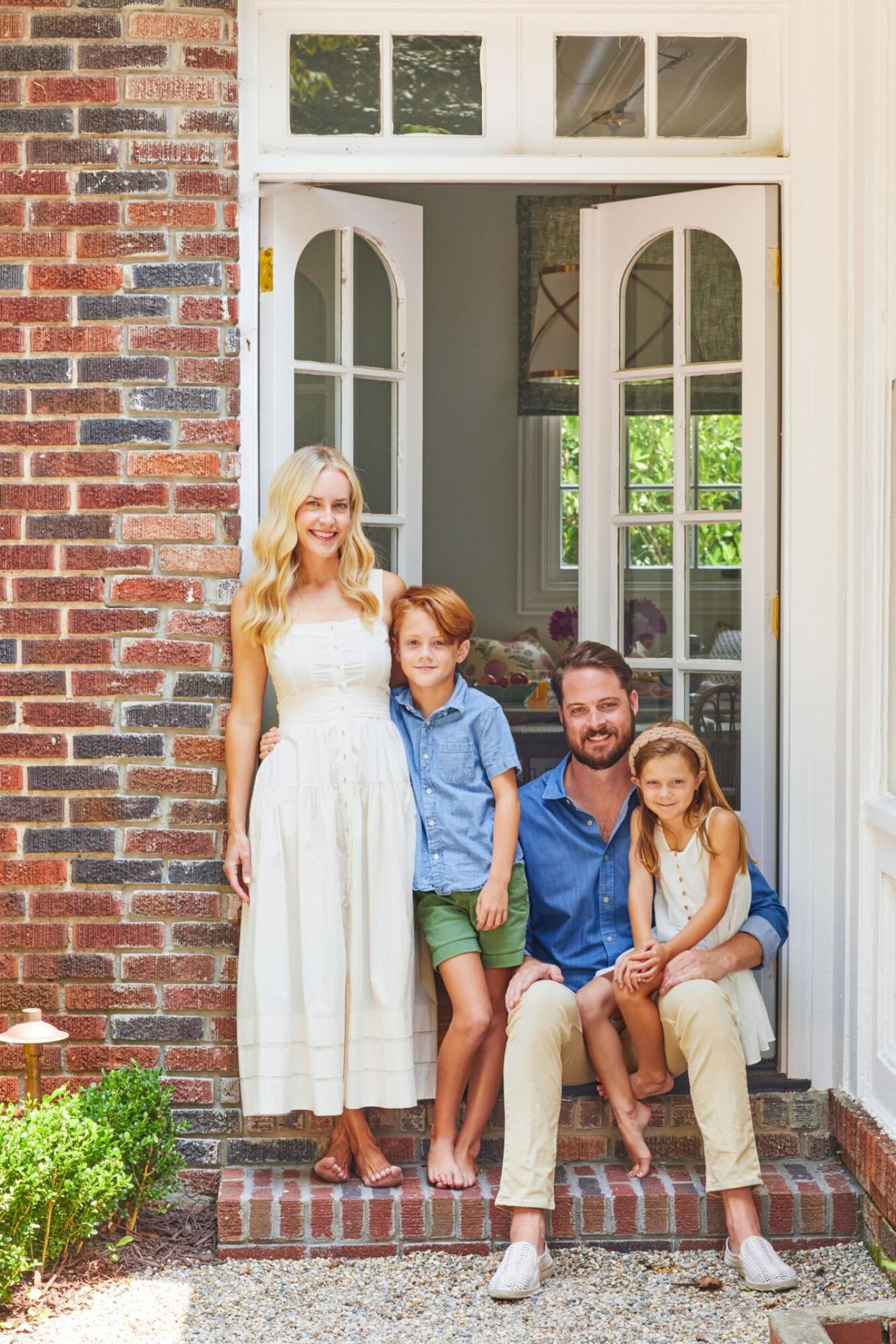
To see Alexis Simpson's gorgeous three-bedroom Atlanta Home now, it's hard to believe that the circa-1923 Druid Hills property actually sat on the market for more than a year. "The houses in Druid Hills are beautiful and have so much character," says Simpson, cofounder of Establishment Home (a design firm and online home-goods retailer). "But most people have lived in them for so long that there's an enormous amount of work that needs to be done."
Undaunted by the house's outdated bathrooms, ancient electrical fixtures, and antiquated kitchen, Simpson and her husband, Brad, promptly fell for its hidden potential. "I just walked in and instantly knew," she says. "It really was a love-at-first-sight experience."
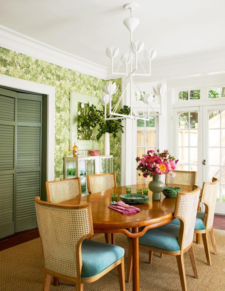
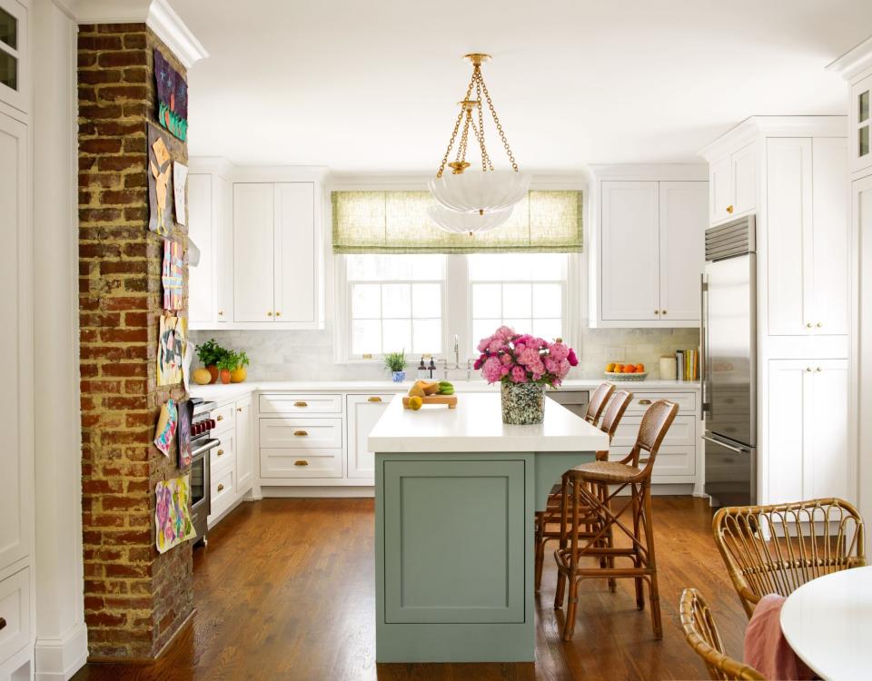
There was hardly a square foot that wasn't touched in the subsequent renovation, but most of the changes were cosmetic—apart from the kitchen overhaul, which absorbed a mudroom to create a larger, more functional space for the family of four. "We refinished all the floors, painted everything, put up wallpaper, and replaced all the lighting," says Simpson, who was determined to honor the history and style of the house while adding modern touches. That commitment meant maintaining the existing footprint and preserving the period design details, such as the weathered terra-cotta tile floors in the conservatory turned dining room. "Keeping a lot of those original characteristics—even if they weren't perfect—was really important to me," she says. "I didn't want to lose any of the house's uniqueness."
Throw in a Surprise—or Two
Simpson admits her style runs toward classic. She's passionate about antiques and loves florals, like the Lee Jofa print on the slipper chairs and window seat in the family room. To add a contemporary punch, she relies on funky lighting and eclectic art. "I like to have at least one unexpected thing in a room," she says. "It helps balance something that's more traditional, like a floral."
David Tsay; Styling: Page Mullins
Get an Outside Perspective
With an abundance of windows and doors, the home is designed to take advantage of the property's lush landscape. "I tried to bring an outdoor element into each space," Simpson says. In the dining room, which spills onto the patio through French doors, she chose a leafy Cole & Son wallpaper and a botanical-inspired chandelier by Julie Neill to complete the illusion of being outside. "I wanted it to feel playful but elegant, so turning to nature helped me get there," she says.
David Tsay; Styling: Page Mullins
Make it Friendly for Your Family
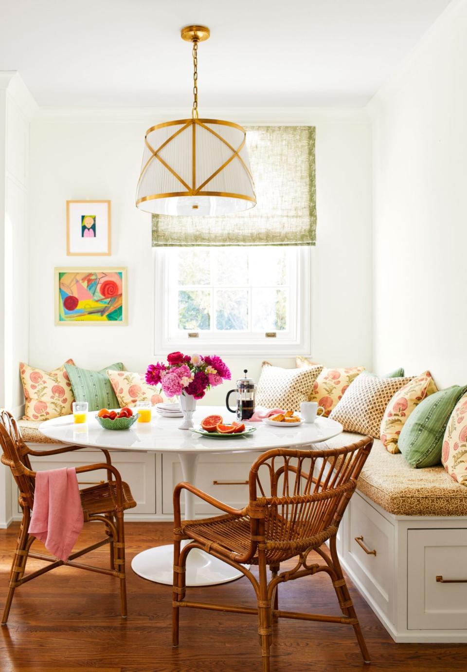
"I enjoy cooking, but I am not a five-star chef," Simpson admits. "I don't need all the gadgets. I just wanted something that we could really use." For this young family, that meant carving out enough square footage in the kitchen for a banquette and table. In addition to being a spot for sharing meals, it's a convenient place for the kids to color, do schoolwork, play cards, decorate cookies—you name it. Simpson can do her work here too.
David Tsay; Styling: Page Mullins
Listen to the House
"We call it the 'Green Room,' " Simpson says of this study-like area. "It had wood paneling when we bought it and was almost screaming at me to go moody." She believes in letting the house lead the renovation process, so she painted this space Farrow & Ball's Card Room Green (No. 79). She lined the bookshelves with vintage family photos and her collection of coffee-table books.
David Tsay; Styling: Page Mullins
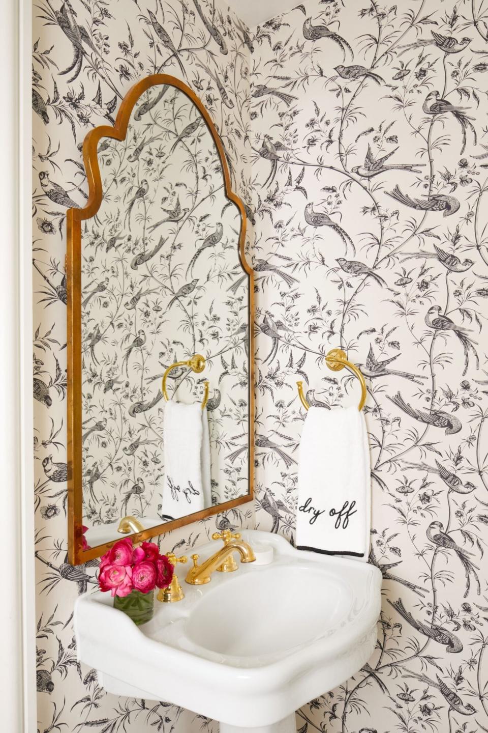
Revive a Hidden Gem
Simpson considered relocating this jewel box of a powder room, which is uniquely positioned under the stairs, but ultimately chose to keep it in its original location to maintain the home's historic layout—quirks and all. She freshened up the small space with a cheeky hand towel from Weezie, a vintage-inspired Brunschwig & Fils wallpaper, and new flooring and fixtures.
David Tsay; Styling: Page Mullins
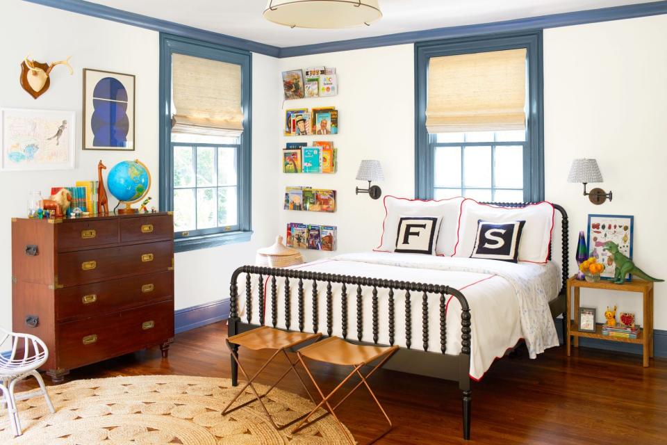
Play for Keeps
"Kids' rooms are often overdone," she says. "I think they're gorgeous, but children grow up so fast that I just can't commit to that kind of design." Instead, the mom of two created spaces that would age with them. She opted to keep the walls of her son Ford's bedroom neutral in Benjamin Moore's White Dove (OC-17) but gave the trim a boost with Benjamin Moore's Philipsburg Blue (HC-159). "Adding antiques can make a kid's room feel timeless," says Simpson, who scooped up Ford's campaign dresser at Atlanta's Peachtree Battle Antiques and Interiors.
David Tsay; Styling: Page Mullins
Find Creative Solutions
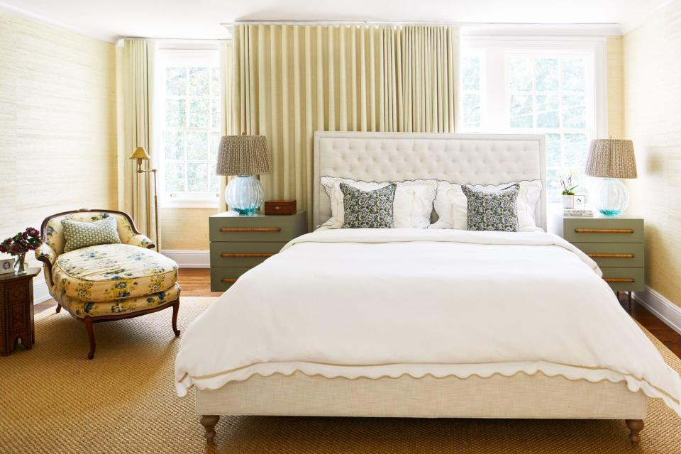
A pair of off-center windows in the primary bedroom initially had Simpson at a loss. "Even centered on the wall, the bed looked off," she says. She credits the window treatment team at Jim Davis Designs with brainstorming the work around: Install custom drapes on a track running two-thirds the length of the room and re-center the bed against the resulting backdrop, which earns bonus style points for blocking out early morning sunlight and softening the overall feel of the space.

