19 Pro-Approved Interior Door Colors We Love, From Bold to Neutral
Interior door colors don't have to be restricted to white. From basic black that adds drama and sophistication to lighthearted blues that give a space a refreshing, approachable look, to quirky colors like light green and pink, any color you would put on a wall can go on a door.
Ready to grab your brush and a roller? Here are 19 interior door colors to get your creative wheels turning.
Benjamin Moore Silver Song
When you want something that is close to white, but not quite, look at a color like Silver Song. This light silver gray adds a refined, styled look to a space that still feels bright and neutral.
Benjamin Moore Wrought Iron
"I love a classic black door with white trim," says Bethany Adams, Principal at Bethany Adams Interiors. "It goes with every style of architecture and color and because it hides everything, it's a practical choice too."
She often turns to Benjamin Moore Wrought Iron in a pearl finish. "It's a softer black that, combined with a low sheen finish, hides the 130 years of wear and tear my own doors have endured," Adams says.
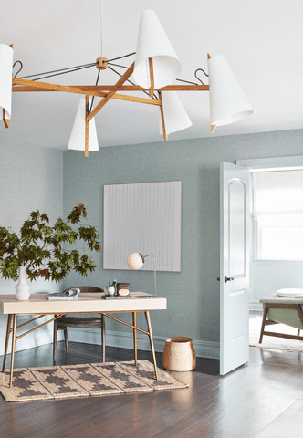
Sherwin-Williams Breakwater
This complex gray-blue from Kristin Harrison, founder of Bungalow 10 Interiors, evokes the moodiness of a stormy day. Use it as a neutral with a cool color palette to add more interest than a basic white, but without going too far into color territory.
Sherwin-Williams Maison Blanche
"In this Victorian era home we wanted to keep the palette warm and complementary to the wood tones in the adjacent kitchen," says Deidre Webster, owner and principal of Studio Day.
Webster painted the door a comforting shade of taupe. Sherwin-Williams Maison Blanche is the color equivalent of a warm hug, adding a cozy look to an otherwise neutral space.
Sherwin-Williams Hazel
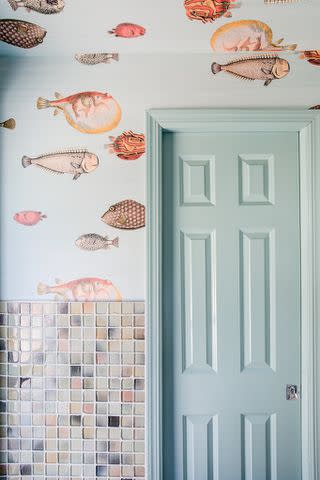
Design by Lola Tucker Interiors / Nicole Larson Photography
This breezy light turquoise in a powder room from Lola Tucker Interiors brings to mind the feeling of jumping into a refreshing pool on a hot summer's day. It's bright and airy, but adds a lovely touch of color. In this room, the designer tied it into the space by custom painting the sink in the same color.
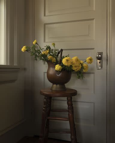
Benjamin Moore Litchfield Gray
Try a light, sandy taupe on the doors to break up a neutral white wall. It doesn't weigh the space down or distract the eye, but adds just enough of a layered look to keep the space interesting.
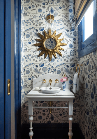
Sherwin-Williams Delft
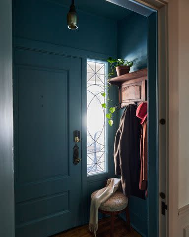
"Sherwin-Williams Delft is the perfect welcoming color," Webster says. "It’s bold but neutral and complements a wallpaper, like the William Morris wallpaper we have in the dining room next to it. I’m obsessed."
This rich color adds a moody look, but can be brightened up with lighter colors.
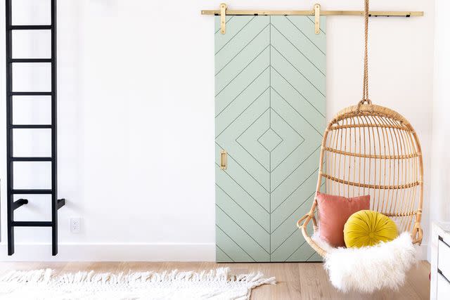
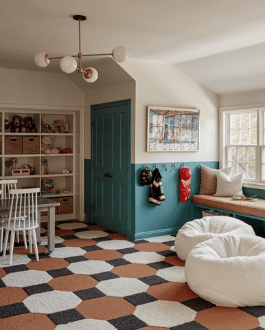
Benjamin Moore Cove Springs
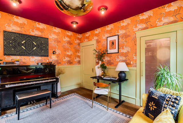
If you're not afraid to make a statement, go vibrant on every surface. Use a different color for walls, ceiling, and doors and trim. You might not think orange, red, and green would work together but, in this space, they do. The doors would never stand up to the saturation if they'd been left a plain white.
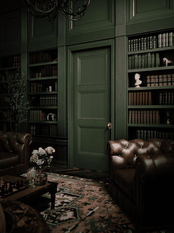
Benjamin Moore Black Forest Green
"Benjamin Moore Black Forest Green is the closest thing I can find to Charleston Green," says Jen Bienvenu, Interior Decorator and Vintage Dealer at J. Bienvenu Interiors, who uses the dark black-green color on both interior and exterior doors.
"Sometimes I have it darkened by 50% which is really just removing the white from the mixture and adding back in Black Forest Green for more of a black with green undertones."
Kilz Magnolia Home Collection Tranquility
Webster used Kilz Magnolia Home Collection Tranquility, a dusty teal, to color wash this room, including the door. The result is a moody space that feels vintage-inspired with its rich, dark tones.
Behr Alice White
A light powder blue interior door color goes with nearly any type of decor. In this room by Casa Watkins Living, Behr's Alice White adds a neutral foil to a vibrant neon orange. But it would look equally pretty paired with all-white or neutral decor.
Benjamin Moore Galápagos Turquoise
Try a rich teal door against a palette of neutrals to give the room a focal point. This door is connected to the rest of the room through a color blocked chair rail effect in the same color.
Sherwin-Williams Rookwood Green
"For your home office or study, you can choose a bold, powerful color such as Sherwin-Williams Rookward Dark Green to help boost your confidence for important meetings while working from home," says Jennifer Renaud, SVP & Chief Marketing Officer at Masonite.
Sherwin-Williams Azure Tide
A vibrant blue that falls somewhere between cobalt and navy is perfect on a door in a high gloss. Choosing a striking hue from a wallpaper in a room helps the door anchor the room.
Farrow and Ball Studio Green
A moody gray-green is always a good choice for an unconventional neutral shade on a door. This color washed effect feels historic and traditional.
Benjamin Moore Rose Parade
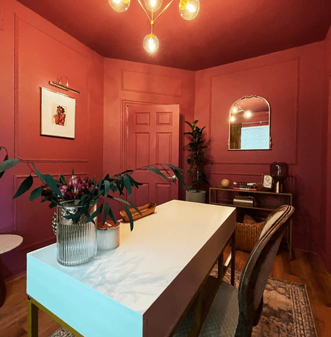
If you're choosing a bold color, go all in. Paint everything ceiling to floor, including the door, in a vibrant shade like this rose pink.
Behr Himalayan Mist
A barely there, misty shade of turquoise is a great white alternative for a door, particularly in a room with a coastal feel.
Sherwin-Williams Drift of Mist
"I love Sherwin-Williams Drift of Mist as a warm neutral with a tiny hint of gray," says Lauren Sullivan, Founder and Principal Designer of Well x Design. "It provides balance in areas receiving a lot of warm, golden-hour natural light—interior doors included."
Sherwin-Williams Agate Green
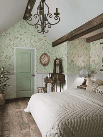
A calming hue, like this bright spring green, feels both lively and relaxing at the same time, making it a perfect color for a bedroom door.
Read Next: 20 Best Interior Paint Colors Most Popular With Decorating Experts
Read the original article on The Spruce.

