19 Incredibly Cool Maps About The United States That Will Make You So Much Smarter
1. First cool thing: The numbers used for our Interstate Highway System aren't random...they all mean something specific.
It's not just that east-west highways end in a zero and north-south freeways end in a five, or that the lower numbers start in the west/south and get higher as you move east/north. The numbers indicate a LOT of other cool things too. For example, a number like 270 indicates it will eventually hit the major interstate 70. This article explains it all well.
2. Los Angeles County has a larger population than 40 actual states!
This graphic, I think, is a little off. It shows only seven states with larger populations than Los Angeles County, but — according to the 2020 census — there are 10 states with more than Los Angeles County's 10.04 million residents (California, Texas, Florida, New York, Pennsylvania, Illinois, Ohio, Georgia, North Carolina, and Michigan).
Still...I never would've imagined that!!!! Time to apply for statehood, Los Angeles, LOL!
3. This topographic map of the US is fascinating — no wonder early pioneers (like the Donner party) had so much trouble heading west!
4. Also fascinating? This map that has the deets behind the territories the United States purchased.
5. This map, meanwhile, shows you where native tribes lived in North America before Europeans showed up.
Want to dig deeper into the historical tribes of North America? Check out this article about Native map maker Aaron Carapella.
6. This map — based on Google Trends search data — charts the fetishes of Americans. Just so you know, there will be no kink shaming from me! Except maybe Pennsylvanians. Balloons? Really? BALLOONS?!
Credit: Future Method
I'm not even sure what "balloons" means in this context, and I won't be googling it. Good day, sir!
7. Want to know which states pay more to the government than they get back and which states get more from Washington than they put in? It's pretty eye opening.
Map of the US states that pays more tax than what they receive from the government, courtesy of CGP grey from coolguides
For more detailed info, check this out from the Rockefeller Institute of Government.
8.This map shows life expectancy in the different counties throughout the USA — looks like the Upper Midwest is a good place to go if you want to live a while!
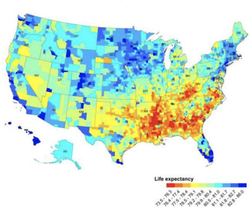
Want to search life expectancy by country, state, or zip code? Do it here.
9. Here's a map that shows the biggest employer in every state...and holy crap, I had no idea Walmart was that big!
This is pretty cool from Visual Capitalist! The biggest employer in each state of the USA. from coolguides
Credit: Visual Capitalist
10. This cool map gives you a sense of how North America's climate compares to the rest of the world.
11. And this one tells you how much snow is needed to cancel school by county.
People in California/Texas/Florida seeing one snowflake falling: "That's it! School is canceled!"
12. This map breaks up the US by cultural regions...interesting!
13. Did you know the regional water brands on the map below are all made by the same company?
These brands are all actually now owned by BlueTriton Brands. Nestlé, which previously owned all these brands, sold them last year.
14. This map shows you the true sizes of countries as opposed to how they look on the famous Mercator projection map.
A little background: Since the world is spread out over a globe, depicting sizes accurately on a flat map is difficult. The Mercator projection map is probably the most famous map (and the one we looked at growing up), but it makes some countries look way bigger than they really are.
15. Here's where the foods we eat are grown in the United States. So, if you want to pick blackberries, you'll have to go to Oregon and Oregon only.
16. I love this one — a map of where cryptids are said to live in the wild. If you're wondering, cryptids are animals, often from folklore, that mainstream science says don't exist.
Credit: Dan Meth
Note to reader: I may have lost an hour today googling these. They all have quite the story!
17. This map showing where presidents were born surprised me — only 21 states (or 42% of the country) have been the birthplace of a prez!
Credit: Live Science
This map doesn't mention President Trump (born in New York) or President Biden (born in Pennsylvania). For the record, Virginia has been the birthplace of the most presidents (8), followed by Ohio (7), New York (5), and Massachusetts (4).
18. This map — for whatever reason — details the legality of marrying your first cousin, state by state.
Since an inaccurate map was recently posted, here is a more up to date and informative map of first cousin marriage legality in the United States (although it is still likely to have discrepancies, so I recommend looking up the laws of your state to be completely sure) from coolguides
19.And lastly, Terrible Maps was true to their name with this terrible — but impressively accurate — map.
Does their state flag have toes?

