19 Fascinating Charts That Even People Who Hate Charts Will Grudgingly Love
As you might've noticed, I LOVE charts. But even if you're only lukewarm on charts, I promise, you are going to love these:
1.First, someone needs to send this chart to Leo to help him see his dating life is getting more than a tad awkward:
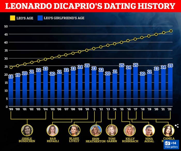
It's, like, no, Leo, there isn't room next to the twenty-year-old on the floating door! You're almost 50!
He really is the real-life version of Matthew McConaughey's character in Dazed and Confused.

2.If Leo wants to settle down he can afford the wedding, even if this chart shows the average wedding in the US has gotten pretty pricey:

People spend the most in California at $77,000, while New York and Massachusetts are tied for second place with $46,000 per wedding.
Meanwhile, people spend the least in Wyoming at $9,000. The second most affordable wedding state? Utah at $16,000 (low-budget, yes, but at least they'll probably have green Jell-O salad!).
3.This chart tells us which countries have more males or females — and YIKES straight men in Qatar better learn some good pickup lines or buy a new shirt or something as only 24.85% of the population is female:

4.Here's just how much — shakes — caffeine is in your favorite — jitters — energy drinks:

As it turns out, Reign, Redline Xtreme, and Raze Energy have the most caffeine at 300 milligrams...
...while surprisingly Red Bull comes in as the drink with the least, with only 80 milligrams.
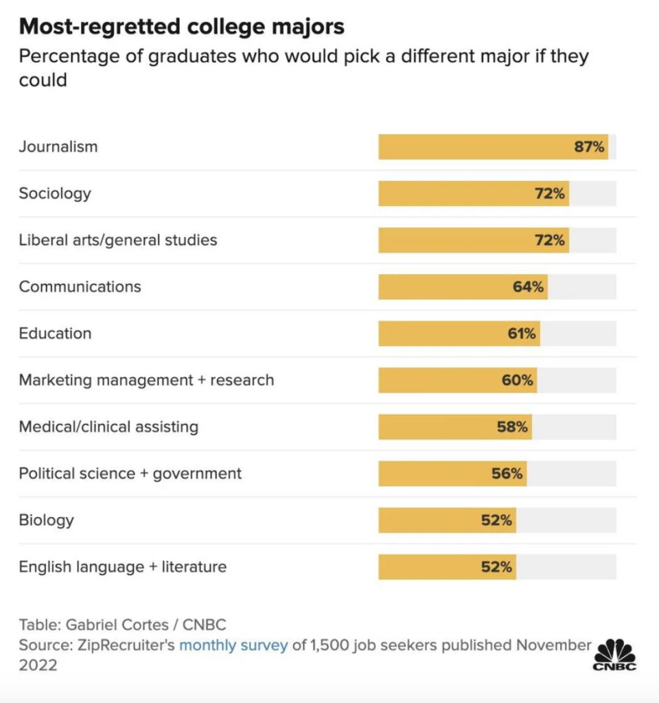
5.College costs more than ever these days...here are some majors you might want to reconsider:
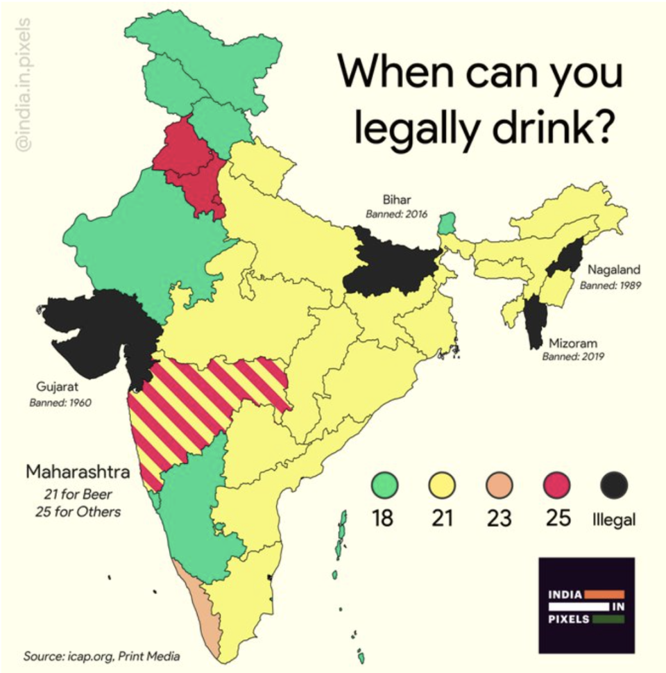
6.OK, I did NOT know this — India has wildly different drinking age rules, ranging from as young as 18 in some spots...to a total drinking ban in others:
7.This equally sobering chart shows how staggeringly much toilet paper we use:
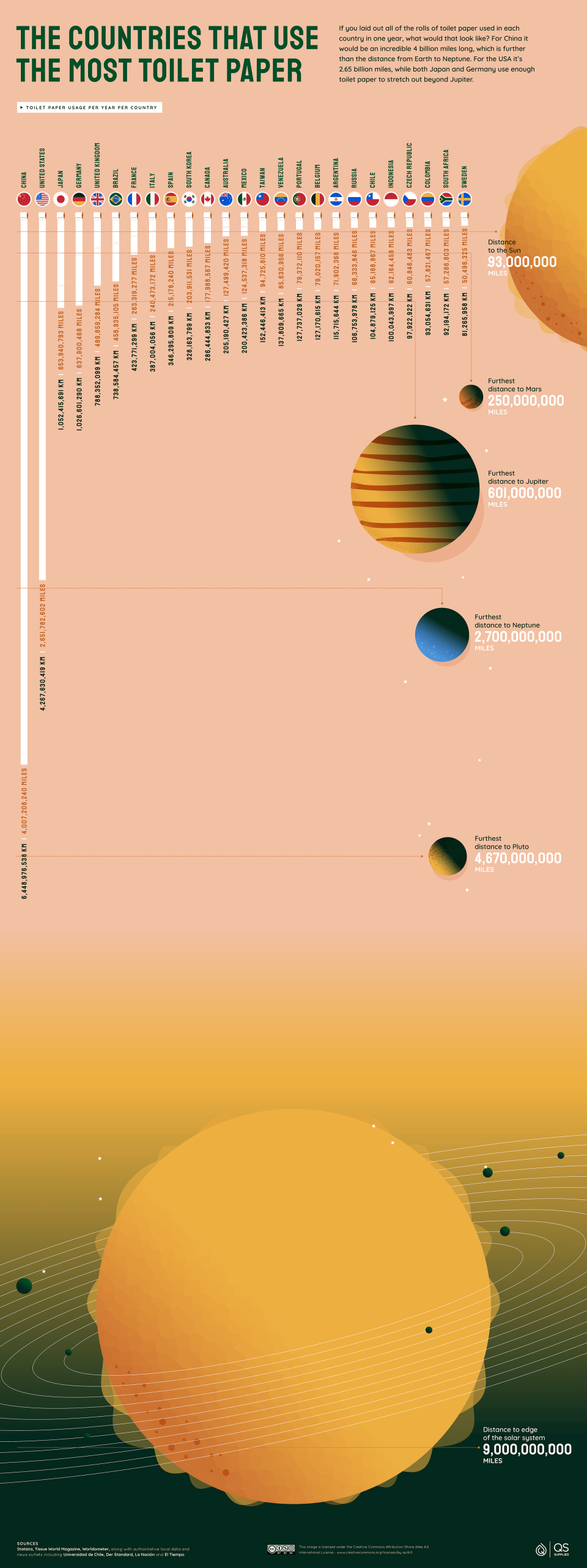
LOL, China! You're the worst! USA! USA! USA! (Oh wait...I, uh, just looked at the per capita numbers. Awkward. Sorry, China.)
8.Speaking of waste and junk...did you know (!!!) there was a giant, freaking garbage patch in the Pacific Ocean:
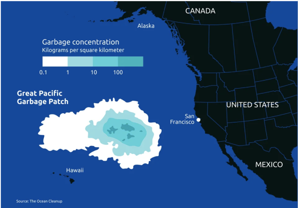
Well, I guess if your plane ever goes down on the way to Hawaii you can always chill atop the giant pile of trash waiting to be rescued. (Just kidding! Sorry, that was a trashy joke.)
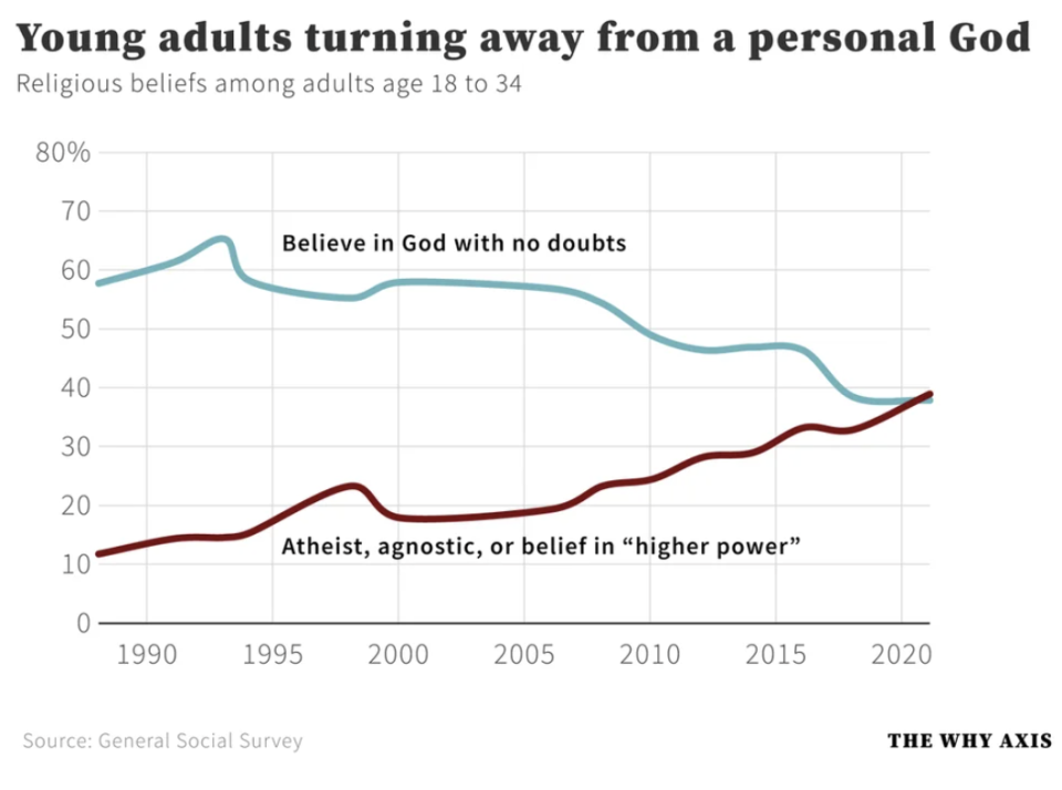
9.Here's another interesting one — young adults are less religious than they were 30 years ago:
10.We all know the USA spends an outrageous amount of money on the military budget, but this puts in stark terms:

What we pay for planes and bombs and whatnot in one year could guarantee every American has a roof over their head for FIVE YEARS! Look, I'm just a simple caveman lawyer (that one's for you, fellow olds), but couldn't we just spend $618 billion per year instead and get all the unhoused off the streets?
11.If you saw my question above about whether we could afford to make cuts to our defense budget — holy crap — the answer is YES! YES! YES! according to this chart:

12.And to drive home the point even more, look at the advantage the USA and their NATO allies have:

13.OK, let's look at something a bit less serious...here's how the popularity of car colors has changed over the years:
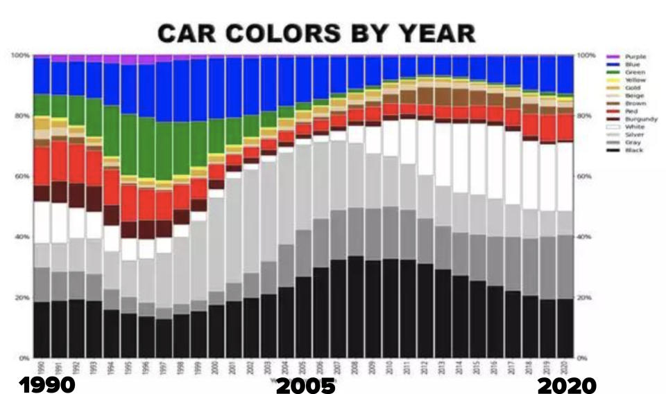
People in the '90s really loved their green cars, huh? I guess I kinda remember it being a fairly popular minivan color.
14.Here's the most spoken languages (excluding English and Spanish) in each US state:

I was surprised to see the most common language in New York (after English and Spanish) was Chinese and not the widely spoken Fuggedaboutit.
15.This chart explaining about the mobs of New York is fun (I mean, as fun as a chart can be about a murder-happy organization):

16.This one's no surprise at this point, but look at the USA's rate of gun-related homicides and gun ownership compared to the rest of the developed world:

Man, that's terrible, huh? I guess I should fix it by saying "thoughts and prayers" or something.
17.This chart — showing the metro areas in the USA where more than 5% of the population uses public transit to get to work — is going to be SOOOOO funny to look at after the environmental apocalypse when we're living underground:

18.This chart is sad but interesting — it shows where Ukrainians fled to during the first year of the war:

19.And lastly, here's something fun and interesting to end on — the times people in Europe have dinner! (Having just got back from Portugal, I can tell you their 9–10 p.m. dinner time is real as I was falling asleep at the table!):

On my next trip I think I'll go eat some early bird dinners with those beautiful Swedes!

