18 Warm Paint Colors for a Cozy and Inviting Space
- Oops!Something went wrong.Please try again later.
If you want to infuse some warmth into your home, consider using one of these beautiful paint colors.
Courtesy Benjamin Moore
Selecting a paint color can set the tone for an entire space. If you're looking to envelop a room in a sense of coziness, you're likely to choose warm paint colors from the red, yellow, and orange families on the color wheel. But, even neutrals like grays and whites (and some blues!) can read as warm depending on the undertones they have—a gray or white with pink or yellow undertones is going to be a warmer shade than a neutral with green undertones, for instance. Ahead, we talked to designers and paint experts about their favorite warm paint colors that will create an inviting space.
Related: 20 Nature-Inspired Paint Colors That Bring the Outside In
Cola by Farrow & Ball
Courtesy Farrow & Ball
Ground your space in a deep brown paired with an off-white. "Warm brown lends more of a rural sensibility when paired with a drab off-white," says Patrick O’Donnell, Farrow & Ball Global Brand Ambassador. "Think Cola (above on the cabinet) from our Archive palette with Tailor Tack (a clean, pink-white)."
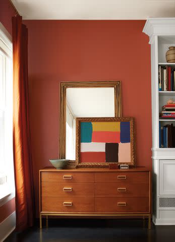
Pomegranate by Benjamin Moore
Courtesy Benjamin Moore
Reds can be a very bold statement color that not everyone wants to embrace, but a muted pink-red, like Pomegranate from Benjamin Moore, might be the perfect warm color alternative. "This red hue is an ideal choice when a color from this family is desired, but with a muted quality that makes it easy on the eye," says Andrea Magno, director of color marketing and design at Benjamin Moore. "Pomegranate brings the right amount of warmth to the walls, making it a favorite from the red offering. This color is surprisingly usable in a variety of rooms—from the traditional red dining room to some more unexpected spots like a burst of color in a powder room."
Dainty Lace by BEHR
Courtesy BEHR
If you don't want to stray too far from the neutral color palette, BEHR's Dainty Lace is a perfect warm neutral that looks fantastic in a kitchen. "Dainty Lace is a gentle creamy color that brings a sense of nostalgic calm to any space," says Erika Woelfel, BEHR’s VP of Color and Creative Services.
Related: How to Use Paint Swatches the Right Way (and Pick the Color You Really Want)
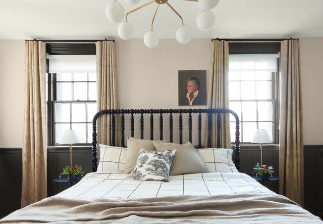
Dix Blue by Farrow & Ball
Courtesy Farrow & Ball
Don't sleep on warm blues. "Whilst this may sound counterintuitive, some blues can feel warm too, especially those of a more aqua note (a little green running through), such as Dix Blue, which is heaven for a bedroom," says O'Donnell.
Chestertown Buff by Benjamin Moore
Courtesy Benjamin Moore
Those looking for a sunny, warm yellow that isn't too bright can find it in Chestertown Buff by Benjamin Moore. "With a traditional appeal and the ability to bring sunny warmth to a room, Chestertown Buff has become a go-to golden color," says Magno. "Deeper yellows can be tricky, but Chestertown Buff is a gentle hue with the tiniest touch of orange in its undertone, making it a great choice for the home."
Drop Cloth by Farrow & Ball
Courtesy Farrow & Ball
A mid-gray beige, Drop Cloth by Farrow & Ball has warm, yellow undertones mixed with traditional gray, making it a perfect warm neutral if you want something a little less bold.
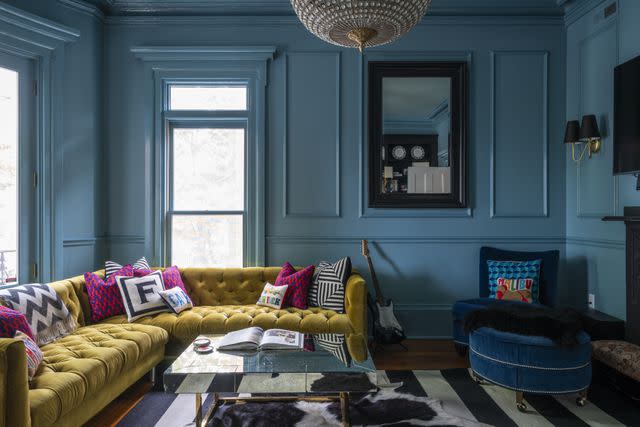
Hague Blue by Farrow & Ball
Heather Peterson Design
In this second-floor family room designed by Heather Peterson, a moody blue takes center stage for a space centered on evening lounging that doesn't get a ton of natural light. Peterson chose to drench the room in Farrow & Ball's Hague Blue. "The house is Edwardian and the clients have modern taste, so we knew we would keep the original woodwork in this former dining room, but wanted to update it by drenching the whole room in a single color," Peterson says. "We love the mystery of this color, which shifts a little more blue or green depending on the light. It's warm enough to meld with the vintage walnut accordion screen and the leather sectional."
India Yellow by Farrow & Ball
Courtesy Farrow & Ball
Yellows naturally evoke warmth, and India Yellow by Farrow & Ball is no exception. "For something more energetic, a saturated ochre like India Yellow exudes masses of character and warmth," says O'Donnell. "Not to mention, it looks blissful in a bathroom."
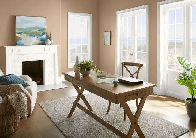
Even Better Beige by BEHR
Courtesy BEHR
Employ a versatile neutral, such as BEHR's Even Better Beige, for a warm color that isn't overpowering. "This shade can be leveraged on its own to create monochromatic looks in kitchens or baths or can be paired with pops of color to personalize any space," says Woelfel.
Related: 13 White Paint Colors Interior Designers Reach for Time and Again
Jitney by Farrow & Ball
Courtesy Farrow & Ball
Neutrals don't have to be cool—they can actually be warm if you choose the right tone. "Stony, earthy mid-neutrals can be your friend if you don’t want to explore too much color in your scheme," O'Donnell says. "Take Farrow & Ball's lovely sand-inspired Jitney (above) or the slightly deeper, more saturated London Stone, for example. Both act as good foils for any decorating tastes and, more importantly, can be flexible enough for any room."
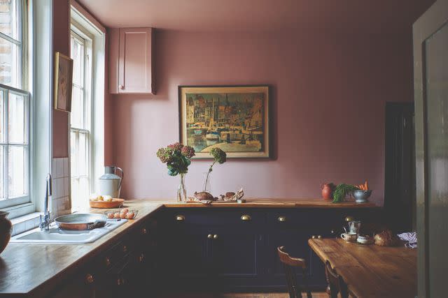
Setting Plaster by Farrow & Ball
Courtesy Farrow & Ball
A beautiful, muted pink can read both warm and sophisticated at the same time. "For a more concentrated depth of color, earthy, muted pinks work a treat," says O'Donnell. "Setting Plaster acts as a neutral in the sunniest of spaces whilst also giving warmth in more darker parts of your home."
Cinnamon by Benjamin Moore
Courtesy Benjamin Moore
Consider drenching a small den or dining room in this rich, warm red, Cinnamon by Benjamin Moore. "This spice-inspired hue exudes a sense of warmth that truly sets a comforting mood," Magno says. "Cinnamon takes a step away from brown with the addition of orange in its undertone, making it a lively and easy-going color."
Related: Mood-Boosting Paint Colors for Every Room in Your House
Annapolis Gray by Benjamin Moore
Courtesy Benjamin Moore
Grays can read warm, with the right undertones, like Benjamin Moore's Annapolis Gray. "Annapolis Gray perfectly bridges gray and beige, resulting in a hue that works well with many other colors from light to dark," says Magno. "With the right amount of warmth in its undertone, Annapolis Gray provides a great option when aiming to move away from cooler grays."
Related: These 10 Neutral Paint Colors Are Interior Designer-Approved—Shop Them Now
Sulking Room Pink by Farrow & Ball
Courtesy Farrow & Ball
An even deeper shade of pink works well in spaces itching for just a little more depth. "The faded rose glamour of Sulking Room Pink carries a little brown beneath its blush," says O'Donnell.
Basketry by BEHR
Courtesy BEHR
Pulling from natural color influences, BEHR's Basketry is warm and welcoming. "This shade offers flexibility to play with and ultimately transforms a space from a place of rest to creativity," says Woelfel.
Related: How to Pick a Paint Color the Right Way
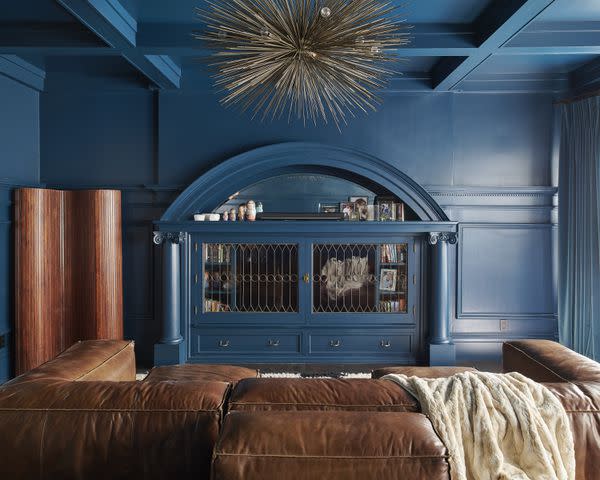
Studio Green by Farrow & Ball
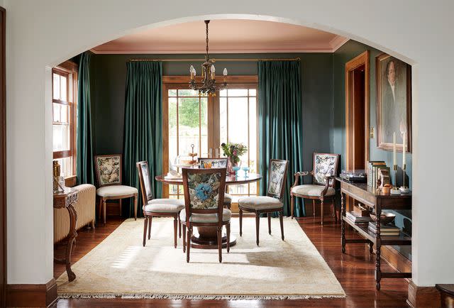
Heather Peterson Design
Farrow & Ball's Studio Green perfectly complements the red-hued hardwood floors and wood furniture, as well as the light pink ceiling in this dining room. The flood of natural light helps the paint color read rich and warm instead of simply dark. "In this Minneapolis home, the dining room is a passthrough from the living room to the kitchen. We used this deep, rich, black-green to slow you down and create a sense of destination," Peterson says. "The warm undertones are complementary to the original oak woodwork, and the color serves as a dramatic, high-contrast backdrop to the light elements in the room."
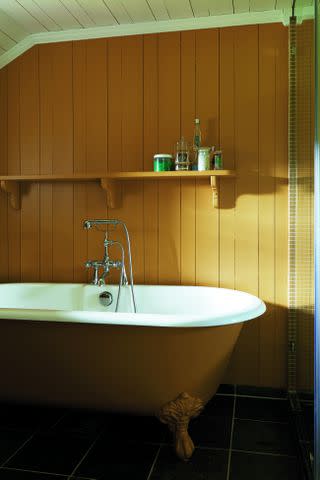
Dead Salmon by Farrow & Ball
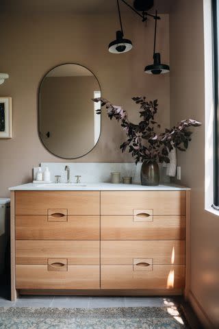
Yond Interiors
Bathrooms don't have to feel sterile and cold—warm them up with a warm, pink-toned neutral instead. "This bathroom is tucked away in a secondary bedroom and we wanted it to feel unexpected," says Julia Miller, creative director of Yond Interiors. "We drenched this bathroom in one of our all-time favorite paint colors—Dead Salmon by Farrow & Ball. It’s honestly a magical color; everyone sees it a little differently and the light shapes the color in such a beautiful way."
Related: 10 Paint Colors That Make Small Bathrooms Feel Bigger
Mink by Benjamin Moore
Courtesy Benjamin Moore
A statement color like Mink by Benjamin Moore is warm, inviting, and dramatic—consider it for an entryway or even a small study. "A super dark brown, Mink delivers dramatic, deep color that serves as an alternative to a black paint color," Magno says. "Mink has a touch of softness that adds to its appeal, plus it works with many other colors from a crisp white to a pale blue or blush."
Read the original article on Martha Stewart.

