15 Underrated Paint Colors Designers Wish You Knew

Browne House Interior Design / Photo by Molly Culver
With so many interior paint colors to choose from, it's easy to overlook a few gems. So that you can expand your radar of amazing hues, take a look at these 15 underrated paint color favorites that designers love and wish their clients would request more often.
Benjamin Moore Crème Caramel 910
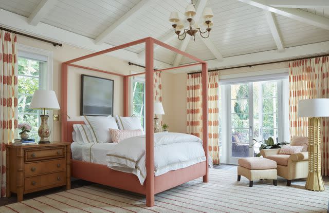
Design by Kristen Rivoli / Photo by Brantley Photo
Kristen Rivoli, the founder of Kristen Rivoli Interior Design, says the shade gives a wonderful soft coral glow. She notes that while the color changes with the light, it never appears dark and recommends using it in bedrooms and bathrooms alike.
Sherwin-Williams French Roast SW 6069
Donna Mondi Interior Design / Photo by David Patterson
Looking to go bold? Donna Mondi, designer and founder of Donna Mondi Interior Design, loves doing just that with French Roast.
"This earthy red hue is the perfect choice to infuse a burst of color into any space, whether it be a Bauhaus-inspired, texture-filled living room or adding depth to a contemporary stairway," she says.
Benjamin Moore Athena 858
Stick to a tried and true classic from Rebekah Zaveloff, co-founder and creative director of Imparfait Design Studio.
She says that Benjamin Moore Athena has been her go-to off-white cabinet choice for the past five years, but she also enjoys using it on walls.
"It has a beautiful warm pink undertone that is so serene and soft and it layers well with brighter (and more mainstream) whites," Zaveloff says.
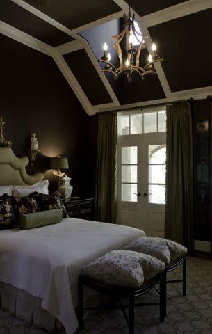
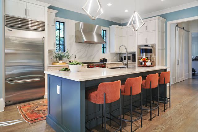
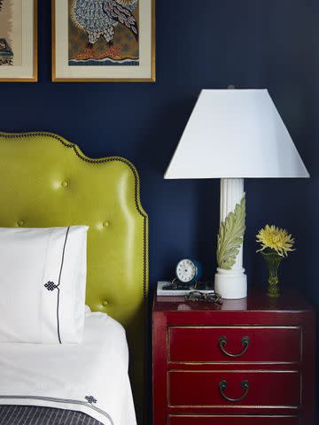
Benjamin Moore Hamilton Blue HC-191
Browne House Interior Design / Photo by Molly Culver
Struggling to find your signature blue? Rachel Little, the founder of Browne House Interior Design, swears by this one, which she describes as a pretty medium blue with an extra touch of yellow that lends a subtle green undertone and is considered a cheerful color.
"It works well in spaces that additionally utilize a good amount of negative space for neutral colors so the blue won’t become overwhelming," Little says.
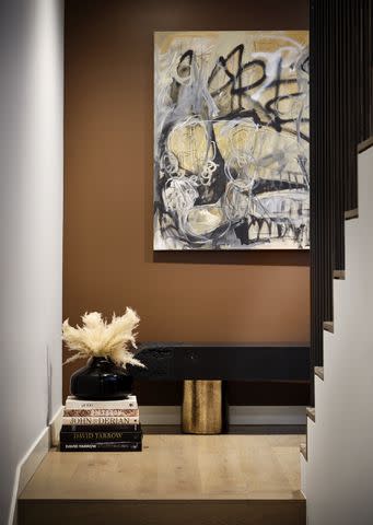
Pratt and Lambert Sicilian Umber
Audrey Curl Interiors / Photo by Jennifer Siu Rivera
Don't be afraid of working with the color brown. "This is such a notable brown color that we even painted it on the ceiling," Audrey Curl, the founder of Audrey Curl Interiors, says.
She explains how it's a lively and rich color perfect for any space.
Sherwin-Williams Repose Gray SW 7015
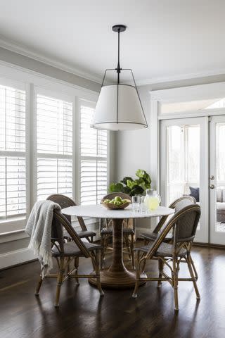
Paige Designs / Photo by Catherine Nguyen
Nice and versatile, Repose Gray is one of Paige Dick's, the founder of Paige Designs, staple colors.
"I love that this color adapts to various design styles, and works well with blue and green colors, which I often use in my designs," she says.
The designer likes to coat walls in this hue when she wants to avoid overshadowing a room's special features whether it's captivating artwork or nature-filled views.
Farrow & Ball Calamine No. 230
Design by Sasha Bickoff / Photo by Patrick Cline
"This shade of pink is very soft and elegant and takes on the role of a nude," Sashae Bikoff, an interior designer at Access to Design at The New York Design Center, says.
Bikoff loves how it offers more personality than a neutral and can work well with other colors and textures.
Sherwin-Williams Icelandic SW 6525
Design by Sapphire Pear / Photo by Caitlin Antje
Barrie Spang, the founder of Sapphire Pear, loves this icy hue.
"It draws interest while maintaining a soothing and livable environment," Spang says. She likes how it looks alongside bright whites and louder hues and considers it to be a fabulous neutral choice.
Sherwin-Williams Delft SW 9134
Krysten Ledet Interiors / Photo by Laura Steffan
Great for modern and traditional spaces alike, Krysten Ledet, the founder of Krysten Ledet Interiors, loves this neutral because it seamlessly blends into any design and transforms any boring space into an elevated retreat.
She likes to use it alongside both white and dark colors for maximum effect.
Benjamin Moore Bunny Gray
A light gray, this shade is fresh and perky in nurseries, living rooms, and beyond, Julieta Alvarez, the founder of Julieta Alvarez Interiors, says. She recommends it for a south-facing room when possible because the blue undertones will help balance everything out.
Benjamin Moore Horizon OC-53
Design by Konstant Home / Photo by Dustin Halleck
While it's one of many neutral paint colors on the market, this hue has its own individualistic charm, Natalie Konstant, the founder of Konstant Home, says.
She calls the color because it's warmer than gray, but more sophisticated than blue. It will instantly add depth and coziness to a room.
Sherwin-Williams Shiitake SW 9137
Donna Mondi Interior Design / Photo by Aimee Mazzenga
Mondi is all about this warm neutral.
"This color is a true chameleon and will perfectly compliment your warm wooden cabinetry while capturing the rich tones of exotic stone countertops," Monday says.
Benjamin Moore Symphony Blue 2060-10
Tara McCauley, an Interior designer at Access to Design at The New York Design Center likes to use this color to add a bold effect on traditional interiors.
"It’s counterintuitive, but in a small room, this color tricks the eye and can create a sense of depth if painted in a matte finish," McCauley says.
Sherwin-Williams Inkwell SW 6992
Zaveloff says she has relied upon this blue/black cabinet color for nearly a decade.
"It satisfies a client’s desire for navy but without too much of a commitment because it’s more of a black," Zaveloff says.
In the kitchen, pair it with brass or polished nickel.
Benjamin Moore Essex Green HC-188
Sometimes the best paint colors come from unexpected places. Zaveloff discovered this one in a European magazine.
"It is the perfect green, and depending on the light it goes from emerald to black," she says, adding that it looks fantastic with brass.
Read Next: How to Identify Paint Color Undertones When Designing a Color Scheme
Read the original article on The Spruce.

