15 Office Paint Colors to Revamp Your Home Workspace
The Spruce / Almar Creative
When it comes to deciding on a paint color for your office, take what you need: An energy booster or a sense of calm. Warm colors, like orange, pink, or yellow can make you feel lively and inspired while you work. At the same time, neutrals and cool tones are perfect for curating a peaceful atmosphere.
Whichever direction you want to take your workspace, here are some of our favorite home office paint colors you'll want to swatch.
Light Gray
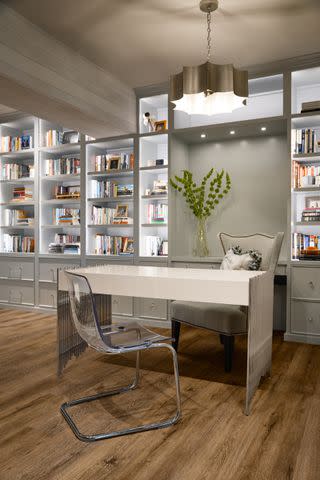
Erica Lea Design Studios / Photo by Starboard & Port
This office by Erica Lea Design Studios features a light gray with cool undertones. An extra relaxing neutral like cool-toned gray is especially great for built-in shelves, as the hue won't compete with colorful trinkets and books.
Paint used: Tinsmith by Sherwin Williams
Terracotta
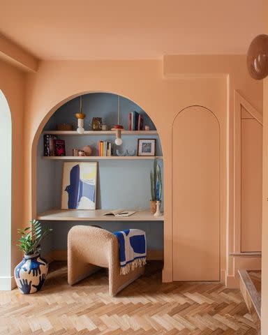
Design by @fernandersoninteriors / Photo by@alexandriahallphotography
If your style gravitates towards Southwestern, just look to the desert when picking out your office paint. Terracotta is a great option to try out, and it can lean more pink or orange depending on the paint's undertones and even the time of day. You can add in some dusty blue accents to offer a little contrast and balance out the warm tones in the room.
Paint used: Faded Terracotta by Farrow and Ball
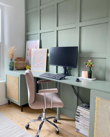
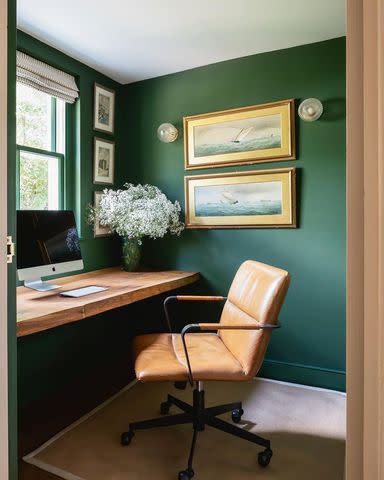
Smoky Green
@shalmaikeim / Instagram
Green paint with charcoal undertones can read as neutral but lends slightly more interest to a room than white or gray. This color will play well with natural materials such as leather and unstained wood, so it's perfect for honing a modern organic style.
Paint used: Vintage Vogue by Benjamin Moore
Sage Green
@prettylittleterrace / Instagram
It's hard to name a more soothing color than sage green. Sage green is an earth-toned green. The undertones can lean a little blue or yellow, depending on the specific paint. Faded pink really pops against sage green, so it's a good option for an accent color.
Paint used: Card Room Green by Farrow and Ball
Beige
@joannes_home2 / Instagram
Beige is back, and for good reason: It's incredibly versatile. This warm neutral looks great next to pretty much any other color. It contrasts well with black or brown accents, and it can work with countless interior styles, from sleek and modern to cozy and vintage. It's an ideal option for an office because it's not a distracting color, which is also one of the same reasons it works well in small spaces, like bathrooms.
Paint used: Egyptian Cotton by Dulux
Powder Blue
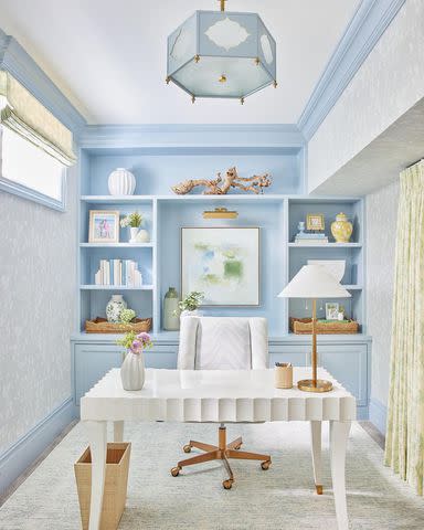
Design by @mcnellinteriors / Photo by @juliadags / Instagram
Powder blue is a timeless color. This pale hue features a hint of light gray, so it's agreeable with so many other hues. It looks extra sharp in an office when paired with brass and gold accents like a desk lamp and chair.
Paint used: Parma Gray by Farrow and Ball
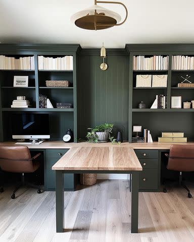
Gray Green
@dawnmarieheuer / Instagram
Choose a color with a little bit of nuance, like gray-green, and you're far less likely to grow bored of the color any time soon. After all, it's essentially two colors in one. This paint may look grayer when the light outside is more blue-cast, such as on a cloudy day. However, during golden hour, it will appear unmistakably green. Gray-green works well with other warm neutrals, like brown and tan.
Paint used: Evergreen Fog by Sherwin Williams
Emerald Green
Design by @escapetosurrey / Photo by @robinqphoto / Instagram
If you want a more bold green, reach for an emerald paint. Emerald is a bright blue-green. There's a reason emeralds look so wonderful in gold jewelry settings. If you choose this color for your office, consider hanging art inside vintage gold frames on the walls.
Paint used: Duck Green by Farrow and Ball
Black
@stephaniealegreinteriors / Instagram
Look no further than black if you want to add a little drama to your day-to-day work life (figuratively speaking, of course). This moody color will make off-white accents pop. Also, you can definitely pair brown with black, so don't be afraid to add in wood accents.
Paint used: Tricorn Black by Sherwin Williams
Navy Blue
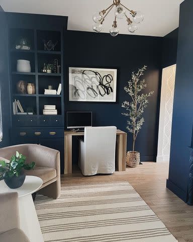
@homeforseven / Instagram
If you want a moody look for your office, but black is a little too bold for your taste, consider navy. Navy works especially well in rooms with light-colored flooring because the contrast creates a sense of balance. Keep in mind that lighting heavily impacts the look of navy paint. In times of low light, your walls may look black. When the sun is shining extra bright, navy can appear nearly royal blue.
Paint used: Hale Navy by Benjamin Moore
Deep Blue Green
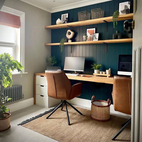
@my_midcenturymakeover / Instagram
Similar to navy, a deep blue green features just a little more warmth thanks to the addition of yellow. Since there are several undertones at play in a dark blue green, you'll notice that this color looks completely different depending on the room.
If your office window faces north, expect the color to read more blue since the natural light tends to be cooler and indirect from the north. However, a south-facing office window will cause this shade to read more green.
Paint used: Hague Blue by Farrow and Ball
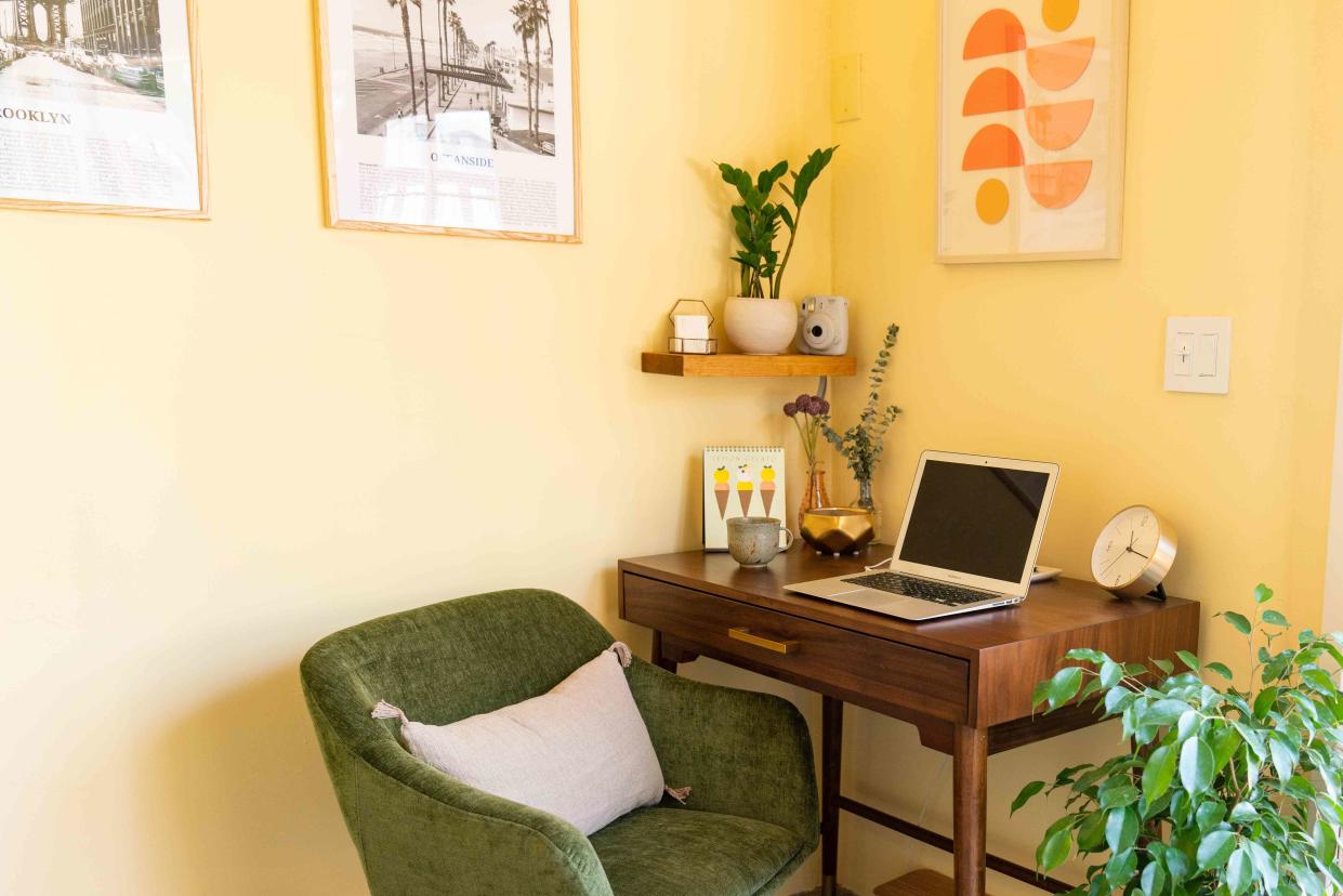
Orange Yellow
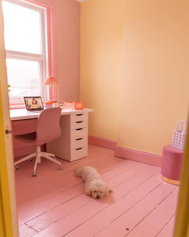
@lindsey_isla / Instagram
It's hard to feel sad in an orange-yellow room. This color channels the warmth of the sun, so every workday will feel like summer. Pair it with an equally cheerful hue like pink, and you'll be set.
Suggested paint: Creamy Orange by Benjamin Moore
Slate Blue
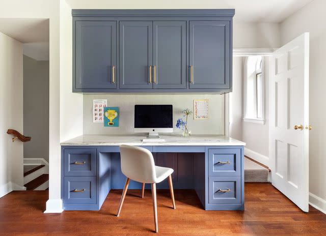
Design by @cleandesignpartners / Photo by @reganwoodphoto / Instagram
If your desk is in a common area in your home, you may not want to choose a bold color that draws too much attention to it. Slate blue toes the line between a color and a neutral, so it's perfect if you want to add interest without making a big statement. This understated color really pops on built-in cabinetry.
Paint used: Evening Dove by Benjamin Moore
Plum
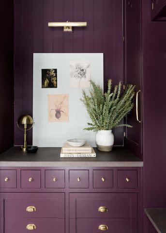
Plum is an interesting color because although it's a cool tone, the addition of a little extra red makes it take on the attributes of a warmer color. Gold accents and green plants are wonderful matches for this color.
Suggested paint: Plum Suede by Magnolia
Coral Pink
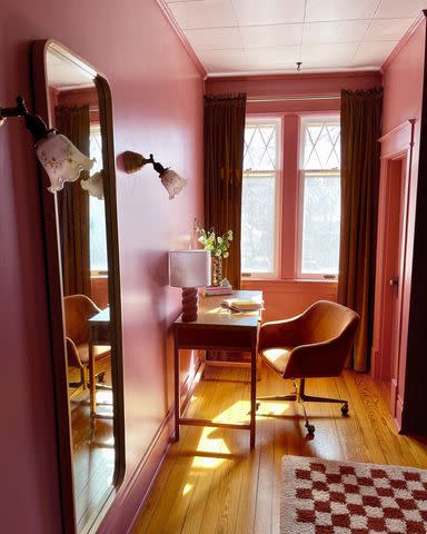
@jasmine_bible_design / Instagram
Add a little orange to pink, and you get coral, a most luscious color. It's a joyful hue, so it will be a good reminder to never take yourself too seriously during a day in the office. As they say, work hard, play hard. Coral pairs well with colors like burgundy and burnt orange.
Paint used: Pink Sky by Clare Paint
Read Next: Paint Calculator: How Much Paint Do I Need?
Read the original article on The Spruce.

