15 Colors That Go Perfectly With Blue—And Look Great in Any Room
Everyone’s favorite hue is even more lovable with these pretty pairings.
Laura Solensky Design
When it comes to universally beloved interior colors, few hues come close to the fanfare that blue receives. Perhaps we can chalk its mass appeal up to its sheer versatility—while blue is typically associated with feelings of tranquility and calm, it can also read as energetic and vibrant, lending a jolt of energy to any room. Likewise, the shade effortlessly finds a home in designs from any era or vibe, looking just as natural in a mid-century modern space as it does in one filled with traditional decor. It was even many brands’ pick for the 2024 color of the year.
It goes without saying, then, that blue also plays well with others, making it a great foundation for your design scheme and an easy place to build a room’s palette from. But where to start? Well, you’ve come to the right place. Below, we’re rounding up 15 stunning examples of blue in action, with all eyes on the corresponding shades that help it come to life. From sunny lemon yellow and vibrant orange to tranquil gray and rich emerald, one look at the below rooms and it’s easy to see why blue is a design MVP (that’s "most valuable pigment," of course).
Related: 21 Gorgeous Blue Kitchens That'll Have You Dreaming of Your Next Renovation
Crisp White
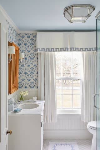
Name a more classic duo—we’ll wait. Blue and white are a perennially popular pair, beloved for their inherently traditional appeal. That being said, they can also feel fresh, especially when realized in crisp, cool shades.
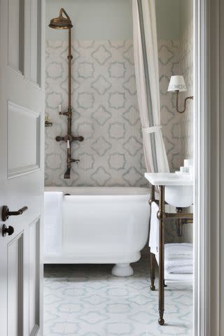
In this sunny bathroom by designer Jennifer Muirhead, Morris & Co.’s Daisy wallpaper in blue and white pairs nicely with crisp white wainscoting and drapery, alongside a slightly shaded ceiling for a posh powder room that guests will love.
Get the Look
Simply White and Summer Shower by Benjamin Moore (all similar)
Lemon Yellow
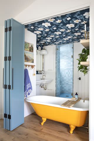
If you’re looking to lean into blue's happy undertones, there’s no better hue to team it with than cheery lemon yellow. The two amplify each other’s good vibes, resulting in a space that’s lively, energetic, and playful.
In this irreverent bathroom by designer Raili Clasen—as seen in her new book, Surf Style at Home, out this April—a custom lemon yellow clawfoot tub pairs with blue bi-fold doors and a clever wallpaper application (from Lake August) that unites all the room’s colors.
Get the Look
Goldfinch by Sherwin-Williams and Selvedge by Farrow & Ball (all similar)
Tropical Teal
David Tsay for Fran Keenan Design, Styling by Liz Strong
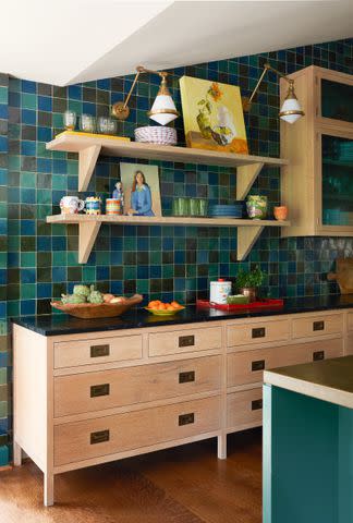
Pairing blue with another member of the same color family is all about finding the right tones, especially when working within an oceanic-inspired palette, like the one seen in this kitchen by designer Fran Keenan.
Here, she uses handmade zellige tile to mix in a range of blues, from inky navy and bold peacock to tropical teal. The latter hue is then repeated on the island, which teams with natural maple cabinetry for the perfect balance of color and calm.
Get the Look
Sicily or Cyprus by Backdrop (similar)
Related: The 12 Different Types of Tiles, Explained by Experts
Mint Green
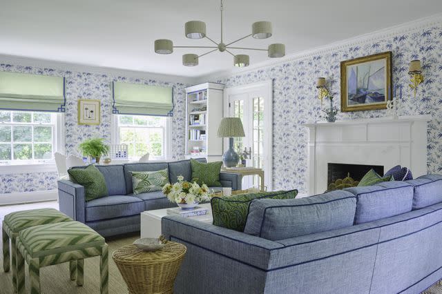
When designer Kerri Pilchik was tasked with breathing life into this New York living room, she turned to approachable shades of denim blue and mint green for a happy escape where it’s eternally spring.
A crisp blue and white Schumacher wallpaper lends a patterned backdrop to linen-like blue couches (with darker contrast trim), custom Roman shades, and a bevy of patterned pillows, all in the room’s signature palette.
Get the Look
Flow State by Clare (similar)
Wood Tones
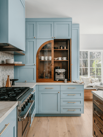
While not technically a color, wood tones are just as ubiquitous throughout the home—and just as beautiful with a range of blues, especially when combined on cabinetry or millwork. In this California kitchen, designer Clara Jung of Banner Day Interiors complemented sky-blue cabinetry with dark wood detailing on the island, floating shelves, and café-worthy coffee bar.
Get the Look
Mediterranean Sky by Benjamin Moore (similar)
Heather Gray
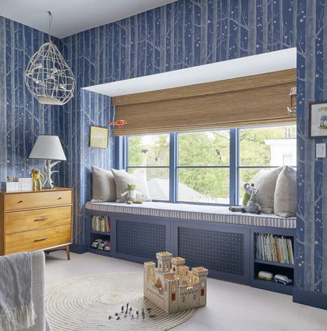
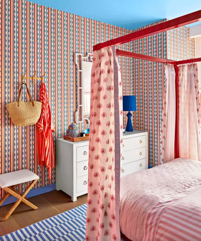
Looking to create a cozy, inviting atmosphere? Pair a deeper shade of blue—think inky navy or rich chambray—with a light heather gray for a combination that feels like a warm hug. In this sweet childhood bedroom, designer Colleen Simonds papered the walls with Cole and Sons’ Woods and Stars (in midnight blue), bringing a calming layer to the space with plenty of gray details, like the custom window seat, pillows, and rug.
Get the Look
Slumber and Silhouette by Dunn-Edwards (all similar)
Related: Here's How to Choose Between Paint and Wallpaper, According to a Designer
Zesty Tangerine
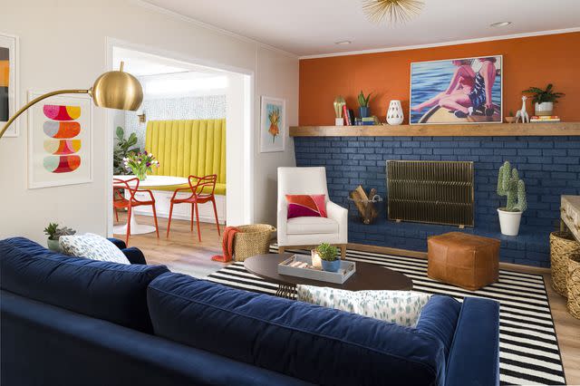
Any time you want to achieve high impact in a space, incorporate complementary colors that reside on opposite sides of the color wheel. In the case of blue, orange is the way to go, offering up another bold hue that can hold its own against everyone’s favorite shade.
To make this wall-to-wall brick fireplace a worthy focal paint, designer Gina Sims juxtaposed rich midnight blue with zesty orange grasscloth wallpaper, delineating the duo with an expansive floating wood mantle and mirroring the colors in details found throughout the rest of the room.
Get the Look
Goodnight Moon by Clare and Bada Bing! by Backdrop (all similar)
Natural Fibers
Calling all coastal fans! If your dream is to live within Nancy Meyers’ Something’s Gotta Give, then this next combination is for you. Rather than pairing your signature blue with a specific shade, help it come alive by way of natural fibers.
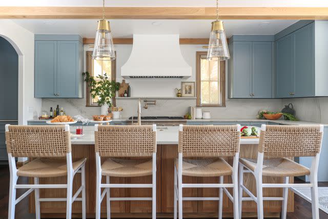
Textures like seagrass, rush, wicker, and rattan make any blue feel instantly coastal while adding much-needed dimension to a design scheme. In this kitchen by designer Valerie Helgeson of Design Directions, stormy gray-blue cabinetry is softened by a quartet of woven rush stools and plenty of wood details in the same shade.
Get the Look
Parma Gray by Farrow & Ball (similar)
Calming Cream
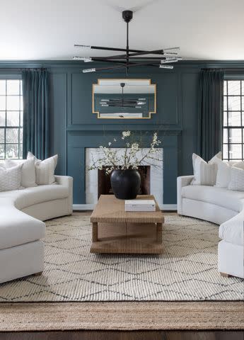
Upon first glance cream and white may seem the same, but hear us out. While one (white) leans into blue’s inherently preppy and cool-toned appeal, the other (cream) softens the shade, bringing out any warmer tones and giving it a “muddier” finish. Here, the team behind Salt Design Co. relied on various creamy details—namely the upholstery—to lend an airy yet warm quality to this expansive blue living room.
Get the Look
Inchyra Blue by Farrow & Ball
Related: How to Get the 'Quiet Luxury' Look at Home
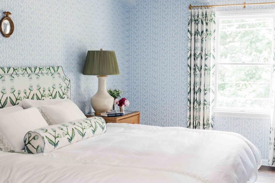
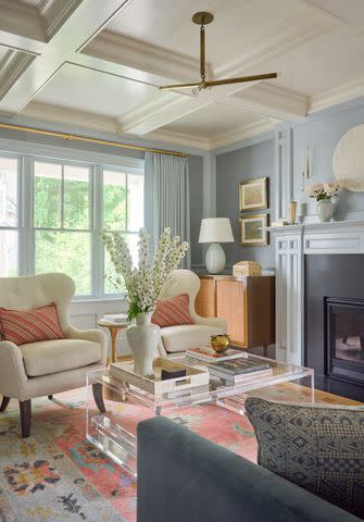
Grassy Green
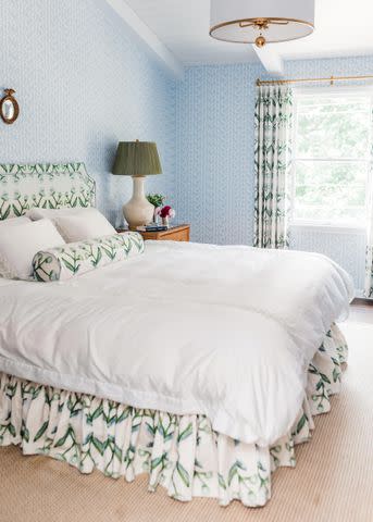
One word comes to mind when we look at this room by designer Laura Solensky: crisp. With a standout palette of nature-inspired hues—namely grassy green and sky blue—this sophisticated retreat is calm but not boring. Solensky uses pattern masterfully as a way to tie various colors into the overall palette, with the bitsy blue patterned wallpaper complementing the floral fabric (both from Erin Donahue Tice) covering the headboard and drapery.
Tame Taupe
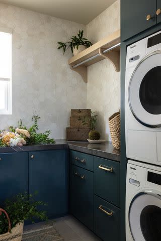
Sand, ecru, mushroom, tan—whatever name it goes by in your world, taupe has universal appeal. It skews much warmer than most whites, making it a great way to soften the cool tones of your go-to indigo. We especially love it when paired with inky blues, as seen in this elevated laundry room by designer Terri Brien. In it, she pairs natural stone hex tiles with rich midnight blue cabinets for a bold room that’s a study in contrasts.
Get the Look
Dark Night by Sherwin-Williams (similar)
Glittering Metallics
Let’s face it: Metallics are basically neutrals, so you’d be hard-pressed to find a hue that they don’t combine well with. That being said, shades of blue are especially versatile—you can warm them up with a hit of bronze or unlacquered brass, or compliment their coolness with some polished nickel. In this bathroom by Studio Peake, patinated bronze fixtures bring warmth to the blue and white tile and sky-blue walls.
Get the Look
Blue 02 by Lick (similar)
Related: 5 Timeless Bathroom Decor Ideas That Will Never Go Out of Style
Charming Coral
If bold orange isn’t your thing, you can still harness the power of complementary colors by pairing your blue-based palette with a softer hue within the orange family, like coral. In this traditional living room by Kerri Pilchik, powdery blue mixes with charming coral (and plenty of cream) for a classic space that still feels very now.
Get the Look
Discreet Orange and Thawed Out by Dunn-Edwards (all similar)
Elegant Emerald
Dramatic emerald green is bold enough on its own, but team it with blue and the pair is bound to make a statement. The duo is a match made in design heaven, especially for homeowners looking to lean into their moody side without losing all dimension in their space.
Here, the team behind Ash & Pine Interiors accentuated an eye-catching wallpaper from Kelly Ventura with a sumptuous emerald velvet couch that just begs for a mid-day break.
Get the Look
Polo Blue and Calypso Green by Benjamin Moore (all similar)
Cherry Red
Christopher Testani for Real Simple
When we say red and blue, chances are your mind probably goes to a certain mid-summer holiday, right? Well, we have good news: The Americana color combo looks good on more than just the star-spangled banner.
Case in point—Designer Megan Hopp relied on the tried-and-true pairing to bring a more-is-more maximalist ethos to the 2023 Real Simple Home, opting for especially bright versions of each shade (plus several bold patterns) to skew more punchy than patriotic.
Get the Look
Sweet Melon and BFF Blue by Valspar
Related: Keep Up With Our 2024 REAL SIMPLE HOME!
For more Real Simple news, make sure to sign up for our newsletter!
Read the original article on Real Simple.

