14 Sage Green Paint Colors These Design Pros Swear By
These on-trend shades will stand the test of time—we promise you'll love them for years to come.
It might not be easy being green, but it's sure easy to decorate with green—especially when it comes to interior paint. Green plays nicely with just about any other color (seriously, name one color it doesn't look good with—we'll wait), making it a go-to paint choice when designing stylish, yet classic interiors. Of all the possible shades, sage green is especially lovely. Organic and earthy, sage green paint grounds any room it's used in. We love that there's no strict definition of the hue either—there's a little variety in each shade, meaning there's a sage green color for everyone. Need proof? We asked interior designers to share their favorite sage green paint colors, below. These are regret-proof hues you'll be happy to live with for years to come.
Related: The 8 Best Living Room Paint Colors, According to Design Experts
Saybrook Sage by Benjamin Moore
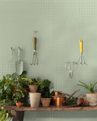
"I love Benjamin Moore's Saybrook Sage, because it instantly softens a space, while still feeling neutral," says Molly Torres Portnof of DATE Interiors. It pairs equally well with bold, bright colors and subtle hues, she explains. "It also works in a multitude of spaces, like a powder room, bedroom, or kitchen. Painting the walls, trim, and doors in Saybrook Sage is an easy way to make a space feel charming and cozy."
French Gray by Farrow & Ball
"Although dusty greens are having their moment in the spotlight, we've been using Farrow & Ball's French Gray for quite some time. A subtle, earthy shade, it's a neutral that we're sure we'll be using for many years to come," says interior designer Angela Hamwey of Mackenzie & Co. "It's very soothing and makes any space feel relaxed and calm. It works well with light wood tones as well as soft white walls, but it also pairs so well with black accents. It would look beautiful as a stair accent with black handrails."
Texas Sage by Benjamin Moore
"In my book, anything green goes!" says Nancy Lane of Nancy Lane Interiors. "One of my favorites is a gorgeous sage green color from Benjamin Moore called Texas Sage. It's like a muted olive with warm silvery undertones. I'm not afraid to use it anywhere—walls, trim, doors, cabinets—you simply can't go wrong. It's divine!"
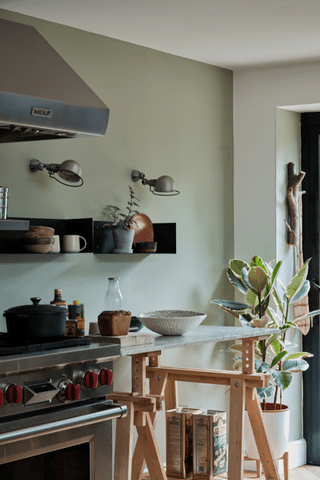
Oil Cloth by Benjamin Moore

Designer Heidi Caillier selected Benjamin Moore's Oil Cloth for this kitchen, which complements the dark soapstone countertops. It's a flexible color that can be used in traditional or modern settings, infusing a sense of calm thanks to its soft, gray undertones.
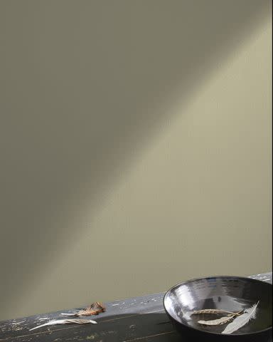
Green Smoke by Farrow & Ball
Lauren Pressey
"Farrow & Ball's Green Smoke is one of my favorite sage green paint colors. Green Smoke is very complementary, as it can easily pair with many finishes and other colors. It's a perfect sage that can act as a neutral, so other items can stand out in a room," says Linda Hayslett, the designer behind LH.Designs. You don't have to worry about matching when it comes to Green Smoke—Linda promises that this hues goes with everything from gold to black to plum to navy. Plus, it can work in a wide variety of spaces. "Honestly, I'd use this color in any room of the house," she says.
Kennebunkport Green by Benjamin Moore
Interior designer Taniya Nayak of HGTV's Battle on the Beach, says, "A staple for me has been Benjamin Moore's Kennebunkport Green. Green has always been the one color that serves as a neutral to me. You can pair pretty much any color alongside a green. This one is soothing, as most sage greens should be, but has just enough depth to create a mood in a room." She recommends pairing this earthy hue with shades of white and ivory, as well as richly textured woven or crocheted pieces.
Evergreen Fog by Sherwin-Williams
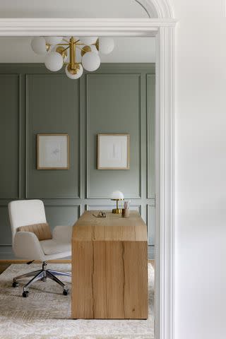
Designer Liz Goldberg of CAROLYNLEONA opted for Evergreen Fog by Sherwin-Williams in this home office, which also happened to be the brand's 2022 Color of the Year. It's a calming mid-tone gray-green that's perfect for a space where you need to concentrate—it offers color to a space without overstimulating the mind.
Avocado by Sherwin-Williams
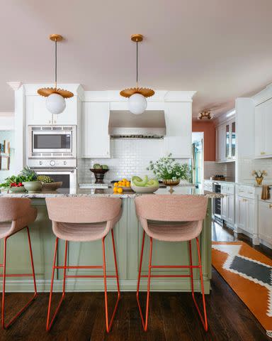
Margaret Rajic; Styled by Brandi Devers Russow
Sage green can sometimes feel a bit stale or too traditional but when it's paired with the right colors, it looks fresh and modern. Designer Natalie Papier of Home Ec. opted for a more lively sage color with a slightly yellow undertone on the kitchen island, choosing Avocado by Sherwin-Williams. Natalie combined the hue with pinky-orange accents for an unexpected twist, like the Blu Dot stools and painted ceiling (Malted Milk by Sherwin-Williams).
Sherwood Green by Benjamin Moore
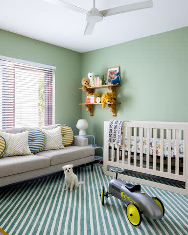
This nursery designed by Samantha Sara Interiors features a sage green that's a little more saturated with cool undertones, giving it an almost candy-like quality—fitting for a kiddo's room! The color, Sherwood Green by Benjamin Moore, has hints of gray, which means it's still elevated enough to grow with a child as they age and their tastes mature. The design firm says they "focused on incorporating the outdoors while keeping the room fresh and playful for the family’s newest addition—a baby boy. The paint and rug provided a sophisticated yet whimsical palette for layering both new and vintage accessories and accents."
Calke Green by Farrow & Ball
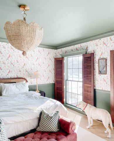
Wit & Delight
And now we're looking at a grown-up's bedroom featuring sage green—according to Kate Arends of Wit & Delight (it's her own room!), this particular shade was custom, but it closely matches Farrow & Ball's Calke Green, which the paint brand touts as a "traditional sage green." It's richer and more saturated than other colors on this list, but it provides a heft that grounds this room. (Adding a light, floral wallpaper balances and brightens the space.)
Courtyard Green by Dunn-Edwards
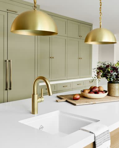
Designer Ginny Macdonald chose this yellowy, gray sage color (Courtyard Green by Dunn-Edwards) for this large U-shaped kitchen. The reason? "The perimeter cabinets were a soft white with a dark green herringbone backsplash, so we pulled out a lighter green paint to complement the backsplash for the fridge and pantry wall," Ginny says. According to her, the goal was to mix different colors and materials, which is further evidenced by the white oak island, which adds more warmth. (And the yellow undertones in the oak pair beautifully with the green paint color and brass fixtures and hardware.)
Grenadier Pond by Benjamin Moore
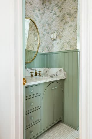
Sage is the perfect color for a bathroom—it's a calming, spa-like shade after all. Design studio The Misfit House incorporated Grenadier Pond by Benjamin Moore in this pretty bath but requested the paint store mix it at 75 percent, which basically means they wanted only three-fourths of the pigment and the rest of the formula is white, resulting in a lighter, less intense shade.
Ash Grey by Farrow & Ball
Designer Jake Arnold applied Ash Grey by Farrow & Ball in this Beverly Hills guest cottage. The shade is incredibly relaxing thanks to the soft gray undertones, which is ideal in spaces designed for rest. We love how Jake coated everything—including the walls, door, and trim—in the color.
Green Trellis by Valspar
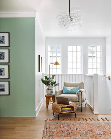
Photography by Laurey Glenn; Styling by Zoë Gowen
We set up a charming reading nook in the 2022 Real Simple Home and opted to paint the accent walls this lovely sage green (Green Trellis by Valspar). It adds a punch of color in this otherwise all-white transitional space—this is a second floor landing of a three-story home that also serves as a walkway between three rooms. The nature-inspired color feels fresh and bright because it's paired with crisp white.
Related: The All-Time Best Paint Colors, According to Real Simple Home Designers
For more Real Simple news, make sure to sign up for our newsletter!
Read the original article on Real Simple.
