14 Designer-Approved Paint Colors For Powder Rooms
These paint picks are pro-approved.
Christy Kosnic
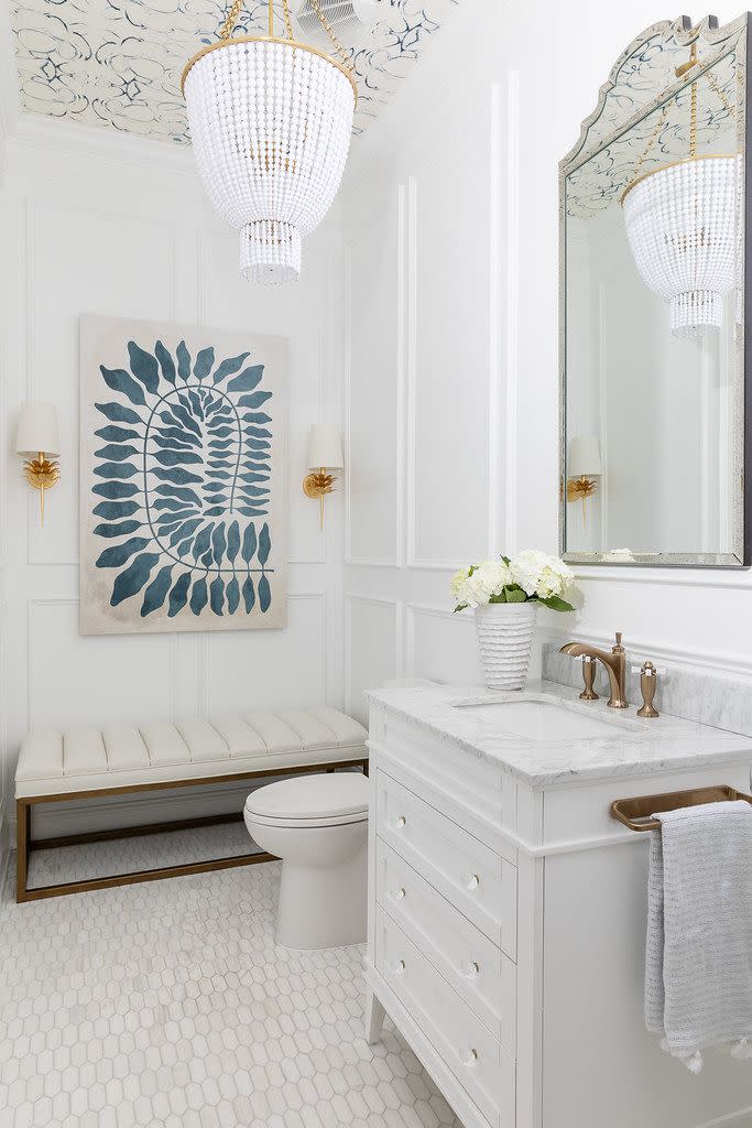
Sherwin-Williams Pure WhiteWhen it comes to picking paint for your powder room, there are a number of routes you can go. You may be looking to make a splash with color, experiment with a dark, deep shade you might not normally think to use, or take another route entirely. If you’re having trouble narrowing down your top powder room paint picks, read on to learn which shades pro designers are loving as of late.
Below, 10 designers share their top 14 powder room paints and explain what makes these colors so special.
Farrow & Ball Pink Ground (No. 202) and Farrow & Ball Setting Plaster (No. 231)
Becky Nielsen, the founder of Becky Nielsen Interiors, cannot get enough of soft pink hues for the powder room. “These two Farrow & Ball colors—paired with a marble sink and wood or painted vanity—are the most soothing and flattering,” says the designer, who has an office in Nashville.
Sherwin-Williams Aristocrat Peach (SW 0027)
This is another related hue that Memphis designer Maggie Clarke of Maggie Clarke Interiors recommends. She notes, “It’s guaranteed to put a little pep in your guests' step as they check their reflection in the mirror.”
Reema Desai Boldes.
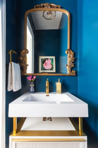
Sherwin-Williams Moscow MidnightSherwin-Williams Moscow Midnight (SW 9142)
Why should a powder room be boring? “I tend to go with anything but white,” says Heather Disabella of Heather Disabella Interior Design in Washington, D.C. “I like bold tones,” she explains, citing this saturated blue as an example. “After all, powder rooms should be treated like the jewel box of your home!”
Benjamin Moore Salamander (2050-10) and Benjamin Moore Dragon’s Breath (1547)
Taylor Johson is also a fan of going bold and moody in the powder room using the two colors highlighted above. “I love taking the color onto the trim, moldings and casings as well,” says the founder of Taylor Johnson Interiors in Greenville, South Carolina. “Since you’re not in this room too often, it’s the best place to take a design risk.”
Annie Tipton of Annie B Designs in Knoxville, Tennessee, also enjoys using Benjamin Moore Salamander. “I love using dark, bold colors in powder rooms,” she explains. “I particularly love Salamander because of the warm undertone and how it can be used to highlight a piece of art or hardware finishes.”
Farrow & Ball Downpipe (No. 26) and Benjamin Moore Newberg Green (HC-158)
If you’re in search of additional dark hues, try these two suggested by Erica Burns of Erica Burns Interiors in Washington, D.C. “People tend to go light in small spaces, but layer a bunch of art on the walls and have dimmers on the sconce lighting and it creates a very cozy feel,” she comments.
Benjamin Moore Kendall Charcoal (HC-166) and Sherwin-Williams Porpoise (SW 7047)
“I love taking risks in powder rooms,” says Washington, D.C., designer Rashida Banks, who runs an eponymous firm. She likes these dark gray bronze hues, noting that they “pair really well with natural materials like wood or stone.”
Pantone 14-1036 TCX Ochre
On the other hand, you may wish to say hello to a bright and cheerful hue in the powder bath. “We’re going to see some yellow added to the mix,” explains Divya Vaswani of Atlanta’s Divya Vaswani Interiors. “It adds an element of playfulness.” Pantone Ochre is a favorite. “It’s a little earthier, warm yet bold but not overly saturated,” Vaswani says.
Sherwin-Williams Willowleaf (SW 9649)
Liz Goldberg of CAROLYNLEONA is currently using this deep sage hue in a client’s powder room, opting for a limewash finish to “add depth, dimension, and texture to the walls,” the Raleigh designer explains. She adds, “This beautiful shade of earthy green makes a space feel warm and memorable!”
Stacy Zarin Goldberg
Sherwin-Williams White HeronSherwin-Williams Pure White (SW 7005) and Sherwin-Williams White Heron (SW 7627)
Neutral lovers, these hues are for you! “For some spaces, picking the best neutral is critical,” explains Sallie Lord of Grey Hunt Interiors in Chantilly, Virginia. “They are clean without a yellow base that looks fresh, soft, and bright,” she says of the two colors mentioned above.
For more Southern Living news, make sure to sign up for our newsletter!
Read the original article on Southern Living.

