12 Exterior Paint Colors That Can Make Your House Look Cheap
Even before someone enters your home, a first impression is made by your home’s exterior. The way that you keep your landscaping, the architectural style, and namely, the exterior paint color, all act as a calling card for your home, whether people are strolling by or coming to visit. And most importantly, these exterior aspects can make or break a home sale, too.
“Selecting the right exterior paint color can help elevate the aesthetic of your house and make it look elegant, fun, stylish, and often expensive,” says Emily LaMarque, founder of Emily LaMarque Design Studio. “The exterior of your house is the first thing people see, and it sets the stage for who you are and how you live. Painting your house a color with a level of sophistication makes your house look cared for, shows pride of ownership, and shows that it’s meaningful to you.”
Halie Porter, founder at Swann Street Interiors, stresses the importance of curb appeal and making future buyers’ heads turn. She says, “Intentionally selecting colors that will make your home look more expensive can raise the value of your home monetarily and support the economic growth of your neighborhood.”
No matter the reason for updating the look of your home, it’s always a good idea to keep your distance from the following paint colors that can unfortunately cheapen your home’s exterior. That said, paint is a deeply personal decision and you should ultimately consider your home's architectural style and period as well as where you live before making your choice. For example: A pastel pink or mint green beach cottage would look right at home in the Bahamas, but the same paint color might stick out like a sore thumb in Minnesota. Here, the paint colors that can make your home look cheap, according to designers.
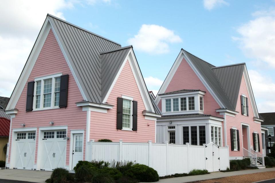
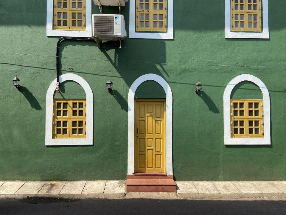
Pink
“The majority of pinks—salmons, hot pinks, peaches, bubblegum pinks—are not well-suited to residential homes,” Porter says. “They remind us, and future buyers, of children’s toys or less mature venues.”
There are, however, exceptions to every rule. If you live in, say, a fabulous Victorian house or beachy Caribbean cottage where a rosy exterior feels appropriate for the time and pdriod, it's A-OK to think pink.
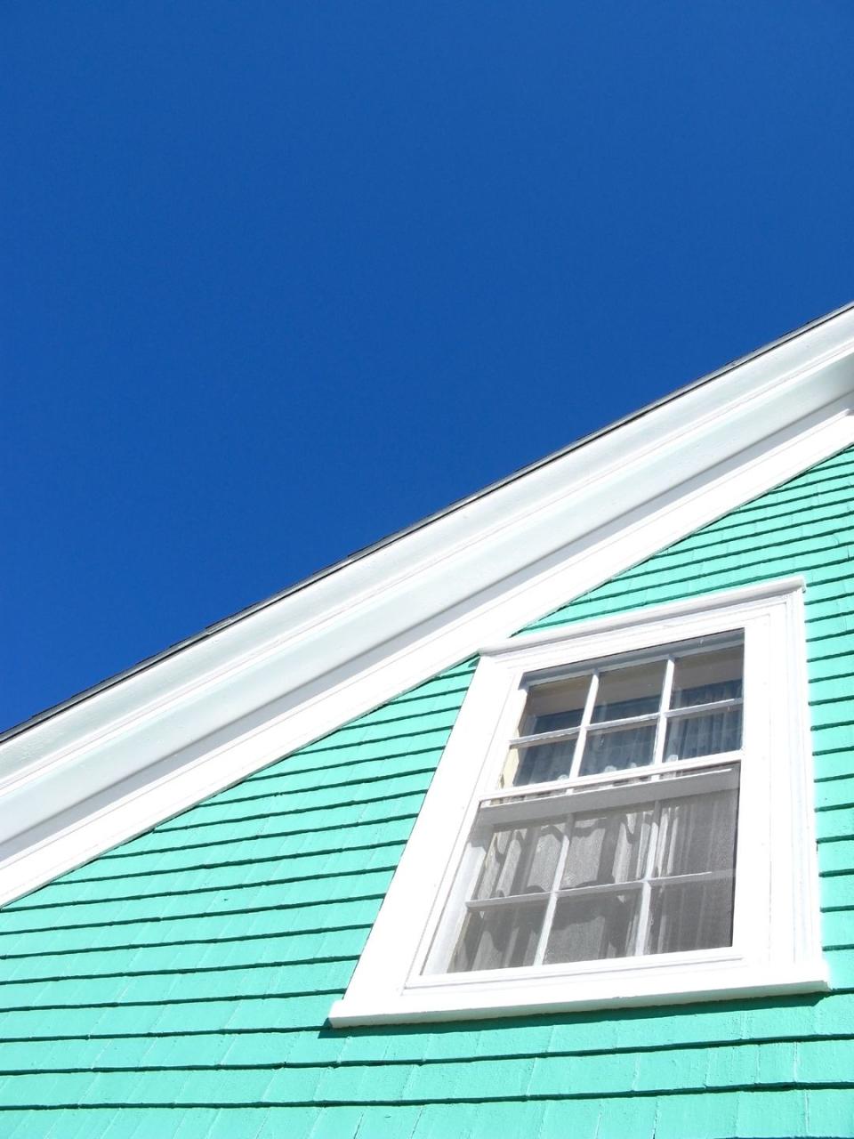
Mint Green
Although shades of mint green or pale aqua tend to be pretty colors on their own, “they just don’t read right on the exterior body of a house,” LaMarque says. “Mint green often feels dated and retro, but in an unsophisticated way.”
If you’re gravitating toward green for your exterior, instead, LaMarque suggests using a green hue with olive, sage or pine undertones “so that it references green shades that you would see in nature.”
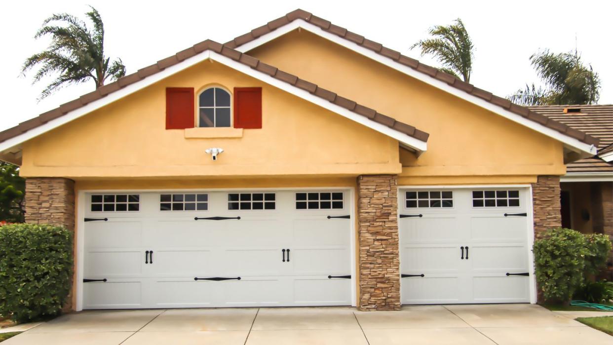
Orange
There are some colors that just don’t play well with others, and orange is one of them. Porter points out that orange particularly doesn’t go with neutral colors, such as the brick, wood or metal materials you typically see on the exterior of a home.
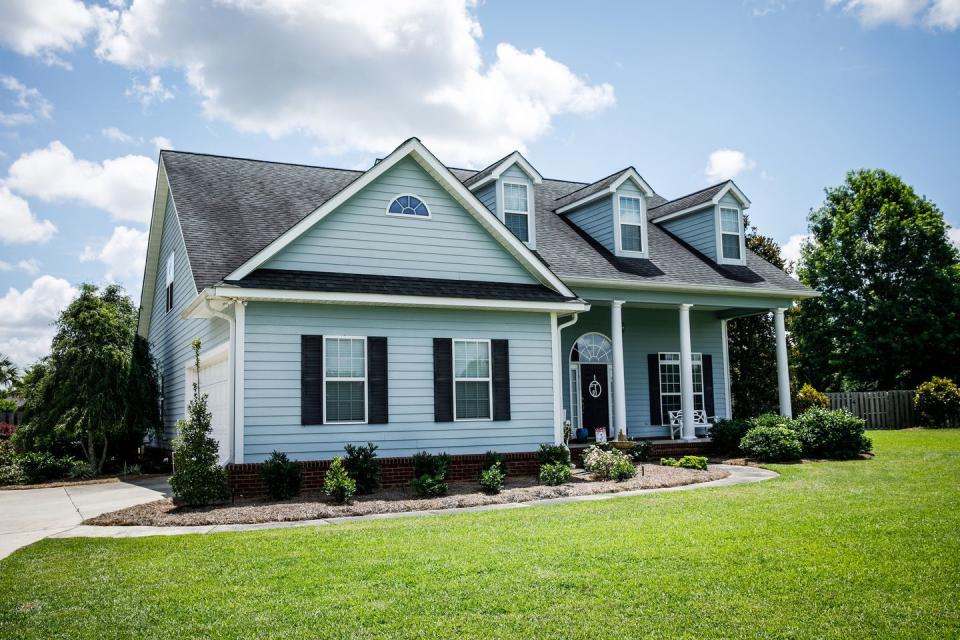
Light Blue
Light or pastel blue (or specifically, baby blue) “feels really dated and is reminiscent of the 1980s,” LaMarque says. “Pastel blue easily washes out and can make your exterior feel exceptionally cheap.”
Light blue exterior paint can be done right (think: Colonial-style homes with red front doors, the Rainbow Row houses in Charleston, or beachy Nantucket cottages), but it's a little harder to pull off. If you're thinking of going blue, consider consulting a designer and swatching several hues before pulling the trigger.
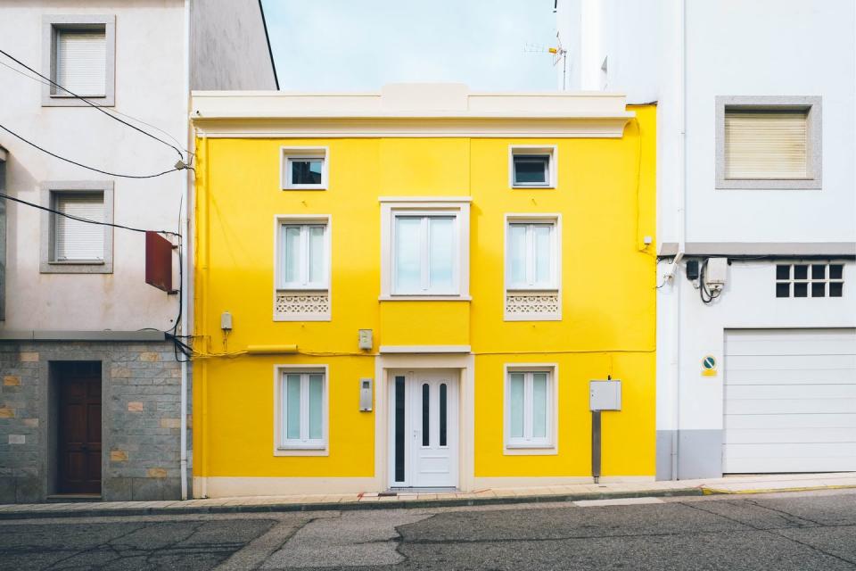
Bright Yellow
“It seems that yellow, influenced by Latin or English design, has a resurgence every 5 to 10 years, so it may be too trendy a color to make a more permanent appearance on a more traditional style home’s exterior,” Porter says. “There are other more playful and timeless alternatives.”
Cool Gray
Porter notes that shades of cool gray can often read “a touch too sterile.” She adds that houses painted in this shade remind her of cinder blocks.
LaMarque refers to this hue as “battleship gray.” She adds, “This color can suck the life out of a house and looks like a painting mistake,” she says.
If you're opting for a gray exterior paint color, select one with warm undertones so that “the house feels inviting and rich in depth and color,” LaMarque adds.
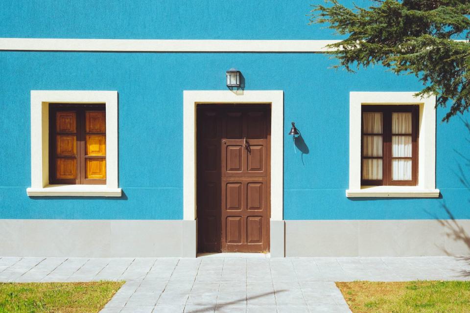
Turquoise
“There’s a time and a place for a bold blue, but unless you’re in a cottage in the Florida Keys, turquoise is likely a touch too beachy,” Porter observes. “A subtle pale blue or seafoam green can still instill a strong coastal feel more tastefully.”
Yellow Beige
LaMarque says, yellowish, off-white paint tones that look like vanilla are common, stale, and boring. In that same spirit, LaMarque says that yellow beige, which is often seen on “every faux Tuscan McMansion,” has been around since the early 2000s.
“That color shade is dated, fairly unattractive, and generally looks cheap because it tends to remind us of overdone construction and developments that aren’t fresh, unique, or timeless,” she adds.

Jewel Tones
Porter says that jewel tones, like sapphire blue, ruby red, and emerald green, can make the interior of a home feel rich and sophisticated, but these colors fall flat in intense natural sunlight. “They’re great in moody spaces, but not so great for a home’s exterior,” she says.
Purple
Another shade in the jewel tone family that doesn’t look great on a home’s exterior is purple. “Shades of purple can look exceptional, sophisticated, and fun on the interior of a house, but on the exterior, it can look extremely out of place,” LaMarque says.
“If you have a period house or want to use a shade of purple on the exterior, try using it as an accent on the trim and opt for a shade that has warm and rich undertones, like a deep aubergine rather than a pale purple such as lilac or lavender.”
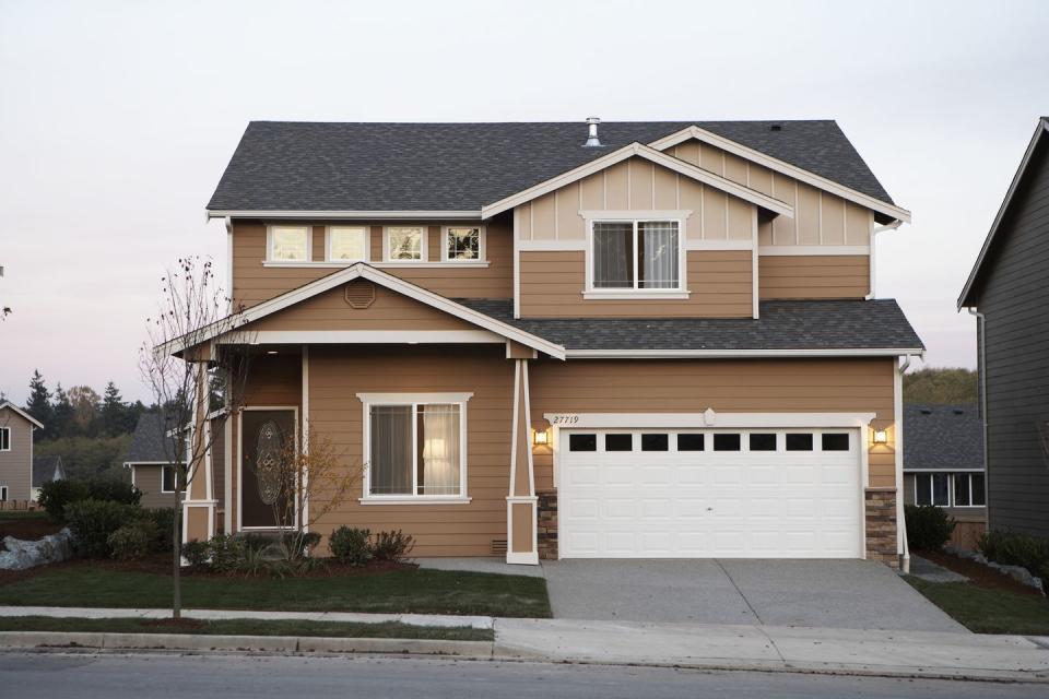
"Boring" Brown
LaMarque says that “boring brown,” especially with yellow undertones, can feel especially safe as a paint color, and “safe is often common, easy, boring, and expected.”
“Brown has been used on housing tracts for decades because it’s something benign that doesn’t offend the masses,” she says. “But brown can often read as dirty. It also screams generic and builder-grade—not personalized.”
If you want to paint your exterior brown, opt for a rich chocolate brown which is a shade that can actually make your house look more expensive.
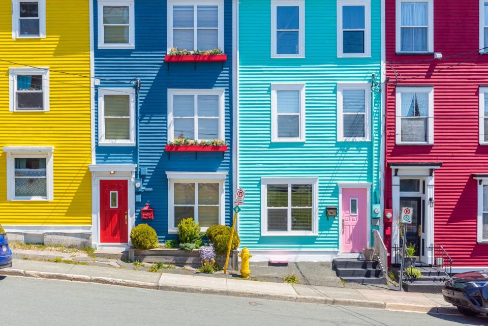
Anything Overly Bright
In general, “anything overly bright,” such as extra-saturated, bold or primary colors, won’t look right for a home’s exterior, according to LaMarque. “Bright colors in big doses are often overwhelming and look juvenile. There is so much surface area on the exterior of a house that a bold tone screams its presence to the entire neighborhood.”
She adds, “If you insist on a bold color, leave it to a small accent on the house, such as the front door, rather than the body of the house itself.”
You Might Also Like

