12 Ceiling Paint Colors That Add Drama to Any Room, According to Interior Designers
These ceiling paint colors are anything but neutral—they incorporate dramatic hues, high glosses, and pops of color.
When it comes to painting the ceiling, flat white is the perennial choice—but who says you can’t get creative with color? The ceiling is another space to flex your style and play with color, whether by creating a high-contrast look, adding a subdued shade that complements your walls, or going with the old Southern tradition of painting the ceiling blue.
Ready to grab your roller and break from the status quo? Here are 12 ceiling paint colors to get you inspired.
Related: 10 Common Painting Mistakes to Avoid During Your Next Project
Blue Porcelain by Benjamin Moore
Julie Soefer
"I absolutely love to use color on ceilings, as a way to complement or even contrast the dominant colors in a space,” says Courtnay Tartt Elias, principal and creative director of Creative Tonic Design. She used her grandmother's French blue opaline glass chandelier as a starting point in this space. "I wanted the ceiling to enhance and complement the stunning array of blues it holds. Naturally, I turned to paint for the rafters in the ceiling, in a softer version of blue, Benjamin Moore's Blue Porcelain. Its muted nature allows the heirloom chandelier to really pop without competing or overwhelming," says Elias.
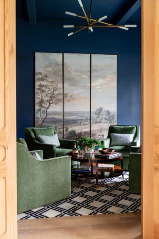
Newburyport Blue by Benjamin Moore
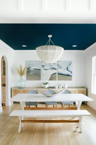
Frances V. Isaac Photography
Add drama to a crisp, coastal white room by going dark on the ceiling. In this room, Gaelle Dudley, interior designer and founder of GLDESIGN, created depth with this unexpected addition to a neutral color palette. The dark navy seems to recede into the sky, making the ceiling seem endless.
Yarmouth Blue by Benjamin Moore
"Haint blue is not just a shade for porch ceilings. I like to use this color on the ceiling in entryways and hallways," says Jen Bienvenu, interior decorator and vintage dealer at J. Bienvenu Interiors. She often uses Benjamin Moore, Yarmouth Blue, HC-150 as her go-to haint blue shade.
"It's subtle enough to nod to the tradition without feeling too contrived," says Bienvenu. Here, she added a white light fixture to create a Wedgwood Jasperware moment.
Related: How to Pick a Paint Color the Right Way
Dead Salmon by Farrow & Ball
"Dead Salmon by Farrow & Ball is such a great chameleon color," says Lauren Sullivan, founder and principal designer of Well x Design. "It looks slightly different in every setting, ceilings included." She recently used it in her guest bedroom, which she just completed. The warmth of the color on the ceiling creates a cozy, enveloping space that encourages slowing down.
"I especially love painted ceilings in rooms with wallpaper—using tones from the wallpaper allows for a cohesive design and draws the eye upward," says Sullivan.
Majestic Blue by Benjamin Moore
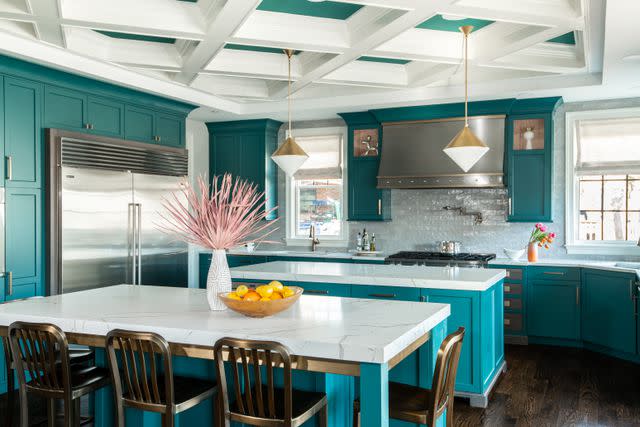
When painting a ceiling, you don’t necessarily have to paint the entire ceiling. This kitchen has a coffered ceiling and the molding details were left white, while the color was used as an accent. "The cabinetry is Benjamin Moore Casco Bay, so when painting the ceiling trays we decided to take the color a shade lighter than the cabinets to brighten it up more," says Dana Schwartz, principal designer at Dana Schwartz Design.
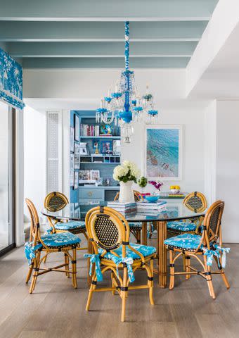
Swimming by Sherwin-Williams
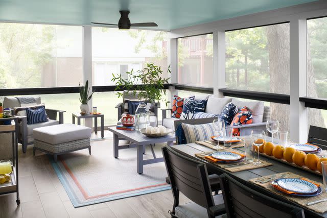
Interiors by LH
A more vibrant blue is striking on a ceiling, particularly in a space that is tied directly to the lush colors of the outdoors. "We remodeled this entire lower level and wanted to create areas that were bright and inviting," says Laura Hildebrandt, design principal at Interiors by LH. "In the southern tradition, we painted the porch ceiling blue.”
Related: 20 Nature-Inspired Paint Colors That Bring the Outside In
Indigo Batik by Sherwin-Williams
Ellen Renee Photography
With a bold color on the walls, continuing that color onto the ceiling can create a sleek, seamless look. "We chose to wash the room in this moody blue to set it apart from the rest of the light, bright, and airy house. Indigo Batik conveys a more mellow and mature tone, which is perfect for those late nights and adult convos," says Mimi Meacham, founder and principal designer of Marian Louise Design.
Autumn Cover by Benjamin Moore
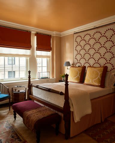
Michael Mundy
A warm orange and a satin finish is daring on the ceiling, yet it creates a cozy, vintage-inspired bedroom in this room by Phillip Thomas, founder and principal of Phillip Thomas Inc. He used Benjamin Moore's Autumn Cover to complement a quilt hung behind the bed and red and mustard accents throughout. The entire space feels like curling up on a crisp fall afternoon.
Mediterranean Breeze by Benjamin Moore
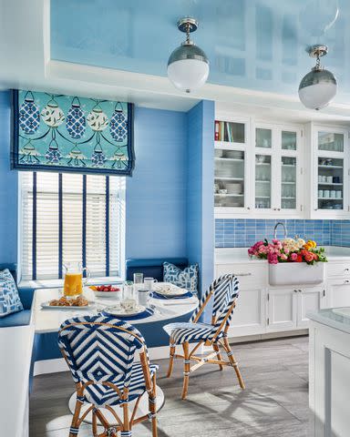
Michael Mundy
High gloss on a ceiling? It can be done! A relaxing periwinkle wall and the whitest of white molding, painted in Benjamin Moore's Super White, are contrasted with a high gloss ceiling in this kitchen that feels like a refreshing dip in the deep end. The ceiling is done in Hollandlac High Gloss from Fine Paints of Europe, color matched to the usually subdued Benjamin Moore Mediterranean Breeze. But, when it’s on the ceiling in this high-impact sheen, it takes on a vibrant and energetic look.
Shamrock by Sherwin-Williams
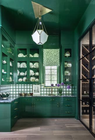
Julie Soefer
"In a very traditional space, I love to add in an element of surprise, especially if it is a small, discrete room within a larger home, as you can really amp up the drama without impacting the flow of the rest of the home," says Elias. In this space, she did that through ceiling color, adding a rich, dramatic green around the entire room. "We covered every bit of the butler’s bar in a high-gloss, bold, vibrant green, including the ceiling, creating a jewel-box space that shines. Taking the color through the ceiling increases the drama and keeps the eye from resting on a distinct demarcation line," she says.
Related: Color Drenching Is the Latest Must-Try Paint Trend, According to Interior Designers
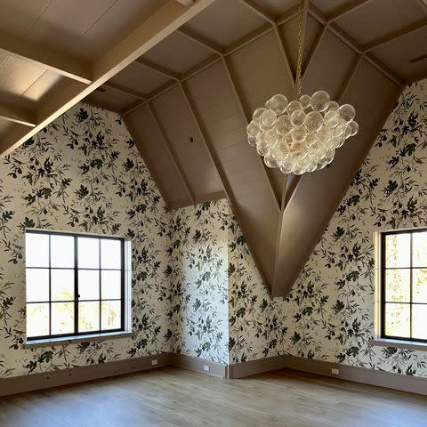
Debonair by Sherwin-Williams
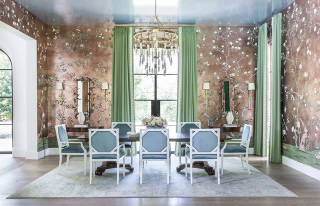
Julie Soefer
Inspired by custom de Gournay wallpaper in their Badminton pattern, printed on antique rose paper, Elias was inspired to bring in a high gloss color in Sherwin-Williams Debonair. "It lends a bit of drama without overwhelming the real star of the show, the wallpaper, and catches the light beautifully! The combination of the blues in the chairs, rug, and high gloss ceiling ensures that the room isn't overly formal and remains welcoming and fun,” says Elias.
Pineapple Cream by Sherwin-Williams
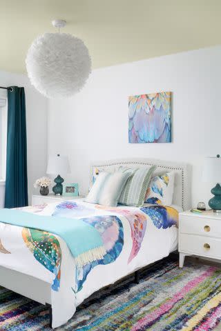
Stylish Productions
A light touch of yellow adds warmth and interest without feeling too far off from classic white. It creates contrast with the white, but still feels neutral. "We painted the ceiling a sunny yellow so that when the client’s daughter was in bed looking at her feather chandelier, there would be contrast between the white chandelier in the ceiling," says Hildebrandt.
Read the original article on Martha Stewart.

