11 Barely-There Paint Colors Designers Swear By


Don't assume a soft palette of off-white, cream, blush, and taupe is just for your makeup bag. These subtle, neutral shades are reminiscent of a fresh-faced, no-makeup look that works for your interior, too. Blending quiet, nuanced tones (like your favorite concealer, shadow, and lip-to-cheek rouge) is perennially stylish.
Designer Shannon Eddings of Austin's Shannon Eddings Interiors thinks so, too. Her favorite shade is Benjamin Moore's Basking Ridge Beige, which she deems a warm pink. "We often contrast it with a shade darker, like Deer Field, on doors and trim," she says.
For Suzanne Duin of Houston's Maison Maison Design, Benjamin Moore's Manchester Tan is a reliable go-to. "When I want to bring an 'established' look to a space, this color never disappoints." For a flattering shade of blush, Caron Woolsey, founder of CW Interiors, says Tissue Pink "casts a calm glow that is both becoming and elegant."
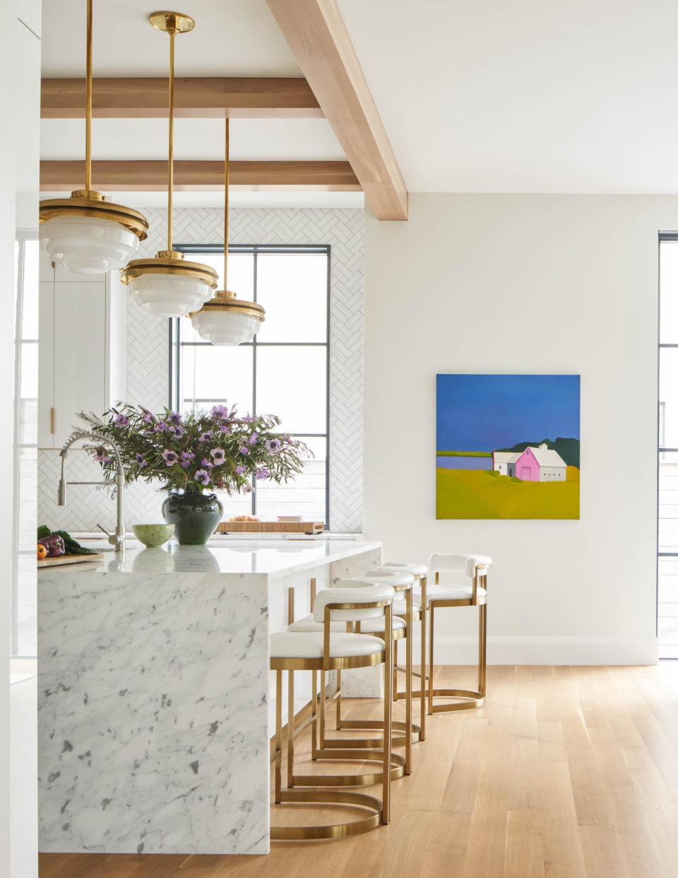
Looking to refresh your home with a soft paint color? You're in luck. We've asked Southern designers for their favorite barely-there shades. Read on for their recommendations.
