11 of the best gaming logos of all time
The best gaming logos have become as iconic as the games they identified, often transcending the gaming world to become wider cultural references that are instantly recognisable. Sometimes they capture the mood and theme of the game, while others tapped into the fashions of their day.
The best video game logos can be a good source of inspiration for anyone looking for a gamer logo for their streaming operation or for a look for their own game. Below we round up some of our favourites, including all-time classics and more recent icons. Also see our pick of the best social media logos for more inspiration.
11 of the best gaming logos
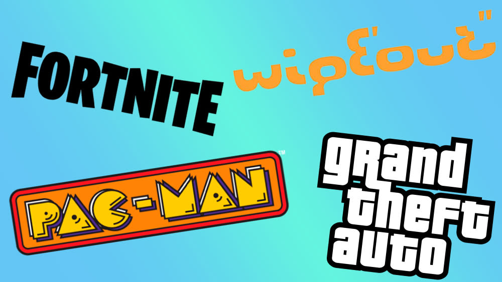
01. The Wipeout logo
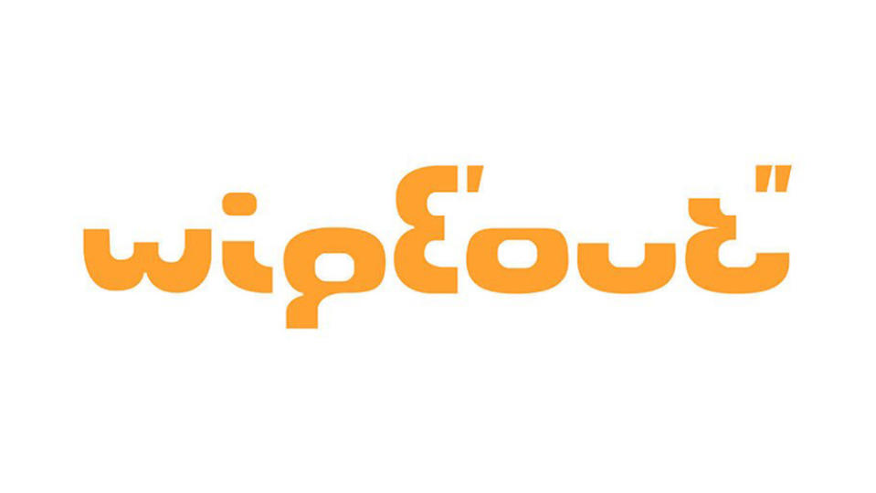
Wipeout was a big hit for the original PlayStation back in the late 1990s, and the futuristic racing title had what remains one of the cleverest video game logos. The Wipeout logo is designed to resemble digits on an LCD stopwatch. That might seem strangely retro now for a game that was supposed to be set in 2052, but, along with a soundtrack from the likes of Orbital and the Chemical Brothers, it felt like the future in 1995.
The original Wipeout logo was made entirely from a cut-up number 8 from the Eurostile typeface. The pieces are aligned differently to spell out the name of the game with a few modifications to clean things up). Even the dot on the top of the 'i' is formed from the negative space in the number 8 in Aldo Novarese's original typeface. And the logo even includes time indicators for minutes and seconds (' and "), although many fans at the time didn't realise what the dashes meant.
02. Pac-Man logo
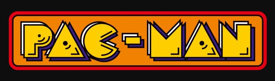
In 1980, Namco released an arcade game in Japan called 'Puck-Man', in which a character attempts to eat all the dots in a maze, while avoiding ghosts. But when it came to the international release, they worried that unruly youngsters might be tempted to vandalise the machines by changing the ‘P’ to an ‘F’, so Pac-Man was born.
Pac-Man was designed by Toru Iwatani as a game that would entice females into the male-dominated environments of arcades. He set out to make the gameplay non-violent and the characters ‘cute’. He was also inspired to focus it on eating, after eavesdropping on teenage girls, for whom food was a popular topic of conversation. The strategy worked, and Pac-Man became the first game to break out of the young male ghetto and appeal broadly to girls, women and couples.
The logos for most of the early video games, such as Space Invaders, Asteroids and Defenders, largely aped the kind of lettering seen in superhero comics, which again were skewed in their appeal to young males. The Pac-Man logo, in contrast, took inspiration from a more approachable, broad-based cartoon style that would appeal to both girls and boys. It also cleverly incorporated the central character into the 'C', and used a couple of dots and squiggles to further personalise the other letters.
03. Donkey Kong logo
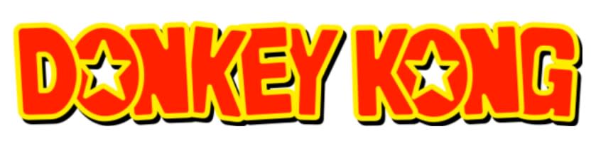
Conceived by Shigeru Miyamoto and released by Nintendo in 1981, Donkey Kong introduced the world to the platform game genre. One of the first games with a storyline that visually unfolds on screen, it involved moving a character (who reappeared in later games as Mario) across a series of construction site platforms, while jumping over obstacles and avoiding barrels thrown at you by a gorilla. Universal Studios sued, claiming the latter infringed its copyright of King Kong. But once that case collapsed, Donkey Kong went on to become one of the most loved games of all time.
The logo shown above was used for the first three Donkey Kong Country games developed by Rareware, as well as their Game Boy Advance remakes. Fun, colourful and cartoony, it did a great job in representing this pioneer in a new wave of games; ones that were less about blowing up space aliens, and more about chaotic comedy action and endearing characters.
04. Super-Mario logo
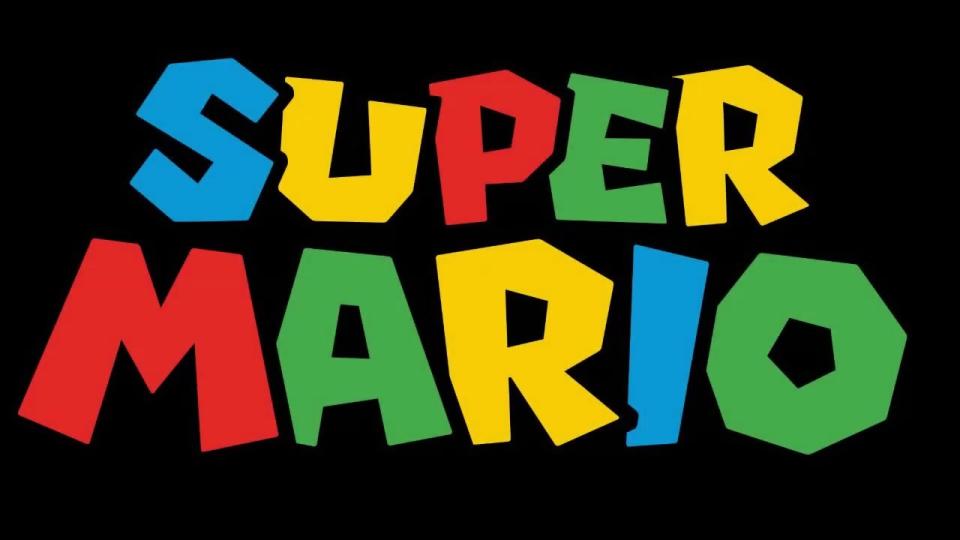
Having first shown his (unnamed) face in Donkey Kong, 1985 saw Mario get a platform game of his own on the Nintendo Entertainment System. Super Mario Bros. saw the Italian plumber traverse the Mushroom Kingdom attempting to rescue Princess Toadstool from the turtle-like Bowser. It became one of the bestselling games of all time, with more than 40 million physical copies sold, and Mario has remained a cultural force ever since, with a new animated movie in production as we write.
There's a chaotic energy to the bold and colourful Super Mario logo which represents the anarchic fun of the video game series perfectly. While perfectly readable, there's a definable sense of movement in the cartoon-like letters, not to mention an identifiable sense of swagger; just like the character himself.
05. Street Fighter
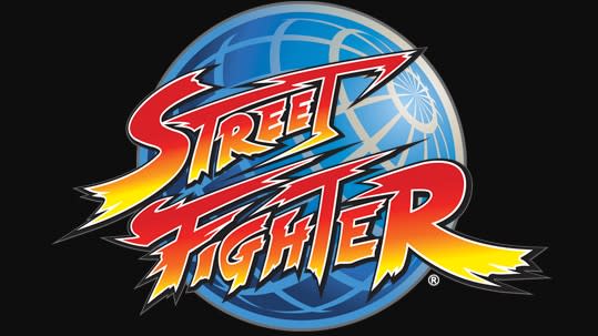
If the macho violence and destruction of the earliest video games was put in the shade by family-friendly titles like Pac-Man and Super Mario, it returned with a vengeance in 1987 in the form of Capcom's Street Fighter. One of highest-grossing franchises of all time, this title established the one-on-one fighting genre, and sold 44 million units worldwide, and the sequels are still going strong (see the Street Fighter 6 logo)
The Street Fighter logo, shown above atop 30th anniversary branding, leaves nothing to the imagination. There's a palpable sense of fiery, kinetic energy to the heavy-metal lettering that conveys exactly how much merciless punch-and-kick action the player can expect. All together now: "Hadouken!!!"
06. Sonic the Hedgehog logo
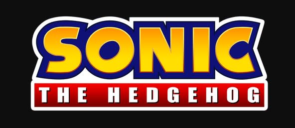
There was a Sonic the Hedgehog movie in cinemas earlier this year, but Sonic first appeared on our video game screens way back in 1991. The lovable blue hedgehog was designed specifically by Sega as a rival to Nintendo's mascot Mario. His first outing, a platform game that involved a fast-moving character rolling in a ball through a long winding tube, was a huge worldwide hit.
After a couple of false logo starts, this 1999 design hit the sweet spot, and has remained in place. On the face of it, it doesn't convey anything specific about the character or game, aside from the trademark blue used as the 'Sonic' outline. But look carefully at the circle inside of the 'O' of 'Sonic' and you'll notice it's quite dramatically slanted. This references the shape of the character when he rolls into a 'Spin Dash' move (an iconic gameplay element where you charge up speed from a standstill). Glance over to the 'C' and you'll see the same effect repeating. It's a small thing, but it adds a lovely touch of personality to the logo that fans will appreciate – even if only subconsciously.
Curiously, it turns out the Sonic X logo for our spikey friend's anime spinoff contains an amusing optical illusion.
07. Doom logo
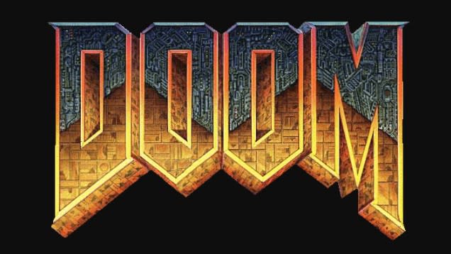
First created in 1993, Doom focused on the exploits of a space marine who fights hordes of demons and the undead. One of the pioneering releases in the first-person shooter category, it introduced 3D, immersive-feeling graphics to computer gaming, and paved the way for a generation of aggressive and bloody multiplayer shooting games that followed in its wake. The original logo was illustrated by the late sci-fi artist Don Ivan Punchatz, and its combination of mechanical and organic elements nicely reflected the grimy hellscape of the much-loved game.
08. Grand Theft Auto logo
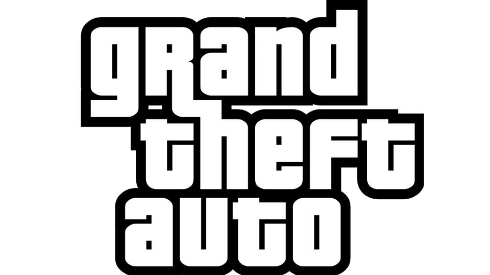
Released in 1997, Grand Theft Auto tore up the rulebook over what video games could be and the kind of broader cultural influence they could have. The headlines focused around inclusion of swearing, violence, nudity and sex. But more broadly the highly developed sandbox element meant gamers could enjoy the feeling of free roaming, rather than being locked in to a particular mission.
Based around a flame design, the original logo was as flashy, cheap and gaudy as the game characters themselves. But in as the series matured, a new streamlined branding debuted in 2001 and has remained in place ever since. With GTA established as the fourth highest selling franchise of all time, this visual identity no longer had to 'sell' the game, but simply evokes a mixture of confidence and comic wit in a more restrained and (ultimately) effective manner.
09. World of Warcraft logo
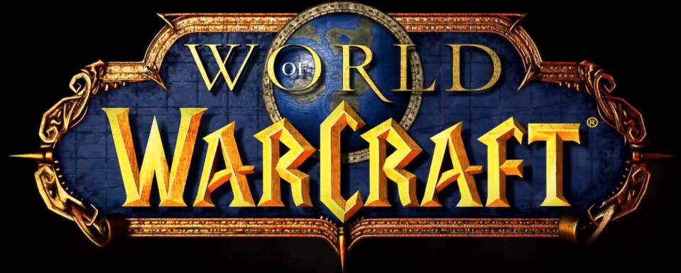
Released in 2004, World of Warcraft remains today the biggest name in massively multiplayer online role-playing gaming. It reflects a new era in which gaming is no longer a solitary passion but a defiantly collective one. Set in a Lord of The Rings-style world, its logo is strongly influenced by the kind of ornate and pseudo-medieval art and letting that adorns book covers, tabletop games and film posters across the fantasy genre. And the design has stood the test of time exceptionally well: aside from a few colour changes, it's remained unchanged all this time.
10. Minecraft logo
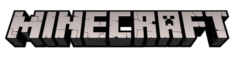
Just when you thought you knew what was what in gaming, Minecraft was officially released in 2011 and turned everything upside down once more. Set in a block-centred world that was basically like a digital version of Lego, Minecraft allowed players to express their creativity like never before. Its logo clearly and cleverly reflects the building nature of the game, plus there's a sneaky insertion of a Creeper face in the letter 'A' (Creepers are enemies that attack you in the game by exploding near their target).
11. Fortnite logo
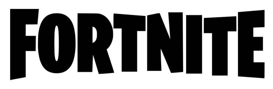
The last on our list of the best gaming logos brings us to the present day. Released in 2017, Fortnite is a 'battle Royale' survival game in which up to 100 players fight to be the last person standing. It quickly became wildly popular around the world, not least because it's free to play, cross-platform, and sits somewhere in the middle between casual and 'serious' gaming. That fun feel translates nicely to its logo, which is based around chunky letters that seem to be randomly offset from each other, conveying a laid-back and relaxed vibe that suits the game's predominantly school-age audience. The font has inspired some of the best gamer logos too.
Thanks to Macy-Anne Trimont for her input into this article.

