10 Paint Colors Inspired by Each of Taylor Swift’s Eras
- Oops!Something went wrong.Please try again later.
Embrace your home renovation era with these Taylor-inspired paint colors.
Courtesy of Sherwin-Williams
The excitement of Taylor Swift’s Eras tour has extended far beyond ticket offices and stadiums. Her iconic style and color-coded albums have inspired fashion and design trends, and now they’re coming to home decor, too. There’s no denying Taylor is a talented storyteller, capturing our hearts with her lyrics and our attention with her eye-catching style and album aesthetics. Her fans know that everything Taylor does has meaning; including the color scheme of each album.
If one thing’s for sure, Taylor has a firm grasp on color psychology. The mood of each album is transmitted through color. So, we’re taking a leaf out of her book to help you bring each album to life in your own home. We talked to paint color experts who recommend the best paint colors inspired by each of Taylor Swift's eras.
Related: 8 Ways to Decorate with Lavender, This Year’s Hottest New Color Trend
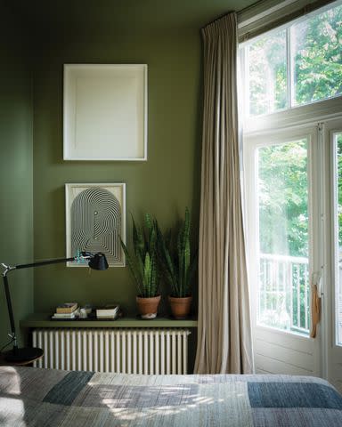
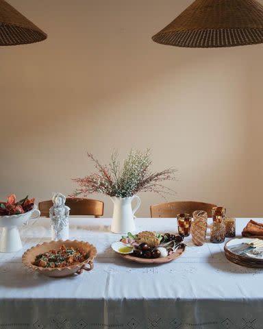
Debut: Olive No. 13 by Farrow & Ball
Courtesy of Farrow & Ball
Taylor Swift floated into the music scene as an American country sweetheart. Taking to the stage in her signature cowboy boots and floaty sundress, the 16-year-old's youthful charm and simple country style swiftly captured the hearts of her audience.
Channel Taylor’s American country style with a rich, earthy green shade, like Olive by Farrow & Ball. Beyond its apparent association with nature, green also signals new beginnings and growth, making it the perfect color to mark the era that catalyzes her rise to stardom. In line with Swift’s rural roots, Olive is a muddy green that feels grounding and organic. "Olive is an earthy, comforting shade which thrives in darker spaces, where its richness creates a grounding and comforting sanctuary," says Patrick O’Donnell, international brand ambassador for Farrow & Ball.
Paint Color: Olive by Farrow & Ball
Related: The 11 Best Green Paints for Cabinets, According to Experts
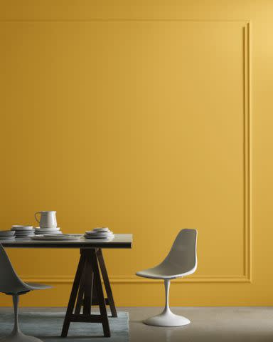
Fearless: Golden Bounty by Benjamin Moore
Courtesy of Benjamin Moore
The Fearless era is the perfect excuse to up the gold, glitz, and glam. For this album, Taylor swapped her floaty sundress for a heavy dose of gold fringes and sequins. Not even her guitar could escape it, taking on a new rhinestone sheen. Her look was bold and glamorous, so what better way to play into that energy than with Benjamin Moore’s Golden Bounty.
"This jewel-tone yellow is a statement-making hue that adds depth and confidence, especially in unexpected areas such as the ceiling or cabinets," says Hannah Yeo, color marketing and development manager at Benjamin Moore. The rich yellow shade is infused with earthy ochre and amber undertones, affording it a mesmerizing golden depth. "Full of personality, this golden hue sparkles with joy, levity, and luxury."
Paint Color: Golden Bounty by Benjamin Moore
Related: These Are the Yellow Paint Colors Interior Designers Love to Use
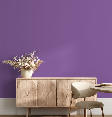
Speak Now: Cabaret by Dunn-Edwards
Courtesy of Dunn-Edwards
The Speak Now era saw Swift’s first real style evolution. She finally kicked off her cowboy boots in favor of an enchanting, romantic, and fairytale-like aesthetic featuring various shades of purple; the color of mystery and fantasy. An era brimming with open-hearted romanticism and unabashed honesty, Dunn-Edwards’ Cabaret is the perfect paint color for anyone looking to connect with their feminine side and conjure an enchanting space that also feels empowering.
"Cabaret is a powerful and majestic dark purple color with a bold spirit of independence and mystery," says Sara McLean, color expert and stylist at Dunn-Edwards. "The dramatic depth and playfulness of Cabaret speaks to the duality of Taylor Swift's Speak Now era, where we see the singer blossoming into adulthood and exploring her powerful voice in music."
Paint Color: Cabaret by Dunn-Edwards
Related: 10 of the Prettiest Purple Paint Colors to Upgrade Any Room
Red: Atomic Red by Little Greene
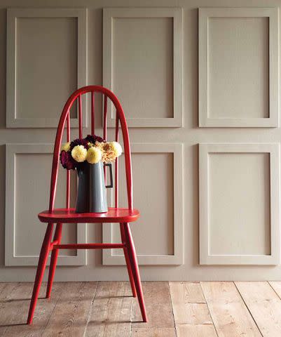
Courtesy of Little Greene
Red is a color associated with strong emotions, like anger, love, desire, and passion. It’s vibrant, stimulating, and provocative and, in this context, represents an emotionally charged Swift singing about her tumultuous and toxic relationships.
"Atomic Red by Little Greene is a shade with an undeniable impact that perfectly encapsulates Taylor Swift’s dynamic Red era, typified by her signature bright red lip," says Ruth Mottershead, creative director of Little Greene.
During this era, Swift’s love of all things vintage and retro became apparent as she began to sport 50's style high-waisted shorts and dresses. "Our brightest and boldest red is a fabulous accent shade for adding a bold pop of color to a neutral scheme," Mottershead says. Stick to a predominantly black, white, and tan palette and dress the space with retro decor to complete the Red era look.
Paint Color: Atomic Red by Little Greene
Related: The 8 Best Paints for Furniture That Will Give Your Home Decor a Quick Refresh
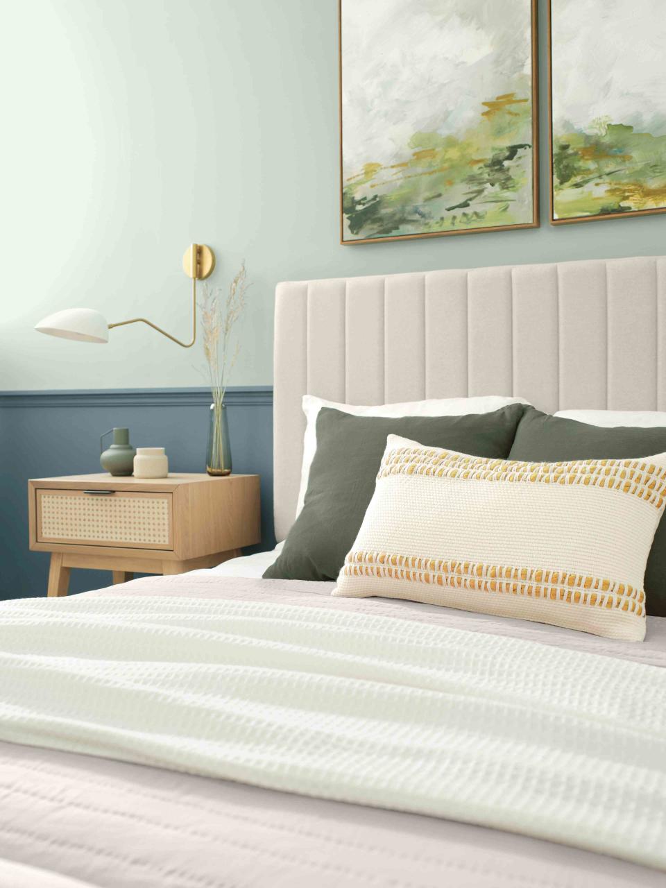
1989: Copen Blue by Sherwin-Williams
Courtesy of Sherwin-Williams
The 1989 album marks a new chapter for Swift with her official transition into the pop genre and move to New York City. The album is named after her birth year, symbolizing the rebirth of her music and life, represented with a distinct urban theme, a far cry from her country roots. Think cityscapes and neon lights, crop tops, high heels, and a freshly cut bob. The album aesthetic celebrates the freedom that comes with youth, represented by a pale blue color palette.
At once calming and refreshing, Copen Blue SW 0068 by Sherwin-Williams is the perfect paint color for anyone looking for a fresh start. "Copen Blue SW 0068 is an effortless, laid-back blue color," says Sue Wadden, director of color marketing for Sherwin-Williams. "It is a natural fit for casual living thanks to its transitional shade that brings a variety of colors and textures together."
Make the most of its soothing influence by introducing it in a living room or bedroom, and complete the 1989 look with seagull motifs and soft beige and lavender accents.
Paint Color: Copen Blue SW 0068 by Sherwin-Williams
Related: 14 Ideas for Blue Paint Colors for Perfectly-Hued Walls
Reputation: Little Black Dress by Behr
Courtesy of Behr
The Reputation era signaled Swift’s return to the public eye following the drama with Kanye West and Kim Kardashian. The album saw her shred her good-girl image and take a darker turn with her sound and lyrics. However, despite the dominant themes of enemies and bad reputation, the underlying lede is the secret romance evolving despite them. This was represented aesthetically with a moody style featuring lots of black, leather, dark lipstick, and snake motifs. Channel the drama and vengeance of this era with Little Black Dress by Behr.
"Little Black Dress is a deep, rich black hue that is reminiscent of the classic black dress, a timeless and reliable fashion staple known for its versatility and ability to make a sophisticated statement," says Erika Woelfel, vice president of color and creative services at Behr Paint Company. "The shade exudes elegance and power while also representing a departure from the conventional."
Woelfel suggests pairing it with lighter contrasting colors, wood tones, or bold design elements like gold fixtures or décor pieces to create a dramatic visual impact. "This aligns with the artistic direction of the Reputation era, which featured darker aesthetics, bold fashion choices, and striking visual imagery," she says.
Paint Color: Little Black Dress by Behr
Related: How to Choose the Best Black Paint Colors for Bold, Beautiful Walls
Lover: Positively Pink by Valspar
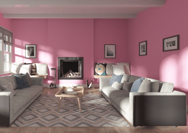
Courtesy of Valspar
From a slithering snake to a beautiful butterfly, the Lover era marked another dramatic plot twist in the Taylor Swift narrative. Like a rainbow after a storm, Lover saw Taylor come full circle back to the dreamy, pretty, fairytale version we first fell in love with. Lover is a 'love letter to love' featuring an ethereal pastel palette of pinks, blues, and purples, and rainbow, butterfly, and heart motifs. If you're looking to conjure a cheerful, light-hearted, dreamy, and romantic mood, reach for Valspar's Positively Pink 1003-1C. Vibrant, fun, and fanciful, the bubblegum pink shade embodies the Lover era and cute girl-next-door vibe.
Sue Kim, director of color marketing at Valspar, recommends bringing Positively Pink into the bathroom to channel the upbeat Lover energy daily. "The bathroom is where we start and end the day; where we have a chance to embrace positive energy to share with those around us," she says. "Channel a light-hearted attitude through this true shade of pink with everyday rituals."
Paint Color: Positively Pink 1003-1C by Valspar
Related: The Best Pink Paint Colors, from Mauve to Coral
Folklore: Archival by C2 Paint

Courtesy of C2
Folklore is a pandemic-driven masterpiece, influenced by the feelings of solitude and isolation lived by many during lockdown. The antithesis of her previous upbeat pop album, Folklore documents Swift’s experiments with an alternative indie style inspired by a pursuit of escapism that was satiated by the fictional tales told through folksongs. "The color gray is seen throughout the music videos of Taylor Swift's album 'Folklore,' which suits the album's overall atmosphere and emotional resonance," says Tia Clarida, head of marketing at C2 Paint. With this in mind, she suggests the paint color Archival to bring the Folklore era to life.
"Since she created the album during the pandemic, this soft yet versatile gray perfectly relays the sentiments of simplicity and nostalgia and seems to mirror the album's understated, introspective qualities," Clarida says. "The album blends light and dark, a mix of melancholy and hope, reflecting the complexity of human emotions during an unprecedented time."
Clarida likens this to the full spectrum nature of nuanced neutral paint colors, like Archival, that reflect the full range of natural light. "The absence of black ink ensures all colors are reflective and luminous—illustrative of the hope her album ultimately delivers," she says.
Paint Color: Archival by C2 Paint
Related: Top 10 Expert-Recommended Gray Paint Colors, Plus How to Pick One
Evermore: Taupe 03 Soho Roc House by Lick
Courtesy of Lick
Another of Taylor’s lockdown musings, Evermore is a continuation of her alternative folk-inspired era. However, this time her videos were mostly shot out in nature in the fall with a misty or sepia filter, evoking the comfort, warmth, and nostalgia attached to the fall and winter seasons. Wearing thick-knit cardigans and plaid check coats, with loose braids and curls and minimal makeup, Taylor’s aesthetic practically screams Cottagecore.
Conjure the homely, heart-warming elements of the season and take inspiration from nature with Taupe 03 Soho Roc House by Lick. "A warm subtle taupe with red and grey undertones, Taupe 03 Soho Roc House has a dependable nurturing quality creating a room that feels instantly calming," says Tash Bradley, Lick’s director of interior design and color psychologist. "Taupe 03 Soho Roc House is a color that connects you to the earth, making a space feel cozy, comforting, and peaceful."
Complete the Cottagecore look with reclaimed wooden furniture, a muted color palette, layers of soft texture and gentle pattern, like woven wool and plaid, and sweet-scented candles for a gentle ambient glow.
Paint Color: Taupe 03 Soho Roc House by Lick
Related: The Best Taupe Paint Colors for Timeless Elegance
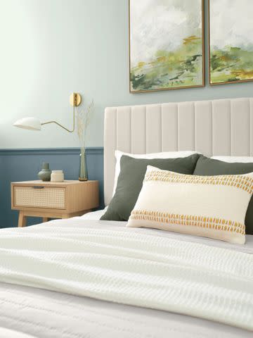
Midnights: Dignified by HGTV Home by Sherwin-Williams

Courtesy of HGTV Home by Sherwin-Williams
The Midnights era is Swift's latest album, inspired by her nocturnal musings. In confronting her innermost thoughts, Swift reflects on everything from the feeling of vulnerability and isolation during sleepless nights to the early hours spent dancing, drinking, talking, hugging, and crying. The album is depicted with abundant night-time imagery and rich blue shades, alluding to the night sky and the depth of her thoughts. Get lost in the expansive depth of the night sky with Dignified HGSW6538 by HGTV Home by Sherwin-Williams, a dark blue with a purple undertone that emulates the depth and moodiness of the night sky.
"Dignified is the perfect shade to pair with Taylor Swift’s Midnights era as it colorfully represents the moodiness and depth of Swift’s lyrics and melodies," says Ashley Banbury, color marketing manager for HGTV Home by Sherwin-Williams. "Perfect for a bedroom space, Dignified creates a beautiful room that feels meditative and calm, conducive to a good night’s sleep."
Lift the dark shade with warm whites and gold or brass metallic finishes, and capture the dreamlike quality of the era with ice blue and purple accents.
Paint Color: Dignified HGSW6538 by HGTV Home by Sherwin-Williams
For more Better Homes & Gardens news, make sure to sign up for our newsletter!
Read the original article on Better Homes & Gardens.

