10 big brands with ridiculously similar logos
Similar logos can turn up for several reasons, and some are so similar they make us do a double take. Originality is normally a key goal in logo design. When a brand's trying to stand out and make itself known and memorable, it doesn't usually make sense to look like another brand. Beyond potential legal issues, it would go against the idea of trying to forge a unique brand identity.
Of course, there are brands that intentionally use similar logos to try to create an association with a popular brand or even directly pass themselves off as a better known company. But while obvious, intentional rip-offs are widely condemned by the creative community, things aren't always so clear cut.
Some similar logos share a resemblance that's entirely accidental. Sometimes, that's because the brands are in the same sector and had the same inspiration. It's perhaps logical that many sports teams and car markers have logos that share similar shapes and motifs. They've almost become genres of logo design with certain conventions. But even brands in completely different sectors can come up with similar logos resulting from very different inspirations.
Below, we'll round up nine examples of famous companies with very similar logos. Some of them led to legal disputes while others were clearly unintended. While originality is key, there's a lot more to a logo too. See our guide to how to design a logo and our pick of the best logos of all time for inspiration for your own designs – inspiration, mind, we're not saying you should make similar logos like the brands below.
The most similar logos in branding
01. Pepsi vs Korean Air
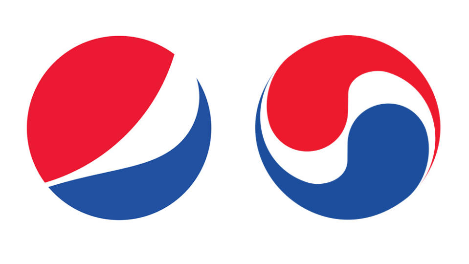
Several elements can make a logo look similar even if has a very different origin and inspiration. Shape and colour are two of them, but there the same shapes and colours can hold meaning and identity for very different brands. The Pepsi and Korean Air logos look ridiculously similar when viewed side by side, with the same shape and the same three colours. But the similarity isn't intentional – the similar logos both took inspiration from the national flags of the brand's home countries.
Founded in 1962, Korean Air took the colours of the Korean flag and put them into a shape inspired by the yin-yang symbol. Meanwhile, the Pepsi globe can be traced back to the cola brand's bottle tops in the 1940s, when it added blue to its red colour palette to show patriotism during World War II and differentiate itself from Coca-Cola. Of course, both brands have tweaked their logos over the years, and the new Pepsi logo looks less similar now that it's reintroduced the brand name in the circle, but they've kept similar colour palettes.
02. Formula 1 vs 3M's Futuro tights
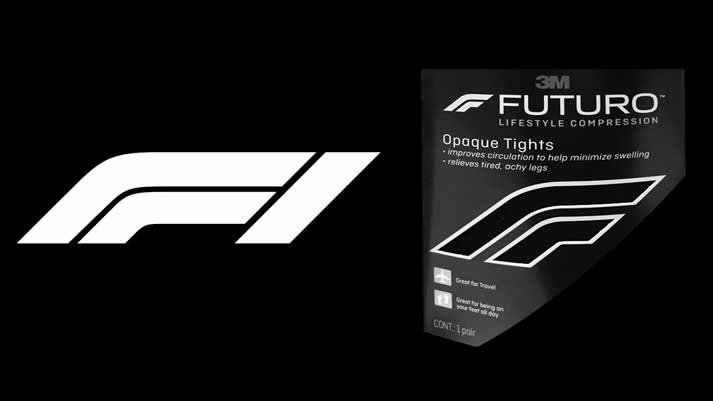
Often the most successful logos are the most simple, but it can be difficult not to simplify in the same way that someone else has simplified. Indeed, some people claim that with the current trend towards logo minimalism, logos are starting to all look the same. With only a limited number of letters in the alphabet, it's inevitable that some logos for brands that share the same initials will be compared to each other. Often the key consideration companies make before deciding to protest about such resemblances is whether the similar logos occupy the same sector – no matter how tenuously.
Stationery manufacturer 3M sought to take legal action over W+K's Formula 1 logo back in 2018 because it said it resembled the logo of its Futuro compression tights, and since F1 also produces clothing, that put them in the same sector. The companies appear to have eventually reached an amicable agreement. If you're wondering how to deal with legal issues yourself, see our piece on how designers should deal with plagiarism.
03. Airbnb vs Azuma Drive-In
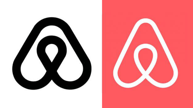
When DesignStudio announced its new Bélo symbol for Airbnb in 2014, a symbol of "coming together" and "belonging anywhere", the internet went wild – comparing it to everything from genitalia to Peter Griffin's chin.
But it also attracted comparisons with other logos, from Habitat to Monocle magazine and, as Erik Spiekermann pointed out on Twitter at the time, lesser-known brands Automation Anywhere (which has since rebranded) and Network.
But look even further back, and you'll find an even more remarkably similar symbol employed by a Japanese drive-in called Azuma, designed in 1975. Did DesignStudio rip off Azuma? We seriously doubt it – the symbol, drawn with a single flowing line, is just too satisfyingly simple not to have been independently created before.
04. National Film Board vs Virtual Global Taskforce

When it comes to visual metaphors, however smart, there's always a chance someone else will have thought of it – albeit with a different meaning in mind.
A giant eye, combined with a stick figure so that the pupil doubles as the head, formed the National Film Board of Canada's distinctive 1969 logo. Known as 'Man Seeing', it was intended to symbolise a vision of humanity – and has since been reworked to crop in more tightly for its modern-day logo.
Meanwhile, Virtual Global Taskforce – an organisation that tackles online sexual abuse of children – somehow arrived at a remarkably similar visual representation for its rather different line of business, depicting an all-seeing eye roaming the internet and watching over children. Coincidence? Well, yes. It seems so.
05. Starbucks vs Starpreya
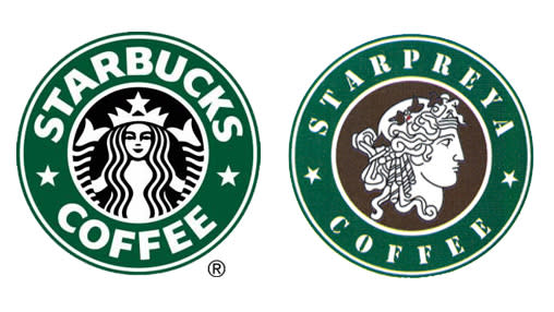
Next we come to a David vs Goliath-style clash of similar logos within the same sector: Seattle-born, global coffee giant Starbucks, and Elpreya, a relatively tiny South Korean company that sells coffee under the brand Starpreya – a name derived from the Norse goddess Freja.
Elpreya began trading in 1999, the same year Starbucks opened its first South Korean store. Both brands featured the brand name wrapped around a green circle, and a female character in the centre, white on a black background. And more crucially, they both sold coffee.
Starbucks claimed copyright infringement, but the Korean Intellectual Property Tribunal disagreed, arguing that the marks were too dissimilar to be confused. The Tribunal's degree of impartiality is another question – but the underdog won this time. In 2011, with Lippincott's help, Starbucks later ditched its green circle and made the mermaid an even more distinctive, ownable brand asset. More recently, former Russian Starbucks reopened as Stars Coffee with a logo that looks incredibly similar to the ones that they replaced.
06. Ubuntu vs Human Rights First
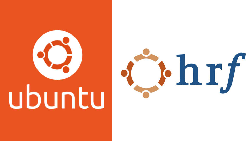
Rather like the eye with legs in our second example, the remarkable similarity between these logos for dramatically different businesses can surely be put down to the universal nature of some visual metaphors.
Ubuntu is an open-source software operating system, while Human Rights Foundation (hrf) does as the name suggests. Their common ground is communities working together towards a shared goal, and the simple graphic representation of a circle of people linking hands expresses that equally well in both sectors.
07. Gucci vs Chanel
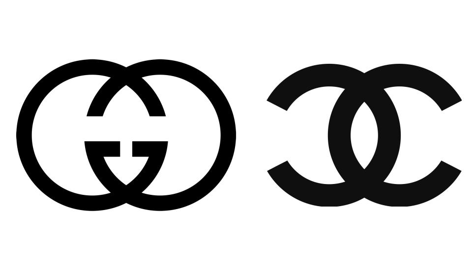
Monograms are common in the world of fashion logos, so it's no surprise that two big-hitting high-fashion brands have found some common ground when it comes to interlocking similarly shaped characters together.
The fact that Gucci's two 'G's and Chanel's two 'C's are both based on a geometric typeface doesn't help, as you essentially end up with overlapping circles at the core of the logo. But there are notable differences: the Gs face inwards, while the Cs are back to back. Gucci employs a thinner line weight, and the logomark is also used smaller relative to the wordmark than Chanel.
Gucci has had bigger concerns than Chanel in recent years, however: its nine-year legal battle with Guess over its own interpretation of interlocking Gs (in this case, four rather than two), as well as other alleged design imitations, finally came to an end in 2018 with an undisclosed agreement.
08. Beats by Dre vs Stadt Brühl
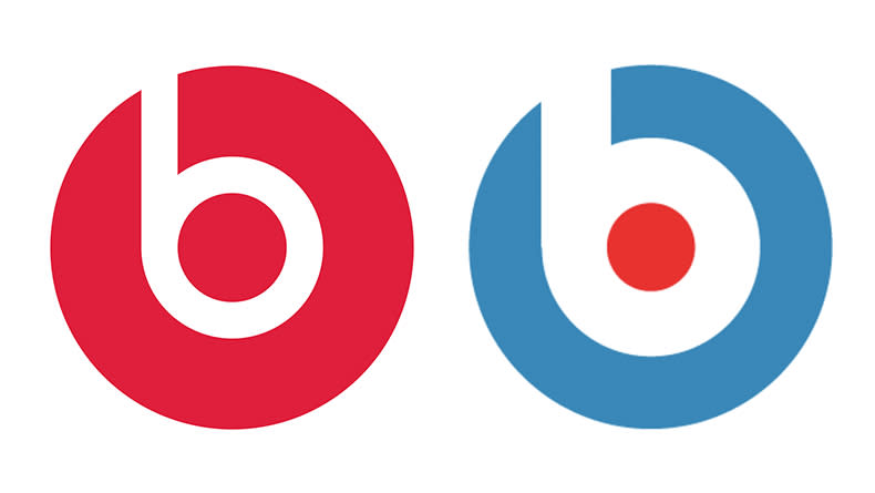
We'll be brief with this one. If common ground is likely to be found with monogram logos, when a business uses a single letter to represent itself it is inevitable that there'll be a coincidentally similar logo to be found in another sector.
Such is the case with the logo for Beats by Dre, which fits a lowercase 'b' in the Bauhaus typeface inside a circle, to resemble headphones. Is it strikingly similar to Anton Stankowski's 1971 identity for the city of Stadt Brühl? Well, yes, but it seems like an unlikely source of inspiration to say the least.
09. Sun Microsystems vs Columbia Sportswear
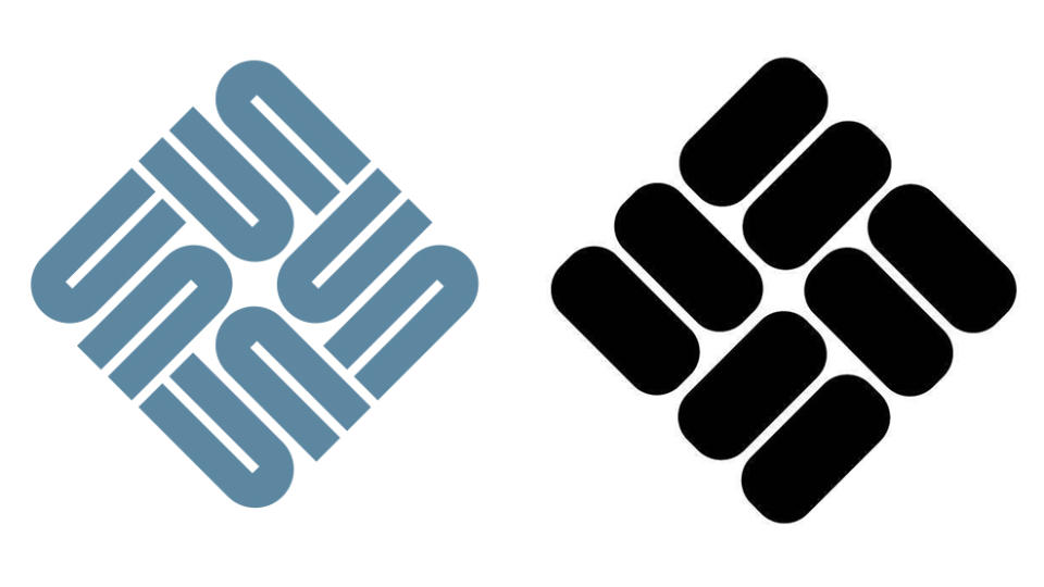
Designed by computer science professor Vaughan Pratt in the 1980s, the Sun Microsystems logo is a 'rotationally symmetrical chain ambigram' – which in layman's terms means it reads 'sun' whichever way you rotate it.
On a brutally simple level, if you screw up your eyes and ignore that all-important graphic flourish, Columbia Sportswear's logomark is certainly similar. It's formed from interlocking shapes with rounded ends, rotated at the same angle, and is usually locked up with the wordmark on the left-hand-side, at the same scale.
Columbia's stylised interlocking shapes symbolise a textile weave pattern, but the logo is missing the smart twist that takes Sun's logo to the next level. That twist also ensured the Sun logo stood the test of time until the company's 2010 acquisition by Oracle.
10. PayPal vs Pandora
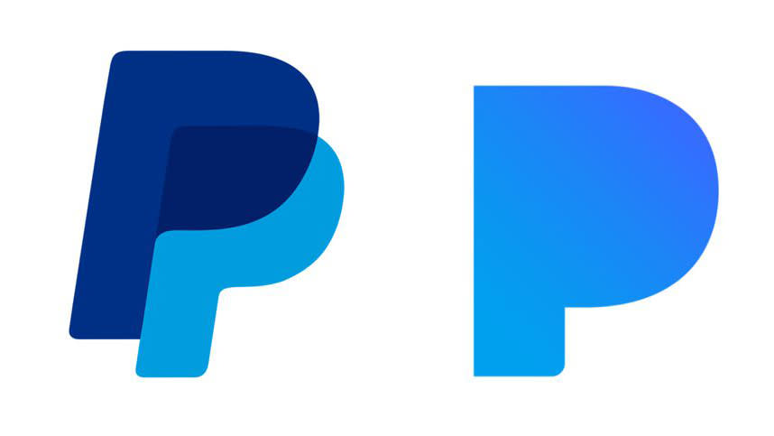
We finish with another battle between similar logos that ended up getting the lawyers involved – and proves that the universal approach of using a single letter to represent your brand isn't necessarily safe territory after all, especially if there is more than one similarity to your logo and another brand's.
When music-streaming service Pandora unveiled its logo in 2016, complete with a filled-in counter within its cyan-coloured letter 'P', PayPal wasn't happy. Its two overlapping blue Ps, both sporting filled-in counters, certainly had some striking similarities – particularly when seen small as an app icon.
Indeed, as part of its 2017 court case, PayPal submitted over 100 pages worth of social media posts from users who were confused between the two apps. A settlement was agreed, and three months later a new, jazzy, multi-coloured Pandora logo was rolled out – the same outline shape with a filled-in counter, but decorated with wavy lines that added purple, red and orange to the original blue.
For more logo inspiration, see our pick of the best textless logos and the best new logos.

