10 of the best paint colors to launch in the last year – the new classics for decorating you might not have even heard of
So far, 2023 has seen many a new trend, theme, and color scheme enter the design stage. We've watched boucle textiles find their fame, so-called 'quiet interiors' take over our styling, and grey shades slowly be usurped by sandy beiges. We've also welcomed a fair amount of other new paint shades to the block, too.
Despite not even reaching the year's halfway mark, 2023 has proven to be a time of bold, brave, and bright new hues. As we look to inject vibrant personality into our homes, jewel tones have proven the most popular newcomer on the scene with many of our favorite paint brands introducing new deep-pigmented hues. That's not to say that a natural neutral doesn't still have its place. Sandy, desert beiges seem to be the new grey, offering a delicate and versatile alternative to their darker counterpart. Pastels still prevail too, with subtle sages and salmons still proving a popular choice for a more calming scheme.
Spoilt for choice? We think so, too. A privileged situation to be in, it nevertheless makes choosing your next on-trend shade for your fresh paint ideas even harder. So, to ease the process, we've chosen our 10 favorite new paint colors to launch in the last year. From subtle sages to raging reds, here are our best picks.
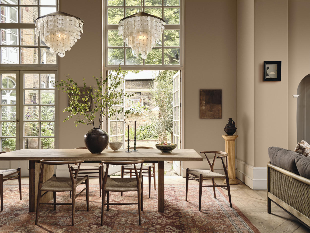
Best new neutral tones

Dunn-Edwards - Go Quietly
With the trend for so-called 'quiet interiors' taking the design world by storm, 'Go Quietly' seems an apt name for Dunn-Edward's latest neutral. Part of their New Neutrals Color Collection containing 160 brand-new neutrals, the sandy off-white is a soft, serene choice for rooms you want to relax in. It's also dark enough without slipping into the territory of brown, making it a versatile for rooms with lots of wood tones, too.

Farrow & Ball - Tailor Tack
Lighter than Setting Plaster but equally warming, Tailor Tack is the lightest and most delicate of Farrow & Ball's pinks. Released at the tail end of 2022 alongside 10 other new shades, this shade takes its name from the tacking thread used in Haute Couture ateliers. It has enough pink to contrast with white when used together in a space but also acts as a warming white in north-facing rooms.

Lick - Grey 08
Grey might not be dominating homes as it once was, but there's always a time and place for a smokey charcoal. Launched following a collaboration with Soho House, Grey 08 has cooling undertones inspired by the interiors of Amsterdam House and pairs beautifully with warm terracotta tiles, industrial interiors, and glossy marble finishes. In a matt finish, we think it makes the perfect daring alternative to a glossy white trim.
Best jewel tones

Mylands - Sorrel Green
If 2023 has shown us one thing, it's that this year is all about decorating with jewel tones. The move towards vibrant, rich hues confirms we're all embracing bolder colors, and Mylands' Sorrel Green is ideal for that task. Taken from a newly curated palette, this botanical green has a brilliant emerald quality and umber undertones for a fresh and inviting feel. According to Dominic Myland, CEO, it's perfect for those, 'wanting to add a touch of maximalist glamour to their interiors'.

Benjamin Moore - Starry Night Blue
For a bold sapphire blue, look no further than Benjamin Moore's Starry Night Blue. With connotations of - you guessed it - the night's sky, it's a calming yet daring hue that has an inky effect when used on your walls. The enveloping shade is a great choice for color-drenching smaller spaces such as powder rooms and works as a great accent color in white schemes for a beachy, Meditteranean feel.

Farrow & Ball - Bamboozle
Fiery and feisty, Bamboozle is another new one from Farrow & Ball's recent launch, an ultra-warm, seriously spirited tone. Reds are undoubtedly a tricky one to get right in the home, but this avoids being overstimulating thanks to its earthy undertone and a touch of dark pigment. Don't be afraid to pair it with more subtle neutrals, either. 'Think about using a tide line with Bamboozle on the bottom and a warm neutral like Jitney on top,' says Joa Studholme of Farrow & Ball.
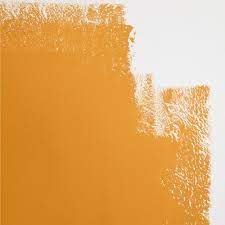
Color of the Year, Backdrop
The name might be a cheeky dig at the 'Color of the Year' phenomenon, but this recent release from Backdrop might just be in the running. An energetic, warm 'rubber-band' orange, this shade highlights a turn towards warmer tones of terracotta, rust and even red in 2023 that we didn't expect. This is brilliant one to try for a more colorful take on this warm color idea.
Best delicates and pastels

Dunn-Edwards - Mist Seascape
Sage green is going nowhere in 2023 (or any year after, it would seem). This enduring shade has been given a subtle hint of lucidity with Dunn-Edwards' new Misty Seascape, a light blue-grey belonging to their New Neutrals Collection. This nature-inspired, vaporous cool pastel is totally calming and pairs well with cool white, warm sandy beiges, and deep reedy greens for a palette reminiscent of a coastal cottage escape.

Sherwin-Williams - Redend Point
Redend Point made Sherwin-Williams' top spot as Color of the Year 2023, and for good reason. Inspired by nature, the earthy clay pink transports you to soft desert sands, making this deep dusky rose a super comforting choice. 'Redend Point was inspired by the idea of finding beauty beyond ourselves,' says Sue Wadden, director of color marketing at Sherwin-Williams. 'It's a heartening hue that invites compassion and connection.'

Lick - Pink 13
A dusky pink with a touch of grey, Lick's Pink 03 is another shade from the Soho House collection, this time inspired by the trendy Nashville House. About as pastel pink as you could possibly get, we love the vibrancy of this pretty shade which is still understated enough to be used in more subtle, pared-back spaces. It's a fresher take on the smokier pinks we saw last year, and we love its look within a charming cottage kitchen.

