Martha Stewart's 'anti-trend' farmhouse color scheme proves that this 'deeply unfashionable' shade is still so elegant
- Oops!Something went wrong.Please try again later.
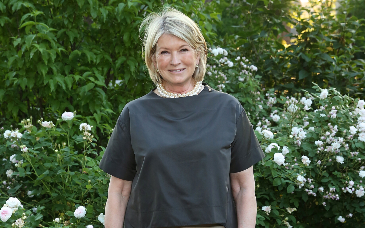
Few homes are quite as influential as Martha Stewart's farm, nestled in Bedford, New York. From here, the founder of the eponymous media empire shares her lifestyle tips with the world – usually in the shape of hearty recipes or green-thumbed advice. However, we've recently noticed that Martha is (perhaps unintentionally) shaping color trends – starting with this golden retro revival – and now with the most controversial hue of the moment: gray.
'It's no secret that the use of gray in interiors is currently subject to debate, largely due to its perceived coldness, which is making it deeply unfashionable with some,' says Lucy Searle, Editor in Chief, Homes & Gardens. 'However, some twists on the classic cool gray, predominantly a stronger gray-green, are still in favor with design professionals. A glimpse around Martha Stewart's farm suggests she, too, is a fan of this color combination.'
'Kevin Sharkey [Martha's executive director of design] paid us a visit yesterday at the farm. As is his habit, he took some charming and evocative photos, some of which I can share here. All farm scenes,' she says.
A post shared by Martha Stewart (@marthastewart48)
A photo posted by on
From the snapshots taken around the farm, it is clear that the entire property takes on a gray-green palette – from the cool-painted walls to the subtle green furniture (and inevitable indoor plants) around the living spaces and world-famous kitchen.
Every photo exhibits gray or green – in one combination or another – and in some cases (such as the 9th photo), they are paired together. So, while decorating with gray comes with reservations, Martha's home teaches us that – when combined with green – this color still has the ability to feel homey.
She's not alone in her admiration for this color pairing.
'Gray and green are both calming colors – but green especially signals to the brain that you are in a safe space and invites feelings of tranquility and peace,' says Connecticut-based interior designer Carlin Van Noppen. For these reasons, she says a gray and green palette is an 'excellent choice' for rooms where relaxation is usually the goal (primarily the bedroom) but looks great around the home, as Martha demonstrates.
You can find similar paint colors at Backdrop Home: samples of Italian Plaster, Road to Todos Santos and Saged will give you a combination that's similar to Martha's.

However, therapeutic qualities aside, why do these colors work so well together? Carlin says that their similar blue undertones make them a seamless pairing.
'Blue is required to make green and is also used in most shades of gray, endowing the shades with a common energy,' she explains.
'Green and blue together are appealing to us because they mimic colors we see in the natural world (think pine trees against a stormy sky, tall grass in the sand dunes, or moss on a bed of stones). This combination is visually attractive and soothing to our brains.'
How to style gray and green – the Martha Stewart way
When decorating with green and gray, it is hard to go wrong. Whether we separate our grays and greens or combine them in the same room (both of which Martha has done in various spaces around her estate), what matters is that they both exist somewhere in our homes.
Alternatively, Carlin says that if we pair the colors together, we should focus on choosing shades with matching undertones. 'I have already mentioned that green and gray share cool blue undertones, but some tones may be more brown or yellow,' she comments.
'Be sure to match these tones. Since gray is usually lighter than green, I recommend beginning with a gray base in your design scheme and adding green accents.'
It's no secret that Martha is a force in the kitchen – and you can tap into her style with this essential cooking and dining ware. We're starting with these picks from her recent Amazon collection below.
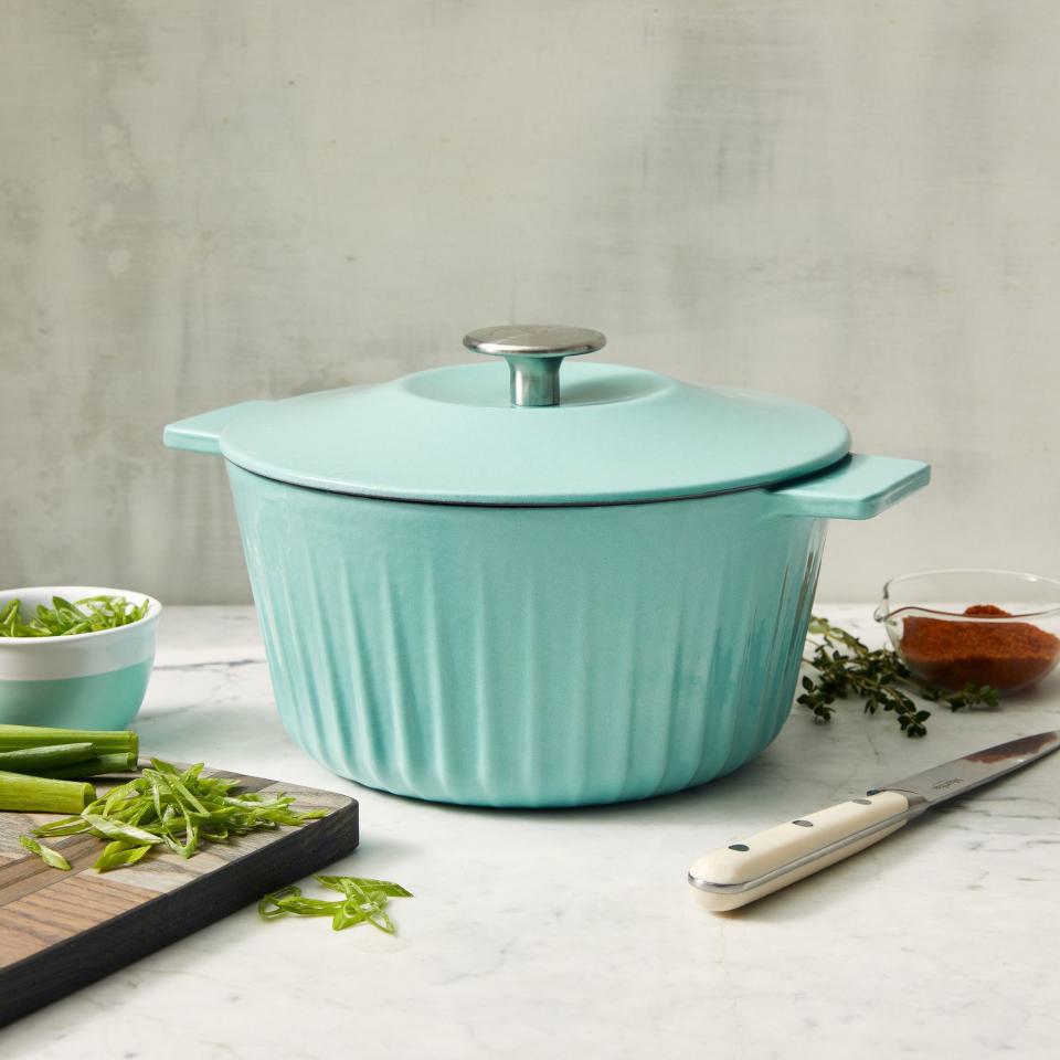
Enamel Cast Iron Dutch Oven
In Martha Blue, this Dutch Oven is an asset to any colored countertop – but in true World of Martha style, its qualities are far beyond its aesthetic. What we really love about this piece is its durability – thanks to its cast iron construction that is said to distribute and retain heat evenly.
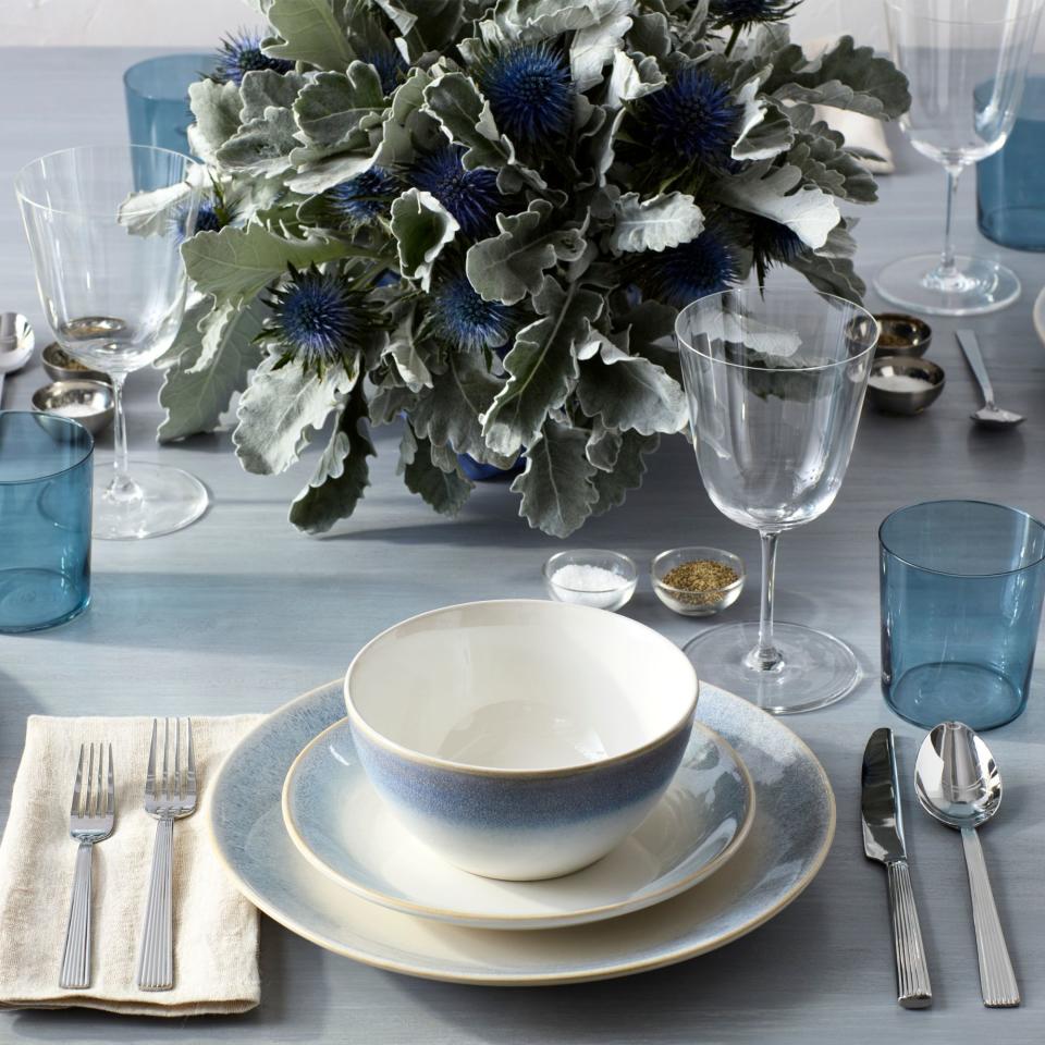
Perry Street Stoneware Reactive Dinnerware Set
Mastering the art of dining table styling is something that is important around the calendar – but with Martha's help, the process has never felt quite so seamless. The set comes in several colorways, but this white and blue combination is a timeless choice.
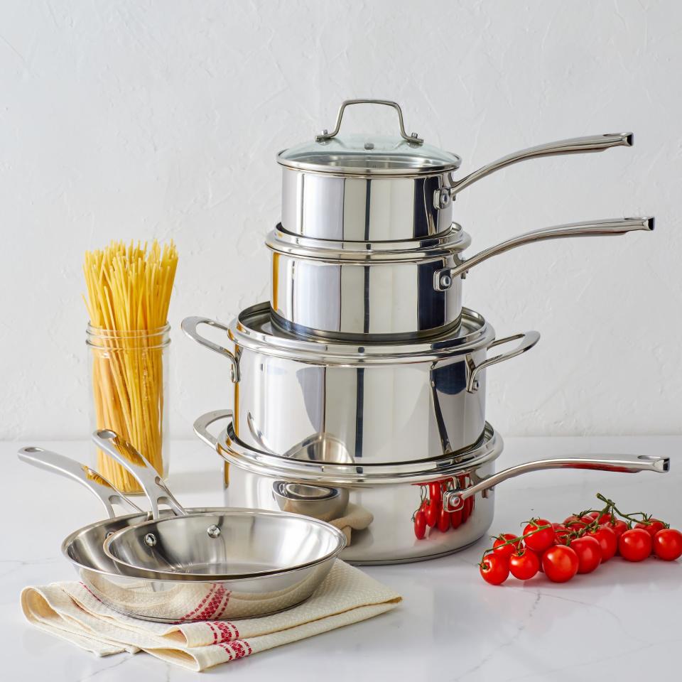
10 Piece Stainless Steel Cookware Set
When investing in – and organizing pots and pans – you could do far worse than following Martha's lead. She is a kitchen master, after all. So, unsurprisingly, her 10-piece stainless steel cookware set has a place among our favorite picks.

