The 5 Rules of Decorating with Summer 2022’s Trendy (Yet Polarizing) Color
When the world feels dark, it’s only natural to want to surround yourself with light. So, it seems all too fitting that home experts are noticing waning interest in the aughts’ “it” neutral—pale gray—and the sudden rise of a very unexpected-yet-cheery hue: yellow. We’re ready to manifest brighter days ahead, turning to what’s considered one of the happiest colors on the spectrum.
Since yellow can very easily overwhelm a space, we turned to the pros to find out how to make it feel fresh for 2022.
RELATED: Your Eyes Aren’t Deceiving You—This Color Is Popping Up Everywhere
1. Use it Wherever You Need an Energy Boost
Yellow adds warmth to a room, making it feel more inviting, and it can also be invigorating. “We’re seeing the color jump in popularity even more as people look for a way to infuse fun into their homes,” says Sue Wadden, director of color marketing at Sherwin-Williams. “I recommend using it in areas meant for play, or where you gather with friends and family, like a kitchen or living room.”
Aura readers and color psychologists often recommend it for creative spaces as well—anywhere you could use a pick-me-up (without downing another cup of coffee).
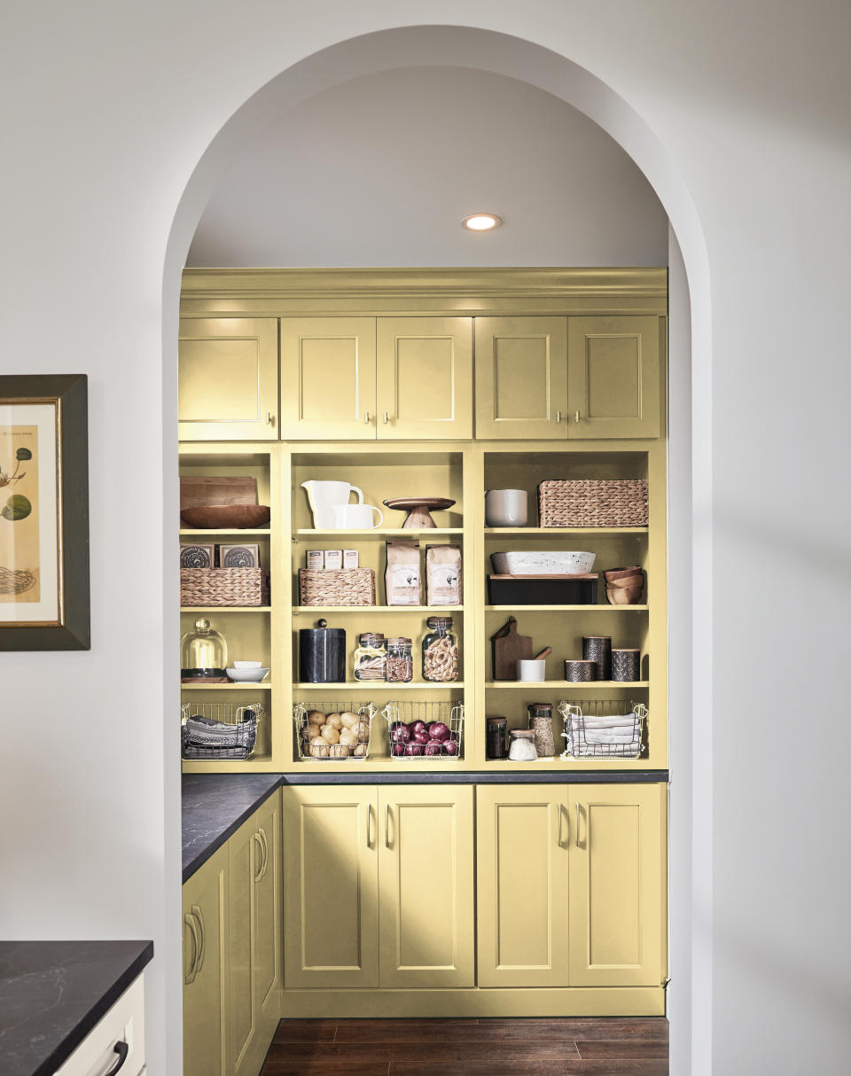
2. Go “Soft Modern” in the Kitchen
Pale yellow livens up a kitchen, but to keep it from feeling staring-into-the-sun intense, it’s best paired with a “soft modern” aesthetic. Picture clean lines—less ornate cabinetry—and a more minimalist approach to the space, with light wood tones and other organic elements woven in. “homeowners are seeking ways to create nurturing environments that promote positivity, connect them to nature and ease their minds,” says Stephanie Pierce, director of design and trends at MasterBrand Cabinets. The overall feeling is more sunlight-wafting-through-a-cottage-window-on-a-spring-day than traffic light.
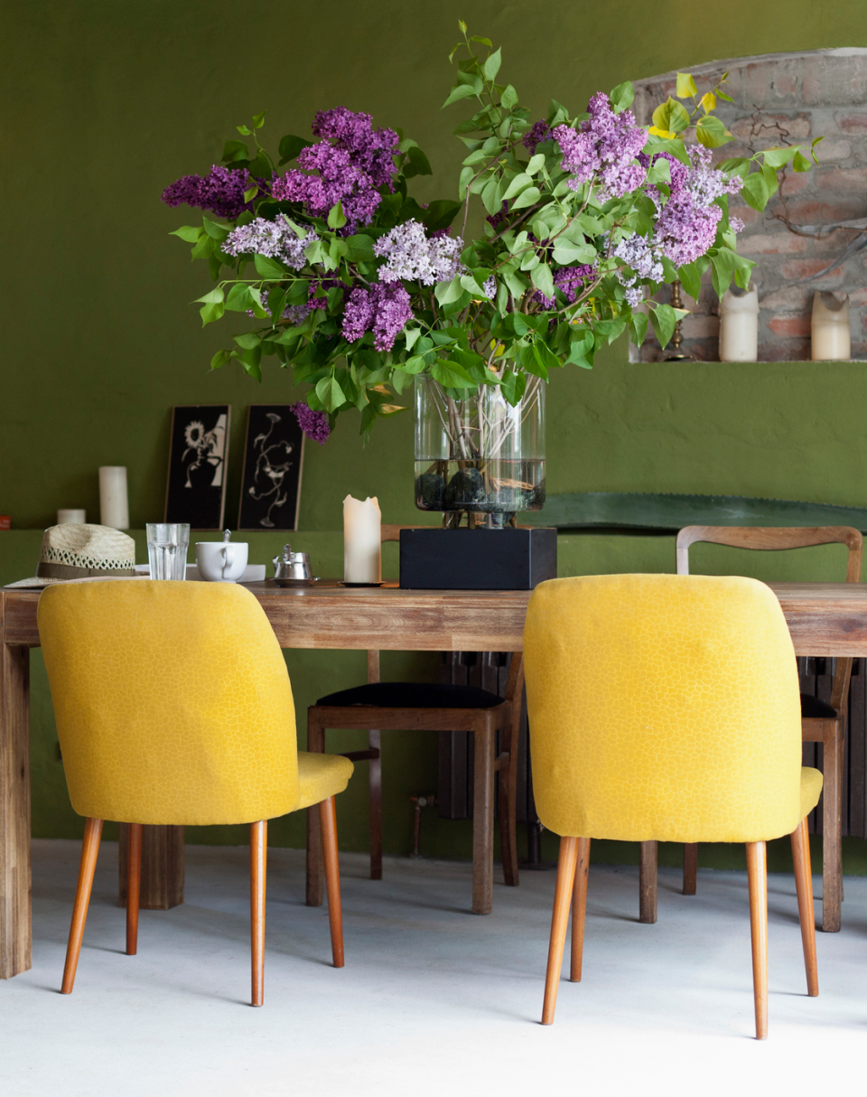
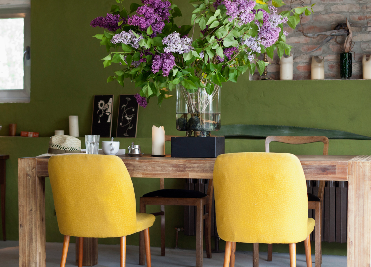
3. Save Bold Colors for Accent Pieces
If you want to ease into the trend, start working yellow into a room with accessories, like throws, pillows and artwork, or furniture. That way, if the color feels too intense for you, you can easily spread out the yellow to other rooms (or change it out completely).
4. And Layer It In
“The key to making the most of the color is by nestling it into a broader and unexpected palette,” says Sarah Dooley, director of upholstery at Sunbrella. “For example, a marigold hue paired with jewel tones creates a bold statement that can make a space feel radiant, whereas a softer yellow layered with neutrals on a pattern or layered throw pillows adds more subtle warmth.”
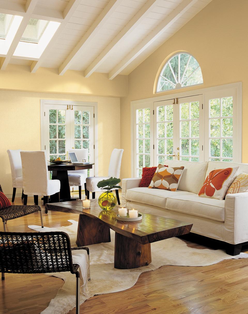
5. Match Depths
Blue, white and green all pair nicely with yellow, but the key to getting them to really work in harmony is to match their depths. A pastel yellow, like the Sunbeam Yellow (SW 0078) walls above, is best complemented with a muted tone, like Moody Blue (SW 6221) or Alabaster (SW 7008), Wadden says. If you prefer deeper, more saturated yellows—like a marigold shade—consider a blue that’s closer to navy. (Wadden suggests pairing Naval with Gambol Gold or Bakelite Gold, for example.)
RELATED: The Best Front Door Color to Boost Your Home’s Resale Value

