The YouTube logo: a history

The YouTube logo hasn't changed a huge amount over the years. Compared to some of the social media and internet startups that emerged around the same time, the video sharing platform has provide a lesson in restraint when it comes to redesigns – and that may be why it's been able to avoid the outrage that greets many logo makeovers (unlike the recent UI redesign backtrack).
Most of YouTube's logo redesigns have been so subtle, that you might not have noticed them at all. Chances are you're very familiar with that black logotype and red square. But the logo has changed several times over YouTube's 18 years of existence. Below, we'll show you every version that's been used to date. It might not be in our pick of the best logos of all time. But the YouTube logo history can still teach us a few things about how a successful logo can be almost imperceptibly improved and streamlined over time.
The YouTube logo history: 2005 to 2011
It's difficult to remember a time when no one knew what YouTube was, but when former PayPal employees Chad Hurley, Steve Chen and Jawed Karimon launched the platform on Valentine's Day, February 14 2005, that was the situation they faced. This meant that they needed a logo that somehow captured what YouTube was. And the design they settled on did just that.
They opted for a logotype with the brand's name in a very old font, Alternate Gothic number two. Despite being branded as a single word, YouTube was split in two: the first half of the name in black, while “Tube” appeared in white, in a rectangular box that was rounded enough and had just enough of a gradient to clearly be interpreted as a television.
The YouTube logo 2011 to 2013
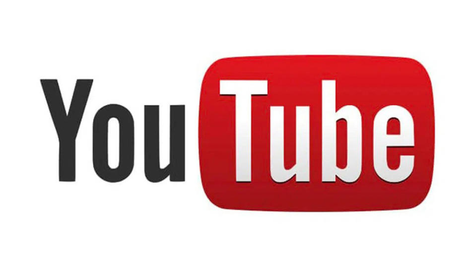
It would be six years before the YouTube logo was tweaked at all – and it was, it finally was, it was a very minor change. By 2011, people knew what YouTube was. People were also now using flatscreen TVs instead of cathode-ray tubes. So YouTube platform flattened that red box a little, making it less glossy, less 3D, and less obviously resembling an old television.
Now with a matte finish, the logo seems to have been designed to look more modern, fresh and relevant. Note the shadow at the bottom of the white letters, though. That would look a bit dated within a couple of years.
The YouTube logo history: 2013 to 2015
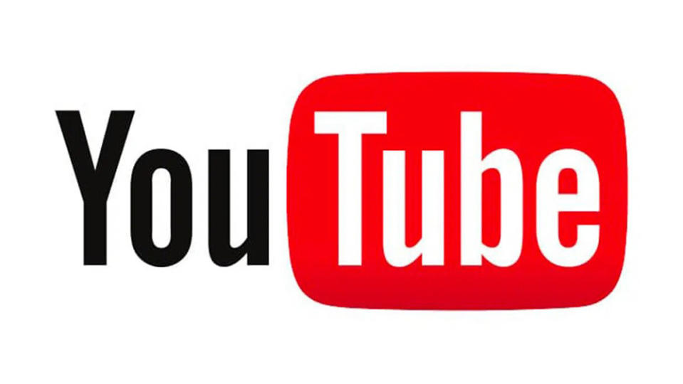
Like I said, that shadow effect wouldn't last long. In 2013, the YouTube logo came in for another quite minor change. That shadow was dropped, and the red background also got brighter. Here, YouTube was following the general trend for simpler, more minimalist logos, ensuring it stayed fresh.
The YouTube logo history: 2015 to 2017

Just two years later, YouTube thought better of that lighter shade or red and darkened it down again. On the one hand, it seems that YouTube suddenly cost restless with its branding – after six years with the same logo, it was now making minor tweaks every couple of years. But, again it was following the general trend – perhaps even the need – to simplify and flatten logo designs. This change seems intended to communicate the platform's maturing into something more serious and professional.
The YouTube logo history: 2017 to today
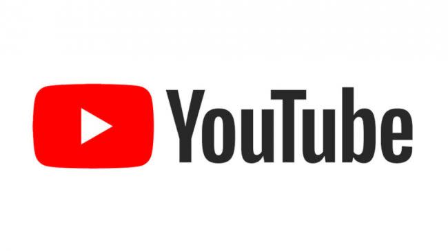
After another two years, the YouTube logo saw its first and only major overhaul in in 2017. The new design, which was created in-house, finally dropped the TV shape surrounding 'Tube', moving that to one side to allow space for a cleaner and clearer wordmark. Now, with the type run together and all in black, it finally becomes clear in the logo that YouTube is intended to be spelled as one word with no space.
Instead of 'Tube' in the red box, there's now a white play button. This had the benefit of allowing the icon to stand alone for use in spaces where a wordmark would be too big, for example as a mobile app icon, making the new logo more flexible for different use cases.
It was a clear transformation from the previous logo, and in fact, it involved more changes than many people might have noticed. The typeface was changed to a new bespoke font, and the colour of the rectangle changed again, now a pure red, #FF0000, which YouTube said represents the "RGB of video". Again the brighter colour serves to make the icon alone immediately recognisable when used on smartphones.
YouTube Logo history: all of the the YouTube Black History month logos
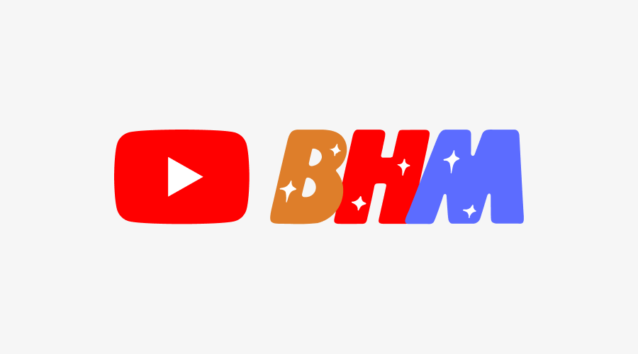
The most radical change to the YouTube logo came in February 2021, but only as a temporary campaign, a little like Google's doodles. To mark Black History Month (BHM), the platform commissioned Black artists to reimagine the platform's logo every week in February.
A new design appeared on the site every Monday, starting with Brazilian artist Leandro Assis's contribution. Assis's logo features YouTube's familiar red play button, but with stylised 'BHM' lettering replacing the standard YouTube wordmark.
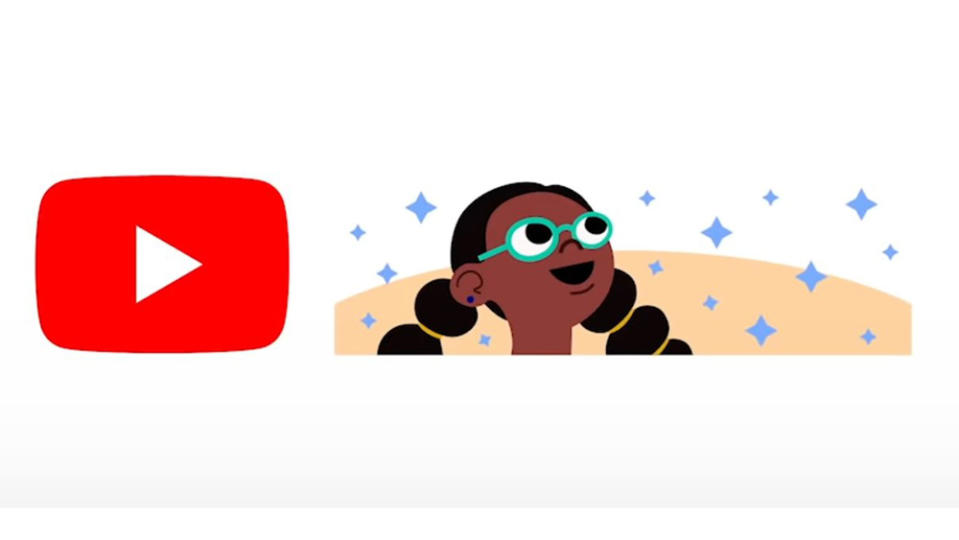
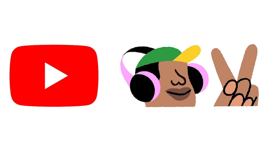
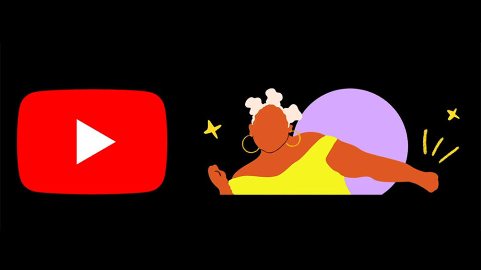
Assis's logo was followed over the next three weeks with designs by North Carolina-based artist and designer Keisha Okafor, Louis-based designer and illustrator Marco Cheatham and Brooklyn-based illustrator Shanée Benjamin (see all of the YouTube Black History Month logos in the gallery above).
"What inspired me to create this piece were the Black people around me," Assis told YouTube in a blog post introducing the BHM project. "The meaning and importance of our hair, the way we dance, the rhythms we create, and the beauty of our different skin tones."
More recent YouTube logo changes
YouTube's BHM initiative could have been the start of a regular feature, like Google's Doodle, but it wouldn't be until August 2023 that the platform experimented with YouTube logo changes again. And when they came, they were rather random.
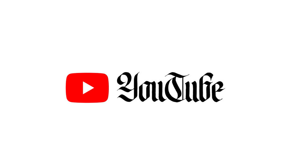
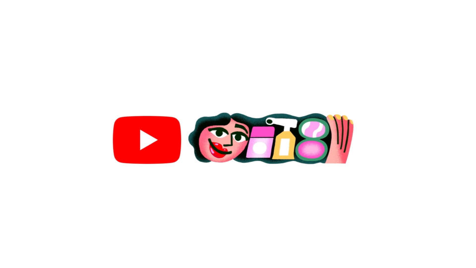
Coming quite close to each other, YouTube implemented an animated logo in an olde-style blackletter font for World Calligraphy Day – yes, that's a thing, and it followed up with a design that replaced the YouTube logo with a tribute to GRWM videos (that's Get Ready With Me for anyone who hasn't been watching videos of people doing their makeup for their school prom. There haven't yet been enough YouTube logo variations to constitute a regular phenomenon like the Google Doodle, but two in one month makes us wonder if the platform might be planning to make them a feature.
What we can learn from the YouTube logo history
The main thing we can learn from the YouTube logo history is that a good design stands the test of time. And when it does need updating, it's often best to proceed slowly, subtly and with a clear motivation.
With the exception of the more radical temporary YouTube logo variations, the YouTube logo has only ever changed as much as YouTube felt it needed to in order remain fresh and relevant, ensuring that it's always remained easily recognisable.
For more insights into how logos have changed, see our piece on the Google logo history. And If you're feeling inspired by the YouTube logo history and looking to hone your own design skills, see our guide to how to design a logo. If you need to upgrade your software, see the best current prices for Adobe's Creative Cloud suite of apps below.
Read more:
Are these the worst logos of 2022

