Windows 10's new icons: Experimental or the future of icons?
I'm all for better stability and improved performance in the Windows operating systems, but I've always been fascinated with the icons. Chances are you are too. I know that we aren't alone; otherwise there wouldn't be such a plethora of software out there that revolves around creating, viewing, and using icons. Don't believe me? Just Google Icon Software.
Now, we all know what icons are, but I love the succinctness of Wikipedia's description of a computer icon:
"A computer icon is a pictogram displayed on a computer screen in order to help the user navigate a computer system or mobile device. The icon itself is a small picture or symbol serving as a quick, 'intuitive' representation of a software tool, function or a data file accessible on the system. It functions as an electronic hyperlink or file shortcut to access the program or data."
I've used Windows for a long time now and have always looked forward to seeing the updated icons in each new version of the operating system. With each successive iteration of Windows, the icons have always gotten more detailed, colorful, and yes, even fun to look at.
If you are interested, take a look back at "The Evolution of Windows Icons gallery" that I did for TechRepublic back in 2009, soon after Windows 7 went RTM.
For the sake of expediency, take a look at the Control Panel image (Figure A) from that gallery. As you can see, the Control Panel icon grew more expressive and detailed as it evolved from the black and white box in Windows 1.0 to the wonderfully detailed dashboard image in Windows 7.
Figure A
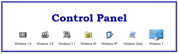
The Control Panel from the Evolution of Windows Icons gallery.
This and many of the other Windows 7/8.x icons look incredibly realistic using the Extra Large Icons View setting (Figure B). The 3-Dimensional aspect, the color, and the shading make these icons almost a work of art. My favorite in this image is the Recycle Bin.
Figure B
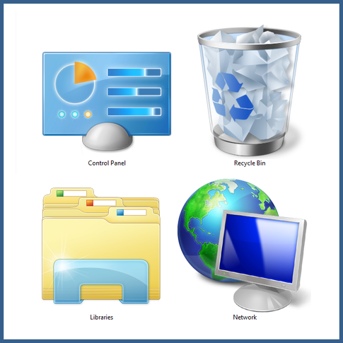
Windows 7/8.x icons look incredibly realistic using the Extra Large Icons View setting.
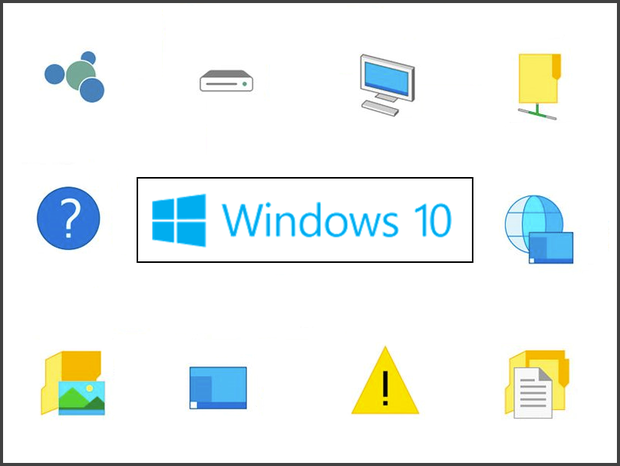
Now, here we have Windows 10, with its new, 1-dimensional, very colorful, but primitive looking icons. Don't get me wrong, it's not that I totally hate them; it's just not what I was expecting.
Of course, there's always the possibility that these icons are simply experimental placeholders, while Microsoft's graphic designers are conjuring up new works of art. In fact, in a recent tweet, Gabriel Aul, of Microsoft's Windows Insider program, seemed to allude to that fact.
But then again, maybe they're not placeholders. After, all we have been seeing more of these new flat icons with each new build of the technical preview. And the recently leaked Windows 10 screenshots that are rocketing around the web show even more of these new icons. Of particular note in these screensshots is the Recycle Bin icon.
What's your take?
What do you think of the new icons that are appearing in Windows 10? Share your opinion in the discussion thread below.