Control Panel and Settings: Why are both still UI options in Windows 10?
Something has been bothering me about Windows for quite some time. Chances are, it's been bothering you, too.
In Window 8.1 and Windows 10, we have both the old Control Panel and the new Settings user interfaces (UIs) for configuring various settings in the operating system. Some configuration options are in Control Panel and Settings, and some options are only available in one of the interfaces. And, there are even instances when you are working in the new Settings interface and you select an option and up pops a standard Control Panel dialog box. Talk about disorienting!
Back in the Windows 8 timeframe, I was disappointed by this half-baked approach, but I figured Microsoft was in a transition period and that the company would eventually put the Control Panel to rest and make the modern UI-based Settings the de facto configuration tool in the new operating system.
Over time and into the Windows 8.1 timeframe, more options were copied from the Control Panel to Settings. I liked that Microsoft was making progress, but it was still confusing because the majority of these configuration options were available in both places. Where are you supposed to go to configure this or that?
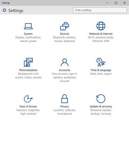
However, along the way, I became enamored with Settings (Figure A). The UI is clean looking and simple to navigate, and the controls are easy to understand and use.
Figure A
It's easier to work with Settings than Control Panel when it comes to configuring the operating system.
By comparison, the Control Panel with its wizards, tabs, panels, and nested dialog boxes (Figure B) is a very tedious way to work. Besides, it's long in the tooth, even with the slight enhancements it has received over the years.
Figure B
The Control Panel UI is long in the tooth.
Configuring in Windows 10
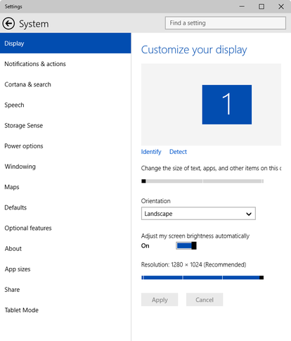
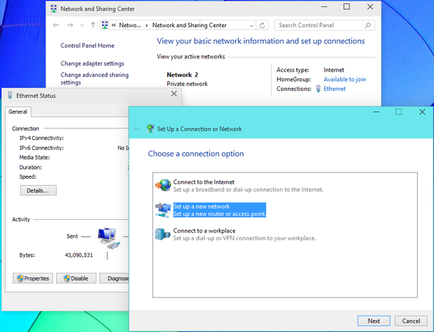
When the most recent Windows 10 build (9926) was released, I was glad to see even more progress in the Settings UI (Figure C), and my hopes were high. Unfortunately, I soon discovered the same duplication and lack of consistency -- the Control Panel still exists, and there are configuration options in Settings that bring up old Control Panel dialog boxes (Figure D).
Figure C
The Settings window in build 9926 shows improvement, but it still reeks of inconsistency.
Figure D
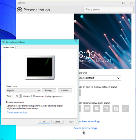
There are still configuration options in Settings that bring up old Control Panel dialog boxes.
This is essentially a beta operating system and there are bound to be some rough edges, so maybe I should cut Microsoft some slack, right? I don't think so.
After all, Microsoft has been working on this Metro/modern UI for more than a decade. It started with the Windows XP Media Center, made its way to the now defunct Zune, migrated over to Windows Phone, and finally became the centerpiece of Windows 8. If anyone is a preeminent expert on the modern UI, it's Microsoft, so why haven't they been able to convert the entire set of Control Panel utilities over to the Settings UI? Microsoft has completely converted so much of what were once staples in Windows to the modern UI, so why leave the Control Panel behind?
Now we're working with the fourth publically available build of the Windows 10 operating system, and we're within six - seven months of the GA release, and yet there appears to be no solid transition underway. My fear is that the Control Panel/Settings mess will be in the Windows 10 release.
What's your take?
Do you like the Settings UI, or do you prefer the Control Panel? Share your opinion in the discussion thread.
Also see
With the Windows 365 trademark, the Windows 10 subscription plan becomes apparent
The Windows 8 scrap heap: 10 features that didn't make it to Windows 10
Windows 10 spotlight: Technical Preview (build 9926) (Tech Pro Research, a sister site of TechRepublic)
