Lego's vibrant new brand identity feels both nostalgic and timeless
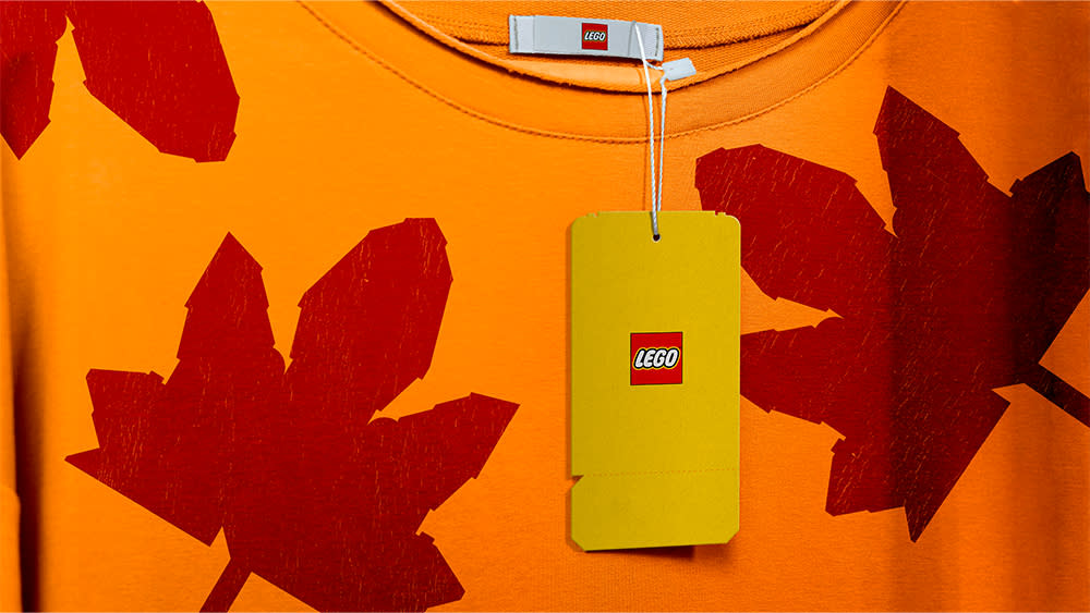
We all know the Lego logo, but beyond that core brand asset, our favourite purveyor of coloured building bricks has been a little inconsistent in its branding. That's changing with the launch of a full brand identity built in-house brick-by-brick.
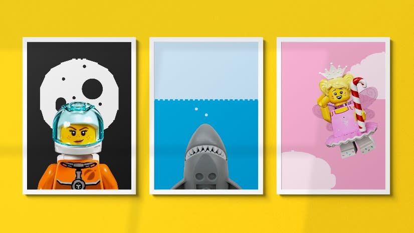
Covering physical products and digital, the playful new branding takes advantage of the recognisable form of Lego bricks to construct both digital and physical assets with an emphasis on learning through play. After the recent Lego AI controversy, it seems like a good idea to make sure everyone's on message with a cohesive design language.
While the Lego logo has long been a consistent recognisable design element, the Danish toy brand found itself in need of a broader fluid and cohesive brand experience across all products. So Our Lego Agency, with input from the brand consultancy Interbrand, set about creating an identity by researching different modes of visual storytelling.
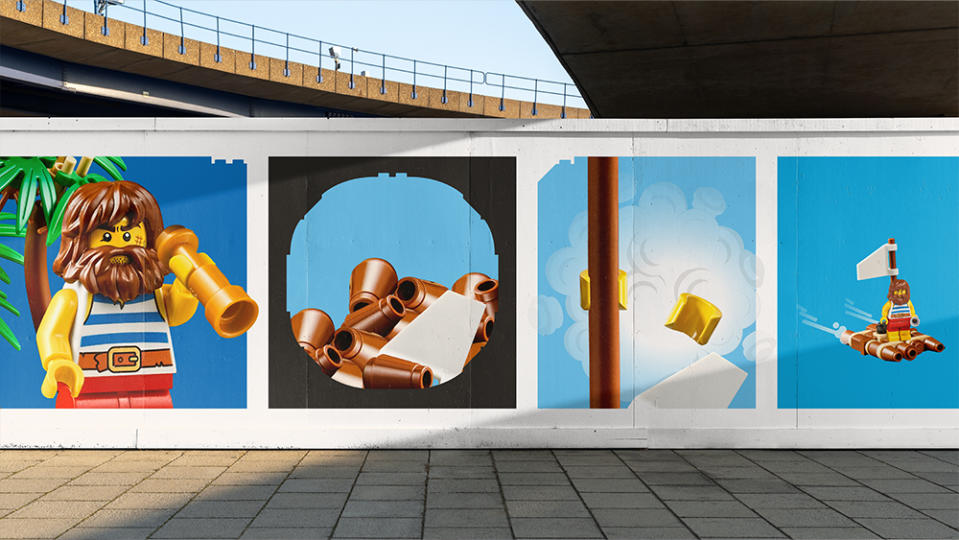
Recognising that the company’s youngest fans are still learning to read, they turned to the visual language of comic books, something Lego has leaned into in the past. The result is a new brand architecture and assets that represent the Lego brand experience with the use of cells, speech bubbles, action graphics, and, of course, Lego minifigures.
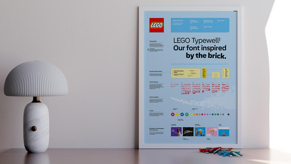
Lego says that a massive 23 guidelines and 110 principles were whittled down to five key design principles: design for the audience, build from the system-in-play, tell stories, be playful and optimistic and keep it simple. The result is an identity that fits Lego's history – indeed, it might trigger nostalgia for anyone who grew up with the brand, but also feels fresh and modern.
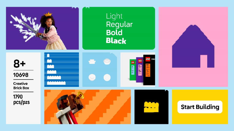
The rebranding includes a clutch system named Lego Brick Pro, which enables the process of building Lego elements to be replicated digitally in the form of a font (or 130 glyphs). This can be used to quickly build holding shapes, illustrations, UI buttons, and more using the same geometry as the bricks. For example, a store button made out of Lego could be built at the same ratio to transition between physical and digital experiences.
Meanwhile the new typeface, Lego Typewell, is based on type discovered in the Lego company archive. Action graphics add dynamism, drama, and emotion to images using 58 Lego elements instead of words, while motion principles included branded ways of transitioning, editing or moving design elements, inspired by the way people play with Lego, for example separating and dropping the bricks.
Thomas Holst Sørensen, global head of design at Our Lego Agency, said: “The Lego Group has been the master of constant reinvention for 90 years. Lego play offers the chance for discovery and invention, where you can always create something new from something familiar. Our new brand DNA reflects what is important for the Lego brand. It is a beautiful, simple, and well-constructed system that both unifies and breaks free the creative and playful expression of our brand and product experiences.”
Oliver Maltby, executive creative director, portfolio lead at Interbrand, said: “The LEGO Group’s archives were a treasure trove of elements that contributed to crafting the final solution – a mix of storytelling pieces that we used to build out a full Lego set just as iconic and timeless as the brick itself. The playfulness of the new identity reinforces the vision of the Lego brand as a global force for learning through play.”
For more branding news, see the new Papa Johns brand identity, the Decathlon rebrand and the "cheap and nasty" new Massimo Dutti logo.

