The best header and display fonts making an impact in 2024
Choosing the right display font for your headers is one of the most powerful ways of setting the tone for your entire project. Whether the pieces you’re designing are print or digital, making an impact is always important. However, many of the most successful fonts are both impactful and nuanced.
Often, the brand or campaign you’re designing for will have a layered message. In today’s economy, many organisations have cutting edge and traditional aspects they want to convey. Because of this, many of the fonts in our list combine a retro feel – often a mid-century vibe – with a contemporary finish.
To assemble this list, we talked to practicing designers in branding, packaging, digital campaigns and publishing, and surveyed trend reports and sales. Our list reflects both what’s popular and what’s inspiring designers right now. As in any area of creativity, fonts are a subjective topic, but we reckon at least one or two of the following will hit the mark with you and help you in your work. Some are available as free fonts at certain weights, and others are part of Adobe Fonts. For more type inspiration, see our feature on the best typewriter fonts.
The best header and display fonts
01. Recoleta
Recoleta is a very popular typeface at the moment and it’s not hard to see why. Characterised by strong contrast, Recoleta’s Bold and Black styles have a retro vibe that hints towards the 1970s but without going over the top while at lighter weights Recoleta has an arts and crafts feel to it. There are 15 styles in total, including seven Alt versions that bring some extra flourish. The full set costs $129 or £104.19.
02. OhNo Softie
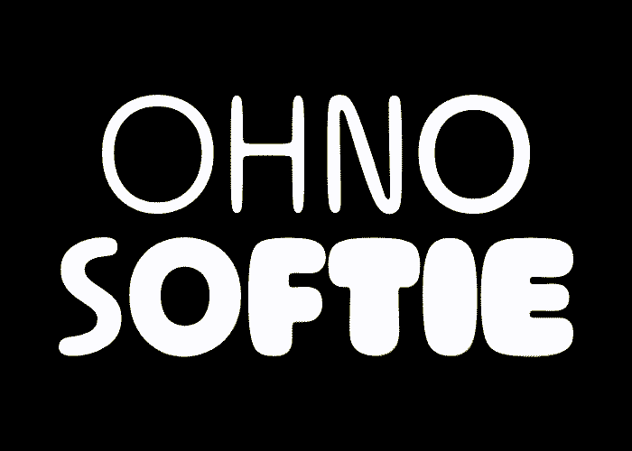
“Fabric softener brand designers, please, for the love of God, take notice,” reads the blurb for Softie, but we see a future for this typeface elevating anything from designer furniture to digital services. Its gentle, organic roundedness acts in contrast to built environments that crush the human spirit, while its puffiness speaks of comfort in an unpredictable world of economic fakery and loudhailer politics. Softie Black looks voluptuous, while Light will give any design a human touch. It’s $99 for the full family, or $40 per style.
03. Borna
Borna has a quirky, modern look and feel. It celebrates technology while finding beauty in those little glitches that draw the eye when technology does the unexpected. Uniform stroke widths are unusual in typography as they don’t aid legibility. Borna’s designers use them while simultaneously drawing in the outer edges of certain curves to the point where a character almost breaks, saved by little wedges protruding from the vertical strokes to somehow hold things together. This fascinating adaptation feels like an architectural response to the intentional glitch. Borna is a pay-what-you-want family, and the medium weight is free.
04. Garda
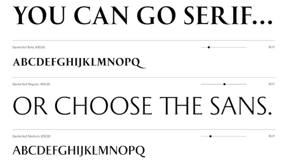
Like Borna, Garda throws you with little details that don’t add up. Based on Roman inscriptions, this character set is well structured with its proportions applied across serif and sans serif fonts within the Garda family. There is a sense of classical beauty here, yet the serifs are ever so slightly asymmetrical. We love how they spread to support characters such as the 'M' and the 'A', like hands splayed ready to do push-ups. It’s €350 for all 10 styles.
05. Greycliff CF
Greycliff CF is a sans serif font with all the crisp legibility of old school modernist typography but none of its cold rigidity. Generous in x-height and width, Greycliff nonetheless has very short ascenders and descenders. This is a font with an air of mid-century optimism that feels contemporary thanks to corners that have been sanded smooth for easy living. In spite of this, it still feels industrial, rugged and durable – ready for anything you throw at it. The full family of 18 styles starts at $275.
06. Dala Prisma
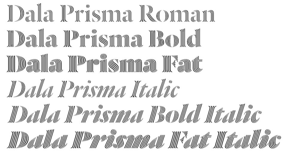
Although Dala Prisma only works at large sizes, it has the ingenuity to deserve a place in your Font menu. Prisma is an adaptation of the Dala Floda stencil font, with inlines that stretch and pinch in within each stroke for a powerful optical effect that advances on the geometric inline typography popular in the 1970s, which has been recycled ever since. The heavier the style, the more inlines it possesses, making it all the more hypnotic. $80 per style or $300 for all six.
07. Coreta
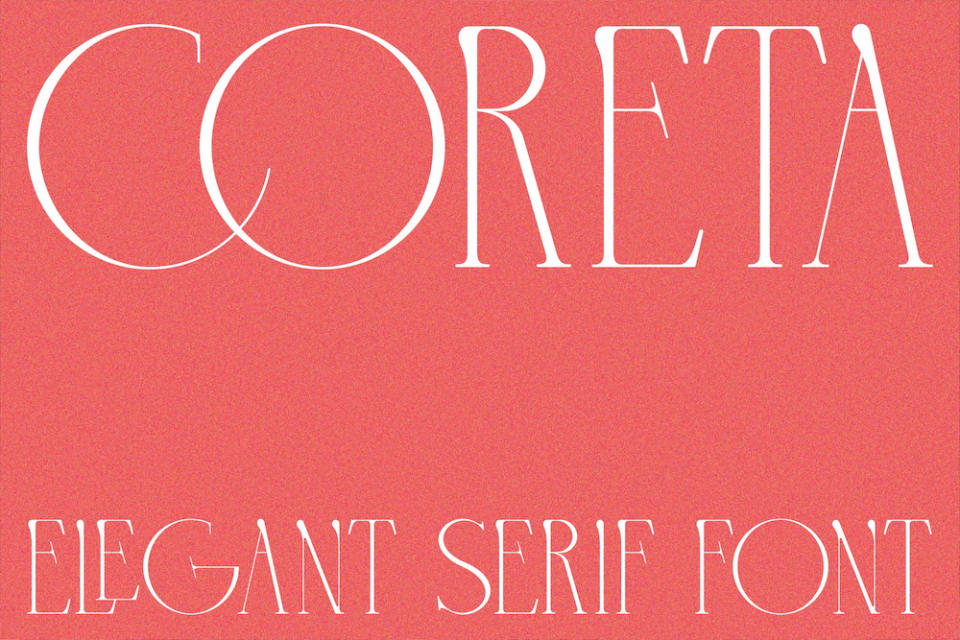
Taking cues from the geometric precision of Art Deco, and the natural elements of Art Nouveau, Coreta is thin, delicate and graceful. It comes in one style, with 255 glyphs, and has unusual vertical strokes which begin with a nub and terminate in a serif. Most of its characters are condensed, but it really lets loose with the roundness of C, Q and O – and a capital G that is particularly unique. When playful elegance is what you need, select Coreta. It’s $13 or £10.50.
08. TT Ramillas
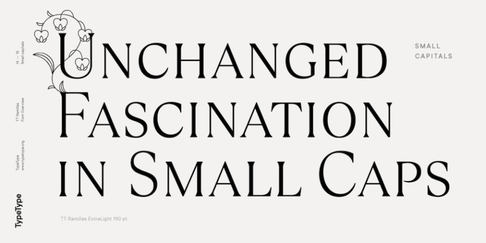
For sophistication or impact – TT Ramillas has everything you need. Used in its Regular weight, it feels elegant, robust and restrained – not pushing the contrast for the sake of it. When it’s time to play, you can roll out its Outline, Décor and Variable versions, or apply its nature-inspired sets of Initials. Ramillas was intended for the fashion sector but its designers have thrown everything in – over 900 glyphs, and 28 styles – to extend its flexibility. $269 for the full package.
09. Denton
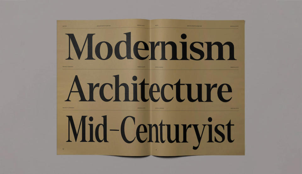
Mid-century Modern with a contemporary twist is what many brands are looking for at the moment and that is what Denton has been designed to deliver. Whereas similar serif typefaces in our list have opted for softness and light, Denton is confident with its sharp edges and strong contrast. Although it’s a serif font family, it punches very well out of black and works perfectly as a header font for advertising. There are 86 styles across this ‘superfamily’, setting you back £360.
10. Darkones
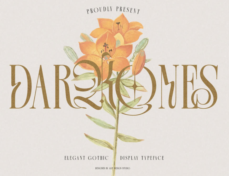
Darkones is a bizarre hybrid between a blackletter and serif typeface, which turns out to have quite a whimsical, arty feel to it. Its makers see it being used for magazines, tattoos, social media and clothing however it may sit well in higher end markets like fashion and beauty, spirits branding and perhaps even jewellery. It has very imaginative ligatures and some of its strokes have a jolt in the middle, as though whoever drew them was elbowed in the ribs at a crucial moment. Expect the unexpected: it’s only $15 for Regular and Italic.
11. Abolition
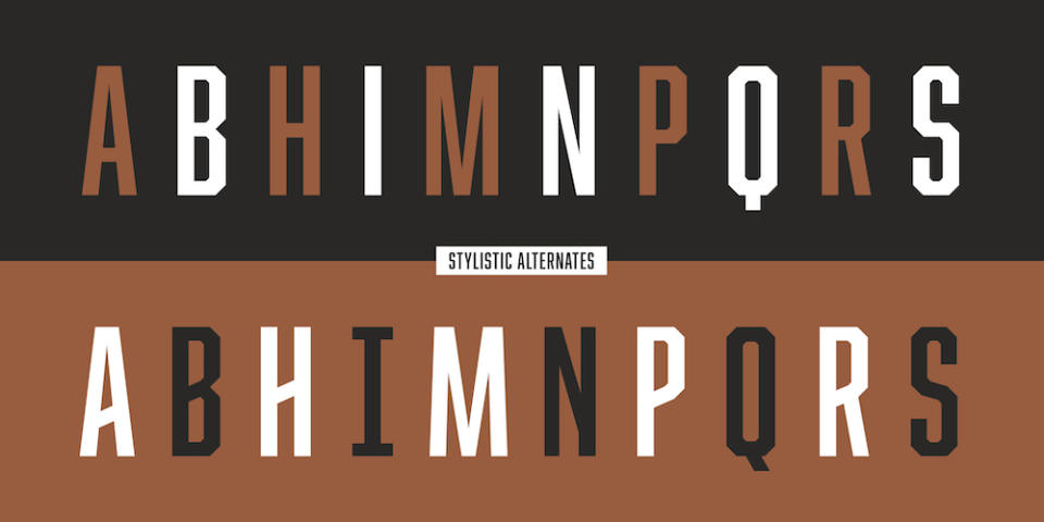
We’re nearing the end of our list and what’s missing so far is something mean and muscular. Abolition has these qualities and looks like the lettering on 70s sports jerseys – condensed, angular, straightforward. Fort Foundry has added two interesting styles – Rough and Lines – which give you more to play with. But there’s no whimsy here. Abolition is a modern, industrial font, so blue collar you might expect to pay by the hour. Ten styles for thirty bucks ain’t bad.
12. Freight
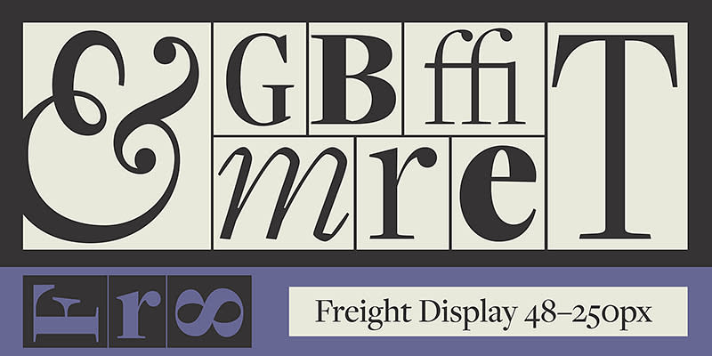
Freight is one of the best examples of a versatile font collection that has a traditional feel thanks to the 18th century Dutch typefaces that inspired it, but has a modern sensibility thanks to Joshua Darden’s willingness to innovate where needed. Its classic Display serif looks sharp and intelligent, a Macro slab version feels more up-to-date and there’s a sans using the same basic proportions for when you need it. There are 156 in the full collection at $675, though Freight is part of Adobe Fonts.
13. Uniquen
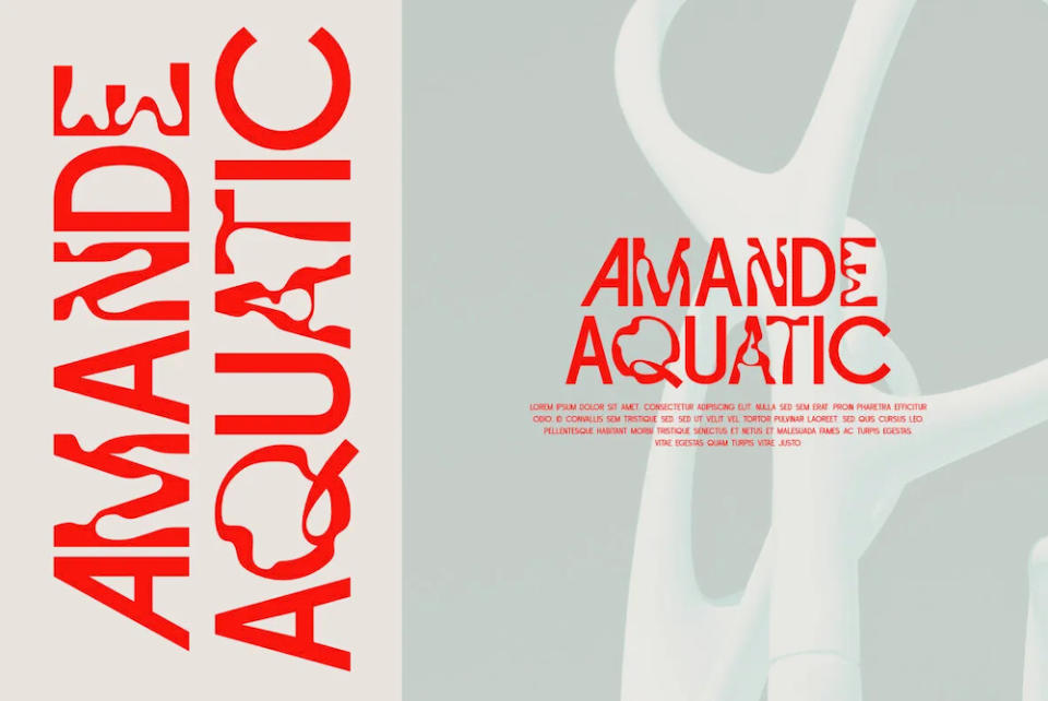
Happy accidents are something we celebrate in modern creativity – they remind us we’re human in a world where AI bots write techno hits and post them to Spotify. Uniquen feels full of happy accidents. It’s a decorative font with two sets of capitals – one fairly playful sans serif alphabet, and one where the characters look as though they’ve been distorted by the rippling surface of the sea. While it’s not as fully formed as some of the font families above, it could be just the touch you need to break them up. Uniquen costs $15.
For more font choices, see our best graffiti fonts, best script fonts and the best fantasy fonts.

