What the actual hell is going on with Google's newly redesigned Android emoji

Google announced last week that Android emoji would be getting a complete revamp with the next version of Android, Android O.
As my colleague Stan wrote after the announcement, the redesign was long overdue. Android users have long had objectively worse emoji than their iOS counterparts.
SEE ALSO: Google is completely revamping Android emoji and it's about damn time
For example, just look at this evolution of iOS crying emoji vs. Android crying emoji:
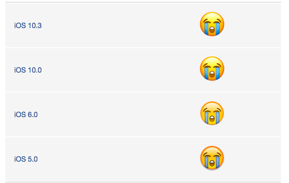
Image: emojipedia
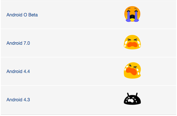
Image: emojipedia
iOS has been more or less the same for many years, and for good reason — the iOS emoji are great. They're clean, consistent, and they look polished - quintessentially Apple. They're also often considered the standard emoji.
Android on the other hand started out with a black and white monstrosity, inspired by the Android logo and then evolved into the infamous blob.
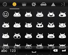
Image: swiftkey
Since Android emoji were never quite as good as their iPhone counterparts, I was extremely excited to hear Google announce that they were redesigning their Android emoji. Emoji are everywhere, but as a lifelong Android user, I've simultaneously gotten used to the Android's emoji blobs, the inconsistencies of expression, and the misunderstandings that came with the difference in the emoji across platforms, all the while trying to ignore Google's emoji as best I could.
I'm not the only one avoiding Google's Android emoji. Over the years, many apps like Facebook and Twitter have been using their own versions of emoji, while others like WhatsApp use the iOS emoji in the app. Android phone makers like Samsung also have their own version of emoji.
Given the struggle with Android emoji in the past, I welcomed Google's redesign wholeheartedly. However, the more I look at the new emoji, the less I like them. Something about the new emoji seems just a little bit ... off.
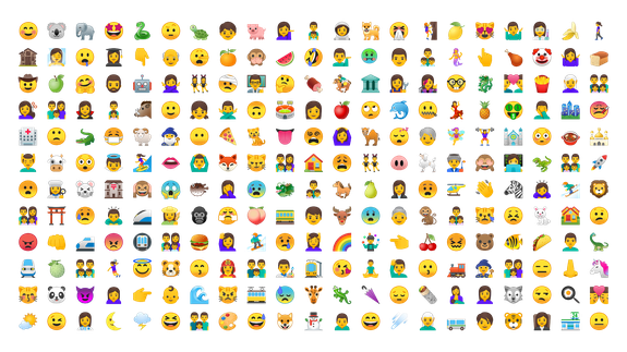
Image: google
Sure, some of the changes are good. The emoji are now circular instead of blobs. And the new emoji feature a border around each design which will make the emoji more legible to a wider range of people on the web.
Image: google
And we cannot forget how great the new dog emoji is:

Image: Emojipedia

Image: emojipedia
However, there's just really something very unsettling about the new Android emoji. Especially the smileys.
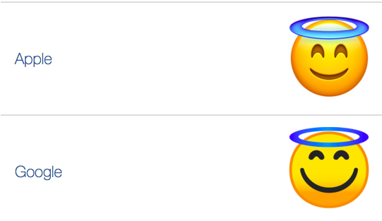
Image: emojipedia
The Google one looks like a cheap knockoff of the Apple one — it has a much bigger, wider smile, and just looks wrong.
Let's look at "Loudly Crying Face:"
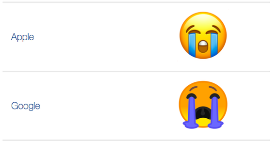
Image: emojipedia
Apple's is exaggerated, sure. The lines of tears are too perfectly straight. Google's, however, is just bizarre. Firstly, it's orange which we know is code for angry. Why is the crying emoji also angry? We may never know. Secondly, the tears just do not make sense. They look like curtains, and the physics of the floating tear pools just do not add up. You can actually see the emoji's uvula, which is extremely unnecessary. It's an emoji! Does it really need an uvula.
Lastly, let's look at "Face with tears of joy":
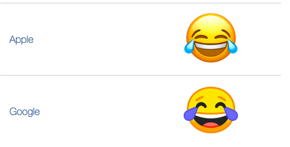
What on earth is happening here? It looks squished, the proportions are not right. Two designers from the team behind these wrote about the redesign, where they explained the new grid they used for making all the emoji standardized.
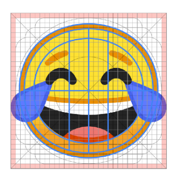
Image: google
Here's our friend, now with a grid, and it does not look any better. If anything, it just looks worse.
And last but not least, what the actual hell is this:

Image: google
Yes, the new emoji have come a long way from the original black and white Android logo-inspired monstrosities. They look cleaner, there's finally much less ambiguity over what iOS emoji they map to, and they're more legible. The redesign is a step in the right direction and a sign that they care, but unfortunately, they still have a long road ahead to be nearly as pretty as the flawless iOS emoji.
WATCH: Signs you're reading too much into instant messages with emoji