
Grading all 30 new NBA uniforms as they're released

In case you haven’t heard, the NBA is making the switch from Adidas to Nike in 2017-18. The Swoosh will take over as the official on-court apparel provider of the league starting in October. That, among other things, means new jerseys and uniform combinations for all 30 NBA teams.
Nike announced a new framework for its NBA jerseys last month, scrapping the traditional home and road designations and replacing them with an “Association” uniform (white), an “Icon” uniform (color) and two other alternates that will be revealed at later dates. The two core combos, though, are being released by teams throughout the summer.
Below is everything we’ve seen so far, starting with the most recently revealed. As more designs trickle in, this post will be updated, and grades will be doled out accordingly.
New York Knicks — B
Future Meets Future: @FrankLikina + @Nike Association & Icon Edition uniforms unveiled #NewYorkForever #Knicks pic.twitter.com/AshSNVkRxt
— NEW YORK KNICKS (@nyknicks) August 11, 2017
'Tis the season (almost) #RookiePhotoShoot pic.twitter.com/EPnkCCIaFW
— NEW YORK KNICKS (@nyknicks) August 11, 2017
The Knicks' new Nike uniforms look like the Knicks' old Adidas uniforms, only 100% swooshier. pic.twitter.com/ynS9JQlXNn
— Dan Devine (@YourManDevine) August 14, 2017
The Knicks’ announcement says the “Association edition will be similar to the home white uniform of previous years,” while the Icon edition “resembles the road blue uniform.” The most significant adjustment? “On both uniforms, ‘Knicks’ has been added at the belt buckle.”
Well, that and the angled piping at the bottom of the shorts:
Frank and the rest of th rookie class pic.twitter.com/3kVw8efcjS
— Stefan Bondy (@SBondyNYDN) August 11, 2017
All told, not much to vent the spleen about. We’ll see if the team in the league’s largest market winds up with something a bit splashier when their two alternates are unveiled, likely in a few weeks. — Dan Devine
Brooklyn Nets — B
New beginnings. #WeGoHard pic.twitter.com/HG6648ARrA
— Brooklyn Nets (@BrooklynNets) August 11, 2017
Side-by-side comparison of Nets' old and new white uniforms. pic.twitter.com/LIl1RNt61k
— Paul Lukas (@UniWatch) August 11, 2017
Side-by-side comparison of Nets' old and new black uniforms. pic.twitter.com/gnBfKXe49O
— Paul Lukas (@UniWatch) August 11, 2017
Not much difference here — a slight change on the angle of the stripe on the shorts, the addition of the secondary logo on the belt, and the new uniform patch on the chest. One good thing, though, is that the background of the Infor patch is now black-and-white, rather than the garish red initially planned, a splash of color that probably seemed like a good idea, but that stuck out like a sore thumb in execution. All told, simple and plain; not much to write home about, but nothing much to complain about, either. — Dan Devine
Houston Rockets — B-
New threads for the 2017-18 season. pic.twitter.com/AhFbbTTLeK
— Houston Rockets (@HoustonRockets) August 10, 2017
Again, not much of a change here — what looks like a more consistent width on the cut of the V-neck collar, the addition of solid piping around the arms and a change in the Vs along the ribs of the jersey, and that’s kind of it. Sharper stripes, cleaner lines and a “more collegiate feel,” according to the folks at Rockets blog Space City Scoop. Now, we wait to see what Houston does with its two alternates; here’s hoping some iteration of last year’s slick black joints stick around. — Dan Devine
New Orleans Pelicans — B
This is BIG: New @Nike threads coming to New Orleans! #Pelicans #NOLA ⚜️ pic.twitter.com/7boDbQUvt1
— New Orleans Pelicans (@PelicansNBA) August 10, 2017
Once again, with feeling: not much of a difference from last year’s model. The most notable adjustment, though, is a positive one: the lettering across the chest has gone from itsy-bitsy to proportionally large and more readable, which is nice. Beyond that, the Pels keep things steady, so if you like their combinations of navy, white, gold and red (which I do), you’ll be happy. — Dan Devine
San Antonio Spurs — C
The Icon. pic.twitter.com/HWXA6WNKpu
— San Antonio Spurs (@spurs) August 11, 2017
The Association. pic.twitter.com/eJZHQkkBTV
— San Antonio Spurs (@spurs) August 11, 2017
A classic, evolved.
@BP3 & @Dwhite921 showcase our new Spurs x Nike threads » https://t.co/3nlKoaxTne pic.twitter.com/x7hzdokqyE— San Antonio Spurs (@spurs) August 11, 2017
Like many of their fellow NBA teams, the Spurs didn’t make many adjustments at all in their new threads. The ones they did make, though — switching up the font on their lettering on the front of the jerseys, removing the gray/silver lining around the letters, shrinking down the size of the numbers a bit — all seem like at least slight downgrades, though. Given the chance to make major changes or making no changes, the Spurs instead might have done just enough tinkering to make their look a little worse. — Dan Devine
Memphis Grizzlies — A
Grit & Grind evolved.
Our classic style combined with @Nike’s innovative high-performance design https://t.co/gWPZXO9GvZ pic.twitter.com/HiPfmRkgZK
— Memphis Grizzlies (@memgrizz) August 10, 2017
Grit & Grind ! pic.twitter.com/QNk8VXBhiD
— Mike Conley (@mconley11) August 11, 2017
Here, on the other hand, the small tweaks — removing the gold triangle from the collar, sliding the bear logo from the point of the collar down to the shorts and removing it from the left leg — are all nice, clean and unobtrusive. Memphis’ myriad combinations of deep and light blues with gold and white have ranked among my favorite uniforms in the league over the years, and these subtle shifts do nothing to compromise that position. — Dan Devine
Los Angeles Clippers — A
The New Wave is here.
Get familiar » https://t.co/cpKEj3q7kW pic.twitter.com/beYWWNE5Oj
— LA Clippers (@LAClippers) August 11, 2017
Good job, Clippers. pic.twitter.com/xWFOQHrBDh
— Dan Devine (@YourManDevine) August 11, 2017
My feeling on the Clips’ uniforms had not changed since Steve Ballmer introduced them in the summer of 2015. The home whites were, at best, not great; the red and black roadies with that rough logo were even worse. So these are a sight for sore eyes:
Side-by-side comparison of Clippers' old and new white uniforms. pic.twitter.com/gqi2AFczPm
— Paul Lukas (@UniWatch) August 11, 2017
Clippers' primary colored uniform (formerly road) changing from red to blue. pic.twitter.com/9KuX6BB04l
— Paul Lukas (@UniWatch) August 11, 2017
Going from black to blue on the color unis and on the lettering of the whites, and getting rid of the silly lines underneath the team name on the front are both improvements. I’m not sure I’m as sold on the two-tone butt and thigh striping on the shorts, though I do kind of like the horizontal lines running up and down the sides of the uniform; your mileage, of course, may vary. Keep us from ever having to see one of Clippy-style those logos front and center on the chest of an alternate uniform, guys, and I’ll donate to whichever aviary Chuck the Condor wants. — Dan Devine
Dallas Mavericks — B
Mark your calendars! New jerseys will be available for purchase at @MavsHangar on 9.29.17! pic.twitter.com/3Zye1DydSE
— Dallas Mavericks (@dallasmavs) August 11, 2017
Dallas Mavericks uniform for 2017-18 compared with last year pic.twitter.com/iYd8yC3Gl5
— Chris Creamer (@sportslogosnet) August 11, 2017
Dallas Mavericks blue/road/icon uniforms for 2017-18 versus last year.
Relatively the same: number is larger, collar slightly tweaked pic.twitter.com/8W23zh9xRx
— Chris Creamer (@sportslogosnet) August 11, 2017
Another one with minimal change — getting rid of the notch on the collar, adding a star to the belt, slightly lighter shades of blue and gray, and it looks like the numbers are a bit bigger. Along the same lines as the Nets: not much to write home about, but nothing much to complain about, either. — Dan Devine
Los Angeles Lakers — A
Updating a timeless look: https://t.co/3XscgG4lzu
— Los Angeles Lakers (@Lakers) August 11, 2017
@UniWatch #Lakers releasing three jersey reveals as opposed to all teams showing only two. pic.twitter.com/81ZxmsNYHT
— Mandy Lopez™ (@2EP0L) August 11, 2017
As expected, nothing drastic here. According to the team, “The most noticeable update to the Lakers’ uniforms is how thin they appear,” which makes sense; after all, why mess with a classic? By revealing their purple, gold and white strips, the Lakers removed suspense from one of their two alternate uniforms; what remains to be seen is if the team will stick with some version of its black “Hollywood Nights” alternate for its fourth and final uniform of the season. — Dan Devine
Phoenix Suns — A-
Next up in the NBA/Nike jersey reveal: the Suns. pic.twitter.com/Zvmt86ZbgC
— Dan Devine (@YourManDevine) August 10, 2017
It's Time! pic.twitter.com/ObRkifIh4s
— Phoenix Suns (@Suns) August 10, 2017
The big shift here: Phoenix has ditched the effect of angling the lettering and numbers on the fronts of their jerseys upward, and instead reverted to just having their team/city names run horizontally across the chest, with bigger numerals centralized on the stomach and no sunbeam lines on the right-hand side. I kind of liked the old ones — the evocation of a rising sun was a neat and appropriately unique touch — but the result is pretty sharp.
The arc of “PHOENIX” on the “Icon” jersey, the super-sizing of “SUNS” on the whites, and the beveling effect on the lettering might be a bit busy for some, but the move to a two-tone collar all the way around (as opposed to having the front be one color and the back another) is nice, as is adding purple as an accent color back into the white uniforms. And, as always, the Suns’ purple look is one of the cleanest in the league. It remains to be seen how long Phoenix’s young talent will need to coalesce into a team worth watching, but at least we know they’ll look pretty good along the way. — Dan Devine
Minnesota Timberwolves — B-
As it turns out, those early leaks via “NBA 2K18” and Andrew Wiggins’ Instagram account wound up being on the button:
The new threads have dropped. Bring on the New Era. #NewEraNewThreads pic.twitter.com/t0PjCcp8II
— Timberwolves (@Timberwolves) August 10, 2017
New take x Bold vibe: https://t.co/bbAc9WmfYd#NewEraNewThreads pic.twitter.com/mmqgVSTutW
— Timberwolves (@Timberwolves) August 10, 2017
The Wolves, then, stand as one of the teams that used the Nike switch-up to completely revamp their design — new color schemes, with a darker blue (“midnight navy,” according to the team) accenting the white jerseys and serving as the baseline of the “Icon” unis, joined by the lighter shade (“lake blue”) that accented the previous model; new fonts and colors on the letters and numbers on the front and back; a pair of horizontal stripes below the collars on the jerseys (sort of similar to what the Washington Wizards have) and at the bottoms of the shorts; a new circular primary logo along the side of the shorts.
They represent significant departures from what came before …
Side-by-side comparison of old and new Timberwolves uniforms. pic.twitter.com/Z1e5Y6dUwY
— Paul Lukas (@UniWatch) August 10, 2017
Side-by-side comparison of Timberwolves' old and new blue uniforms. pic.twitter.com/t30ueTxCzM
— Paul Lukas (@UniWatch) August 10, 2017
… which, when you’re a franchise looking for its first playoff appearance in 14 years, makes some sense.
There’s something somewhat futuristic about the new kit, and it has elicited pretty sharp opinions in both directions since the official unveiling. As someone who grew up digging the early Kevin Garnett-era road blues and who actually dug all the trees and greenery of the 2008/2009 reboot, this strikes me as a bit too antiseptic, especially in maximizing the navy to which so many teams seem to be steering while minimizing the green accents that have always given the Wolves their splash of color:
@Timberwolves Hey guys…where's the green at in the new threads? Need some green in there for sure
— Norman Anderson (@NormTheAngler) August 10, 2017
Then again, if an early video-game leak of one of Minnesota’s still-to-come alternate uniforms is also on the money, we could be getting all the green we can handle very, very soon:
Timberwolves New Green Jersey Leak from #NBA2K18 #NBA pic.twitter.com/6mKwrKx23Q
— TA (@TaylorAdrian) August 4, 2017
Be prepared to adjust the levels on your monitors and TV screens, y’all. — Dan Devine
Milwaukee Bucks — B

From the looks of things, the main differences between the uniforms the Bucks introduced last season and the ones they’ll rock this year are moving their alternate “M” logo from the collar down to the belt on the shorts and adding a Harley Davidson patch as part of the league’s new jersey advertising pilot program. Reasonable people might disagree as to whether or not the black-and-orange logo standing out against the Bucks’ green-and-white uniforms is a pleasant aesthetic touch, but by and large, keeping the status quo isn’t a bad idea when you’ve got as clean a look as the Bucks sport. — Dan Devine
Utah Jazz — A-
The Note x The Swoosh
It’s in the details: ➡️ https://t.co/N7gYFsC0Mj pic.twitter.com/yCqkkGrgwr
— Utah Jazz (@utahjazz) August 9, 2017
Homage x Heritage | The Association x The Icon
Details: https://t.co/N7gYFsC0Mj pic.twitter.com/b6aSe7c5gg
— Utah Jazz (@utahjazz) August 9, 2017
Utah played things pretty close to the vest, largely sticking to the script of last summer’s very clean revamp. The subtle tweaks, though — moving from two-tone collars to a solid monochrome around the neck, shifting to blue to green numerals on the front of the white “Association” jerseys, using thicker piping under the arms — all seem like they’ll make the simple scheme pop. (That gold looks super gold now, right?) The Jazz will be a very different team on the court next season, but they’ll still look sharp while they’re out there. — Dan Devine
Denver Nuggets — B-
A “new era” in Nuggets basketball will come with a return to the navy coloring Denver favored from the mid-1990s through the early-Aughts, and as an alternate option in the mid-to-late-2000s. Vaya con dios, powder blue; I’m sad to say you were too beautiful to last more than 14 years.
#MileHighBasketball pic.twitter.com/yvee9aB7qG
— Denver Nuggets (@nuggets) August 8, 2017
They're here. #MileHighBasketball pic.twitter.com/rZR3fdoEI1
— Denver Nuggets (@nuggets) August 8, 2017
Unveiled. #MileHighBasketball pic.twitter.com/RrlO1VYY1b
— Denver Nuggets (@nuggets) August 8, 2017
Official. #MileHighBasketball pic.twitter.com/yRyL1oxW6T
— Denver Nuggets (@nuggets) August 8, 2017
The baby blue’s not totally gone; it’s still in the circular pickaxe-and-ball logo on the shorts, and if you squint, you can see it encircling the lettering on the fronts of the jerseys and in the piping down the sides. But navy’s clearly the dominant color in the new uniforms, which don’t feature a ton of significant adjustments otherwise …
Side-by-side comparison of Nuggets' old and new white uniforms. pic.twitter.com/W8ON5jd4Fk
— Paul Lukas (@UniWatch) August 8, 2017
Side-by-side comparison of Nuggets' old and new blue uniforms. pic.twitter.com/DHWj43iIis
— Paul Lukas (@UniWatch) August 8, 2017
… so your feelings on whether this is an upgrade or downgrade will likely depend on which hue of blue you prefer. Personally, I’m a powder guy. I liked that Denver leaned on the lighter shade that reminded me of the mile-high-in-the-sky spot they occupied in the NBA landscape. This just kind of reminds me of the Jazz. Still crisp and clean, and not bad, per se; just a little blander and less distinct than what the Nuggets used to wear. — Dan Devine
Cleveland Cavaliers — C-
Dan Gilbert might not have thought much of how the Indiana Pacers fared in the Paul George deal, but the Cavs owner seems to have been on the same page with Pacers’ brass when it came to using the Nike change-over as an opportunity to launch a wholesale makeover rather than just make small tweaks.
The Cavs have overhauled their look, switching up their primary and secondary logos by introducing shields (all the better for Defending the Land, natch!) the font on their wordmark, changing the font on their jerseys and, as noted by the eagle-eyed Chris Creamer, introducing a beveling effect on the letters of their wordmark across the front of the jerseys. Amid all that change, though, at first blush, the three-time-defending Eastern Conference champions’ new uniforms — sorry: their “new coat of armor,” which is “designed for the modern-day defender” (yeesh) — call to mind ones worn by a squad they’ve vanquished a couple of times over the past few years: the Atlanta Hawks.
Paying homage to the game.
Paying tribute to our heritage.@Nike’s Association + Icon edition uniforms for the Wine & Gold.#AllForOne pic.twitter.com/5b1cHxZjW4
— Cleveland Cavaliers (@cavs) August 7, 2017
The Shield.
The Swoosh.
The Wingfoot.
Introducing our new coat of armor → https://t.co/iuYLihcVwT #AllForOne pic.twitter.com/QjqpaYQmxb— Cleveland Cavaliers (@cavs) August 7, 2017
Setting aside those similarities, there’s something to be said for taking a big swing. With the thick piping on the collar and sleeves, sharpened edges on the letters and numbers, truncating down to and giant-sizing “CAVS” on the white jerseys, the angled gold stripes on the sides of the jerseys and shorts (apparently aimed at evoking the contour of the Cavalier’s shield) and the change-up of using gold-rimmed-by-navy-blue letters and blue-rimmed-by-gold numbers on the wine-colored jerseys do represent a bold crack at a reboot. I’m just not sure the Cavs made contact, though. (The blue numerals, in particular, seem like they’re going to get lost.) It kind of feels like Cleveland threw a bunch of stuff at the wall here in service of projecting a more aggressive image when simpler might have been better. — Dan Devine
Washington Wizards — B-
Here’s the Wizards’ new-look red and white gear:
The Association Edition. #DCFamily pic.twitter.com/8b9cxixrPA
— Washington Wizards (@WashWizards) August 3, 2017
The Icon Edition. #DCFamily pic.twitter.com/jQDE7w1BuN
— Washington Wizards (@WashWizards) August 3, 2017
If you find yourself thinking, “Hey, swooshes aside, that doesn’t look very different from what they’ve been wearing the past couple of years,” you’re not alone:
Comparison of Wizards' old (left) and new white uniforms, with new smaller number size. pic.twitter.com/x14vr39xjw
— Paul Lukas (@UniWatch) August 3, 2017
Comparison of Wizards' old and new red uniforms, with new smaller number size. pic.twitter.com/hHFEBu6eE7
— Paul Lukas (@UniWatch) August 3, 2017
So: same color patterns, same designs, slightly smaller numbers. The saving grace here is that the existing Wiz kits looked pretty dope, so no major change means not upsetting the apple cart.
Sadly, that won’t be true of Washington’s two yet-to-be-unveiled alternate uniforms, because a team spokesperson confirmed to the Washington Post that — despite the love of fans and superstar players alike — the super-clean white “Stars and Stripes” alternates that John Wall and company rocked through last postseason won’t be among the team’s four options this year. That could change in years to come, but for now, I’m preemptively bumping the Wizards’ grade down a tick. I like to think of myself as tough, but fair. — Dan Devine
Chicago Bulls — B+
The big news here is that Chicago’s whites, its Association jersey, will be worn on the road, while the red Icon jersey will be used at home. That’s a departure from the NBA norm, but it’s a departure the new Nike uniform framework allows for. So why not be unique? We’ll see if any other teams follow the Bulls’ lead.
Other than the home/road switcheroo, there’s nothing special here. Both jerseys look fine. We’ll see where Chicago goes with its other two combos.
FIRST LOOK: Say hello to the Chicago Bulls @Nike Association jersey, which will serve as our primary road uniform this upcoming season. pic.twitter.com/Q2c0bqDNcj
— Chicago Bulls (@chicagobulls) August 2, 2017
FIRST LOOK: Introducing the official Chicago Bulls @Nike Icon jersey, which will serve as our primary home uniform this season. pic.twitter.com/OtMRZww8Mu
— Chicago Bulls (@chicagobulls) August 2, 2017
Philadelphia 76ers — B-
The Sixers introduced a slight tweak: The front lettering — blue on the home whites, white on the road blues — is now accompanied by a red shadow.
In general, the blue design looks better than the white; overall, these are about league-average.


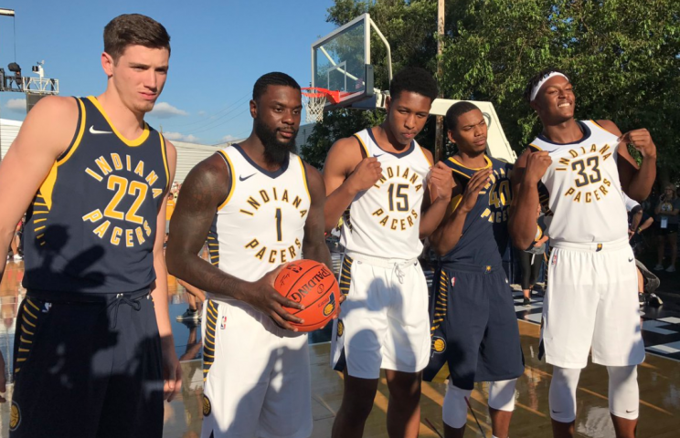
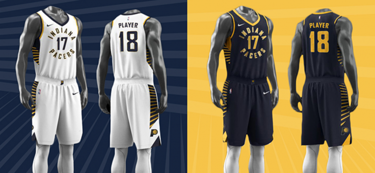
Indiana Pacers — A-
Hot take: The Pacers’ new jerseys are awesome. They’re part of a rebrand that will include a new secondary logo (seen on the waistband in the jerseys below) and a court re-design.
You can roll your eyes all you want. You can grumble about the flashy navy and yellow stripes or the new circular nature of the lettering. But the designers of these new Pacers threads were bold, took a risk, and the risk paid off. This is a great new look.
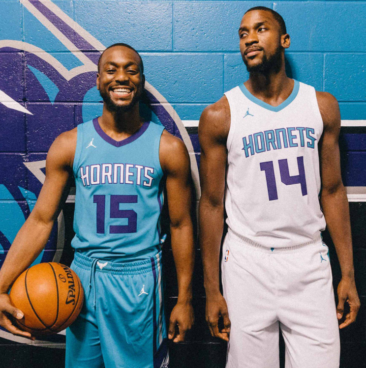
Charlotte Hornets — B+
The Hornets’ jerseys are fresh. It’s not just the Jumpman logo, which is a great touch, and distinguishes Charlotte’s unis from the rest. The color scheme might be the best in the NBA, and the design accentuates it.
You might not be able to see it in the picture below, but both jerseys have stripes down the sides that definitely add something. A full gallery can be found here.
Portland Trail Blazers — C
Pretty boring. Sorry, Portland.

Oklahoma City Thunder — C
No sponsor, no one feature that jumps out at you. Again … boring.

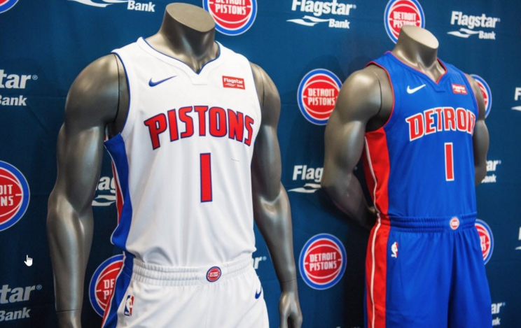
Detroit Pistons — B
It’s a pretty simple look, but the Pistons pick up some bonus points for the seamless integration of their new jersey sponsor, Flagstar Bank. The red logo gels with the team’s established color scheme.
Sacramento Kings — A
These are gorgeous. The hue of purple on the Icon uniforms is perfect. The white-grey-purple color scheme just works. The Kings, weirdly, are doing things well these days!


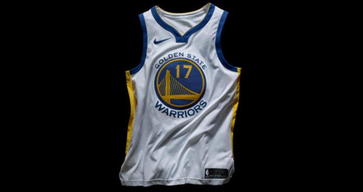
Golden State Warriors — Incomplete
Nike unveiled Golden State’s Icon jersey as part of its initial announcement, but the Warriors have not yet unveiled the rest of their uniform combinations. So we’ll wait to pass judgement.
This page will be updated every time a new uniform combination is revealed.
More from Yahoo Sports:
• ‘Rally kitten’ appears before huge Cardinals grand slam
• Mayweather vows to make McGregor pay for racist remarks
• Report: Kings’ Randolph arrested on felony marijuana charge
• Texans rookie QB Watson impresses in debut

