Timeless Kitchen Cabinet Paint Colors Designers Love
Neutrals are forever.

Mary Patton Design
While we’re still not convinced that you’re ever really finished decorating your home, there are some things that you hope to be a one-and-done. Namely, your kitchen cabinets. If you’re going the paint route here, a timeless color that will last you a lifetime is the way to go. That way, you might need a touch-up here and there to account for paint chips from daily wear and tear, but you won’t have to worry about your cabinets looking dreadfully outdated in just a decade.
Future-minded homeowners are in luck, because we’ve gathered a selection of top Southern designers’ picks for colors that will never go out of fashion. To make sure that the look of your cabinets will age well, designers recommend avoiding yellowy whites, sage greens, bright colors, or even grays—all of which they say are either outdated or on their way out. Instead, these designers are all for well-loved neutrals and neutral-adjacent deep color tones.
“Paint colors are hard to categorize as they each have a different personality of their own depending on the situation they were chosen for,” explain Vy Truong and Han Dang, the co-founders and principal designers of Very Handsome Studio in Houston, Texas. “However, without fail, it seems that neutrals will never go out of style.”
Stick to these timeless shades for kitchen cabinets that you can rely on staying stylish.
Bright White
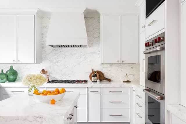
Heidi Harris Photography; Design by Morse Design
“Light and white kitchens are timeless. They are here forever,” says Andi Morse, of Morse Design in Atlanta, Georgia. “If you go back in time you will see that white kitchens existed in the 1920s, 1950s, and up to now.”
Colorful kitchens are all the rage right now. We love it as much as the next person, but keep that color off your cabinets for the sake of longevity. Build in color elsewhere using elements that are less commitment, like displayable decor, rugs, and details. Your white cabinets certainly won’t clash—nor will they if you ever decide to change the kitchen decor color scheme however many years from now. White cabinets have seen us through our stark-white kitchen phase, they’re currently supporting us amidst the color craze, and they’ll be just as reliable for all the kitchen trends to come.
When it comes to picking the right paint, our designers have some strong opinions. Most important though, is making sure you choose a bright white rather than one with yellow tones. Mary Patton of Mary Patton Design in Houston, Texas says that Farrow & Ball’s All White is her go-to, while Morse loves Benjamin Moore’s Decorator’s White.
“Decorator’s White looks good in almost every space,” Morse raves. “It's a bright white that can go a bit gray depending on the light. The gray tint prevents the white from looking yellow which will date a white paint choice.”
Cool Off-White
If bright white isn’t for you or your kitchen, designers encourage an off-white approach. However, the rule about avoiding yellowed shades still applies. Choose something natural with cool undercurrents like Sherwin Williams’ Eider White, the color of choice for Very Handsome Studio’s designers.
Black
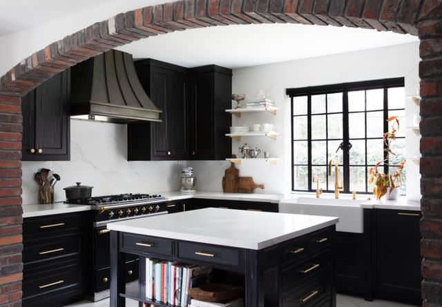
Molly Culver; Design by Mary Patton Design
On the opposite end of the spectrum from the light and bright paints, but still maintaining a neutral palette, designers can’t get enough of black cabinets. “We always consider first a beautiful black tone,” Truong and Dang tell us.
If you seek a moody interior and are opposed to light colors, black is the recommended route for your cabinets as opposed to a vibrant jewel tone that can quickly fade out of style.
“There's also a movement towards forced vintage, where new is made to look old on purpose for aesthetic value. Deep jewel tones are often chosen to enforce these aesthetics,” Truong and Dang say. “Though beautifully designed and thoughtful in theory, things done in excess tend to age poorly with time.”
Go for black instead. Brittany Farinas, CEO and creative director of House of One in Miami, Florida turns towards black paint when she wants to create a bold look for the kitchen. It’s a sleek and powerful color that you don’t have to worry about fading into obscurity over time.
Navy Blue
If you do insist on a touch of color, these designers beg of you to consider a sophisticated, deep shade—something so dark as a navy blue paint that it sits at the intersection of colorful and neutral. It’s not quite black, but has a similarly elevated effect.
“I think black and a dark navy are never going away and remain timeless over the years,” Morse reveals. Her pick for navy paint is Benjamin Moore’s Hale Navy.
Army Green
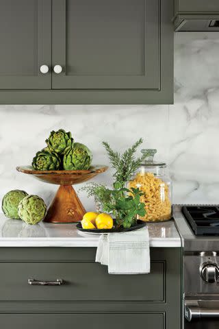
Another road less taken to the cross-section of colorful and neutral is army green. Though Patton is firm in her belief that some of this shade’s brighter tones like sage are due for a renaissance (“It’s been so done: It's time for something else.”), darker army green is here to stay.
“Darker shades of classic colors like navy blues or army greens help to effortlessly bring elegance and age to a space,” Truong and Dang say, recommending Farrow & Ball's Treron. Meanwhile, Rosemary by Sherwin Williams is Farinas’s army green of choice.
For more Southern Living news, make sure to sign up for our newsletter!
Read the original article on Southern Living.
