Breaking Down the S&P 500's First 50 Days of 2022
Yesterday marked the 50th trading day of the year, and it's been one of the worst starts of the year for stocks ever, according to S&P 500 Index (SPX) data going back to 1929. The index is down 10.6% on the year, which ranks sixth out of 94 years for the worst first 50 trading days. This week I’m looking at how the S&P 500 has performed going forward after awful starts to the year.
Double-Digit Losses to Start the Year
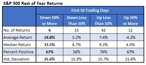
Here’s a table showing how the SPX has performed for the rest of the year based on the returns for the first 50 days. Since 1929, there were only six other years in which the index fell by 10% or more. Stocks tended to make big returns going forward. The index averaged a gain of 25% for the rest of the year, with a median return of more than 33%. In the 12 years in which the S&P 500 gained over 10% in the first 50 trading days, it fell by an average of 4% for the rest of the year. Based on this, big returns up or down early in the year lead to mean reversion over the rest of the year.
The end of the year is a long way away for some traders. The table below shows S&P 500 returns broken down like the table above, but it looks at the next month of trading rather than the rest of the year. Historically, this has marked a buying opportunity. The index averaged a gain of more than 6% over the next month, with all six returns positive after double-digit losses in the first 50 trading days.
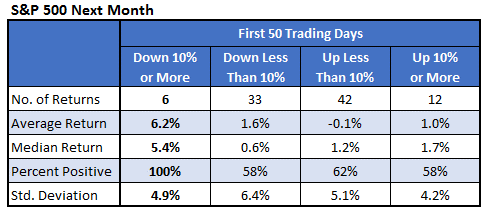
The next table shows each of the seven years in which the SPX lost double digits in the first 50 trading days of the year. The index was up every time over the next month and next 50 trading days. So, historically, this has marked a short-term bottom. The last time we experienced this was just two years ago in 2020 at the beginning of the Covid-19 crash. Stocks took off from there with the S&P 500 gaining nearly 40% over the rest of the year.

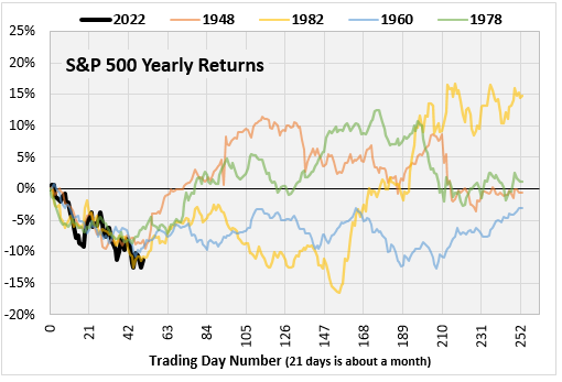
Most Similar Chart Paths
Here is another way to look at it. I considered the chart path through the first 50 trading days of this year and found past years that most resembled this year. The chart below shows the S&P 500 return for 2022 so far, along with the four years that most resemble these first 50 days. The four lines of past years support what we found above that declines in the first 50 trading days have been close to a short-term bottom. A couple of lines, 1982 and 1960, break the current lows but in both cases, it’s a few months before that happens.
This last table shows the ten years whose first 50 days looked most like the first 50 days of this year. Again, it suggests a good chance we’re at a short-term bottom. The next month in these ten most similar years saw the S&P 500 gain an average of 4.2%, with nine of 10 returns positive. The next 50 days, which averaged a gain of 8% with 90% of the returns positive, is also impressive. The rest of year returns are closer to normal, averaging a return of 8.5% vs. 6% for other years. Only 60% of the rest of year returns are positive, which is less than all other years (69%). The most recent year on the list is 2008. Stocks got decimated that year by the financial crisis.

