Art Beat reviews 'Profusion of Color: Abstracts' at Marion Art Center
- Oops!Something went wrong.Please try again later.
For over a century, museums and galleries have been exhibiting works of art — painting, drawing, sculpture, photography and more — that can be categorized as “abstract.”
Sometimes it has been celebrated. Sometimes it has been met with cynicism, contempt and derision, often punctuated with the much expected cliche comment: “My kid could do that.”
But how does one define abstract art? Is it the drip paintings of Jackson Pollock or the “soak stains” of Helen Frankenthaler? Is it Kandinsky’s “Composition V” from 1911? The visionary paintings of the Swedish mystic Hilma af Klint? The Venus of Willendorf? Hand prints on a cave wall?
Picasso said, “There is no abstract art. One must always begin with something, afterwards one can remove all semblance of reality; there is no longer any danger as the idea of the object has left an indelible imprint.”
The painter Milford Zornes stated, “All art is abstract because art is an abstraction of the truth.”
Hence, all art is deviation from reality. A painting of a tree is not a tree, a painting of a nude is not a nude. It’s a divergent reality. To tap the pop culture zeitgeist, it is a variant from the multiverse. It’s a lie. And if a realist painting is an untruth (and of course, it is), perhaps the more abstract the work, the bigger the lie.
But the lie serves a purpose: it conveys different realities that ultimately connect humanity with the world at large as culture reflects nature through distortion, be it mild or wild.
The current exhibition at the Marion Art Center features three painters who dive into the deep end of the pool of abstraction, make a big splash and do their laps with perfectly executed strokes.
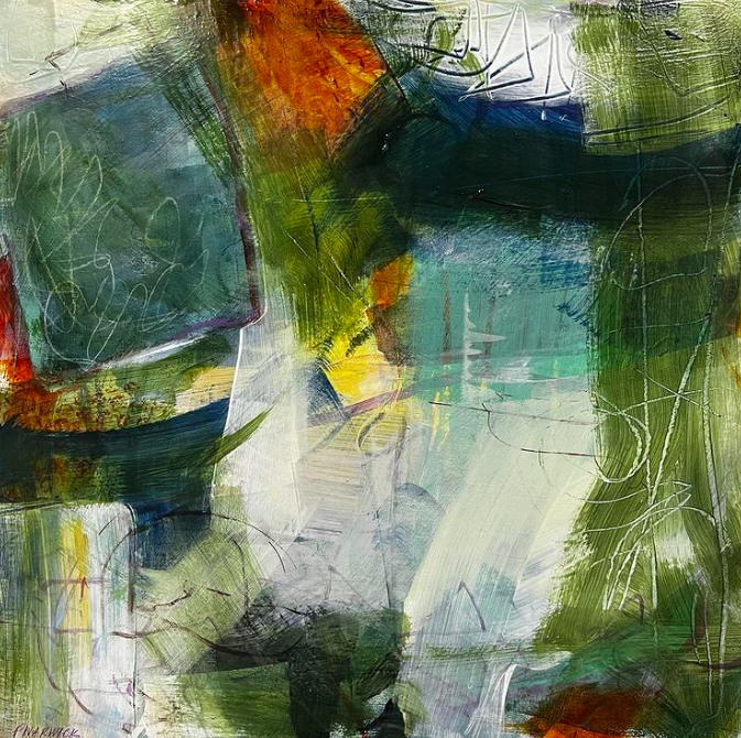
Pat Warwick
Several of the works of Pat Warwick are abstracted only marginally as there remains a clear and unapologetic connection to the “reality” of landscape painting.
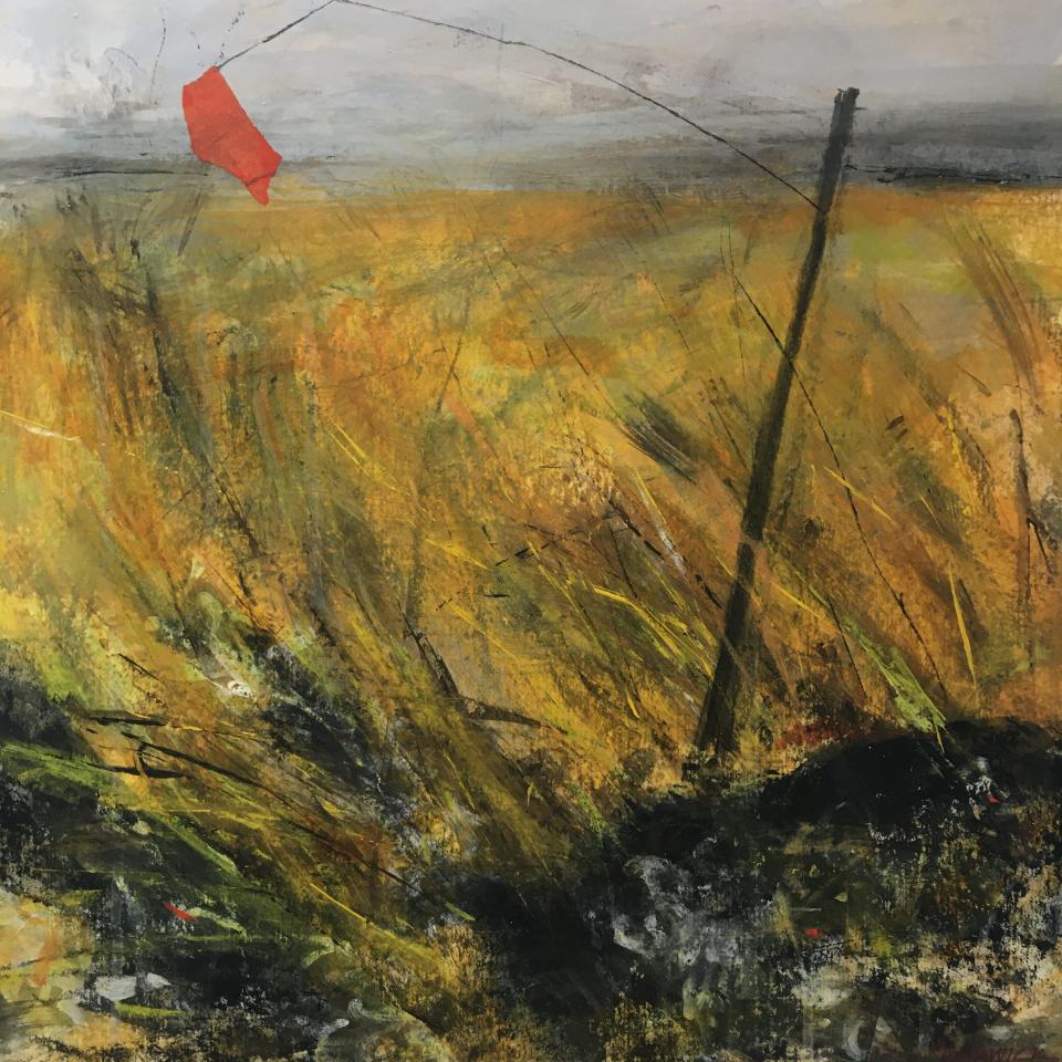
In “Aftermath,” a band of gray across the top delineates a horizon over a morass of amber, brown and olive-green streaks that replicate a field. A small red flag dangles from a twisted wire on a crooked post and it somewhat makes the point that it’s just a little lie.
Warwick’s “Wintermarsh” features yellow strokes and black shadows that suggest straws of hay protruding from a grayish blue mound of snow. She disrupts the usual spatial relationship of a “realistic” painting by flattening the picture plane, so that foreground and background become one.
With “Overview,” Warwick becomes more playful with color and composition, with the whisper of a tree to one side; while she goes full-blown non-objective in “Too Much Talk,” with love of brushstroke, mark making and nonsense calligraphy.
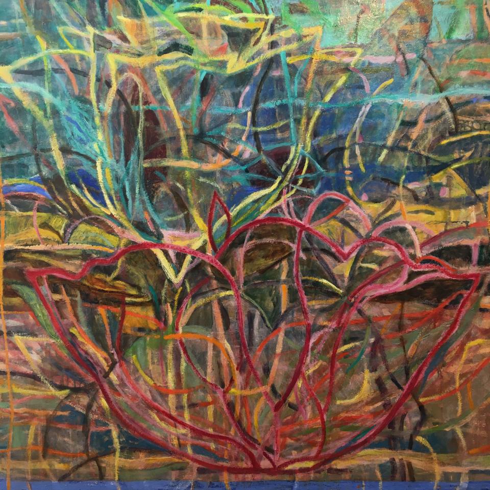
Pat Coomey Thornton
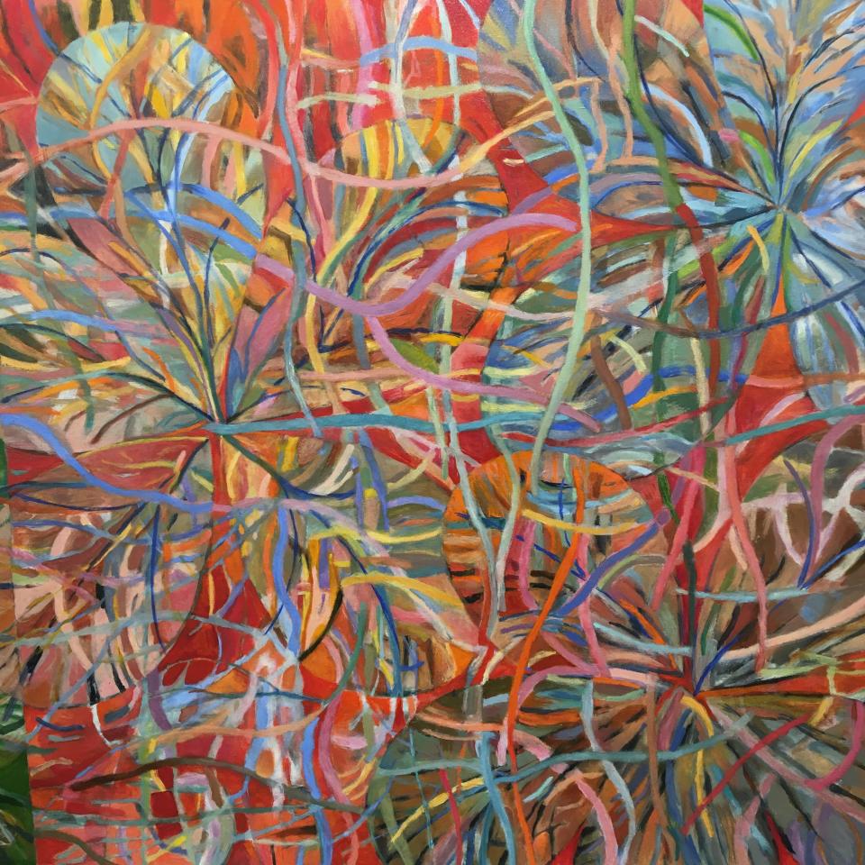
Pat Coomey Thornton’s abstractions are bold and whimsical explosions of color that often (but not always) are inspired by floral motifs. With thick curving lines of lavender, blue, orange, scarlet, pink and more in “Blossoms,” she has created a tightly choreographed visual dance.
The push and pull plays with the viewer’s sense of space. Barely there, but there nonetheless, are intangible shapes — curved leaves, flower petals- that both pop forward and recede into the background.
Thornton’s “Petals” are suggested more by the power of title than by any clear depiction of said petals. Loops of off-white seem to restrain the earth tone squiggles and roller coaster curves in the behind-it-all space.
With the larger scale “Point of Departure,” Thornton is celebrating color itself. While cavorting with thick swirls of avocado green, cherry red and tangerine, it is the cool electric blue that steals the show.
If Warwick lies a little with her landscape references and Thornton lies a bit more with her botanical inspirations, it is Alyn Carlson that is the biggest liar. Even with evocative and descriptive titles, most of her work was cut out of whole cloth. It’s a fabrication.
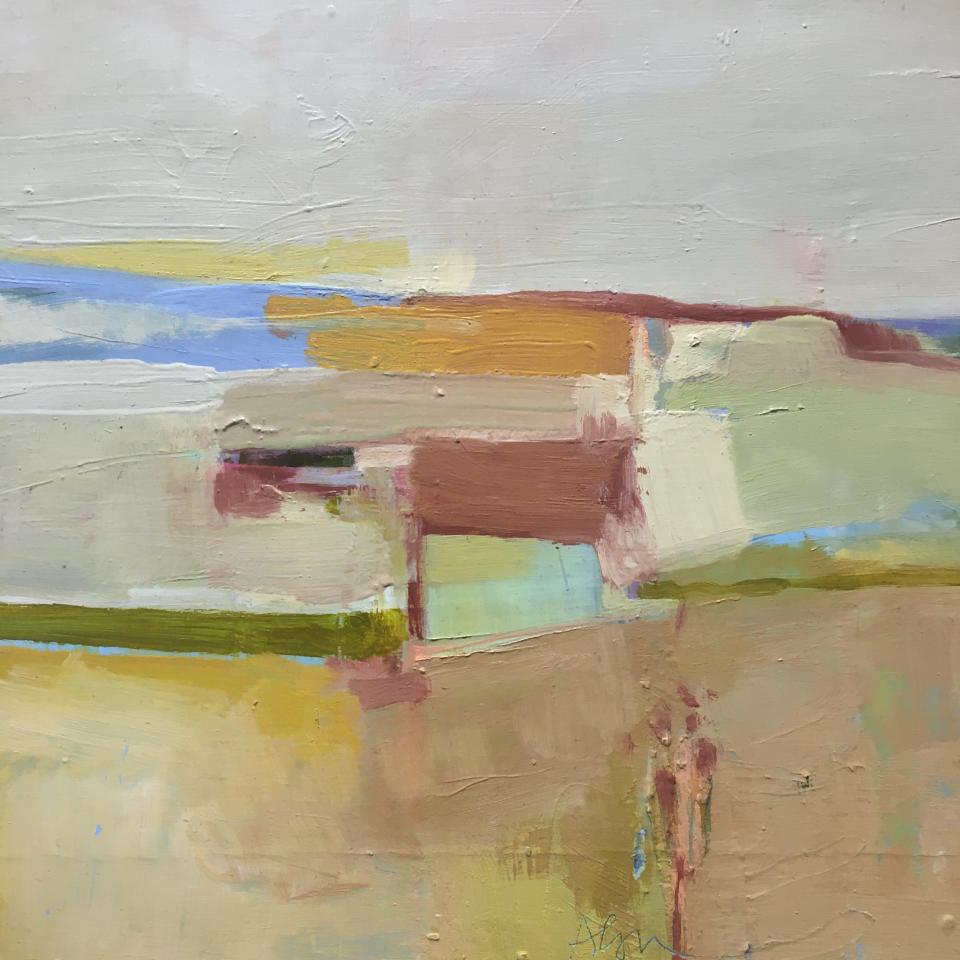
Alyn Carlson
And that is not a bad thing. She is the purest abstractionist of the trio.
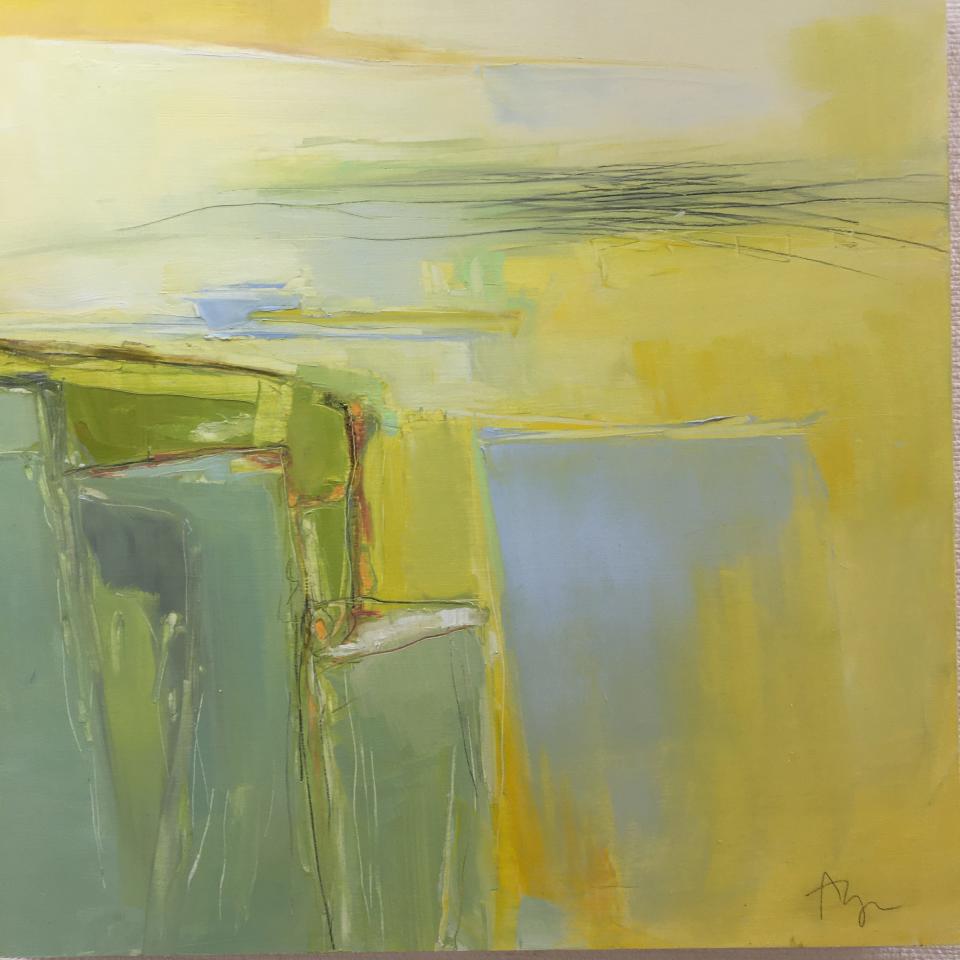
Carlson’s “Butter Sky East” is a handsome arrangement of decidedly murky colors that interact with restraint and dignity. Her “Rachel’s Cove” is a gathering of hues, including a Band-Aid beige, a vivid cornflower blue, and dried blood red, that remarkably work well together. Her “North End Gloaming 522” reveals no city twilight but does reveal an affinity for de Kooning.
Carlson’s “Aqua Linea 400” is an enthralling painting that suggests a greater connection to something outside the painting itself than any of her others. It is easy to imagine a distortion of an urban landscape: a vivid orange sunset over an elevated train in Chicago or Queens.
Look closely through the windows. Do you see the seated blonde in the capri pants looking at a book or a cellphone? See the straphanger in the long green coat?
No? Maybe I’m lying. Or not.
“Profusion of Color: Abstracts” is on display at the Marion Art Center, 80 Pleasant Street, Marion through June 25.
This article originally appeared on The Herald News: Art Beat looks at 'Profusion of Color: Abstracts' at Marion Art Center

