2 Prime Indicators of Investor Optimism
Not long ago, I wrote about how the Investors Intelligence (II) sentiment survey was showing significant and persistent optimism. That’s not surprising given the S&P 500 Index (SPX) keeps hitting all-time highs. This week, however, I’m contrasting that sentiment survey with a different one put out by the American Association of Individual Investors (AAII). In this survey, optimism has collapsed. The chart below shows the difference in the percentage of bulls and percentage of bears from each survey. The AAII poll shows an equal number of bulls and bears, while the II poll shows a lot more bulls. First, I talk about the different methodologies in the survey, and then I quantify S&P 500 returns after we see these polls and the stock market behaving as they are now.

Polling Methods
You can see in the chart above that those polled in the AAII survey are a lot fickler than those in the II poll. That’s due to the methodology. The II poll is a collection of over 100 published investing newsletters in which the editors at II determine the percentage of bulls and bears. There’s also a third designation for those that are long-term bullish and short-term bearish. The AAII poll is very different. It’s an online poll of individual investors who simply vote which way they think the market goes over the next six months. It’s easy to understand why anonymous people voting online would be more likely to switch their stance than a published weekly newsletter.
Individual Investors Get Squeamish
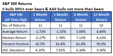
We have data on both polls going back to 1987. I looked at past instances when the II poll showed at least 35% more bulls than bears, while the AAII poll had at least as many bears as bulls. The table below summarizes how the SPX performed after these occurrences. The second table shows typical returns since 1999, the year of the first occurrence.
When we compare the two tables, there isn’t a whole lot of difference to be seen. In the very short term (one month), there’s a bit of underperformance after a signal when you look at the average return. The likelihood of a positive return, however, was a little better. Within six and 12 months after a signal, stocks have done slightly better after these poll divergences. Overall, though, stocks tend to perform close to normal.

The fall in optimism seen in the AAII poll is especially interesting now as the SPX hits all-time highs. I looked at those returns above, and I filtered out only the signals that occurred with the index at all-time highs. This has happened 11 other times. The table below summarizes those returns. The AAII investors were right to be bearish in the short-term. A month after these signals occurred with the index at an all-time high, the SPX averaged a loss of 1.72% over the next month, with less than half of the returns positive. Longer term, however, tended to perform better than normal.
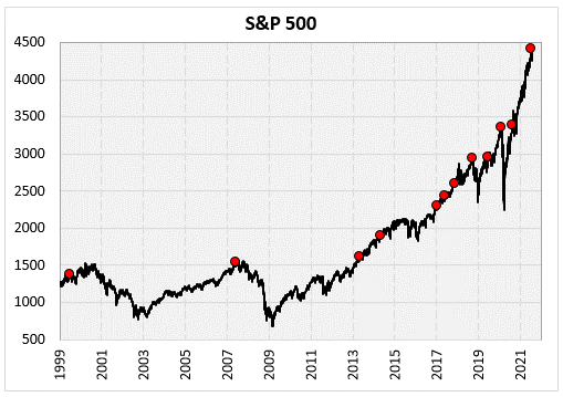
Finally, the chart below shows the SPX since 1999. The dots are the signals of when the index was at an all-time high then the AAII poll showed pessimism, differing from the II poll. The first two occurrences happened relatively close to major market tops. These signals also occurred in September of 2018 and February of 2020 right before markets sold off sharply (double-digit percent losses in the next three months). While the longer-term returns have been fine after these instances, the recent pessimism in the AAII poll might be something to be concerned about in the short term.