Why Kia Should Adopt a New Badge Design Like This One
Kia's lead designer, Tom Kearns, recently told us he agrees that it may be time to redo the company's logo, which has gone unchanged since 1994. Back then, when the Kia brand launched in the United States selling only the Sephia economy car, vehicles as large and luxurious as the new Telluride SUV, as sporty as the Stinger, and generally as well-executed as the entire Kia lineup would have been beyond imagination.
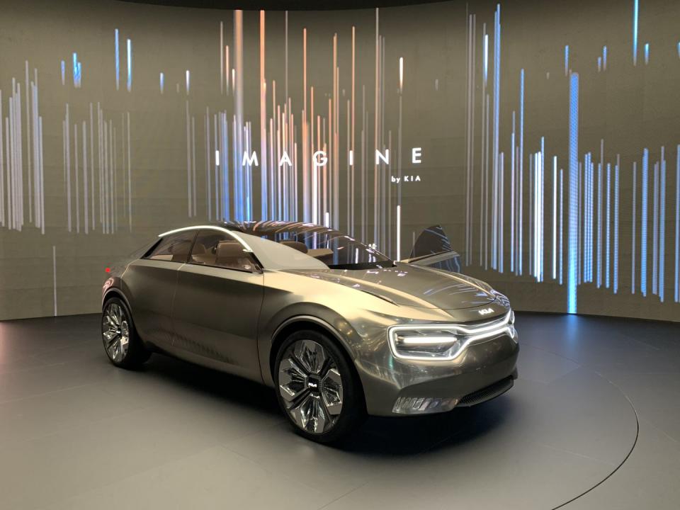
But here we are. Kia's two-plus-decade transition from selling budget transportation to jockeying in the mainstream against Honda, Toyota, Ford, and others deserves a branding reset. Luckily, a compelling candidate for Kia's next badge design was lurking in plain sight at the 2019 Geneva auto show, on the nose and tail of the Imagine by Kia concept car.
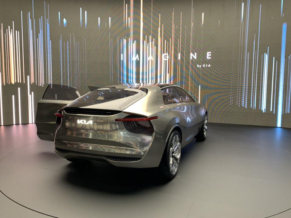
Standing in stark contrast to Kia's current logo, in which the word "KIA" lives in a featureless silver oval, the Imagine by Kia wears that word in a cool, NASA-like font. With no generic oval and no tangible visual link to the 1994 Sephia, it is vastly more fitting for the front ends of such products as the Telluride and the Stinger. We think the Imagine by Kia concept car's logo is modern, subtly upscale, and fresh-adjectives we'd also readily apply to virtually any current Kia product.
To be clear, brands don't often toss their logos in the trash bin and start over. Even subtle changes to long-serving brand markers are treated carefully. (Cadillac, for example, has evolved its shield logo only a few times in its 100-plus-year history, with the loss of the badge's decorative wreath marking its biggest break.) Taking a logo like Kia's, which is young by industry standards, and making major changes still risks confusing customers and flushing brand awareness down the toilet.
And yet . . . Kia's logo is simply its name, not a graphic marker like BMW's blue-and-white roundel, or Mercedes-Benz's three-pointed star, or Toyota's, um, whatever that vaguely T-shaped interlocking-loop thing is. The new Kia logo on the concept is, drum roll, also its name, just in a nicer-looking font. If Kia is dabbling in changing its signature marker even for a concept car, it indicates the company is at least looking at the idea of changing it on its production cars. So, Kia, if you were fishing for feedback on the Imagine by Kia concept's sweet logo, here's our answer: Go for it.
('You Might Also Like',)

