Users prefer Apple’s ‘hideously ugly’ new iOS 7 icons to old ones 2 to 1
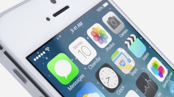
Apple’s new iOS 7 software has been pretty polarizing so far. Specifically, the new design has been met with mixed reactions as users adjust to the flat new look of Apple’s mobile software. While overall opinions have varied, it seemed like most people could at least agree that the new iOS 7 icons are pretty terrible. In fact, one accomplished designer BGR spoke with went as far as to call them “hideously ugly.” As it turns out, however, not everyone dislikes the new icons. In fact, it looks like a pretty surprising number of users prefer the new iOS 7 icons to the older versions they replace.
[More from BGR: iOS 7 beta 2: Full change log now available, iPad version released]
A recent poll created using Input Factory’s “Polar” app asked iOS users which icons they prefer, Apple’s iOS 7 icons or the older versions from iOS 6 and previous builds. Each icon pair was lined up so that users could vote on them individually, and the results are pretty shocking. As Protean co-founder Henry Balanon pointed out on Twitter, users prefer Apple’s new iOS 7 icons to the older versions nearly 2 to 1 with more than 46,000 votes having been tallied.
[More from BGR: iOS 7 beta 2 walkthrough [photo gallery]]
Of course, there are several new iOS 7 icons that are undeniably ugly to almost everyone who looks at them. For example, respondents preferred Apple’s old Reminders icon to the new one by a sizable margin, and response to the new Safari icon was even worse.
The full results of the poll can be seen here.
This article was originally published on BGR.com
