The truth about Farrow & Ball - the paint we love to hate
I think we can agree that not all changes are improvements. No one wants a “revised” digestive biscuit, “better” ketchup or “enhanced” red London bus, for example. (See the “improved” Thomas Heatherwick-designed Routemaster, so boiling hot in summer that furious Londoners christened them Roastmasters.)
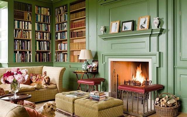
But Farrow & Ball, paint pushers to the aspirant middle classes since 1946, have now “improved” their paint formula, and to be honest, far from being a Farrow and Balls-up, I’m fine with it. The comforting sight of those brown and grey paint cans tossed into skips have, for decades, been a sign that the neighbourhood is on the up.
Where F&B tins appear, can Boden trousers, rare breed pork and Waitrose be far behind?
When we painted the outside of our house in Downpipe Grey, the volume of people who stopped to ask our decorator what colour it was, made him even grumpier than usual. Others dropped notes through the door asking what shade we had chosen. All began, “I hope you don’t think this is too weird…”. You say weird, I say Tuesday.
The chatter at the school gates, in the local artisan coffee shop and at the farmer’s’ market has reached a new level of concern
Yet, while it can seem we’re living in a world drowning in Farrow & Ball, it had not been without its issues. I’m sure I’m not alone in needing a sharp intake of breath before embarking on that paint conversation with our decorator.
Any suggestion that you might go for F&B, is met with eye-rolling and teeth sucking. There can be death stares. Some might suggest you pick a less tricky paint. Some refuse to use it at all. Most will charge more, as it requires extra coats and therefore takes more time to apply.
This already fragile relationship became even more fraught in 2009, when the company changed the formulation so that all of their paints were water based, instead of oil based. My decorator’s reaction? “It’s like painting with bloody milk! Tea, strong, four sugars.”
So for years now, many of us have been cheating on Farrow & Ball. The prospect is certainly a tempting one, not least for your bank balance. A five-litre pot of F&B estate emulsion costs a princely £74.50; five litres of the Dulux equivalent is £26.
Little wonder so many of us are shelling out £4.50 for a tiny F&B tester pot and running off to our local DIY shop to mix-up an almost identical colour at a bargain price. Once a whispered secret around dinner tables up and down Britain, the volume has increased as we compare the merits of various high street doppelgangers.
Now, though, it seems the rumblings of revolt have been heard at Farrow & Ball HQ in Dorset. They have responded by adding one to 20 per cent more pigment to their paints to give them better opacity and coverage. According to spokesman Gareth Hayfield, the company is: “constantly looking at what customers want and we take feedback from all different markets in which we operate.”
Our bedroom is painted in Pelt - partly because it’s a fabulously soothing shade of deep purple, partly because the name made me laugh
Some professionals have already reported a positive change in the application of the paint. But are we happy yet? No we are not.
The chatter at the school gates, in the local artisan coffee shop and at the farmer’s’ market has reached a new level of concern. Namely: will we be able to touch up scuffs and nicks with the new formula (because, God knows, you can barely breathe on F&B without it chipping)?
At least, it appears, the F&B paint chart remains unchanged. Because our continuing and sometimes grudging affection must, surely, be in part thanks to their bonkers names. Other companies pale by comparison (though in the Nineties, when I worked for an interiors magazine, I once painted a room in Speculum, a wince-inducing grey by Dulux.)
When we moved into our house, I applied at least 20 shades of white, off white and cream in patches along the hallway. I spent hours trying to decide between Wevet, Clunch, String, Savage Ground and Drop Cloth, until my husband said, “Debora. Please. I am on my knees. Just pick one”.
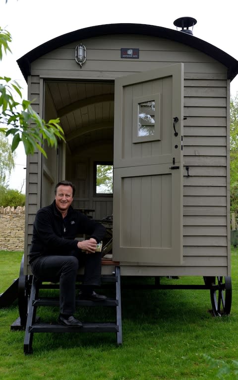
But I’m still obsessed with the names, years later. Our bedroom is painted in Pelt - partly because it’s a fabulously soothing shade of deep purple, partly because the name made me laugh. I have flirted with Mole’s Breath, Elephant’s Breath, Pale Hound, Dead Salmon (seriously) and Mouse’s Back - incidentally the choice of Samantha Cameron for her husband’s ‘shepherd’s hut’ in their Cotswolds garden, along with Clunch and Old White.
And then, because I love to cook and write about food, I have actually toyed with creating a dinner menu entirely inspired by F&B names: Smoked Trout, followed by Pigeon with Radicchio and Brassica, finished off with a compote of Cooking Apple Green. Delicious.
So - despite all strong arguments to the contrary - I remain a Farrow-and-Ball-aholic. Of course, I have done the colour matching thing. I’ve slapped real and faux F&B on the wall next to one another – upwards of five coats for the former, two coats for the cheaper to get the same coverage. And you know what? I hate to say it but I can tell the difference. The expensive paint has a greater depth of colour and changes with the light during the day.
But here’s the thing: when you get that perfect, rich, subtle finish and then you add your pictures, furniture, books, family, dogs - hell, when you push your life up against it - can you really tell the difference? Probably not. And if you can, you’re spending too much time staring at the walls.

