The most important points to know about the economy right now

It’s still early in 2017—and very early in the administration of President Donald J. Trump (though some may feel it’s already been eons.) That means it’s a great time to take a step back and take stock of where we are.
To that end, I thought I’d share a few charts with you that reflect some of my thinking.
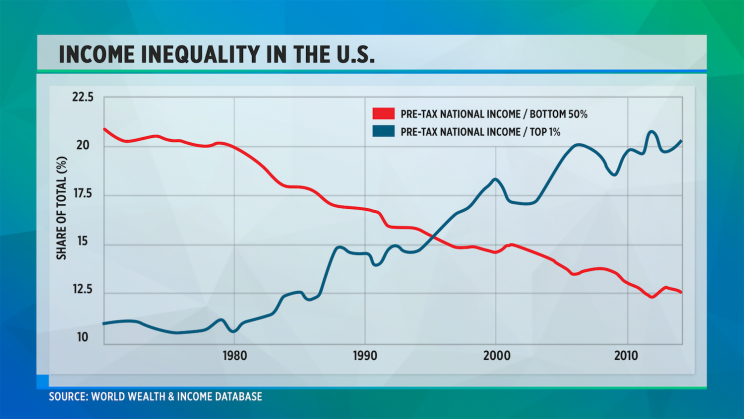
Let’s start with a chart that I think really speaks to why Trump was elected, and that is income inequality. This notion may be familiar to you, but to me this is a striking and scary picture. Trump tapped into the discontentment that those who are riding the red line feel, but remember he promised to help these people, too. Ultimately, one way or another, this divide must be narrowed.
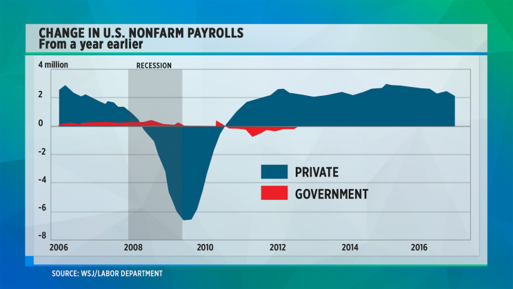
Let’s talk about job growth for a minute. The chart below shows just how devastating the great recession of 2008/2009 was, and how we’ve had a nice long job recovery since then…
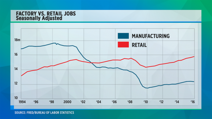
But what kind of jobs are we creating? This next chart shows that the number of retailing jobs has grown and in fact now outstrips job growth in manufacturing. You can imagine that some of these retailing positions that have been created are low-paying jobs in fast food restaurants while there are fewer high-paying jobs in car assembly plants. So even though we’ve had job growth, wage growth has been anemic.
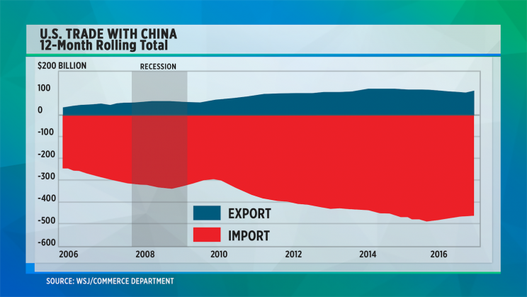
And where are those factory jobs going? To China, among other countries. This chart shows the very significant trade imbalance we have with China, which has grown substantially over the past decade. This too is an issue that Trump raised during his campaign.
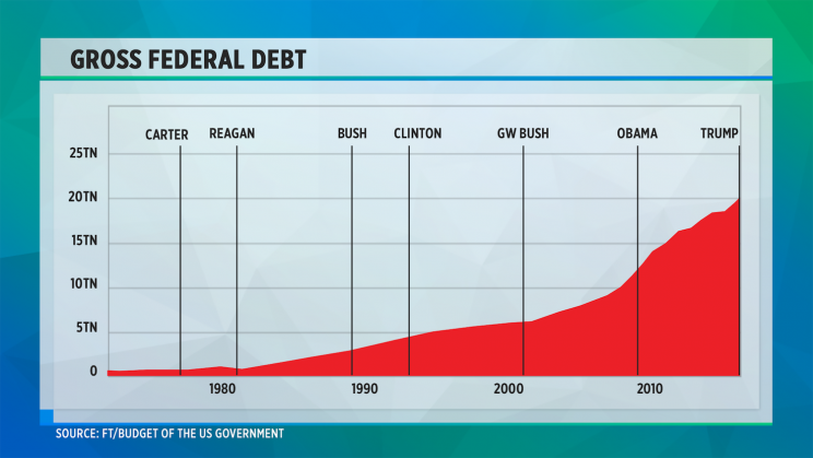
Trump has also spoken about cutting taxes and enacting a huge infrastructure build-out. But how much flexibility does he have? Here you can see our federal debt is high. Now true this chart doesn’t adjust for GDP growth, but it still shows that federal debt continues to climb.
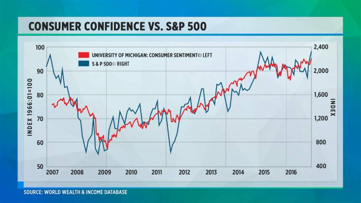
And finally here’s the chart that Larry Fink, CEO of Blackrock, said he found “horrifying.’” It shows a strong correlation between consumer confidence and the stock market. Fink said this is scary because it seems to show that people are buying stocks at the wrong time.
So there you have it. Six charts, each giving a snapshot of where we are now. Each one shows a problem, and an opportunity too.
Andy Serwer is editor-in-chief of Yahoo Finance.
Read more:
Why Mexico’s problems are always our problems
The investor’s guide to 6 market themes for 2017
What people in China think of Donald Trump
Chris Blackwell is the real most interesting man in the world

