Tesla's Letterhead Is So Much Better Than Edison's
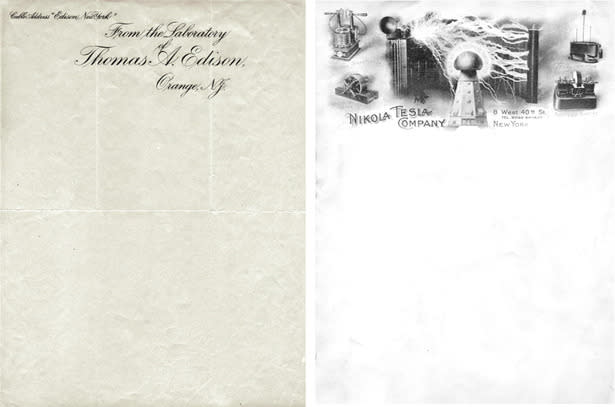
We noticed yesterday that Nikola Tesla's letterhead was awesome. All kinds of electrical gizmos take up the top fifth of his pages. Seeing as the nerd conventional wisdom is that Tesla was the real genius and Edison was a near-fraud marketing guru, we got to wondering what Edison's letterhead looked like. Edison's letterhead is plain and scripty. Really, it's no contest whose letterhead is better. Judging by these examples from Letterheady.com, Tesla wins by a mile.
Update: Maia Weinstock (@20tauri) sends in this "slightly more interesting" Edison letterhead. I like the font better than in the script version above, but Tesla's is still far better.
More From The Atlantic
