Sufjan Stevens Joins the War on Helvetica Light

The punk band Savages has committed a crime against typefaces, according to folk musician Sufjan Stevens, by choosing Helvetica Narrow for its most recent album cover.
RELATED: Why Google's Design Is More Consistent Than Apple's Unorganized iPhone Mess
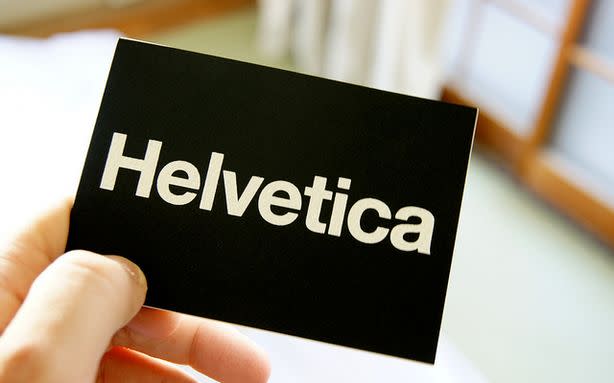
True, many love the original Helvetica, introduced to the world in 1957 by our friends in Switzerland. But the skinny version of the classic font, weirdly spaced and italicized, amounts to what Stevens calls a "very uncool typography blunder," on his Tumblr. "Weight loss is the worst thing that can happen to an iconic font," he adds, citing the recent fracas over the Helvetica font in Apple's new iOS7.
RELATED: Apple's iOS Update Could Kill Snapchat, or at Least Make It Even Creepier
Indeed, many web designers are in Stevens's camp when it comes to lighter Helvetica fonts. Apple's decision to go with Helvetica Neue Light in iOS 7 was deemed sacrilegious by design-conscious tech geeks. Eventually, Tim Cook's design minions came to their senses and swapped out the thinned out version for a more sensible Helvetica Neue (i.e., regular).
RELATED: What Apple's Flat iOS 7 Design Will Look Like — When It Gets Here
But what is true for a smartphone giant may not hold for a punk band. In the case of Savages, the thinner Helvetica might actually be acceptable. "Light weights look cool (moreso at larger sizes) and work well in advertising and logos, but are generally harder to read," wrote Instapaper founder and Tumblr millionaire Marco Arment on his blog. Helvetica Light may have a bad rap because of the iOS7 disaster, but that should not condemn the whole typeface to obscurity.
RELATED: iPhone's New iOS7 Design Is Flat as Hell and You Can't Stand the Wait Anymore
Stevens criticism extends to other aspects of the album cover: "Also can we talk about the weird italics (unnecessary affectation, and very un-British),cramped leading (totally unforgivable) and unnecessary line break? Who the Fraggle designed this?"
